We use a variety of data stores at DoorDash to power our business, but one of our primary tools is classic relational data powered by Postgres. As our business grows and our product offerings broaden, our data models evolve, requiring schema changes and backfills to existing databases.
When DoorDash was smaller and in fewer time zones, it was reasonable to take a few minutes of downtime at night to perform these kinds of data operations. But as we have grown to include merchants, customers, and Dashers in over 4,000 cities on two continents, it is no longer acceptable to have downtime in our system. Our global span means we have to engineer solutions to perform major operations on huge tables without disrupting the business.
During our pre-growth phase, the most obvious way of backfilling a new column was to simply add the column as nullable, and then start a background process to fill in the rows in batches. But some of our tables have become so large and include so many indexes that this process is far too slow to stick to any kind of reasonable product schedule.
Recently, our Storage team honed a backfilling technique for our Postgres databases that allows us to completely rebuild a table—changing types and constraints for multiple columns all at once—without affecting our production systems. The unexpected benefit of this technique is that we can transactionally swap the two tables both forwards and backwards, enabling us to safely test out the new table and switch back if problems arise while maintaining data integrity.
This method reduced a projected three month project down to less than a week while letting us update tables in a production environment. Not only could we add our new field, but we also had the opportunity to clean up the entire data model, fixing data inconsistencies and adding constraints.
The need for data backfills
Not every schema change requires a backfill. Often, it is easier to add a nullable column and create default behavior for NULL values in application code. While fast, this process has disadvantages, such as not being able to add database-level constraints. If application code erroneously forgets to set the value, it will get default behavior, which may not be what was intended.
Some schema changes require a backfill, though. For example, switching data types for primary keys requires that all historical data be updated. Similarly, denormalization for performance reasons requires backfilling historical data if no sensible default behavior can be implemented.
The difficulties of in-place data backfills of large tables
Trying to update every row in a large production table presents several problems.
One problem is speed. Updating a column on a billion rows in Postgres is equivalent to deleting a billion rows and inserting a billion rows, thanks to the way Multiversion Concurrency Control (MVCC) works under the covers. The old rows will have to be collected by the VACUUM process. All of this puts a lot of pressure on the data infrastructure, using compute cycles and potentially straining resources, leading to slow-downs in production systems.
The number of indexes on the table amplifies this pressure. Each index on a table effectively requires another insert/delete pair. The database will also have to go find the tuple in the heap, which requires reading that portion of the index into the cache. At DoorDash, our production data accesses tend to be concentrated at the very tail end of our data, so the serialized reads of a backfill put pressure on the database caches.
The second problem is that if the writes happen too fast, our read replicas can fall behind the primary writer. This problem of replica lag happens at DoorDash because we make heavy use of AWS Aurora read replicas to service read-only database traffic for our production systems. In standard Postgres, the read replicas stay up to date with the primary by reading the write-ahead logging (WAL), which is a stream of updated pages that flows from the primary writer to the read replicas. Aurora Postgres uses a different mechanism to keep the replicas updated, but it also suffers from an analogous problem of replication lag. Aurora replicas typically stay less than 100 milliseconds behind, which is sufficient for our application logic. But without careful monitoring, we found that it is fairly easy to push the replica lag above 10 seconds, which, unsurprisingly, causes production issues.
The third major problem is that even “safe” schema changes, like widening an INT column to BIGINT, may uncover unexpected bugs in production code that are not trivial to locate by mere inspection. It can be nerve-wracking to simply alter an in-use schema without a backup plan.
The solution to all of these issues is to avoid altering the production table in-place entirely. Instead, we copy it to a lightly indexed shadow table, rebuild indexes after, and then swap the tables.
Creating a shadow table
The first step is to create a shadow table with a schema identical to that of the source table:
CREATE TABLE shadow_table (LIKE source_table);
The new shadow table has the same schema as the source, but with none of the indexes. We do need one index on the primary key so that we can do quick lookups during the backfill process:
ALTER TABLE shadow_table ADD PRIMARY KEY (id);
The final step is to make schema alterations on the new table. Because we are re-writing the entire table, this is a good opportunity to discharge any technical debt accumulated over time. Columns that were previously added to the table as nullable for convenience can now be backfilled with real data, making it possible to add a NOT NULL constraint. We can also widen types, such as taking INT columns to BIGINT columns.
ALTER TABLE shadow_table ALTER COLUMN id type BIGINT;
ALTER TABLE shadow_table ALTER COLUMN uuid SET NOT NULL;
ALTER TABLE shadow_table ALTER COLUMN late_added_column SET NOT NULL;
Writing the copy function
Next we will create a Postgres function that will copy and backfill rows at the same time. We will use this function in both the trigger, which will keep new and updated rows synchronized with the shadow table, and the backfill script, which will copy the historical data.
The function is essentially an INSERT paired with a SELECT statement, using COALESCE statements to backfill null columns. In this example, we weren’t adding any columns, so we rely on the fact that the two tables have columns in the same order, but if this operation had added columns, we could deal with those here by listing the columns explicitly in the INSERT.
CREATE OR REPLACE FUNCTION copy_from_source_to_shadow(INTEGER, INTEGER)
RETURNS VOID AS $$

INSERT INTO shadow_table
SELECT
  id,
  COALESCE(uuid, uuid_generate_v4())
  created_at,
  COALESCE(late_added_column, true),
  ...
FROM source_table
WHERE id BETWEEN $1 AND $2
ON CONFLICT DO NOTHING

$$ LANGUAGE SQL SECURITY DEFINER;
Those COALESCE statements are the essential parts–the effect here is “look to see if a value is NULL and, if so, replace it with this other thing.” The use of COALESCE() allowed us to do some data repair on over a dozen columns all at the same time.
The INT to BIGINT conversion is free with this technique. Just alter the shadow table’s schema before starting the procedure and the INSERT handles the type promotion.
Finally, we want to make sure that we do no harm, so this function is written in a way to minimize the risk of the backfill script accidentally overwriting newer data with stale data. The key safety feature here is the ON CONFLICT DO NOTHING, which means it is safe to run this function multiple times over the same range. We will see how to deal with updates in the trigger below.
Setting the trigger
Even application developers well versed in the intricacies of SQL may not have had an opportunity to use a database trigger, as this feature of databases tends not to be integrated in application-side frameworks. A trigger is a powerful feature that allows us to attach arbitrary SQL to various actions in a transactionally safe way. In our case, we will attach our copy function to every type of data modification statement (INSERT, UPDATE, and DELETE) so that we can ensure that all changes to the production database will be reflected in the shadow copy.
The actual trigger is straightforward, except that for UPDATE it performs a DELETE and INSERT pair inside a transaction. Manually deleting and re-inserting in this way allows us to reuse the main backfill function (which otherwise would do nothing because of the ON CONFLICT DO NOTHING). It also ensures that we won’t make a mistake and overwrite newer data because the backfill function can’t perform an UPDATE.
CREATE OR REPLACE FUNCTION shadow_trigger()
RETURNS TRIGGER AS
$$
BEGIN
  IF ( TG_OP = 'INSERT') THEN
      PERFORM copy_from_source_to_shadow(NEW.id, NEW.id);
      RETURN NEW;
  ELSIF ( TG_OP = 'UPDATE') THEN
      DELETE FROM shadow_table WHERE id = OLD.id;
      PERFORM copy_from_source_to_shadow(NEW.id, NEW.id);
      RETURN NEW;
  ELSIF ( TG_OP = 'DELETE') THEN
     DELETE FROM shadow_table WHERE id = OLD.id;
      RETURN OLD;
  END IF;
END;
$$ LANGUAGE PLPGSQL SECURITY DEFINER;

CREATE TRIGGER shadow_trigger
AFTER INSERT OR UPDATE OR DELETE ON source_table
FOR EACH ROW EXECUTE PROCEDURE shadow_trigger();
Performing the backfill
For the actual backfill, we used a custom Python script that uses a direct database connection in a production shell. The advantage here is that development is interactive, we can test on a staging environment, and we can stop it instantly if something goes wrong. The downside is that only the engineer who has access to that production shell can stop it, so it must be run while someone is able to monitor it and stop if something goes awry.
In our first round of backfilling, the speed was orders of magnitude faster than in our earlier attempts at in-place modification of the original production table. We achieved about 10,000 rows per second.
In fact, the real problem is that we were writing a bit too fast for our replicas to keep up under production load. Our Postgres replicas generally have replication lag that is sub-20 milliseconds even under a high load.
With a microservices architecture, it is common for a record to be inserted or updated and then immediately read by another service. Most of our code is resilient to slight replication lag, but if the lag gets too high, our system can start failing.
This is exactly what happened to us right at the tail end of the backfill—the replication lag spiked to 10 seconds. Our suspicion is that because Aurora Postgres only streams pages that are cached in the replicas, we only had issues when we started to touch more recent data residing in hot pages.
Regardless of the cause, it turns out that Aurora Postgres exposes instantaneous replication lag using the following query:
SELECT max(replica_lag_in_msec) as replica_lag FROM
aurora_replica_status();
We now use this check in our backfill scripts between INSERT statements. If the lag gets too high, we just sleep until it drops below acceptable levels. By checking the lag, it is possible to keep the backfill going throughout the day, even under high load, and have confidence that this issue will not crop up.
Making the swap
Postgres can perform schema changes in a transaction, including renaming tables and creating and dropping triggers. This is an extremely powerful tool for making changes in a running production system, as we can swap two tables in a transactional way. This means that no incoming transaction will ever see the table in an inconsistent state—queries just start flowing from the old table to the new table instantly.
Even better, the copy function and trigger can be adjusted to flow in the reverse direction. The COALESCE statements need to be dropped, of course, and if there are differences in the columns, those need to be accounted for, but structurally the reverse trigger is the same idea.
In fact, when we first swapped the tables during this particular operation, we uncovered a bug in some legacy Python code that was expressly checking the type of a column. By having the reverse trigger in place and having a reverse swap handy, we instantly swapped back to the old table without data loss to give us time to prepare our code for the schema changes. The double swap procedure kept both tables in sync in both directions and caused no disruption to our production system.
This ability to flip flop between two tables while keeping them in sync is the superpower of this technique.
Conclusion
All database schemas evolve over time, but at DoorDash, we have an ever evolving set of product demands, and we have to meet those demands by being fluid and dynamic with our databases. Downtime or maintenance windows are not acceptable, so this technique not only allows us to make schema changes safely and confidently, but also allows us to do them much faster than traditional in-place backfills.
Although this particular solution is tailored for Postgres and uses some features specific to AWS Aurora, in general this technique should work on almost any relational database. Although not all databases have transactional DDL features, this technique still minimizes the period of disruption to the time it takes to perform the swap.
In the future, we may consider using this technique for other types of schema changes that don’t even involve a backfill, such as dropping lightly-used indexes. Because recreating an index can take over an hour, there is considerable risk involved in dropping any index. But by having two versions of the same table in sync at the same time, we can safely test out these kinds of changes with minimal risk to our production system.
Acknowledgements
Many people helped with this project. Big thanks to Sean Chittenden, Robert Treat, Payal Singh, Alessandro Salvatori, Kosha Shah, and Akshat Nair.
When moving to a Kotlin gRPC framework for backend services, handling image data can be challenging. Image data is larger than typical payloads and often needs facilitated partial uploads in case of network issues or latency problems. For these reasons, simple unary requests to upload images on a backend framework are not reliable. There also needs to be a way to manipulate binary data so image data can be attached to a request made to a REST API.
DoorDash had to overcome these image data handling issues when the Merchant team was rolling out its new storefront experience, which enabled restaurants to brand their online ordering site.
When creating storefront experiences, many restaurants wanted to upload custom logos, which could only be done manually. To automate this problem we created a new endpoint that could handle image data and communicate with REST APIs. In the end we were able to successfully create an image endpoint that could communicate with REST APIs and effectively automate the merchant custom logo uploading process.
The image uploading challenge for DoorDash Storefront
At DoorDash, we needed to be able to upload custom logos for our Storefront initiative, which was challenging given our Kotlin gRPC stack. The problem was that each merchant’s storefront site was automatically generated with a generic logo taken from the businesses’ public assets. Relying on this automated process meant that when merchants asked to use custom logos for their storefront sites, we had no way to easily upload the new images and had to resort to doing it manually.
Initially, we were able to support custom logos by manually storing the image data using an endpoint in the Merchant Data Service (MDS; our main microservice for managing all merchant data) and manually updating the URL data for a store in our database for each logo change request. We needed to find a scalable and less time-consuming solution as more merchants started using the service and logo update requests were becoming more frequent.
To automate image uploading for our Storefront, we created an internal tool/endpoint that could handle image data requests and communicate with the MDS, which is a REST service. In implementing this tool, we had to think about two main things:
How do we efficiently intake and parse image data?
After the intake of image data, what is the best way to transmit image data from our gRPC service to MDS?
Creating an image upload tool in a gRPC service that can make REST API calls
Our solution was to create a client streaming endpoint in our gRPC service. Since there was a need to send this image data to a REST service, we created a RequestBody entity that wraps around the binary image data to attach the image data to a POST request. To send data from a gRPC client to a REST server would require the use of an HTTP client framework. In our case, we used OkHttp to build this REST client that allows our gRPC service to make requests to REST services. Using the OkHttp library, we built a client that allows us to make client calls to the MDS, and the image data was then sent as part of a multipart request.
Creating a client streaming endpoint
The first step in creating a client steaming endpoint is to define the endpoint parameters in a protocol buffer (protobuf) file. For this use case, we define the endpoint as an RPC that takes an UploadThemeImagesRequest entity as a request objectand returns an UploadThemeImagesResponseentity as the response object. Notice that in defining a client streaming endpoint, we prefix the request entity with the “stream” keyword. This is the major difference in defining an RPC for a client streaming endpoint and a simple unary endpoint, otherwise, they are defined in the same way:
Next, to explicitly define our request and response entities, we need to define them as messages in the .proto file. Note that we could also import message definitions in the event that there is a generic message that has already been defined in another .proto file.
The request entity UploadThemeImageRequest has four fields. Entity_id and entity_type are metadata associated with images. Logo_image_file and favicon_image_file are nullable fields that store the binary image data related to store logos and favicons respectively.
The response entity UploadThemeImageResponse has two fields. It returns links to the most recent logo and favicon images related to a store.
The main reason for implementing the image upload endpoint as a client streaming RPC is because we want to take in the image data in bits called chunks. Chunking is a great way to handle binary image data because it allows for partial uploads, and we can track upload progress in case we want to add such a feature to the frontend clients. Chunks are also great because we use less memory per chunk of the request sent. Defining our endpoint as a client streaming RPC will provide a mechanism for intaking binary data as a stream of chunks.
Once the RPC definitions are set up in our .proto file, the next step in our implementation is to generate a server side stub and implement the logic for our endpoint.
Parsing binary image data in your gRPC service
On the server side, the request from a client call is going to come through as a RecieveChannel object. This stream allows us to receive the requests in chunks. The snippet below shows the function that handles the incoming request. We will now go through and identify relevant parts of the logic.
suspend fun uploadThemeImages(
   requestChannel: ReceiveChannel<StorefrontInternalProtos.UploadThemeImagesRequest>
): StorefrontInternalProtos.UploadThemeImagesResponse {
   val faviconImage = ByteArrayOutputStream()
   val logoImage = ByteArrayOutputStream()

   val request = requestChannel.receive()
   val entityId = request.entityId
   val entityType = request.entityType.name

   request.faviconImageFile.writeTo(faviconImage)
   request.logoImageFile.writeTo(logoImage)

   for (chunk in requestChannel) {
       chunk.faviconImageFile.writeTo(faviconImage)
       chunk.logoImageFile.writeTo(logoImage)
   }

   val faviconByteArray = faviconImage.toByteArray()
   val logoByteArray = logoImage.toByteArray()

   val favicon = when (faviconByteArray.size) {
       0 -> DEFAULT_PHOTO_ENTITY
       else -> merchantDataServiceRepository.uploadThemeImage(entityId, faviconByteArray).throwOnFailure()
   }
   val logo = when (logoByteArray.size) {
       0 -> DEFAULT_PHOTO_ENTITY
       else -> merchantDataServiceRepository.uploadThemeImage(entityId, logoByteArray).throwOnFailure()
   }

   val themeWithNewDetails = Theme(
           entityId = entityId,
           entityType = entityType,
           faviconImage = favicon.id?.toString(),
           logoImage = logo.id?.toString()
   )
   themeRepository.updateTheme(themeWithNewDetails).throwOnFailure()

   return StorefrontInternalProtos.UploadThemeImagesResponse
           .newBuilder()
           .setFaviconUrl(favicon.imageUrl ?: "")
           .setLogoUrl(logo.imageUrl ?: "")
           .build()
}
Since the client call passes image data in the form of binary data, we initialize an output stream, ByteArrayOutputStream, to write binary data to. In the code snippet above, notice that we initialize the output streams as:
 val faviconImage = ByteArrayOutputStream()
  val logoImage = ByteArrayOutputStream()
To read the data from the incoming request stream, we iterate through the RecieveChannel request with a simple for loop. The for loop automatically terminates once the client stops sending data through the stream. Notice that the request comes with metadata. To store that metadata in memory without having to re-assign a variable every time in the for loop, we receive the first chunk of data with ReceiveChannel.receive() and assign them to entityId, entityType variables. ReceiveChannel.receive() is another means of taking in chunks from a data stream.The first chunk also comes with some image data so we need to write that to the output stream:
 val request = requestChannel.receive()
   val entityId = request.entityId
   val entityType = request.entityType.name

   request.faviconImageFile.writeTo(faviconImage)
   request.logoImageFile.writeTo(logoImage)
Next, we run a for loop to continually receive subsequent binary image data until the client stops transmitting data through the stream. For every chunk we will read the faviconImageFile and logoImageFile fields and write the binary data to output streams, as shown below:
for (chunk in requestChannel) {
       chunk.faviconImageFile.writeTo(faviconImage)
       chunk.logoImageFile.writeTo(logoImage)
   }
Once the loop is done executing, all the binary image data would have been written to the outputStream. To bundle up the data we have compiled from the stream, we simply convert the data in the ByteArrayOutputStream to a byteArray like so:
val faviconByteArray = faviconImage.toByteArray()
val logoByteArray = logoImage.toByteArray()
At this point what is done with the image data depends on the use case. For our team, an integral part of the subsequent logic was sending this data to MDS which is a REST service. To upload the image data to MDS, we call the merchantDataServiceRepository.uploadThemeImage method and pass the logo or favicon image data and entity_id as arguments. This function abstracts the functionality of sending the image data using a REST client. We delve more into how this method sends client requests in a subsequent paragraph.
Building a REST client in a gRPC service
Using OkHttp, an HTTP client framework, we built an HTTP client to send REST requests for our gRPC service, as shown below:
@Provides
fun getMdsClient(): MerchantDataServiceClient {
   val client = buildHttpClient()
           	.addInterceptor(ApiSecretInterceptor(System.getenv(MDS_API_KEY)))
      .build()

   val retrofit = Retrofit.Builder()
             .addConverterFactory(JacksonConverterFactory.create(OBJECT_MAPPER))
.client(client)
.baseUrl(System.getenv(MDS_API_URL))
.build()

   return retrofit.create(MerchantDataServiceClient::class.java)
}

private fun buildHttpClient(shouldRetryOnFailure: Boolean):
       OkHttpClient.Builder {
             return OkHttpClient.Builder()
           .addInterceptor(BaseHeaderInterceptor())
           .addInterceptor(TimeoutInterceptor())
           .addInterceptor(HttpLoggingInterceptor().apply {
               level = HttpLoggingInterceptor.Level.NONE
           })
           .retryOnConnectionFailure(shouldRetryOnFailure)
}
In the function buildHttpClient,OkHttpClient.Builder() is used to build an HTTP client that enables sending requests to a REST service. Using.addInterceptor(), an interceptor can be added to intercept requests for specified reasons specific to your use case. There is also .retryOnConnection(), which determines whether the HTTP client should attempt to re-establish connection with a server when a request fails. After building the client, we must connect it to a server. In our case, MDS is the server. We connect the client to MDS using retrofit.
Sending requests to a REST API using an Okhttp Client
Now that the REST client is set up, we are ready to send the image data as a post request to MDS. As mentioned earlier, we call the merchantDataServiceRepository.uploadThemeImage function to send the image data to MDS. The function is shown below:
fun uploadThemeImage(entityId: Long, imageFile: ByteArray): Outcome<PhotoEntity> {
   return MetricsUtil.measureMillisWithTimer(
           metrics.timer(UPLOAD_THEME_IMAGE_LATENCY)) {
       try {
           val requestBody = imageFile.toRequestBody(DEFAULT_IMAGE_TYPE.toMediaTypeOrNull(), 0, imageFile.size)
           val request = okhttp3.MultipartBody.Part.createFormData(
                                name = DEFAULT_IMAGE_NAME,
                                filename = DEFAULT_IMAGE_NAME,
                                body = requestBody)
           val response = mdsClient.uploadPhoto(request).execute()

           if (response.isSuccessful) {
response.body()?.let { Success(it) } ?:                  Failure(handleFailureOutcome(response))
           } else {
               Failure(handleFailureOutcome(response))
           }
       } catch (error: Exception) {
           logger.withValues(
                   METHOD to UPLOAD_THEME_IMAGE,
                   ENTITY_ID to entityId)
                   .error(MDS_UPLOAD_THEME_IMAGE_ERROR_MESSAGE.format(error, error.toStackTraceStr()))
           Failure(error)
       }
   }
}
Using OkHttp, we create a RequestBody entity that wraps around binary image data to be attached to client calls made to a REST service.
val requestBody = imageFile.toRequestBody(DEFAULT_IMAGE_TYPE.toMediaTypeOrNull(), 0, imageFile.size)
Next, we create a multipart request using OkHttp and attach the image data. This is done by using okhttp3.MultipartBody.Part.createFormData as shown below. Notice that the RequestBody entity that was created above to wrap around the image data is passed as an argument to the body parameter of the request:
val request = okhttp3.MultipartBody.Part.createFormData(
                                name = DEFAULT_IMAGE_NAME,
                                filename = DEFAULT_IMAGE_NAME,
                                body = requestBody)
Notice that we pass the requestBody entity created earlier as an argument to the body parameter. After we create our request, we make a client connect to the MDS:
val response = mdsClient.uploadPhoto(request).execute()
Now in our client interface, we define the function, mdsClient.uploadPhoto, that sends this request.This method sends a multipart request to a REST service with the okHttp client that was implemented earlier.
The @Multipart annotation indicates to the OkHttp client that this is a muli-part request. The @Post annotation indicates to the Okhttp client that this is a POST request. The @Timeout annotation used here is a custom annotation we created to enable us set time out constraints to requests sent via the REST client. We go into detail about how we achieved this in the following section.
Setting dynamic timeout constraints on an OkHttp client using annotation
One thing worth noting is that OkHttp allows the setting of timing constraints on requests when initializing the client, but it does not support setting timeout constraints to specific requests dynamically. Being able to set dynamic timeouts for different requests proves useful since some requests to a server intrinsically take longer than others.
In such a scenario, it makes sense to set different timing constraints for different requests rather than a generic timeout constraint. This allows us to better debug our client and ensure that all requests execute in a reasonable amount of time. To set up a dynamic timeout mechanism, we created a custom annotation @Timeout that takes three arguments.ReadTimeout, ConnectTimeout, andWriteTimeout.
annotation class Timeout(
   val connectTimeout: Int = HTTP_CLIENT_CONNECT_TIMEOUT_MILLIS,
   val writeTimeout: Int = HTTP_CLIENT_WRITE_TIMEOUT_MILLIS,
   val readTimeout: Int = HTTP_CLIENT_READ_TIMEOUT_MILLIS
)
Using these parameters, we can set specific timeout constraints for a specific request, as shown:
However, how do we actually get our client to apply these timeout constraints? We make use of an interceptor as mentioned earlier, which we add to the client on initialization.
The code snippet below shows how we implemented this interceptor:
class TimeoutInterceptor : Interceptor {
   override fun intercept(chain: Interceptor.Chain): Response {
       val request = chain.request()
       val timeout = request.tag(Invocation::class.java)?.method()?.getAnnotation(Timeout::class.java)
       val newChain = chain
               .withReadTimeout(timeout?.readTimeout ?: HTTP_CLIENT_READ_TIMEOUT_MILLIS, TimeUnit.MILLISECONDS)
               .withConnectTimeout(timeout?.connectTimeout ?: HTTP_CLIENT_CONNECT_TIMEOUT_MILLIS, TimeUnit.MILLISECONDS)
               .withWriteTimeout(timeout?.writeTimeout ?: HTTP_CLIENT_WRITE_TIMEOUT_MILLIS, TimeUnit.MILLISECONDS)

       return newChain.proceed(chain.request())
   }
}
The interceptor basically checks every outgoing request for a timeout annotation.
val timeout = request.tag(Invocation::class.java)?.method()?.getAnnotation(Timeout::class.java)
The timeout variable is set to null when no such annotation is found associated with the request. We then set the custom timeout constraints if they were set using the annotation or simply set them to default values if the annotation is absent. After which we return the new request and its updated timeout constraints.
Results: Storefront image uploads are now automated
With this tool, the storefront team was able to improve efficiency by automating the time-consuming task of uploading custom logos and favicons to merchants’ stores on the platform. The image upload endpoint helped the team enhance the storefront experience for our merchants by giving them more control over their storefront instance.
In explaining how we dealt with this task on our Storefront team at DoorDash, we have shown how to create an image upload tool using a client-streaming endpoint. We also demonstrated how to communicate with a REST server from a gRPC service, and even more specifically, how to send image data as part of a multipart request to a REST endpoint.
Abdallah Salia joined DoorDash for our 2020 Summer engineering internship program. DoorDash engineering interns integrate with teams to learn collaboration and deployment skills not generally taught in the classroom.
Making accurate predictions when historical information isn’t fully observable is a central problem in delivery logistics. At DoorDash, we face this problem in the matching between delivery drivers on our platform, who we call Dashers, and orders in real time.
The core feature of our logistics platform is to match Dashers and orders as efficiently as possible. If our estimate for how long it will take the food in an order to be cooked and prepared for delivery (prep time) is too long, our consumers will have a poor experience and may cancel their orders before they are delivered. If prep time estimates are too short, Dashers will have to wait at merchants for the food to be prepared. Either scenario where we inaccurately estimate food prep time results in a poor user experience for both the Dashers and the consumers. Noisy estimates will also affect the network by reducing the number of available Dashers who could be on other orders but are stuck waiting on merchants.
At the heart of this matching problem is our estimation of prep time, which predicts how long it takes for a merchant to complete an order. The estimation of prep times is a challenge because some of our data is censored and our censorship labels are not always reliable. To manage this, we need an accurate but transparent modeling solution for censorship that is not readily available in the machine learning toolbox.
We tested methods ranging from Cox proportional hazard models to neural networks using custom objective functions with little success. Our winning solution was a simpler pre-adjustment to our data that allowed us to use common gradient boosting machines (GBMs). In this article, we will define the problem in greater depth, walk through these ideas we tried, and explain the technique we developed that satisfied our constraints.
The prep time estimation challenge: dealing with censored data
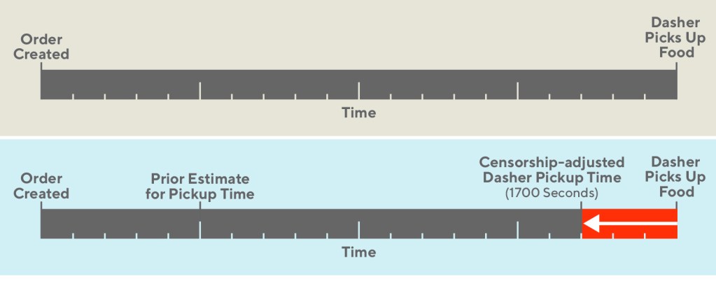
To understand the challenges of estimating prep time let’s first take a look at the ordering process, which can be seen in Figure 1, below:
Figure 1: Our goal is to minimize the Dasher wait time segment by estimating the prep time as accurately as possible and making the food pickup as close to the Dasher arrival as possible.
After an order is sent to the merchant, the Dasher is assigned to the order and can travel to the merchant at the estimated prep time, but may end up waiting until the order is ready. If the Dasher waits at the store for more than a couple of minutes, we have some confidence that the order was completed after the Dasher arrived. In this case, we believe the observed food prep time to be uncensored. This data is high quality and can be trusted. Alternatively, had the Dasher not waited at all, we believe the prep time data to have been censored, since we don’t know how long the order took to be completed.
The data here is unique for two reasons. Much of the data is left censored – meaning that the event occurs before our observation begins. In typical censorship problems, the timing is reversed. It is also noisily censored, meaning that our censorship labels are not always accurate.
Herein lies our challenge. We need to build a prediction that is accurate, transparent, and improves our business metrics. The transparency of our solution will allow us to learn from the censorship that is occurring and pass feedback to other internal teams.
With these requirements, we’ll describe methods that we tried in order to create a model that could handle censorship for our estimated prep times. Finally we’ll go into depth on the solution which finally worked for our use case.
The first three prep time estimation solutions we tested
We had competing priorities for a winning solution to the prep time problem. Our production model needed to incorporate the concept of censorship in an interpretable and accurate way.
Our initial approach was to discard the data we thought to be censored. This approach did not work because it would bias our dataset, since removing all the censored data would make our sample not representative of reality. Important cases where dashers were arriving after food completion were being completely ignored. In terms of our criteria, this naive approach did have an interpretable censorship treatment, but failed in terms of accuracy, since it’s biased.
We tested a few iterations of Cox proportional hazard models. These have a very transparent treatment of censored data but can be inaccurate and difficult to maintain. Offline performance was poor enough to convince us that it was not worth spending experimental bandwidth to test.
We then tried more sophisticated black box approaches that incorporated analogous likelihood methods to Cox models, such as XGBoost’s accelerated failure time loss functions and adaptations of WTTE-RNN models. These solutions are elegant because they can handle censorship and model fitting in a single stage. The hope was they could also provide a similar degree of accuracy to censorship problems that ordinary GBMs and neural networks can provide to traditional regression problems.
For both of these black box approaches, we found that we were unable to get the offline metrics that were necessary to move forward. In terms of our constraints, they also have the least interpretable treatment of censored data.
A winning multi-stage solution
The final technique we tried involved breaking the problem up into two stages: censorship adjustment and model fitting. An ideal model will make the most of our censored data, incorporating prior estimates of food prep time. We incorporate prior estimates by adjusting the data, and then fit a model on the adjusted data set as if it were a traditional regression problem.
If a record is censored and its prior estimate is well before a Dasher’s pickup time, then our best estimate for that data point is that it occurred much earlier than observed. If a record is censored and our prior estimate is near or after a Dasher’s pickup time, then our best estimate is that it occurred only slightly before we observed. If a record is uncensored, then no adjustment is necessary.
By comparing the observed timing to the prior expected timing, we create an intermediate step of censorship severity. Identifying and adjusting for censorship severity is the first stage in our two-stage solution, effectively de-censoring the data set. The second stage is to fit a regression on the adjusted dataset.
The two-stage approach carried just the right balance of transparency and model accuracy. It let us deploy boosting techniques leading to greater accuracy. This approach also let us inspect our data directly before and after adjustment so that we could understand the impacts and pass learnings along to partners in the company.
Not surprisingly, this method also led to the biggest metrics improvements, improving our delivery speeds by a statistically and economically significant margin.
Transparency of censorship treatment
Improvement of accuracy and business metrics
Drop uncensored records
High
Low
Proportional hazard models
Medium
Low
XGBoost AFT
Low
Low
WTTE-RNN
Medium
Medium
Two-stage adjustment
High
High
Figure 2, below, shows the delivery times observed in a switchback test, comparing the two-staged and incumbent model at different levels of supply.
Figure 2: The two-stage adjustment fits our actual data in production better than alternatives.
A recipe for building a censorship adjustment model
Below is a brief recipe to handle censorship in a model. There are three example data points: one is completely uncensored, and the other two are censored to different degrees. We select a simple censorship adjustment method here, a linear function of the censorship severity.
Record #
Target Value (Directly observed)
Is Censored (Directly observed)
Prior Estimate (built from baseline model)
Censorship Severity = Observed Arrival Time – Prior Estimate
Adjustment = 0.2 * Severity
Adjusted Target (Used as modeling target)
1
1500s
No
2000s
NA
0s
1500s
2
1750s
Yes
1600s
150s
30s
1720s
3
2000s
Yes
500s
1500s
300s
1700s
Note that our uncensored data is not adjusted in any way. Transparency allows us to check if this was desirable or not, enabling iteration on our censorship scheme.
Figure 3, below, illustrates the adjustments that were made. In the uncensored case, our model targets the time at which the Dasher picks up food. In the censored case, our model targets an adjusted variant of that data.
Figure 3: The censored case targets adjusted duration by incorporating a prior estimate.
The earlier our preliminary naive estimate is, the larger the adjustment will be. Since the ground truth is unobservable in censored situations, we are doing the next best thing, which is to inform our data with a prior estimate of the ground truth.
The censorship adjustment introduces a need for other hyperparameters. In the example above, we use a constant value, 0.2. The larger this scale parameter is, the greater our adjustment will be on censored data.
Conclusion
It’s important to identify key properties of a modeling solution. Many times, there are elegant options that seem appealing but ultimately fail. In this case, the two-stage adjustment is a clever elementary adjustment. Complex likelihood methods were not necessary. By adding a two-stage adjustment, we achieved our goals of accuracy and transparency that wasn’t available from off-the-shelf solutions we tried initially. The result is that a simple solution gave us the accuracy and transparency that we were seeking.
Censored data is a common problem across the industry. As practitioners, we need to work with the data that’s available regardless of how it’s obtained. Sometimes, experimental design leads to subjects who drop in and out. Other times, physical sensors are faulty and fail before the end of a run. This two-stage adjustment is applicable to other censored problems, especially when there’s a need to disentangle the challenges from censorship and the underlying modeling problem.
Online companies need flexible platforms to quickly test different product features and experiences. However, app-based development and strict API responses make iterative development difficult, because each change requires a new release, which is slow, costly, and not immediately available to consumers.
At DoorDash, we wanted to improve customer experiences with iterative feature development but ran into similar problems where we could not quickly and easily test new experiences. This is because our website was statically stitched by web and mobile clients that called multiple backend APIs and introduced separate business logic to handle the backend response. This setup slowed the development of new iterations and made the website and apps’ overall presentation inconsistent. In addition, we found it challenging to rank all the content for the homepage in an efficient and scalable manner within our Python-based monolith.
To address these problems we rebuilt our homepage inside of a new microservice called the feed service that is able to scale and would utilize Display Modules, essentially generic content blocks that power the layout and contents of the homepage. Using this backend-driven content to dynamically render our homepage provided greater flexibility in testing various hypotheses, understanding customer behavior, and quickly iterating based on experiment results.
The problem with our static legacy UI solution
At DoorDash we needed a more flexible solution to display our content which could also reliably handle our growing website traffic. Let’s break down our existing system and examine how it could not satisfy our flexibility and reliability needs.
Client-side logic requires an app release with every change
With traditional app-based development, the client app receives a backend server API response, performs any additional logic, and renders the page for the user. This was how DoorDash’s homepage worked: the client apps would call multiple backend APIs and stitch each response together while also conducting any necessary business logic.
Since we had three clients, iOS, Android, and web, each implemented its own application logic and delivered its own unique experience, leading to inconsistent user experiences across all three. For example, suppose the backend returns a field called DeliveryFee with a value of 0. An iOS client might interpret this value and present “Free Delivery” while Android might display “$0 Delivery”, which are two different user experiences. This inconsistency was not ideal since it could cause larger bugs and prevented us from having a single seamless experience across multiple clients.
In addition, merely changing “Free Delivery” to “$0 Delivery” and vice versa on clients requires an app store release, which can take up to two weeks. This makes the iterative process extremely slow, since we cannot release every day, and makes it difficult to A/B test different experiences quickly.
Ranking content is difficult with multiple static API response shapes
Another downfall of having to stitch multiple API response shapes by the client was the difficulty of rearranging the content on our pages. On our homepage, we had a different API for different types of content styles.
For example, we had one API that returned carousels and another that returned a list of restaurants. The client would always display the carousels above the list which prevented us from flexibly rearranging the different content types or even intermixing the different content types to see which performed best. We needed a way to organize the layout from the backend so that we could quickly test which layout provided the best experience for our customers.
Handling traffic is not scalable within a shared monolithic service
The majority of companies that start out with a monolithic backend reach a point where one monolith cannot support the growing load, so different functions start to get extracted out into individual services. DoorDash’s homepage backend response was being served by our monolith, and eventually our growth exceeded its capacity. Merely adding compute resources became less efficient and we needed to redesign the homepage inside a scalable, fault tolerant, and isolated microservice. This was not an easy task as there were still many dependencies inside the monolith, which needed a coordinated strategy to get right.
Building flexible backend-driven content at DoorDash
To address the above problems, we set out to power the homepage content entirely from the backend under a consolidated endpoint. We can think of the homepage API response as a list of content holders, which the backend can fill as needed and the clients can render according to the type of content holder. We named these content holders Display Modules. These Display Modules returned by a backend API are composed on top of each other to display the homepage, which is powered by a new microservice.
What is a Display Module?
In short, a Display Module is a generic content holder that supports multiple presentation styles such as lists or carousels. A Display Module also holds critical navigational information in the form of a cursor, which contains important context that we pass from page to page.
display_module:
	id
	version
	display_module_type = store_carousel || item_carousel || store_list
	sort_order
	[content]
After conceptualizing Display Modules, we extracted out the homepage by implementing the different types of content as specific Display Modules and powered the API response using the feed service microservice.
Extracting our homepage
The extraction of the homepage for the consumer app was a large undertaking because there was a lot of content to organize and display. Most of the underlying data is provided by another microservice, called the Search Service but all of the decoration, the visual elements, and response building was located in our monolith. We used this opportunity to approach the extraction from the ground up and were able to achieve the migration with these four steps:
Enumerating the dependencies: Many parts of the homepage were still dependent on the monolith, and it became important to list these dependencies and determine a plan for each.
Creating Display Modules: We took the existing content shapes and fit them into our Display Module concept, creating API request/response contracts.
Implementing the feed service: We built this powerful, scalable, and reliable backend service to withstand peak loads and create feed-style response shapes using Display Modules.
Integrating clients: Once the backend was complete, clients integrated with the new homepage API to render homepage content and layout driven by the backend.
Enumerating the dependencies
It is important to understand and list all the dependencies required to decorate the final response. Figure 1, below, shows some of the different functions required to decorate the homepage. There were no services powering these components at the time so we needed to come up with various stop-gap solutions to unblock our extraction effort.
Figure 1: The homepage response is decorated by calling different underlying services that support various functions beyond simple presentation.
We listed all of our dependencies and considered short-term versus long-term plans; it was important to scale out the homepage without being blocked by these dependencies. We also listed concrete plans for a long-term migration. As a short-term solution, we built APIs for the above dependencies within the monolith with loose coupling so that we could have a fallback whenever the monolith had any issues.
Creating Display Modules
When we were implementing this solution, there were two presentation styles used on the homepage that required adapting to Display Modules: store list and store carousel. Below is the Display Module representation of the two styles:
As we can see, both Display Modules were almost identical in terms of their shape, with each containing a list of store content to display. The main differences between the two Display Modules were type, which dictated how to display the content, and sort_order, which dictated where to display the content. The cursor was used to hold context for subsequent requests or different page requests.
As an example, the cursor for a store_carousel would hold context about the stores presented that the server could pass in a subsequent request to expand the carousel into a list. The cursor was obfuscated to the clients as an encoded string, as seen in Figure 2, below, and serialized/deserialized entirely by the backend.
Figure 2: The homepage (left) is composed of two different Display Modules, a store carousel and a list. The cursor carries the ordered set of store IDs as context for the expanded view of the carousel Display Module (right).
Before getting our hands dirty with writing code and building a service to power Display Modules, we had to define an API request and response shape that the clients and backend could agree to. We used the newly defined Display Modules for the homepage and translated them into protobufs. At DoorDash, we had standardized on gRPC as the main communication protocol for our microservices so defining protobufs for the homepage content provided us alignment across the stack.
Implementing the feed service
To power the homepage response, we needed a backend service that would be responsible for fetching the appropriate content and decorating it for display purposes.
Figure 3: The feed service facilitates creating the homepage response by retrieving relevant content, decorating from underlying services, and assembling Display Modules for presentation.
As shown in Figure 3, the feed service serves as an entry point for a homepage request, and orchestrates the response by fetching data from different content providers, decorating this data via calls to various decorators and building display modules as a feed-style response before returning back to the clients. Using a dedicated backend service to curate the homepage provides us with a single-source consolidation of business logic and a consistent user experience across all clients.
How we integrated with the clients
After building the backend feed service, clients needed to be integrated to render the homepage response. We use a backend-for-frontend (BFF) for all client to server communication. The BFF is responsible for handling user authentication and acting as frontline for client routes. For the web application, which is written in Node.js, the integration with feed service became the first Node service at DoorDash to communicate with a gRPC service.
Results
In general this was a very successful project, as we were able to build a solution that was both flexible and could handle our scale. Specifically, the new system allowed us to:
Experiment with different types of carousels
Enabled experimentation of algorithm-based carousels with “Your Favorites”, “Now on DoorDash”, and “Fastest near you”.
A/B testing of manual and programmatic carousels allowed us to efficiently provide the best customer experience and realize incremental conversion gains.
Improve the customer experience
With backend-driven content, we achieved single-source consolidation so that each client does not need to apply any business logic after the API response is returned.
Customers on mobile and web saw a consistent experience across their devices.
Deliver personalized layouts with Display Modules
With our backend service and Display Modules, we can quickly change and experiment the composition of the feed, giving us more power to understand which layout works best for our customers.
We can also use cursor navigation to carry context from screen to screen.
In addition to the new capabilities above, our extraction of the feed service helped us improve
Homepage latency, our most trafficked page, by roughly 20%.
Reliability and scalability of the homepage by removing dependency of the monolith.
Conclusion
To sum up, we described a need to quickly experiment on different features and examined the problems within our legacy system that prevented us from doing so. By conceptualizing flexible Display Modules and building the feed service microservice to power the content from the backend, DoorDash was able to iterate on experiment results more quickly, leading to a better and consistent customer experience.
Although we achieved a great deal of flexibility with our Display Module paradigm, we plan to improve our frontend system further. There is scope for even more flexibility and opportunity for quicker iteration, but we have taken the first step and paved the way for a greater vision. The work described above lays the foundation for heavier personalization and strong consistency across a customer’s order flow. Next, we can use the feed service and Display Modules concept to power other pages such as the store page and the checkout page!
Acknowledgements
Thank you to Josh Zhu, Ashwin Kachhara, Satish Saley, Phil Kwon, Steven Liu, Nico Cserepy, Becca Stanger, and Eric Gu for their involvement and contribution to the project.
Data-driven companies measure real customer reactions to determine the efficacy of new product features, but the inability to run these experiments simultaneously and on mutually exclusive groups significantly slows down development. At DoorDash we utilize data generated from user-based experiments to inform all product improvements.
When testing consumer-facing features, we encountered two major challenges that constrained the number of experiments we were able to run per quarter, slowing the development and release of new product features:
Our legacy experiment platform prevented us from running multiple mutually exclusive experiments. As a result, there was additional engineering overhead each time we configured a new experiment. We needed to add more automation to the platform to enable faster and easier experimentation.
Small product changes produce smaller and smaller effect sizes, sometimes down to a fraction of a percent. Combined with low experiment sensitivity, the ability to detect true differences in business metrics due to product changes, experiments require extremely large sample sizes and longer testing periods to detect a small effect with statistical significance.
Rapid experimentation and scaling up the number of experiments are essential to enabling faster iterations. To increase the number of experiments that could operate at the same time, we built a layered experiment framework into our test infrastructure, improving parallelization and letting us run multiple mutually exclusive experiments at the same time.
To increase experiment sensitivity, we implemented the CUPED approach (described in the paper, Improving the Sensitivity of Online Controlled Experiments by Utilizing Pre-Experiment Data, by Microsoft researchers Alex Deng, Ya Xu, Ron Kohavi, and Toby Walker), which made our experiments more statistically powerful with a smaller sample size. These efforts helped us quadruple DoorDash’s experiment capacity, which led to more improved features.
The challenge of running mutually exclusive experiments
Under our legacy experimentation system, it was challenging to run multiple mutually exclusive experiments since that would require a lot of ad-hoc implementations on client services. The issue we faced was that many of our experiments involved tweaking features that were related to each other or visually overlapped.
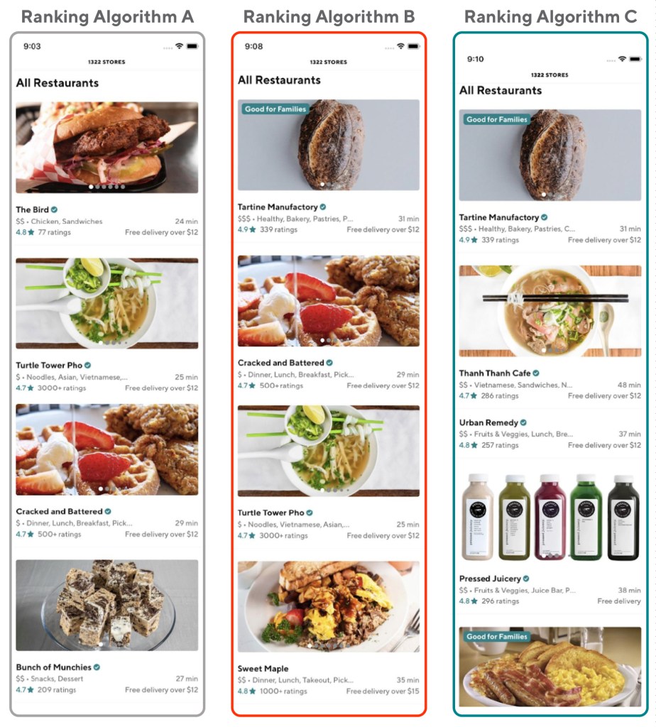
For example, the team wanted to run multiple experiments that showed different store rankings to users powered by different ranking algorithms. If a given user sees two ranking algorithms at the same time, it’s a lot harder for data scientists to figure out which one affected the user’s choice. Therefore, we needed an easy way to make sure users only saw one experiment at a time so we could easily identify which change was responsible for improved conversions.
Figure 1: In one of our experiments, we wanted to find out how users responded to different store ranking algorithms. However, our results would be difficult to analyze if one user was exposed to more than one ranking algorithm.
The other big challenge with having limited experiment parallelization is that, to avoid experiment overlaps, we are forced to test sequentially, slowing down feature development. Under the legacy framework, where we had to conduct traditional multi-variants experiments sequentially, the whole process of testing different ranking algorithms could take several quarters to finish.
The other reason that a lack of parallelization hampers our development speed is that we need to satisfy the following criteria to have full confidence in each new feature we test:
Generalizability: For experiments with a large effect size that require a smaller sample size, we need to ensure that our sample is representative and provides unbiased statistically significant results. If the experiment duration is too short, we risk getting biased results. Consider how DoorDash’s business on a weekday might look different than on a weekend. If an experiment was conducted on weekdays only, the results may not be generalizable to weekends and thus will be biased.
To illustrate, let’s assume there are two experiments: A and B. Both have large effect sizes and therefore require small sample sizes. Without parallelization we would keep experiment A running for one week, despite it getting a large enough sample within four days of weekday traffic, to ensure the results are generalizable and not biased. The same process would need to be conducted for experiment B.
In total, both experiments would require 14 days if tested sequentially. With parallelization, we would run experiment A on 50% of users and run experiment B on another 50% of users (non-overlapping). Both experiments would run for a full week to ensure generalizability and would only require seven days to be completed.
Evaluate long-term business impact: Some experiments have long-term engagement success metrics. In order to know the long-term impact, experiments need to keep running, often for several quarters. If we cannot run experiments in parallel these requirements would significantly reduce our development speed, since each experiment must be conducted over such a long period of time.
The challenges of identifying smaller effect sizes
The other experimentation challenge we faced was dividing our traffic between experiments without critically reducing the sample size, or the equivalent statistical power needed to detect small improvements. After many years of improvements in product optimization, customer reactions stabilize and new product changes produce smaller and smaller effect sizes, often at the level of a fraction of a percent. Figure 2, below, shows a simulated relationship between the sample size and the minimum detectable effect (MDE).
Essentially, if we want to be able to detect small changes with statistical significance, we will need an exponentially larger sample size. Since such a large sample size is required for detecting the experiments’ effects, DoorDash’s daily user traffic can only support so many experiments at the same time. This sample size limitation reduces the number of experiments we can run at the same time, slowing down our development of new features.
Figure 2:. Minimum detectable effect (MDE) estimates the smallest change a given sample size can detect over the control and determines how sensitive an experiment is. Using one of DoorDash key business metrics, if we want to be able to detect 0.1% MDE, it would require 25x sample size as compared to 0.5% MDE.
Improving experiment parallelization with a layered approach
To solve our limited experiment capacity, the Experiment Platform team introduced Dynamic Values, a new experimentation infrastructure that allows us to easily configure more advanced experiment designs by defining a Dynamic Value Object, a mix of rules that describe what features should be enabled for a given user.
Today, the Dynamic Values solution enables stable and robust randomization to client services, as well as the ability to target values based on popular parameters such as region, as shown in Figure 3, below. This new infrastructure allows us to more easily build a random sample of users from everyday traffic and add the required targeting.
Figure 3:The Dynamic Values platform takes the rules defined in the Dynamic Value Object, to either show or hide Feature X from a given user based on the user’s characteristics.
To illustrate howDynamic Values improved experiment parallelization, here is an example of experiments that are related or overlap with others:
Test 1: Store Sort Order Ranking Algorithm A, showing personalized store rankings optimized for Goal A
Test 2: Store Sort Order Ranking Algorithm B, showing personalized store rankings optimized for Goal B
Test 3: Programmatic Carousel Ranking, showing personalized carousel rankings instead of manual rankings
Test 4: Tech Platform Infra Migration, a backend migration that moves all rankings in the search service to our Sibyl prediction service
Each experiment has a couple variants, as shown in Figure 4, below. Given that all the tests have code dependencies and test 1 and 2 are conflicting, as each user can realistically be exposed to only one ranker, we use a single-layer method to run them simultaneously and with mutual exclusivity. Since each experiment has a different sensitivity, success metrics, and short term versus long-term effects, we can optimize traffic divisions to maximize the power of each experiment.
This parallel experimentation structure allows us to easily scale the number of experiments in a decentralized manner without cutting the test duration of each individual experiment and ensuring generalizability. We divide our user base into disjoint groups and each group gets a specific variant of the treatment. For experiments with long-term business impact metrics that need to run for a long time, we assign a smaller user subset to keep the experiment running, and reserve the rest of the users for short-term experiments.
Figure 4:We divide our user base into disjoint groups and each group gets a specific variant. The parallel experiment structure allows us to run four tests that are related or overlapped simultaneously and mutually exclusive.
The tradeoffs of the dynamic values platform approach
The above approach allows us to quadruple the experiment capacity, compared to testing sequentially. Nonetheless, this approach also has some drawbacks:
As the number of experiments increases, the traffic assigned to each variant gets smaller and each experiment will take a longer time to finish. In addition, managing the traffic splitting could become challenging as teams vie for a larger share of the available users to gain statistical power in their experiments.
Given that the experiments do not overlap, we would need to create an additional experiment to test the combined experience and measure the interaction effects.
Solving these kinds of problems could involve:
Launching concurrent experiments by extending the single layer to multiple layers, where each user can be included in multiple experiments, as shown in figure 5, below:
Figure 5: Each user is assigned to exactly one variant in each layer. The granularity of a layer is determined by the trade-off between statistical power and interaction of conflict.
Leverage covariates during the process of assigning users to different experiments’ variants instead of post-assignment. One common example is stratified sampling, where we assign users into strata, sample from each strata independently, and combine all results. Stratified sampling usually works better than post-experiment variance reduction such as post-stratification and CUPED, when we have a smaller number of units available.
Improving foundational experiment infrastructure to support multi-armed bandit (MAB) models. For consumer experiments which often have a couple of variants, we want to focus on learning the performance of all variations and optimizing overall conversions/volume. MAB helps tune the balance between exploration and exploitation.
Figure 6: Instead of A/B testing’s two distinct periods of pure exploration and pure exploitation, MAB testing is adaptive, and simultaneously includes exploration and exploitation by continuously allocating more traffic dynamically to the variant that has the higher chance of winning.
Improving experiment sensitivity with variance reduction methods
In general, there are three common options to improving an experiment’s sensitivity:
Option I: Increase experiment sample size
Option II: Test product changes with a larger effect size
Option III: Reduce the sampling variance of success metrics
Our goal is to increase our experiment capacity and sensitivity, so we didn’t consider Option I, as increasing the sample size would hurt our efforts to increase experiment capacity. In addition, while the DoorDash user base is large, increasing the sample size is not always viable because some product changes may only affect a small subset of the user base, which naturally limits sample size. For example, while a lot of users might view DoorDash’s homepage, fewer users will examine the pickup map, which would limit the sample size for an experiment on that feature.
While we’re always focused on high-impact product changes, it’s also important to be able to measure the effect of smaller changes via Option III. Variance reduction attempts to reduce the variance of target metrics and increase the precision of the sample estimate of parameters. During an experiment’s analysis phase, common techniques include post-stratification and controlling for covariates.
The CUPED method was introduced as a type of covariate control to increase experiment sensitivity. At DoorDash, we found in general that pre-experiment metric aggregates (i.e. CUPED) work better than covariates such as encoded region features.
As shown in Figure 6, we explored different CUPED as covariates versus categorical covariates by using simulations to evaluate the impact of variance reduction by each covariate. For each covariate, we calculate the required sample size for a fixed amount of treatment effect and statistical power, and then compare the calculated sample size to the baseline method (usually through a t-test with clustered robust standard errors).
Using simulations, we found that the user level aggregate gives the most statistical power and is more effective in variance reduction and sample size reduction. Some other things we learned when trying out CUPED included:
When users don’t have historical data, we can use any constant values such as -1 as the CUPED variable. In regression, as long as the covariate (in this case the constant value) is uncorrelated with the experiment assignment, the treatment effect estimate between control and treatment will stay the same with or without the covariate.
The stronger the correlation between the covariate and the experiment success metric, the better the variance reduction, which translates to an increase in statistical power and a decrease in sample size.
Be cautious of singularity problems when using too many pre-experiment variables.
Figure 7: Comparing CUPED vs. categorical covariates, we found that CUPED, especially user level pre-experiment data , tends to be more effective in variance reduction and sample size reduction because of stronger correlation with experiment success metrics.
Future work in experiment sensitivity improvement
Recently DoorDash upgraded DashAB, an in-house experimentation library, and Curie, our experiment analysis platform which incorporates advanced variance reduction methods. Curie significantly improves the convenience of applying variance reduction methods and improves the experimentation sensitivity. To further improve the experiment analysis accuracy and speed, we plan to integrate stratification to increase the statistical power.
Conclusion
Online controlled experiments are at the heart of making data-driven decisions at DoorDash. Small differences in key metrics can have significant business impact.
We leveraged Dynamic Values, ournew experiment infrastructure, to unlock experiment parallelization and launch experiments with a sophisticated design. At the same time, we adopted advanced analytical methods to increase experiment sensitivity that detects small MDE and concludes experiments more quickly.
We quadrupled the consumer-facing experiment capacity. Our approach allows more precise measurement, running the experiments on smaller populations, supporting more experiments in parallel, and shortening experiment durations. This approach is broadly applicable to a wide variety of business verticals and business metrics, while remaining practical and easy to implement.
Acknowledgements
Thanks to Josh Zhu for his contributions to this project. We are also grateful to Mauricio Barrera, Melissa Hahn, Eric Gu, and Han Shu for their support, and Jessica Lachs, Gunnard Johnson, Lokesh Bisht, Ezra Berger, and Nick Rutowski for their feedback on drafts of this post.
As companies utilize data to improve their user experiences and operations, it becomes increasingly important that the infrastructure supporting the creation and maintenance of machine learning models is scalable and will enable high productivity. DoorDash recently faced this issue concerning its search scoring and ranking models: the high demands on CPU and memory resources caused new model production to be unscalable. Specifically, the growth in feature numbers per added model would have been unsustainable, forcing us to reach our maximum CPU and/or RAM constraints too quickly.
To resolve this problem, we migrated some of our scoring models, used to personalize and rank consumer search results, to the DoorDash internal prediction service Sibyl, which would allow us to free up space and memory within the search service and thus add new features in our system. Our scorers now run successfully in production while leaving us plenty of resources to incorporate new features and develop more advanced models.
The problems with DoorDash’s existing scoring infrastructure
Figure 1: Our legacy workflow performs all necessary computations and transformations within the search microservice, which means there are few resources left to improve the model’s scalability.
The search and recommendation tech stack faced a number of obstacles, including excessive RAM and CPU usage and difficulty in adding additional models. Besides the fact that these new models would have required storing even more features, thereby further increasing our RAM and CPU load, the process for creating a new model was already tedious and time-intensive.
Excessive RAM and CPU usage
As the number of model features increases, the existing scoring framework becomes less and less optimal for the following reasons: Features are stored in a database and cached in Redis and RAM, and given the constraints on both resources, onboarding new features to the model causes both storage and memory pressure. The assembly of new scorers becomes infeasible as we reach our limits on space and RAM; therefore, storing features within the search infrastructure is limiting our ability to create new models. Moreover, because we must warm up the in-memory cache before serving requests, the preexisting scoring mechanism also causes reliability issues.
Additionally, we face excessive CPU usage, as hundreds of thousands of CPU computations are needed for our model per client request. This restricts the computations we can make in the future when building new models.
The challenges of adding additional models
It is difficult to implement and add new models within the existing search infrastructure because the framework hinders productive development. All features and corresponding coefficients have to be manually listed in the code, and while we formerly labeled this design as “ML model change friendly,” the implementation of the corresponding ranking script for new models can still take up a lot of time.
For example, one of our most deployed scorers has 23 features, and all associated operations for the features had to be coded or abstracted. Given that more sophisticated models may require many more features, it could take a week or more to onboard a new model, which is far too slow and not scalable enough to meet the business’ needs.
Moving search models to our prediction service
To overcome these issues with the model infrastructure, we moved our scoring framework to DoorDash’s Sibyl prediction service. We previously discussed the innovation, development, and actualization of our in-house prediction service in an article on our engineering blog.
In essence, this migration to Sibyl frees up database space and allows us to more easily construct new models. To accomplish this migration, we have to compose a computational graph that states the operations necessary to realize each new model, assuming that the relevant features are already stored within Sibyl’s feature store and the required operations already exist within Sibyl.
We break the Sibyl migration task down into three major steps:
Migrate all feature values from the search service to Sibyl’s feature store, which is specifically designed to host features. This allows us to free up storage and memory within the search infrastructure.
Implement unsupported operations to Sibyl, including those necessary for feature processing, ranking, and the logistic regression model.
Finally, compose the required computational graphs for the scoring framework.
Since DoorDash uses many different search scoring models, we pick the most popular for the migration. These three steps outlined above are applicable to all scorers, with the primary difference among them being the input ranking features in the model. Figure 2, below, details how the ranking architecture has changed since the migration.
Figure 2: Our new workflow separates the compute-intensive processes from search into Sibyl, freeing up resources to iterate on scorers.
Migrating ranking features from search to Sibyl
The first step in the migration is to move the ranking features from our existing data storage into the feature store using an ETL pipeline. Specifically, we want to move all of the store and consumer features necessary to compute the ranking features (the model’s input features), as well as the feature computation for “offline” ranking features. These offline features rely on only one feature type. For instance, a Boolean ranking feature whose value only depends on store features would be classified as an offline feature.
Building the ETL pipeline
Figure 3. Our ETL data pipeline copies store and consumer features from our data storage to the feature store.
After processing all of our relevant store and consumer features, we need to transform them into our ranking features. We map each of our original ranking feature names to its corresponding Sibyl name, which follows a consistent and descriptive naming format. This, along with a distinctive feature key name, allows us to access the value for any ranking feature given the relevant store IDs or consumer IDs.
For ranking features that have dependencies in both the store and consumer tables, we modify the cache key to store both IDs. Furthermore, before loading any feature into the feature store and before feature processing, we check that the feature is non-null, nonzero, and non-false (null, zero, and false features will be handled in Sibyl using default values instead). Figure 3, above, outlines the end to end approach.
For the sake of consistency, we create a separate table in Snowflake containing columns for the Sibyl feature name, feature key, and feature value.
Migrating the ranking models from search to Sibyl
Next, we focus on processing online features. Before we can accomplish this, however, we have to introduce a list type in Sibyl. Initially, Sibyl supported only three types of features: numerical, categorical, and embedding-based features. However, many of our ranking features are actually list-based, such as tags or search terms. Moreover, the lists are of arbitrary length, and hence cannot be labeled as embedding features.
To implement these lists in Sibyl, we store both a dynamic array and an offsets matrix. The matrix of offsets holds the length of all list-based features in lieu of the list itself, and the dynamic array is a one-dimensional list concatenating the list values from all of the list-based features.
For instance, given two list-based features with values [1,2,3,4,5] and [2,2,3,4,4,6], the offsets matrix would be {5,6} and the dynamic array would be {1,2,3,4,5,2,2,3,4,4,6}. Notice that the offsets matrix can be used to calculate the inclusive start index and exclusive end index within the dynamic array for each list feature. Hence, we are able to deduce the original lists from these two data structures.
Including previously unsupported operations
With the inclusion of lists, we then move on to implementing the missing operations required for processing online features. Previously, Sibyl supported basic arithmetic (add, subtract, multiply, divide, etc.), comparison (equal, greater than, greater than or equal to, etc.), and Boolean (and, or, not) operations. However, some ranking features necessitate vector computations. For our scoring models, we needed to include a cosine similarity operation used to compute the cosine distance between the store2vec and consumer2vec features.
Additionally, to cover all of the necessary computations, we first came up with a required list of computations, which we then conflated into the operations below to reduce computational overhead:
size(), which returns the number of elements in a list
count_matches(), which counts the number of common elements between two lists
count_matches_at(), which counts the number of occurrences of the value at a specific index in one list (“list1”) in the other list (“list2”). To give a high level overview, given index 2 and the two aforementioned lists ([1,2,3,4,5] and [2,2,3,4,4,6]), we want to count the number of occurrences of the value at the second index of the first list in the second list. In this example, we would return 1 since 3 occurs once in the second list. In actuality, this operation has been adapted to handle even more complex cases that involve three or more list inputs.
In some cases, we need to create sets from our lists as to only consider unique values. However, Sibyl operations should only return numeric types. Hence, we add a unique parameter to each of these operations. These three aforementioned operations cover all of the necessary list computations, concluding the feature processing aspect of the migration.
To complete the full ranking migration to Sibyl, we finally had to integrate our ranking model into the prediction service. Our current search ranking model is based on the logistic function. Overall, implementing a logistic regression model was pretty similar to the other aforementioned vector operations since the inputs involved are treated as vectors. We are still entertaining the idea of upgrading to more advanced models in the future, such as boosted trees or some type of deep learning model.
Composing the overall scoring framework
To tie all of these components together, we compose the model in a computational graph format. The ranking models implemented are all composite models, which enable custom processing as opposed to pure models. Using the predefined Sibyl composite model structure, we can instantiate the computational graph for each scorer as follows:
The model computational graphs are composed of input nodes and compute nodes. Input nodes host the input numerical, categorical, embedding, and list features, while compute nodes chain the aforementioned Sibyl operations to perform the requisite calculations which will return the final value in a “result” compute node.
For each model we also define a configuration file composed of detailed input nodes. This includes default values for each feature, which is important since null-, zero-, and false-valued features are not stored in the feature store from the ETL step. We also include dimension and sequence length in the configuration file when applicable. With this step, we are able to obtain the uploaded features from the feature store given a specific store ID and/or consumer ID and input them into the models, and receive a logistic regression score as the output.
Conclusion
In completing the migration of our scorers from our search infrastructure to Sibyl prediction service, we were able to absolve our increasing RAM usage and move one step closer to improving the productivity and standardization of DoorDash’s machine learning models. Furthermore, the new computational graph model format allowed us to reduce the time necessary to produce new models from up to a week to a few hours, on average.
Other companies facing memory pressure due to model improvements or increases in feature numbers would likely find it advantageous to migrate to a dedicated feature store and/or separate prediction service. While Sibyl is internal to DoorDash, a company-wide prediction service can prove to be rewarding in the future, especially if there are many overlapping machine learning use cases across teams.
Acknowledgments
Thanks to Jimmy Zhou and Arbaz Khan for their help and mentorship in building this integration. Also many thanks to Josh Zhu, Nawab Iqbal, Sid Kumar and Eric Gu from CxDiscovery team, Param Reddy, Swaroop Chitlur and Hien Luu from ML Platform team and Xiaochang Miao from Data Science team
DoorDash’s acquisition of Caviar in 2019 afforded us the opportunity to increase efficiency by running Caviar on our existing platform. However, as we also wanted to preserve the Caviar ordering experience for its loyal customers, we rebuilt the Caviar web experience using React components on top of the DoorDash platform.
While DoorDash offers a broad array of restaurant and merchant options, Caviar focuses more on the local premium and food enthusiasts. Before the acquisition, it developed a customer base with expectations about the service, and we needed to maintain the features they had become used to.
One challenge with this project involved serving the correct web experience to site visitors, making sure that DoorDash customers could order from DoorDash-supported restaurants and Caviar customers could order from Caviar-supported restaurants. As we planned on serving both experiences from the same platform, with a shared data infrastructure, this hurdle was not trivial. Likewise, we needed to engineer our React components to preserve the Caviar look and feel.
Despite the challenges around merging the two companies, navigating new codebases, and working remotely, our team was able to come up with scalable technical solutions to support the successful launch of a fully realized Caviar consumer web experience.
Two web experiences, one backend
The Caviar acquisition required that Caviar and DoorDash engineers work together to create a seamless, coherent experience for our customers by migrating Caviar onto the existing DoorDash systems. While Caviar and DoorDash would share a common backend infrastructure, the shared frontend client would support two different experiences.
A major goal of this project was to preserve the Caviar look and feel. In order to achieve this, we had to figure out a way to build two different experiences using the React-based frontend technology on which we had built the DoorDash web experience.
Figure 1: DoorDash established its web experience to help customers easily find and order the food they desired. The DoorDash frontend relies on React components to serve a dynamic, personalized experience.Figure 2: When re-building our Caviar web experience, we wanted to maintain the look and feel that its customers were used to. However, we also wanted to gain engineering efficiency by building it on the same architecture as the DoorDash web experience.
Scoping the project
There were three main challenges in determining how to incorporate a new Caviar experience:
Identify the experience: We needed a simple way to determine which experience the user would receive on page load, Caviar or DoorDash.
Build reusable frontend components: Once we found a way to determine the experience, we needed to build the necessary components within the existing React web codebase to be utilized any time a new experience filter was needed.
Minimize disruption: Last but not least, we needed to avoid changing any major flows or causing dependency issues for ongoing DoorDash projects. This included keeping existing APIs and data structures that were queried from our Apollo GraphQL-based backend for frontend (BFF).
The current frontend system at DoorDash
Figure 3: Two main repositories make up our DoorDash frontend. One consists of an Apollo GraphQL server running data queries to the backend, while the other is the web-based user interface.
Our current DoorDash consumer frontend system consists of two main repositories. The first is our Apollo Graphql BFF server that acts as a middle layer between the client code and the backend code. This middle layer is where we establish all the queries and mutations required to fetch data from the backend through a combination of REST API and gRPC calls.
The second piece is the client application code itself which lives in our web monorepo. This is the main frontend user interface (UI) layer that displays the frontend data fetched from the BFF. It is within this UI layer where we would add our new components to determine which experience to provide our users.
Building the experience
Once we scoped and designed the project, we could begin building. Rather than working from a blank slate, we had the DoorDash web experience available as a model. To integrate with the existing React architecture, we had to think about creating reusable components that could be easily utilized anywhere in the codebase that required a unique Caviar experience.
Determining which factor chooses the experience
The new Caviar web experience would consist of a whole new look and feel that is separate from the DoorDash experience. Caviar would use a unique design, color themes, content, and text. We needed a way to showcase these new elements to our Caviar users without disrupting the existing DoorDash components.
After multiple discussions, both frontend and backend engineers decided to build this new Caviar experience around the availability of a header response being set to either “caviar” or “doordash”. When a user visits the Caviar web site, trycaviar.com, Cloudflare, our web services vendor, catches the request and sets the header to “caviar” so our app-consumer codebase can determine the experience in the UI. Our page rendering service (page-service) grabs that information and initializes the client app with the new header value. We then configure all client calls with a header similar to x-brand=caviar that is passed to the APIs.
Having come up with a mechanism to set the experience, our main goal became creating the necessary React components by utilizing modern React patterns to let developers showcase Caviar or DoorDash specific features.
Implementing a React Context
To be able to capture the correct web experience and have it accessible by our React components, we created a React Context that would serve as the source of truth and hold the experience state.
The current web monorepo had a mixture of newer functional React components and legacy class-based React components. In order to support both of these interfaces, we had to create two ways of providing the experience.
To support the functional React components, we created a hook that would grab the experience directly from our context in order to provide the experience to a component.
We can now call this hook anywhere in a functional component to access the experience. Here is a snippet of a component that calls the hook to determine if we’re in the Caviar experience:
And to support the legacy class components, we created a provider that wraps around the useExperience hook since legacy class components cannot use a hook directly. The provider passes the experience as a prop to the children components.
We can now use the provider to wrap any component that requires access to a specific experience. Here is a snippet of how we use the wrapper in a class component:
Throughout the Caviar integration process, we wanted to provide clear, self-documenting interfaces that could be used throughout the codebase. One such example is the ShowOnlyOnDoordash component. This component provides a simple reusable interface for DoorDash engineers to use while leaving a small footprint in the codebase.
Another challenge we had was implementing changes and refactoring already existing DoorDash components. The strategy we used was to make changes to the internal code but maintain the same interface.
A good example of this was our shared NoMatch component. The Caviar team needed a separate NoMatch experience but we didn’t want to make a large refactor to a crucial component. Instead, we split the NoMatch component into NoMatchDoordash and NoMatchCaviar internally. This way, the NoMatch interface can still be used anywhere with no disruption, but the internal workings would display the Caviar or DoorDash NoMatch component based on the correct experience.
By keeping DoorDash’s current architecture top-of-mind during this project, the Caviar web team was able to create multiple reusable components to provide our engineers with the proper interfaces to access the experience state. By providing this simple pattern, we were able to develop freely on Caviar-specific features without disrupting existing DoorDash features. This way, we preserve separate DoorDash and Caviar experiences for our users.
Our current pattern can also serve as a foundation for other experiences that may be incorporated into DoorDash in the future. We ultimately wanted a common design pattern that encapsulates logic and state in order to provide a clean interface for the developer to implement different experiences. Utilizing reusable React components and React Context allowed for us to easily access shared state across different parts of the application.
Acknowledgements
Shoutout to Ting Chen, Keith Chu, and Monica Blaylock for being amazing teammates and for all their hard work on this project!
Today, many of the fastest growing, most successful companies are data-driven. While data often seems like the answer to many businesses’ problems, data’s challenging nature, from its variety of technologies, skill sets, tools, and platforms, can be overwhelming and difficult to manage.
An added challenge is that companies increasingly need their data teams to deliver more and more. Data’s complexity and companies’ increased demand for it can make it challenging to prioritize, scale the team, recruit top talent, control costs, maintain a clear vision, and satisfy internal customers and stakeholders.
At DoorDash we have been able to navigate a number of these hurdles and deliver a reliable data platform that enables optimal business operations, pricing, and logistics as well as improved customer obsession, retention, and acquisition.
This has only been possible through a series of technical considerations and decisions we made when facing the typical challenges of scaling a data organization.
This article sheds light on the challenges faced by organizations similar to ours and how we have charted the course thus far. We share a few tips and ideas on how similar challenges can be navigated in any large, growing, data-driven organization.
Data platform beginnings: collecting transactional data for analytics
We captured the beginnings of the data infrastructure and solutions at DoorDash in this article published a few years ago. With a scalable data infrastructure in place, we could proceed to leveraging this data for analytics, which lets DoorDash make data-driven decisions about everything from customer incentives to technology vendor choices.
When growing a data platform organization, the first task is to take stock of the transactional data (OLTP) solution(s) used in the company. Once the attributes, such as data schemas and products used are known, it’s possible to start the quest for the right data analytics stack.
It’s not atypical for many organizations to tap into the existing transactional databases for their analytical needs, a fine practice when getting started but one that won’t scale long term. It’s more typical to ETL the data from transactional databases to an appropriate data warehouse system.
Collecting all the transactional and external data needed for analytics is the first step. Once we had this, we then looked into the emerging data needs of DoorDash as described in the sections below.
Ways of conceptualizing data organization growth
The needs of an organization can also be seen in the same light as Maslow’s hierarchy of needs, as shown in Figure 1, below:
Figure 1: We can map the data needs and solutions of a growing data-driven company in a form similar to Maslow’s hierarchy of needs.
At every level of the pyramid there are more advanced data operations.
Beginning with the need to simply collect, compute, and analyze data for business intelligence needs, growing companies will evolve and will need to venture into other needs on the pyramid, such as machine learning and artificial intelligence based inferences, data-driven experiments, and analysis.
As the size and complexity of the business increases, the data team’s responsibilities will grow to include such tasks as data discovery, lineage, monitoring, and storage optimizations until they have reached the top of the pyramid.
Stay Informed with Weekly Updates
Subscribe to our Engineering blog to get regular updates on all the coolest projects our team is working on
Please enter a valid email address.
Thank you for Subscribing!
Another method of addressing the growing needs of an organisation is to look at the time taken for insightsto be computed and available from the time data was collected (ingest) from various sources.
In other words, how quickly is the data collected (as shown in the bottom of the pyramid) and made available to end users such as analysts and product/business leads?
How quickly can end users act on this insight/information and positively impact the business?
This is a continuous process, and is better envisaged using an OODA Loop (Observe, Orient, Decide, and Act), shown in Figure 2, below:
Figure 2: An OODA Loop can be applied to a company’s data strategy, going through its four stages to collect data, understand it, make an informed decision, then act on it.
In a marketplace such as DoorDash, the speed at which we can observe growing demand trends (from our customers via orders placed), the better we can station all the measures needed to meet that demand. Another example could be about the amount of time it will take to launch experiments, understand the results (success or failure), and roll out successful features.
A growing data organization always strives to provide the right solutions to help the growing needs as described in the data needs pyramid. It also aims to provide all the solutions needed to execute on the OODA loop as speedily as possible.
Providing these solutions comes with challenges. The next section describes some of the challenges that we addressed as DoorDash grew.
The challenges of a rapidly changing and growing data organization
As shown in the data needs pyramid, DoorDash’s needs began growing, and with that came a few challenges we had to navigate.
Focus and prioritization: figuring out the right things to build with limited resources
Scale and complexity: managing data on a massive scale and for a wide variety of users with different skill sets
Controlling costs: storage, compute, vendors, and licensing costs add up and need to be managed
Audience and adoption: knowing who we are building the solutions for and ensuring data and models can be trusted
Establishing a platform strategy and roadmap: understanding the immediate and long-term data needs of the company
Hiring and retaining the right team: strategies for hiring engineers with the skill sets required to implement the solutions
Let’s go through some of these challenges in detail.
Focus and prioritization: figuring out the right things to build with limited resources
A data organization within a growing company is always going to be under constant pressure to work on multiple projects. As is typical in the industry, the product organizations usually have higher visibility in terms of important product and business needs that translate into data requirements. If we are not proactive in anticipating the needs of our internal customers, we will always be caught scrambling and likely succumb to the pressure of providing many one-off, ill-designed solutions that later turns into a technical debt or failure waiting to happen.
This is why defining the charter of the data platform organization and its responsibilities are paramount. Once defined, it becomes easier to focus and prioritize. The pressing needs and request for help will never go away—our goal is to have a clear vision of what to tackle first.
It’s important to practice the art of saying “no”. Always ask the right questions. See the “Lessons learned” section on some tips on how to overcome prioritization challenges.
Scale and complexity: from terabytes to petabytes and beyond!
Big Data is about volume, variety, and velocity. Data organizations describe these attributes in terms of millions and billions of messages processed per day or terabytes and petabytes of storage in their data storage solutions. Other indicators of large data volume and scalability are expressed in terms of thousands of ETL pipelines, thousands of metrics, and the never-ending logs and telemetry data (app and user events generated by user actions).
Scalability and the growing need for more compute and storage power are ever present challenges for any growing company. As the delivery volume grows at DoorDash, so does the amount of data that needs to be analyzed in a data warehouse.
In addition to the volume, the types of online data systems are varied. For example, in addition to Postgres, we now have online data in Apache Cassandra, ElasticSearch, and a few other data storage systems. For analytical purposes all these transactional data need to be transferred to our data warehouse via CDC pipelines. It’s difficult to find a scalable, generalized CDC solution that meets every need, which adds to the overall complexity of building these pipelines.
Data collected for observability(such as event logs, metrics, and traces) is another massive contributor to any tech company’s data volume scalability challenges. The popularity of microservices architectures and the ease of launching large clusters of services have only increased the desire to measure, observe, and monitor these services.
Another typical contributor of data volume in most companies are experiments such as A/B tests of new features, that produce huge volumes of data from clickstream logs, feature impressions, and telemetry. For example, Curie, DoorDash’s experimentation analysis platform, processes billions of raw experimentation logs per day to analyze hundreds of experiments on a daily basis.
Other areas of complexity include various compliance needs, such as CCPA andGDPR, that must be satisfied depending on the market.
Cost: With increased scale and complexity, the costs increase!
With the growing scale and the need for processing, storing, and analyzing data comes the increasing costs. Increased costs come from expenses generated by the data center or cloud services, the vendor product licenses that may be part of the organization’s solutions, and from the engineers or other human resources needed to staff the team.
DoorDash uses Amazon Web Services (AWS) as our cloud vendor (for EC2 compute resources and other needs). We also use many data vendors to help address some of our data needs. Understanding the expenses of our data needs is an important part of how we can sustain and grow our organization in a cost effective manner.
Processing data and gaining insights from it has a cost, but how should a data team keep track of them? These data processing costs come in the form of compute costs from a cloud provider, vendor licensing fees or usage charges, support costs for operations, etc.
Cost models are typically different for different solutions and tools, and can be priced in ways such as per developer seat, per volume, or per container. These different models and types of costs makes the budgeting and accounting challenging.
Audience and adoption: Who are we building this for, and how can we help them?
As DoorDash grows, so have the number of teams and the various personas that need access to data and insights.
The skills that a product engineer has in terms of contributing to or consuming data is very different from that of a data analyst or a product manager. Let’s take the example of experimentation. Who are the personas in an organization that define the experiments and the hypothesis? How are the experiments analyzed? Can data analysts run these experiments with the click of a button? Does it require an engineer with “Big Data” expertise to compute and analyze the results of the experiments?
With a plethora of tools, solutions, and technologies, how does the team cope with educating the users of the data ecosystem?
Platform strategies and roadmap: leveraging vs building solutions
As described earlier, data at DoorDash in its early stages focused on the most important and common of data hierarchy needs: namely, the ability to collect, load, and analyze data for business intelligence.
However, as DoorDash’s business grew, and the complexity of the data grew, we had to march up the hierarchy of data needs that included the need for faster, fresher data (near real-time), machine learning data, experiment analysis, and more.
For most companies, cloud providers such as AWS offer a lot of services and products to leverage. In addition, there are many external vendors that can also be leveraged for building out solutions for some of these needs.
The challenge, though, is that there are many solutions to any given problem.
There is no one-size-fits-all solution in this case and each organization should devise a strategy that best fits its needs.
Hiring and retaining the right team: strategies for hiring the skill sets required to implement the solutions
As is evident, with increased scale, complexities, and various data needs, DoorDash had to invest in growing its data platform organization. Although our strategy has been to leverage and use whatever we can from cloud providers and other vendors, we still had to build out quite a few parts of the puzzle ourselves. This would require building a diverse and highly skilled team of engineers capable of rising to the many challenges that we faced.
The Big Data domain is large enough that there are now specialists focusing on particular sub-domains such as stream processing, machine learning, query optimizations, and data modeling. A simple glance at a Big Data infographic will convince you that not everyone will be an expert in every data-related subject. Hence, it becomes a challenge to ensure that the right team is built with the right skills and diversity of experience.
Lessons learned while addressing these challenges
Given the challenges described above, how did we navigate these challenges at DoorDash? Here are some tips that helped our organization and can be utilized to help other growing data-driven companies:
Let’s go a bit deeper into each of these.
Build audience personas and cater to their specific needs
A data platform is a product. It’s always best to use the same principles as one would while building a product that will be used inside or outside the company.
A typical data platform organization caters to the following personas and skills:
Product/functional engineers
Product managers
Business intelligence/data analysts
Data scientists
These personas cover a wide range of skill sets and it’s critical to make sure that they can be productive using the solutions provided by the data platform. For example, many data scientists tend to prefer using R or Python compared to working with Scala and Java. If the batch processing solution that is offered is a Scala-based Spark platform, then data scientists would likely be less productive building solutions using this service.
The second consideration when approaching a target audience is designing the service interfaces. Is it worth investing in a well-designed user interface (i.e. internal data tools/consoles) for operations that are regularly carried out by non-engineers? Or does using solutions require the use of YAML/Kubernetes and the mastery of Git commands?
These are important factors to consider when building out the solutions offered by a data platform.
At DoorDash, our initial team was very technical, but as we grew and the number of users who are not coders increased, we had to invest more in simpler user interfaces to increase productivity and usability.
Another audience are the stakeholders and sponsors of a business unit. The best way to move forward is to ensure a strawman proposal is sent out, feedback obtained, iterated on, and a minimum viable product (MVP) lined up before more investment is lined up.
Define the charter and build a logical framework for approaching typical problems
The key to addressing the ever-increasing business demands is to define the surface area, or the challenges the platform organization will address.
At DoorDash, the data platform is essentially responsible for all post processing and the OODA loop that helps compute, infer, feed-back, and influence the online operations as efficiently, speedily, and reliably as possible.
Once the charter or the focus area (aka surface area) is defined, it becomes easier to know what challenges to focus on.
Ask the right set of questions while prioritizing what needs to be built. A sample set of such questions are:
Is this solution meant for products that drive revenue vs products that are experimental? (tighter SLA, higher priority vs not)
Can the data that is collected be used by multiple teams/use cases?
What quality and SLA of data do they desire?
How often will they use this data? What happens if this data is unavailable for a time period?
Is the data to be consumed by a program or by humans?
How will the volume grow?
Once we gather answers to these questions, we can then analyze the right solution to be built.
When to build point solutions vs generalized platforms
Know when to build one-off solutions (aka point solutions) and when to invest in generalized solutions. It’s usually best to build specific solutions, iterate, learn, and only then generalize.
Often a functional or product team requests some ability/feature to be developed and made available. While very tempting to offer a solution assuming that it falls within the focus area of the organization’s charter, it still is important to know if this is a one-off request that needs a point solution or a generally applicable use case that requires a broader, generalized solution.
DoorDash invested in a point solution for some early use cases, such as predicting ETAs (estimated time of arrival for deliveries). While it was intuitive that there will be many more machine learning models that would need to be built at DoorDash, we still took the path of first building a point solution. Only once that was successful and there was an increased demand from various teams that wanted to use ML solutions did we invest in building out an ML platform as a generalized solution.
We now continue to iterate on this ML platform by building a general purpose prediction service supporting different types of ML algorithms, feature engineering, etc.
Define a Paved Path
Often, the answer to whether a point solution should be built by the data platform team should really be “no”. If the solution cannot be generalized and adopted by a wider audience, it’s best to leave it to the specific team that needs the solution to own and build it themselves.
The challenge to look out for here is future fragmentation(i.e multiple one-off solutions built by different teams).
For example, while only one team needs a certain solution at the moment, they may choose to build it themselves using, say, Apache Samza. Soon enough another team embarks on another use case, this time using Spark Streaming. This continues over a period of time until the company is left with multiple solutions that then need to be supported. This can be a drain on an organisation and is ultimately inefficient.
Hence, it’s best to work with teams that need a point solution since it gives awareness to any new use cases and allows the data team to guide other teams towards the Paved Path. What do we mean by a Paved Path?
It’s simply the supported, frequently treaded path established by the first few teams that worked together in a certain area.
In order to help ensure innovation and speed, functional product teams should be able to build their own solutions. However, this development should be done with the knowledge that being outside of the Paved Path will make any team responsible for their own support and migration going forward. If the separate solution built by the functional team gains success, we can then work together to make it part of the Paved Path.
Build versus buy
The Big Data landscape has grown tremendously. There are many available vendors and product solutions.
Often many companies fall into the trap of not-invented-here-syndrome. They often cite some feature currently not available in a given third party solution and choose to build the solution themselves. While there are many good reasons to build something in-house, it’s a weighty decision that should be considered more carefully.
As leaders at AWS coined the term “undifferentiated heavy lifting”, it’s important to focus on what is critical, germane, and important for the business and build that in-house and simply leverage whatever else is available. Using various open source technologies is a good start, but sometimes, it does make sense to go with an external vendor.
How to decide which route to take?
Consider these questions to figure out the best course of action:
Is there a strategic value in the solution that’s tied to the main business?
Is the vendor’s solution cost effective? Given the growing needs of our organization, how does the cost scale?
What are the operational characteristics of the solution? (For example, it’s not easy to operate an HDFS environment or a very large set of Kafka clusters reliably, even if done in-house it comes with a cost.)
Does the solution need a lot of integration with internal systems? Often it’s harder to integrate external vendor solutions.
Are there any security or compliance requirements that need to be addressed?
Once we have answers to similar questions, it’s a lot easier to choose the best path forward.
At DoorDash we have crafted a cost-effective solution with a mix of cloud, vendor, and in-house built solutions. Most in-house solutions utilize multiple open source technologies woven together. For example, our ML Model Training solution relies on PyTorch. Building a solution in-house makes sense if it’s cost-effective and can bring in efficiencies.
Prioritize trust in data or your impact will be minimal
Reliability and uptime are very important for most services. However, when it comes to analytical/data solution services, some characteristics are different from typical online systems.
For example, in most offline analytical cases we should strive for consistency of data rather than availability, as discussed in the CAP theorem.
It’s important to detect/monitor the quality of data and catch problems as early as possible. When microservices go down there are methods, such as blue/green deployments or cached values, that can restore the functionality provided or reduce the impact of the outage. At the very least a rollback to the previous best version can come to the rescue.
For large data processing pipelines these techniques do not apply. Backfilling data is very expensive and recovery usually takes a longer time.
The lesson we learned here is to focus on data quality, understand the failure modes of the solutions stationed, and to invest in monitoring tools to catch errors as early as possible.
Trust in data is essential to the usefulness of the data. If people suspect the quality is faulty, that will likely translate downstream to lack of trust in the models and analytics the data produces. Therefore if this trust is not maintained the data team cannot be effective.
Be obsessed with your internal customer
There is an adage in the product world or any business that states, “Always treat your customers as royals”. The same lesson applies to how internal customers should be treated. Just because the internal customers are forced to use internal services does not mean they should not be treated like an external customer.
If there has been a breach of SLA, a data corruption, or missing data, it’s important to share this information as early and as clearly as possible with stakeholders and the user base. This ensures that we keep their trust and demonstrate that we believe their data is important to us and we will do our best to recover any data lost.
Define the team’s North Star, measure and share the progress
Setting a North Star
We strive to set forward-looking and ambitious goals. For example, the North Star goal for Curie, our experiment analysis platform, is to be able to perform a certain number of analysis per month by the end of the fourth quarter in 2020.
Measure what matters!
John Doer wrote a book titled, Measure What Matters, about setting objectives and key results (OKRs). In the case of a data organization, the same principle applies.
At DoorDash, we measure various metrics, such as reliability, quality, adoption, and business impact. As Ryan Sokol, our head of engineering reminds us, “You can’t fix what you can’t measure”.
Share the progress
It’s also important that we share our North Star and our metrics on a regular cadence with our stakeholders and user community. Sharing the progress in terms of new features available for use in a regular manner via newsletters or tech talks increases visibility of the direction in which the roadmap is headed and allows our user base to influence the roadmap.
Launch early and iterate in collaboration with the user base
This is a well accepted learning in any consumer based product — especially the internet or app-based ones. Rather than building a product with all the bells and whistles and having a big reveal/launch, most companies prefer to build a minimum viable product and iterate from there. The same tip holds for internal platform organizations.
As described in the Point solutions vs generalized platform section above, it is usually best to work on a point solution for a hero use case (i.e. a high impact, highly sought after need) along with the product team that can adopt this solution. This ensures that the teams who will use this product have skin in the game and multiple teams can collaborate on a solution. In addition to this, the learnings while building this joint solution will then be available as a general offering for all the other teams that want to adopt the solution in the future.
For example, at DoorDash, the Data Platform team partnered with the Logistics team to build a real-time feature engineering pipeline for a few logistics ML use cases, as those described in the article Supercharging DoorDash’s Marketplace Decision-Making with Real-Time Knowledge. Once this was successfully launched and other teams wanted to use real-time features, we then embarked on a new project to generalize the feature engineering pipeline for ML.
Build a healthy data organization by hiring and nurturing the right talent
None of the challenges described can be built without a well-functioning team of passionate, skilled engineers. The data field can be very unforgiving. Oftentimes, some teams drown in operational and support tasks and can barely keep up with the growing needs of the company.
Grow the team organically and with the right skills
Growing the team to address the growing needs of the company is critical. At DoorDash, we ensured we first hired the right senior engineers and leaders — i.e. engineers who have gained valuable experience in the industry — to set the seed and build the foundation for the rest of the team as it grows.
It was valuable to initially hire engineers that can help architect the big picture. Someone who is hands on and can work on fast iterative solutions. Once a foundation is built, it’s good to invest in specialists in certain areas. For example, we started with engineers that could build simple A/B tests, and as the needs of the organization grew, we invested in hiring data scientists and engineers with specialization in various experimentation methodologies.
Diversity in terms of gender, race, thoughts, culture, and, of course, skill sets and experience is also important for a growing organization.
Enable the growth and success of the team
It’s one thing to hire and grow an organization, but it’s also important to keep the existing team productive and happy. It’s important to ensure that the team members are exposed to interesting challenges and have the freedom to experiment with and contribute to the growing needs of the company.
As a growing company DoorDash has many interesting challenges, and a supportive organization that invests in the continuing education and well-being of its employees. We achieve this via various internal and external programs such as mentoring, learning sessions, attending conferences, and sharing knowledge in various tech talks and forums.
We typically measure the growth and happiness of the team using NPS scores and internal surveys to understand areas of improvement.
Never stop learning and adapting to progress innovation
All said and done challenges never end and we must continue to learn. The Big Data ecosystem is always changing and evolving. MapReduce was the latest craze about eight years ago. It is no longer the darling of the distributed computing world. Lambda architectures are giving way to Kappa architectures in the data processing arena. The infographic of product offerings in the data platform field continues to grow complex and is forever changing.
A healthy organization has to be able to discard old ideas and usher in new ones, but do so responsibly and efficiently. As anyone who has ever led large migration efforts can attest, adopting and deploying new ideas is not something that can be done easily.
At DoorDash we have adapted. We continue to learn and iterate over our solutions, but we aim to do so responsibly!
Conclusion
A data platform team is a living organization — it evolves and learns via trial and error. At DoorDash, we have evolved and learned our lessons through the challenges that we encountered.
DoorDash continues to grow, and we are in many ways still getting started. For example, there is still a lot to accomplish in terms of developer efficiency so that our data analysts and data scientists can obtain the insights they want to gather via real-time data exploration. Our ML models can benefit greatly from the use of real-time features. Our experimentation platform aims to not just run A/B tests reliably and smoothly, but indeed make headway in terms of learning from the experiments already launched and tested via deep statistical and behavioral insights.
If you are passionate about building highly scalable and reliable data solutions as a platform engineer and enabling products that impact the lives of millions of merchants, Dashers, and customers in a positive way, do consider joining us.
I hope that these challenges resonate and would love to know how you have navigated similar challenges in your organization. Please leave me a comment or reach out via LinkedIn.
Acknowledgments
As the saying goes, it takes a village to raise a child. Building and nurturing a data organization is similar – it takes a lot of help, guidance, support and encouragement. I wish to acknowledge the following folks for laying the foundation: Jessica Lachs, Rohan Chopra, Akshat Nair, and Brian Lu. And many others that support and collaborate with the data platform team, including Alok Gupta, Marta Vochenko, Rusty Burchfield, and of course the Infrastructure organization via Matan Amir, who makes it possible to run cost-effective and well supported data solutions.
A/B tests and multivariate experiments provide a principled way of analyzing whether a product change improves business metrics. However, such experiments often yield flat results where we see no statistically significant difference between the treatment and the control. Such an outcome is typically disappointing, as it often leaves us with no clear path towards improving the efficiency of the business.
However, experiment analysis need not come to an end after flat aggregate results. While traditional analysis methods only allow us to discover whether the change is better or worse for the entire population of users, causal modeling techniques enable us to extract valuable information about the variation in responses across different subpopulations.
Even in an experiment with flat results, a substantial subset of users may have a strong positive reaction. If we can correctly identify these users, we may be able to drive value for the business through improved personalization—i.e. by rolling out the new variant selectively to the subpopulations that had a positive reaction, as in Figure 1, below. In this way, such causal modeling approaches—also known as Heterogeneous Treatment Effect (HTE) models—can help to substantially increase the value of flat experimental results.
At DoorDash we were able to utilize these HTE models to improve our promotion personalization efforts by identifying which subpopulations had positive reactions to new treatments and sending the relevant promotions to those populations only. In order to explain how we successfully deployed this approach, we will first provide some technical background on how we built our HTE models with meta-learners, a concept described in the HTE paper referenced above, and then how we applied them to our consumer promotion model. We will then review the results of this approach and how it improved our campaign’s performance.
Figure 1: In classic A/B testing, we measure the impact on business metrics of displaying a variant B versus variant A to the total population. Using HTE, we can instead select subpopulations that will receive the treatment and others that will not, yielding greater overall business impact. In this example, we display five subpopulations in the HTE version, three of which have the treatment rolled out to them post-experiment.
How uplift modeling works
In order to determine which subset of users we should target with a specific treatment based on our A/B test results, we need to move beyond the Average Treatment Effect (ATE), which describes the effect of the treatment versus the control at the entire population-level. Instead, we need to look at the Conditional Average Treatment Effect (CATE), which measures the average treatment effect for a given user, conditional on that user’s attributes.
For HTE modeling, we estimate the CATE using meta-learners. Meta-learners are algorithms that combine existing supervised learning algorithms (called base-learners) in various ways to estimate causal effects. We can use any supervised learning algorithm as part of the overall approach for predicting the CATE.
For example, we can use one random forest to predict whether the user will click an email given the treatment condition, and another random forest to predict whether the user will click an email given the control condition. We can then estimate the conditional treatment effect by taking the difference between these two predictions. This particular approach is called a T-learner and is described in greater depth below.
Simple meta-learners for HTE modeling
As in supervised learning tasks, the best meta-learner for a particular causal effects modeling task depends on the structure of the problem at hand. While in supervised learning we can presume that we have access to the ground truth for the quantity we’re trying to predict, this assumption does not hold for causal effects modeling.
As the true causal effect is almost always unknown, we can not simply try out all possible meta-learners and pick the one that produces the most accurate estimate of the causal effect. Since the best meta-learner cannot be identified quantitatively, we need to make an informed selection based on the characteristics of each candidate. To provide a sense of the considerations involved when making such a selection, we will quickly discuss the structure of three fairly simple meta-learners—the S, T, and X-learners—and the strengths and weaknesses of each.
S-learner
Naming: The S-learner gets its name because it uses only a single supervised learning predictor to generate its estimates of the CATE.
Structure: The S-learner directly estimates the dependent variable Y using a single model where the treatment binary T is appended to the set of attributes X during the model training process. This yields a machine learning model that predicts Y as a function of both X and T: S(T, X). Given context X, we then estimate the causal effect as S(1, X) – S(0, X).
Training: The hyperparameters of an S-learner are typically tuned to maximize the cross-validated accuracy of its predictions of Y.
Strengths:
Since the S-learner needs to train only a single machine learning model, it can be used in a smaller data environment than other meta-learners that require separate models to be built independently on test and control data. The S-learner is particularly useful when either treatment or control data is limited but a larger volume of data for the other variant is available, as the learner can use data from the larger-volume variant to learn common trends.
For the same reason, we can also build the S-learner to be easier to interpret than more complex meta-learners. That is, the exact mechanism by which the learner generates its causal effect estimates can be made more transparent and easier to explain to non-technical stakeholders. In particular, S-learners based on elastic net regression and similar linear machine learning models allow for straightforward modeling of heterogeneous treatment effects, i.e., through the introduction of interactions between the treatment indicator T and the attributes X. Note that an S-learner used in this manner is very similar to traditional statistical or econometric specifications of causal models.
Weaknesses:
For some base-learners, the S-learner’s estimate of the treatment effect can be biased toward zero when the influence of the treatment T on the outcome Y is small relative to the influence of the attributes X. This is particularly pronounced in the case of tree-based models, as in this circumstance the learner may rarely choose to split on T.
The S-learner is generally a good choice when the average treatment effect is large, the data set is small and the interpretability of the result is important.
Additionally, when building an S-learner on a tree-based base-learner, it’s important to first validate that the ATE is on the same order of magnitude as key relationships between X and Y.
T-learner
Naming: The T-learner derives its name from the fact that it uses two separate machine learning models to create its estimate of the CATE, one trained on treatment data and another trained on control data.
Structure: The T-learner builds separate models to predict the dependent variable Y given attributes X on the treatment and control datasets: T(X) and C(X). It then estimates the causal effect as T(X) – C(X).
Training: The hyperparameters of each base-learner in the T-learner are typically tuned to maximize the cross-validated accuracy of its predictions of Y.
Strengths:
The T-learner can be used to estimate heterogeneous treatment effects using tree-based models even when the average treatment effect is small.
As the difference between two supervised learning models, the T-learner is still interpretable when compared to more complex approaches.
Weaknesses:
Since the T-learner requires separate models to be built using treatment and control data it may not be advisable to use when either the available treatment or control data is relatively limited.
The T-learner also doesn’t respond well to local sparsity—when there are regions of the attribute space where data points are almost exclusively treatment or control—even when treatment and control are well-balanced in aggregate. In such regions, the supervised learning algorithm corresponding to the missing experimental variant is unlikely to make accurate predictions. As a result, the estimated causal effects in this region may not be reliable.
The T-learner is a good choice when using tree-based base-learners that have a small treatment effect that may not be well-estimated by an S-learner.
Before using a T-learner, make sure that both the treatment and control datasets are sufficiently large and that there aren’t any significant local sparsity issues. One good way to check for local sparsity is to try to predict the treatment indicator T given X. Significant deviations of the prediction from 0.5 merit further investigation.
X-learner
Naming: The X-learner gets its name from the fact that the outputs of its first-stage models are “crossed” to generate its causal effect predictions. That is, the estimator built on the control data set is later applied to the treatment data set and vice versa.
Structure: Like the T-learner, the X-learner builds separate models to predict the dependent variable Y given attributes X on the treatment and control datasets: T(X) and C(X). It also builds a predictor, P(X), for the likelihood of a particular data point being in treatment.
The control predictor C(X) is then applied to the treatment dataset and subtracted from the treatment actuals to generate the treatment effect estimates Y – C(X). The treatment predictor is similarly applied to the control dataset to generate the estimates T(X) – Y. Two new supervised learning models are then built to predict these differences: DT(X) is built on the treatment set differences Y – C(X), and DC(X) is built on the control set differences T(X) – Y.
The final treatment effects predicted by the X-learner are given by weighting these estimators by the likelihood of receiving treatment: P(X) * DC(X) + (1 – P(X)) * DT(X).
Training: The hyperparameters of each first-stage regressor in the X-learner are typically tuned to maximize the cross-validated accuracy of its predictions of Y. The propensity model P(X) is generally tuned to minimize classification log loss since we care about the accuracy of the model’s probabilistic predictions and not just the ultimate accuracy of the classifier. The second-stage regressors are again tuned to minimize cross-validated regression loss.
Strengths:
Like the T-learner, the X-learner can be used to estimate heterogeneous treatment effects using tree-based models even when the average treatment effect is relatively small.
The X-learner is by design more robust to local sparsity than the T-learner. When P(X) is close to one, i.e. almost all data near X is expected to be in treatment, the base-learner built on control data C(X) is expected to be poorly estimated. In this circumstance, the algorithm gives almost all weight to DC(X) since it does not depend on C(X). The opposite pattern holds when P(X) is close to zero.
Weaknesses:
Like the T-learner, the X-learner requires separate models to be built using treatment and control data. It may not be advisable to use when either the available treatment or control data is relatively limited.
Since the X-learner is a multi-stage model, there is an inherent risk that errors from the first-stage may propagate to the second stage. The X-learner should be used with caution when first-stage models have low predictive power.
As a multi-stage model, X-learner predictions aren’t easily interpretable.
The X-learner is useful when deploying a T-learner but local sparsity is present in the data. However, the multi-stage structure it uses to reduce the impact of local sparsity assumes that any first-stage predictions are fairly accurate, so its outputs should be treated skeptically when these first stage predictions are imprecise.
When P(X) is always near 0.5, it’s possible to dramatically simplify the X-learner by training a single second-stage learning model using constructed counterfactuals. The SHAP plots and/or feature importances from this second stage model can then be used to visualize the drivers of your estimate of the CATE.
Using uplift modeling for consumer personalization and targeting
At DoorDash, we leverage HTE models to ensure that our churned customers, people that stopped ordering from DoorDash, get a more personalized promotional experience. These days, people get bombarded by so many messages that we want to use these models to make sure that we only send promotions to individuals that we think will have a positive reaction. This helps make our promotions more cost effective because we reduce the number of promotions that the model thinks will not increase the likelihood of a conversion.
HTE models also let us send different incentives to different consumers based on each consumer’s predicted future ordering behavior. Specifically, we want to predict how each consumer’s order volume over the next month would change if they received a promotion.
To make these predictions, we trained a model that predicted order volume for the consumer over the next 28 days on previous A/B test data. We chose an S-learner given the small set of data available and the size of the aggregate treatment effect relative to other effects.
The base model was a gradient-boosted machine learning model using LightGBM that included many features related to the consumer. Informative features include historical aggregate features for the number of deliveries in previous time periods, recent app visits, how long they have been a customer, and features related to the quality of delivery experiences such as low ratings, or the consumer experience, such as number of merchants available.
We generated the training data as follows:
We first take a set of all the orders where a promo was redeemed; for these training examples, we set promo_order = True. We then generated features (X) based on the information available at the time before the order.
To generate examples where promo_order = False, we used noise contrastive estimation: we took positive examples and replaced them with other consumers in the same region who did not order. We took this approach because, when the promos were originally sent, they were not conducted as A/B tests so we need some way to add negative examples.
Results
When we implemented targeting from the HTE models, we found a subpopulation that would react to our targeted promotions far more cost-effectively than the population at large, reducing our promotional costs by 33% and avoiding sending unwanted promotions to the larger population. Because we also want to achieve high volume at low cost, this targeting can be tuned as needed by marketers to select a wider audience and generate incrementally more orders, or identify a smaller audience and get fewer, but more cost-effective, conversions.
The curve in Figure 2, below, shows the effect of the targeting models. When we choose to limit our reach, we will have smaller Promotion Cost/Incremental Delivery, because the targeting models will choose the best consumers. Based on our goals, we can choose a particular threshold in order to achieve a specific cost per incremental delivery, while ensuring we obtain a specific number of incremental deliveries. At 5% audience reach, we see a 33% decrease in Promotional Cost/Incremental Delivery. This result shows that, when we apply targeting, we can be more efficient with promotion cost, allowing us to fulfill our business objectives and give users more relevant messaging.
Figure 2: Using HTE models to identify subpopulations more receptive to promotions results in lower promotion costs due to the fact we are reaching out to a more targeted group. The larger the audience, the less effective our promotions become because they are less targeted.
Future HTE model use cases
Consumer promotions represent just one area where we are exploring the use of causal modeling at DoorDash. In general, in any area where we can run an A/B test, we can consider using Heterogeneous Treatment Effects to improve personalization. On the consumer side, we are just getting started with the use in consumer promotions. Beyond promotions, we can also use this method to deliver more effective messaging.
Within our logistics team, we are currently exploring several use cases for HTEs. First, we are looking into improving the efficiency of our operations by using causal models to identify subpopulations or markets where changes to our infrastructure that may not be globally beneficial can drive significant improvements. Second, we are looking into using HTEs to develop personalized onboarding experiences for new Dashers, drivers on our platform. By customizing the first-week experience for Dashers based on leading indicators of pain points, we believe we can make the onboarding process significantly easier.
Conclusion
Causal modeling using Heterogeneous Treatment Effects and meta-learners allows us to take existing data from A/B tests and train predictive machine learning models. In the case of promotions, we can target the best subset of users to optimize for our business objectives. This can turn good results into better ones and a flat experiment into something that can allow us to achieve our goals.
Because causal modeling can be used whenever a company has an A/B test or multivariate testing data, it is broadly applicable, and a great way to explore personalization.
The advent of the COVID-19 pandemic created significant changes in how people took their meals, causing greater demand for food deliveries. These changes impacted the accuracy of DoorDash’s machine learning (ML) demand prediction models. ML models rely on patterns in historical data to make predictions, but life-as-usual data can’t project to once-in-a-lifetime events like a pandemic. With restaurants closed to indoor dining across much of the country due to COVID-19, more people were ordering in, and more restaurants signed on to DoorDash for delivery.
DoorDash uses ML models to predict food delivery demand, allowing us to determine how many Dashers (drivers) we need in a given area at any point in time. Historically, demand patterns are cyclical on hourly, weekly, and seasonal time scales with predictable growth. However, the COVID-19 pandemic brought demand patterns higher and more volatile than ever before, making it necessary to retrain our prediction models to maintain performance.
Maintaining accurate demand models is critical for estimating how many Dashers are needed to fulfill orders. Underestimating demand means customers won’t receive their food on time, as fewer Dashers will be on hand to make deliveries. Alternatively, overestimating demand and overallocating Dashers means they can’t maximize their earnings, because there won’t be enough orders to go around.
We needed to update our prediction models so they remained accurate and robust. Delivering reliable predictions under conditions of volatility required us to explore beyond tried and true training techniques.
Maintaining our marketplace
The supply and demand team at DoorDash focuses on balancing demand and number of Dashers at any given time and in any region. Being able to predict future marketplace conditions is very important to us, as predictions allow us to offer promotional pay and notify Dasher’s of a busy marketplace in advance to preempt Dasher-demand imbalances. By doing so, we allow Dashers to deliver and thus earn more, while also enabling faster delivery times for consumers.
Percentile demand model
As a component of our expected demand prediction, we maintain a percentile demand model (PDM) designed to predict within a range of percentiles designed to optimize deliveries. In contrast to an expected demand model, percentile models give us a wider range of insights, allow us to draw confidence intervals, and enable us to take more precise actions.
The model is a gradient boosted decision tree model (GBM) using dozens of estimators and features sourced from a table designed to aggregate features useful for ML tasks (eg. demand X days ago, the number of new customers gained, and whether a day is a holiday). The model uses a quantile loss function,
where ŷ is our prediction, y is the true label, and ɑ is represents a percentile. When we overpredict (ŷ > y), the max function will return its first term, which is the difference between our prediction and the true value multiplied by ɑ. When we underpredict (y > ŷ), the max function returns its second term, which is the same difference multiplied by (1 – ɑ). Thus, this model can be parameterized to penalize overpredictions and underpredictions differently.
The model makes thousands of demand predictions a day, one for each region and 30 minute time frame (region-interval). We weigh the importance of a region-interval’s predictions by the number of deliveries that region-interval receives, calculating each-day’s overall weighted demand prediction percentile (WDPP) as follows:
Where orders region-interval is the number of orders in a region-interval, the summation is over all region-intervals, and the identity function 1{ŷ > y} is 1 on overpredict and 0 otherwise.
How COVID-19 disrupted our predictions
The main impetus for retraining our model was changing demand patterns due to COVID-19. Our models have learned that consumers tend to dine out during the warmer March through May months, but the pandemic bucked those trends.
Figure 1: This chart shows the old demand prediction model’s weighted demand prediction percentile (WDPP) through time, plotting WDPP on the y-axis and time on the x-axis. The purple and yellow lines indicate the range we want our prediction to fall between to maintain a healthy marketplace.
The old demand prediction model (DPM) began severely underpredicting demand once COVID-19 restrictions were put into place and an increasing number of consumers ordered food online. Although the model showed some adaptability to new conditions and its performance recovered, we decided to use the new COVID-19 demand data to see if updating the model would yield performance benefits.
Retraining our percentile demand model
In retraining our demand percentile model, we evaluated it on its ability to predict within its percentile range more consistently than the old model. We also used other metrics like quantile loss as heuristic guides and validated the model’s impact on business metrics before deployment.
Ultimately, the model retraining and prediction scripts will be deployed to our ETL job hosted on Apache Airflow. To enable fast iteration, however, we developed the model on Databricks’ hosted notebooks using a standard ML stack based on Pandas and LightGBM.
We elected to not experiment with the type of model we used, as GBMs are commonly acknowledged to yield good performance on mid-sized datasets like ours. Instead, we focused our investigation on three main categories: dataset manipulation, hyperparameter tuning, and feature engineering.
Hyperparameter tuning
Our old DPM was parameterized to target the upper threshold of the ideal percentile range and then tuned to underpredict so that its predictions fell in range. Although this strategy yielded generally accurate predictions before COVID-19, we hypothesized that parameterizing our model to target the midpoint of the ideal percentile range and then tuning to minimize variance would improve performance. Our experiments confirmed this hypothesis.
With the new setting, we ran a series of random hyperparameter searches. We did not find a configuration we could use out of the box, but we did discover that the number of estimators in our DPM was by far the most influential factor in its performance, allowing us to focus our hyperparameter tuning efforts.
We found that models with underfitting hyperparameters (eg. few estimators, number of leaves, and max depth) tended to have a mean WDPP close to , but also a higher loss and WDPP standard deviation. This suggests that underfit models are less biased towards the training set, but also return looser predictions. Inversely, overfit models had mean WDPP further from , but also lower quartile loss and WDPP standard deviation because they make tighter predictions that were also more biased towards the training set. This is consistent with the bias-variance tradeoff problem.
With these insights, we settled on using 40 estimators and ɑ at the midpoint of the ideal percentile range; the other hyperparameters had little impact on model performance and we left them at values close to their defaults.
Dataset manipulation
In contrast to our smooth-sailing hyperparameter tuning process, our experiments in dataset manipulation ultimately disproved some of our most promising hypotheses.
First, because heightened demand following COVID-19 dramatically impacted our old PDM performance, we hypothesized that we can improve performance by selectively retraining our new PDM on subsets of the historic data. As a result, we categorized our available data into three periods: 1) the pre-pandemic phase 2) the early-pandemic phase, and 3) the late-pandemic phase.
We downsampled data from the pre-pandemic phase on the intuition that pre-COVID-19 data is less representative of current demand patterns. Separately, we downsampled data from the early-pandemic phase based on the intuition that the volatile demand following the earliest COVID-19 restrictions is not representative of the more predictable patterns we see now. However, after retraining our model over both altered datasets we found the modifications to be negligible or detrimental to model performance, highlighting the unintuitive nature of ML model performance.
Next, we removed training data from holidays on the intuition that abnormal demand observed on holidays is not representative of usual demand. Removing data from holidays had a negligible effect on performance. We believe this result is because our model uses features that encode demand from up to several previous weeks (eg. demand 14 days ago), meaning that removing one day’s worth of data does not prevent that data from influencing future predictions.
Finally, we expanded our training set to include all data from the past year, compared to the original PDM which was only trained on eight weeks of historical data. This expanded dataset significantly improved model performance. Our results show that the benefits to generalizability gained by training over more data ultimately outweighed the downsides of using outdated data not representative of current patterns.
Feature engineering
Our experiments in feature engineering, like those in dataset manipulation, initially ran counter to our expectations. But ultimately, some of our most insightful changes to our model would be in how we represented our features.
As we began examining our model’s features, we hypothesized that our model’s degraded performance is partially caused by features that appropriately influence a model trained on pre-pandemic demand, but degrade the predictions of a model trained on demand since the pandemic. To test this hypothesis, we trained two models, one on pre-pandemic data and one on pandemic data (roughly comprising the early- and late-pandemic data of the previous section). We then leveraged an ML visualization technique called SHAP plots to see how our features influenced each model.
Figure 2: In this example from the SHAP Github repo, each row illustrates how a particular feature affected the model’s predictions. The first row has mostly red dots on the left and blue dots on the right, indicating that high values of the corresponding feature decreased predicted amount and low values of the corresponding feature increased predicted amount.
By comparing the effects of individual features, we found that features encoding past demand (eg. demand three days ago) tend to inflate predicted demand in models trained on pandemic data in comparison to models trained before. We posit that this inflation occurs because demand growth following COVID-19 restrictions taught our model that new demand tends to significantly exceed past demand. This expectation often causes our model to overpredict, and we hypothesized that removing some historical demand features would improve model performance. However, our experiments showed that removing these features is detrimental to model performance, reinforcing the difficulty of speculating about ML model performance.
Using SHAP plots, we also identified features that were not correlated with predicted demand. In Figure 2, above, the smooth red to blue gradient of the first row shows that its corresponding feature is correlated with the prediction value, while the jumbled dots of the bottom-half rows show that their features are not. In our model, we removed several features whose SHAP plots were similar to that of the bottom half rows in Figure 2, yielding marginal performance improvements.
Finally, we reformulated existing features into new representations that directly encode information relevant to our model. For example, we changed our prediction date feature from a timestamp to a categorical feature representing the day of the week and reformulated a time-of-day feature from a timestamp to a numeric encoding of temporal distance from meals.
These features resulted in significant improvements in model performance, validated by the fact that their SHAP plots showed a strong correlation with demand. This finding indicated that GBMs are not powerful enough to implicitly convert from date to day-of-week or time to duration-from-dinner, and that manual specification of such features is beneficial for improving model performance.
Results
After tuning our new DPM as described, we compared its performance within a three week test interval to the old DPM model. The old DPM achieved prediction variance of 7.9%, with its WDPP value falling within its percentile range 67% of the time. The new DPM yielded a prediction variance of just 2.8%, remaining within the percentile range 95% of the time. This was an improvement because it meant that our newer model was much more accurate while just as precise.
New DPM
Old DPM
Prediction variance
2.8%
7.9%
Percent in SLA
95%
67%
Following these improvements, we partially deployed our new DPM by routing half of our prediction traffic to the new DPM and half to the old. After verifying that the new DPM affects business metrics favorably, we will deploy it across all our prediction traffic.
Conclusion
The volatile demand that DoorDash experienced during the early days of the COVID-19 pandemic put our demand prediction models to the test. Despite these challenges, we were able to not only recover, but improve, our model’s performance.
Through our model tuning process, we obtained a number of key learnings for optimizing ML performance in our use cases similar to ours:
First, some hyperparameters can have a disproportionate impact on model performance, while others may have little effect at all. It’s useful to identify impactful hyperparameters and focus on them during model tuning.
Second, GBMs may not be powerful enough to implicitly create intermediate features like day-of-week from a date. In such cases, human expertise is necessary to encode features in representations directly useful to the model.
Third, the benefits to generalizability gained by training over more data can outweigh the downsides of using outdated data not representative of current patterns.
Fourth, model observability is very important. SHAP plots, for example, can provide many insights that loss or accuracy alone could never yield.
Finally, and most hard-learned of all, the cleverness of an idea in ML can have little bearing on how it performs in practice. Intuition serves as a guide, but cannot replace experimentation.
We hope these insights will allow us to iterate faster in modeling demand, which in turn will enable us to better serve our customers, merchants, and Dashers.
Austin Cai joined DoorDash for our 2020 Summer engineering internship program. DoorDash engineering interns integrate with teams to learn collaboration and deployment skills not generally taught in the classroom.