Skip to content

A large number of our DoorDash deliveries happen during the evening and in late night hours. Dashers, our delivery partners, were finding it really hard to use the Dasher app because the app’s bright screens did not adapt to the lower lighting conditions. The abundance of white in the design meant that critical information, such as pickup or dropoff instructions, order items, and even just directions to the next destination, were hard to read in the dark.

Figure 1: The bright colors in the DoorDash app can be hard on the Dasher’s eyes when delivering food at night.

In addition to this readability problem, extended exposure to bright screens at night can result in dry and itchy eyes, blurred vision, and headaches. Last, but not least, increased screen brightness in low-light environments can reduce battery life at a critical time when Dashers are on the road. In short, these issues resulted in an overall subpar experience with the platform and decreased Dasher satisfaction. 

Striving for a solution, a few engineers formed a team during a hackathon week to create Dark Mode, a common feature on many mobile apps that changes the color scheme to darker colors so it’s easier to read and less hard on users’ eyes in darker environments, for our Dasher apps. While we focused on the most critical delivery screens, we realized that the experience would be incomplete without supporting Dark Mode throughout the whole Dasher app. Implementing Dark Mode required overcoming several design and engineering challenges.

On the design front, the main challenge was to define and create a design theme that could move programmatically from the default Light Mode to Dark Mode. Additionally, the team had to come up with new design elements because the existing ones would not translate over upon switching to Dark Mode. Effectively, this meant re-architecting our design system to abstract UI components and colors into higher-order semantics that can in turn translate to multiple colors based on context and environment.

On the engineering front, all of our colors used in the app screens were hard-coded RGB, causing inconsistencies even within our own branding. Developers were manually setting the same red color in various screens, resulting in added development time and unintentional copy errors. In addition, these hard-coded colors meant that we could not adjust the UI programmatically based on appearance or light conditions.

Overall, we needed to work on a scalable solution to not only have a custom Dark Mode in the app, but also a way to define our UI to seamlessly adapt to the best Dasher experience for the current environment and conditions.

Building Dark Mode with a programmatic design theme 

To solve the UX problem and the issues our frontend teams were having with a unified design, we built a programmatic template and installed Dark Mode. Our team built Dark Mode first by creating a design system that could represent the DoorDash and Caviar brands in darker colors, and then implementing the design system as well as the Dark Mode swap into our Android and iOS apps.  

Building a robust color semantic architecture in our design language system

Supporting Dark Mode is not as easy as flipping a switch, or simply inverting the colors black for white, and vice versa. It required a coordinated team effort to design a dark version of the app, and then enable users to seamlessly toggle between the dark and light versions. 

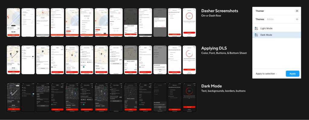
The first thing we did to design Dark Mode was to audit the current On-a-Dash user flow in the Dasher app. We soon noticed that supporting Dark Mode only for the On-a-Dash flow was the same amount of work as supporting the entire app, so our audit and implementation expanded to all other screens in the Dasher app. Approximately, we used 50-plus screenshots of the most representative screens to provide color specifications on all text, icons, borders, and backgrounds. 

a visual example of our dasher app design audit
Figure 2: It was no small amount of effort to create the Dasher app design audit and specifications. We used Themer, a Figma plugin, to easily test our mockups in Dark Mode.

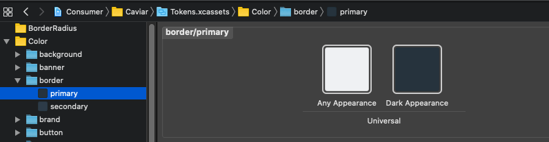
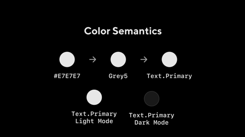
The second step was to analyze our current color semantic architecture, the color names that tell us how, when, or where a color should be used. At the time, we had 121 color semantics in our design language system (DLS). We created a naming structure (i.e. Location + Property + State) that would allow us to scale in the future. As an example, ‘Button.Background.Pressed’ indicates type, location, and state. 

We also expanded our semantics to cover some missing ones and added support for all of our components. At the end of this process we ended up with 223 color semantics. (Since we launched Dark Mode in February, 2020, we have added 214 more!). Each of these color semantics was mapped to a color token (e.g. Red60) not only for Light Mode and Dark Mode, but also for Caviar and our merchant app, giving us complete theming capabilities. 

Visual comparison between light mode and dark mode
Figure 3: We tested our new color semantic structure on every screen to be able to compare Light and Dark Mode mappings.

One critical step in this process involved testing our new colors for Dark Mode in a dark room. This testing revealed that all colors, whites, and dark greys look completely different in a dark setting. For example, we don’t use full white or black in Dark Mode because white bleeds too much into nearby pixels and makes it harder to read. 

image of testing dark mode in a dark room
Figure 4: Testing in a dark room was essential to fine-tune our whites and blacks to the correct brightness level.

Finally, once we had a complete set of screens from the audit, and the color architecture needed, we began specifying the screens in Figma by annotating the correct color for all text labels, icons, buttons, borders, and backgrounds.

visual example of color semantics
Figure 5: Color semantics help us know how and where the color is being used, and therefore map it to the correct value on different appearances like Light or Dark Mode.

Open communication was critical at every stage of the process between the Design and Engineering teams. Our close communication allowed us to quickly test and fix all the problems we saw in the app.

visualization of how our team looked for design bugs
Figure 6: We had one hour testing parties every Friday to find remaining visual bugs.

Last, but not least, we used this opportunity to not only update all our colors in the app, but also some components, such as buttons, Bottom Sheets, and icons.

Building a system design theme: iOS detailed implementation 

Beginning with iOS 13, Apple introduced semantically defined system colors for UI elements that adapt to both Light and Dark Modes. The vast majority of our Dashers who use  iOS devices were already using the newest iOS version, so we decided to leverage this new functionality and build on top of our existing semantic color architecture in our DLS. 

Here are the steps we took to implement Dark Mode: 

Ensure the app is not hard-coded for Light Mode

In the app’s Info.plist, make sure UIUserInterfaceStyle either is not present, or it’s set to Automatic. This will allow the UI to automatically adapt based on the system’s appearance settings.

Convert the existing colors to DLS semantics

Leverage the DLS to translate our hard-coded RGB colors into semantic colors that describe the element rather than a specific color, For example, instead of using #FFFFFF for black text, use .text(.primary) to denote that the color used is for text that has a primary purpose on the screen, such as titles. To do this, follow these steps:

  1. List all the RGB colors being used in the app.
  2. Come up with a conversion chart for each color depending on its context. For example, (#000000 – white) maps to:
    • .primary(.background) for a page background.
    • .button(.primary(.foreground)) for button text.
    • .modal(.background) for a modal popup.
  3. Go over all the Swift files in the project and change them from RGB to their corresponding color semantic using the conversion chart from above.
  4. The .xib files are harder to convert because XCode does not show search results from .xib files. For this, use Visual Studio Code or another IDE that is able to search .xib files in XML format, and replace the colors there as well.
  5. Make sure to remove any UIColor extensions or helper libraries in the code base that return hard-coded colors, so the rest of the developers in the team know not to use them as they continue to develop other features.

Verify all the DLS semantic colors have defined `any` and `dark` appearance

Make sure all of the tokens for the semantic colors in the list from the previous step have both light and dark appearances defined. iOS 13 made this easier by allowing multiple tokens to be associated with one semantic, as shown in Figure 7, below:

Making tokens for specific displays
Figure 7: Starting with iOS 13, we can set tokens based on Light, Dark, or Any Appearance. 

Ensure every color for every UI element is set

After tackling all of the existing colors in the previous steps, move on to tackling all the elements that might not have a specific color set. These elements would be leveraging default system colors instead of the DLS theme that should be applied. Take a second pass at all the views (programmatic and .xibs) to make sure every element has a semantic color properly defined, including for foreground and background. Make sure nothing is pointing at a default or system value.

picture of using Ukit
Figure 8: UIKit sets a default color based on the element, which will dynamically adapt to Dark Mode based on system colors instead of the DLS theme.

While defining every color for every UI element can seem like a daunting task, one helpful way to do this is to temporarily and locally override the DLS theme to return a very bright color, such as purple, every time a DLS semantic color is correctly used. This will visually separate the colors that are correctly using the DLS theme from the ones that are not.

struct CustomTheme: ThemeProvider {
    func color(for token: ColorAssets) -> Color {
        .systemPurple
    }
}

Figure 9: Overriding the custom DLS theme to return a hard-coded, bright color can be useful to detect when the app’s elements are using UIKit’s default colors instead of the theme.

Then run the app, and focus on fixing anything that is not purple!

Figure 10: Anything that is not using the custom DLS theme (and thus isn’t purple) is either using UIKit’s default colors, or is hard- coded to a different value, and will need to be fixed.

Images should use multiple tokens or be defined as templates

When tackling images, the complexity of the asset should determine the approach to use. For simple images that have a single color trace, define the image set to render as template image by default, and set the tint color to a semantic color that will change based on light or dark appearance, as shown in Figure 11, below:

Figure 11: Setting the image set to template will mean the color will come semantically from the tint color, which will adapt to appearance changes. 

More complex images with several traces, especially ones that should not change based on appearance, are better handled with an additional set of assets to handle dark mode, as shown in Figure 12, below:

Figure 12: XCode also allows for multiple appearances (Light, Dark, Any) in image sets.

Transitions between Light and Dark Mode should be seamless

Once every UI element has been updated to using a semantic DLS color value, it’s necessary  to make sure the transition between light and dark appearances is smooth, especially when the app is open. We can rely on the framework to automatically transition most of our colors, but the concept of Light and Dark Mode is implemented in UIKit, not in CoreAnimation. This means that the CoreAnimation layer does not know how to respond to an appearance change, so the color needs to be explicitly updated. For this, we can use UIKit’s traitCollectionDidChange, which is a callback function for when the appearance changes.

    override func traitCollectionDidChange(_ previousTraitCollection: UITraitCollection?) {
        super.traitCollectionDidChange(previousTraitCollection)
        if previousTraitCollection?.userInterfaceStyle != traitCollection.userInterfaceStyle {
            updateColors() // update the colors if the appearance changed.
        }
    }
Figure 13: Overriding the callback for trait collection changes allows us to manually update any colors defined at the CALayer.

Multiple iterations and testing are crucial

This entire process is a huge overhaul of all of the UI elements, components, and screens. Iterate on testing and bug fixing by going through all of the app flows, making sure to verify for both light and dark appearances, as well as transitions between them. 

Developing an Android Dark Mode theme 

When implementing Dark Mode for Android devices, there were two options:

  1. “Easy Dark Mode” with the Force Dark option –  Android 10 and above devices

While support for Dark Mode was not new on Android, the Android 10 update introduced a system-level toggle to switch between dark and light themes. Because users now have this option, they expect most apps to also support Dark Mode. 

Hence the Android framework offered the Force Dark option, a quick solution to support Dark Mode. The side effect of this shortcut is that there is minimal control over how the app looks, and the feature is only supported on devices running Android 10. This wasn’t the best option for us because we needed the same look and feel across multiple devices, not just Android 10, and we also were looking for better customizability on how we design our app in Light and Dark Modes. 

  1. Dark Mode with a custom implementation – works for all Android-supported versions 

Building a custom implementation is an ideal approach, as it enables a custom dark theme offering complete control over how to define the look and feel of the app. This technique is a bit time-consuming and requires more developer-hours than the former approach, but it works on all devices, not just Android 10. 

Another advantage to this second approach is extensibility; this architecture inherently supports multi-theme and requires very minimal changes in the future. 

Updating the parent theme from light to night mode

Our app currently uses Android’s AppCompat theme, and even though it’s usually recommended to switch to MaterialComponents themes, we decided not to. We made this choice because components may break or change the look and behavior of the app, requiring extensive end-to-end testing before making any big changes.

In our case, we decided to update the AppCompat theme: 

  • From Theme.AppCompat.Light.NoActionBar to “Theme.AppCompat.DayNight.NoActionBar"
  • The DayNight theme here enables the “values-night” resource qualifier.

As explained above, if it’s not possible to do a complete transition to the MaterialComponents theme due to time constraints and other challenges, then inherit from the Material Components Bridge theme instead. Bridge themes basically inherit from the AppCompat themes, but also define the new Material Components theme attributes. When using a Bridge theme, start using the Material Design components without changing the app theme.

Update to Theme.MaterialComponents.DayNight.NoActionBar.Bridge

Add a new “values-night” and “drawable-night” resource directory to hold resources for Dark Mode

  • Add a new `colors.xml` resource file inside `values-night` directory that holds all the colors necessary for Dark Mode. The app uses the resources from here when the app is in Dark Mode.
  • Leverage our DLS to translate all hard-coded RGB colors into semantic colors that describe the element rather than a specific color. Then, for each element, define corresponding color tokens in Dark Mode. 
  • For example:
  1. Before 
 <color name="text_black">#191919</color>
 <color name="color_white">#fffff</color>
 <color name="bg_whisper">#E7E7E7</color> 
  1. After – Light Mode
 <color name="text_primary">#191919</color>
 <color name="background_primary">#fffff</color>
 <color name="border_primary">#e7e7e7</color> 
  1. After – Dark Mode
 <color name="text_primary">#E7E7E7</color>
 <color name="background_primary">#191919</color>
 <color name="border_primary">#313131</color> 

Add a switch to toggle between Light and Dark Mode

For Android 10, there is a system-level switch to toggle between Light and Dark Modes. To support older Android versions, we added a toggle option within our app Settings page which can be used to switch between Light and Dark Modes. 

Figure 14: An in-app toggle allows Dashers to selectively override their current system-level setting and select a theme directly.

Implementation to switch between Light and Dark Modes:

fun changeAppTheme(themeType: ThemeType) {
   when (themeType) {
       ThemeType.LIGHT_MODE -> {
           AppCompatDelegate.setDefaultNightMode(AppCompatDelegate.MODE_NIGHT_NO)
       }
       ThemeType.DARK_MODE -> {
           AppCompatDelegate.setDefaultNightMode(AppCompatDelegate.MODE_NIGHT_YES)
       }
       else -> {
           if (Build.VERSION.SDK_INT >= Build.VERSION_CODES.Q) {
               AppCompatDelegate.setDefaultNightMode(AppCompatDelegate.MODE_NIGHT_FOLLOW_SYSTEM)
           } else {
               AppCompatDelegate.setDefaultNightMode(AppCompatDelegate.MODE_NIGHT_AUTO_BATTERY)
           }
       }
   }
}
Figure 15: Update the parent theme to leverage the current setting.

Create a new resource file named `themes.xml` i.e res/values/themes.xml

Theming is basically the ability to systematically design a product to better reflect its brand. Themes and styles are different. A theme is a collection of attributes that refer to app resources and get applied to the whole app or view hierarchy, whereas styles get applied only to a specific view.

Before we defined the system level and new theme attributes, we moved all the theme-related implementation to its own file called `themes.xml`. This helps organize our code better by increasing readability and maintainability, while also setting a clear separation between styles and themes.

Set up theme attributes for an app theme

As mentioned in our official documentation, `A theme is a collection of named resources called theme attributes that’s applied to an entire app, activity, or view hierarchy`. Hence, every view we use in our layout is interested in some of these attributes. 

Let’s look at how our app theme attributes are defined with appropriate semantic values as per our design specifications and then later referenced in our layouts and views. 

Previously, our theme was incomplete, with many system-level attributes still set to default, while others were hard-coded and not referring to our design specifications. 

<style name="AppTheme" parent="Theme.AppCompat.Light.NoActionBar">
   <item name="colorPrimary">@color/red</item>
   <item name="colorPrimaryDark">@color/@darker_red</item>
   <item name="colorAccent">@color/red</item>
   <item name="android:windowBackground">@color/background_gray</item>
   <item name="android:textColorPrimary">@color/dark_grey</item>
   <item name="android:textColorPrimaryInverse">@android:color/white</item>
   <item name="android:textColorSecondary">@color/heading_grey</item>
   <item name="android:textColorTertiary">@color/light_grey</item>
   <item name="android:textColor">@android:color/black</item>
   <item name="colorControlActivated">@color/red</item>
   <item name="colorControlNormal">@android:color/darker_gray</item>
</style>

Figure 16: Most of our colors were hard-coded to RGB values without any consideration for the context.

As shown below, we then updated all system-level theme attributes with appropriate semantic colors and values with corresponding color tokens defined for both Light and Dark Modes in our DLS. 

<!-- Color palette  -->
<item name="colorPrimary">@color/primary</item>
<item name="colorAccentedPrimary">@color/text_accented_primary</item>
<item name="colorAccentedSecondary">@color/text_accented_secondary</item>
<item name="colorAccent">@color/on_accent</item>
<item name="colorOnSecondary">@color/text_primary</item>
<item name="colorOnError">@color/text_error</item>
<item name="colorOnPrimary">@color/text_primary</item>
<item name="colorPrimaryDark">@color/primary_dark</item>
<item name="colorOnBackground">@color/text_primary</item>
<item name="colorControlActivated">@color/red</item>
<item name="colorControlNormal">@android:color/darker_gray</item>
<item name="android:windowBackground">@color/background_primary</item>
<item name="android:textColor">@color/text_primary</item>
<item name="android:editTextColor">@color/text_primary</item>
<item name="android:colorAccent">@color/on_accent</item>
<item name="android:textColorPrimary">@color/text_primary</item>
<item name="textColorDisabled">@color/text_disabled</item>
<item name="android:textColorSecondary">@color/text_secondary</item>
Figure 17: Updated system-level color palette attributes from hard-coded color values to leverage DLS and reference semantic colors.

Apart from the system-level attributes, we have a large variant of typographies that we use in our app. We defined a number of custom theme attributes as per our semantic architecture, which then helped in promoting reusability of resources across the application.

Typography

<item name="android:textAppearance">@style/TextAppearance.Regular.TextFieldText.Medium</item>
<item name="android:textAppearanceSmall">@style/TextAppearance.TextFieldText.Small</item>
<item name="android:textAppearanceMedium">@style/TextAppearance.TextFieldText.Medium</item>
<item name="android:textAppearanceLarge">@style/TextAppearance.TextFieldText.Large</item>
<item name="textAppearanceTextFieldText">@style/TextAppearance.TextFieldText.Medium</item>
<item name="textAppearanceTextFieldTextPrimary">@style/TextAppearance.TextFieldText.Medium.Primary</item>
<item name="textAppearanceRegularTextFieldTextSmall">@style/TextAppearance.Regular.TextFieldText.Small</item>
<item name="textAppearanceRegularTextFieldText">@style/TextAppearance.Regular.TextFieldText.Medium</item>
<item name="textAppearanceRegularTextFieldTextPrimary">@style/TextAppearance.Regular.TextFieldText.Medium.Primary</item>
<item name="textAppearanceRegularTextFieldTextLarge">@style/TextAppearance.Regular.TextFieldText.Large</item>
<item name="textAppearanceSmallLabel">@style/TextAppearance.SmallLabel</item>
<item name="textAppearanceTextFieldLabel">@style/TextAppearance.TextFieldLabel</item>
<item name="textAppearanceMajorPageTitle">@style/TextAppearance.MajorPageTitle</item>
<item name="textAppearancePageTitle">@style/TextAppearance.PageTitle</item>
<item name="textAppearancePageDescriptionBody">@style/TextAppearance.PageDescriptionBody</item>
<item name="textAppearancePageSubtext">@style/TextAppearance.PageSubtext</item>
<item name="textAppearanceSectionTitleLarge">@style/TextAppearance.SectionTitleLarge</item>
<item name="textAppearanceSectionTitle">@style/TextAppearance.SectionTitle</item>
<item name="textAppearanceSectionSubtext">@style/TextAppearance.SectionSubtext</item>
<item name="textAppearanceContentBody">@style/TextAppearance.ContentBody</item>
<item name="textAppearanceLabel">@style/TextAppearance.Label</item>
<item name="textAppearanceCalloutLabel">@style/TextAppearance.CalloutLabel</item>
<item name="textAppearanceNavBarTitle">@style/TextAppearance.NavBarTitle</item>
<item name="textAppearanceButtonSmall">@style/TextAppearance.ButtonSmall</item>
<item name="textAppearanceButtonMedium">@style/TextAppearance.ButtonMedium</item>
<item name="textAppearanceButtonLarge">@style/TextAppearance.ButtonLarge</item>
<item name="textAppearanceListRowTitleLarge">@style/TextAppearance.ListRowTitleLarge</item>
<item name="textAppearanceListRowSubtextLarge">@style/TextAppearance.ListRowSubtextLarge</item>
Figure 18: We added theme attributes for typography to map them to our DLS text styles.

Define the Android system-level Window and Background colors: 

Along with defining platform-level theme attributes, we also added new custom attributes as per our design language specifications. Similar to what we mentioned above, each of these attributes were then later assigned proper color tokens for Light and Dark Mode. 

<!-- Window colors -->
<item name="android:windowDrawsSystemBarBackgrounds">true</item>
<item name="android:windowLightStatusBar" tools:targetApi="m">@bool/use_light_status</item>
<item name="colorBackgroundSecondary">@color/background_secondary</item>
<item name="colorBackgroundTertiary">@color/background_tertiary</item>
<item name="colorBackgroundElevated">@color/background_elevated</item>
<item name="colorBackgroundPrimaryInverted">@color/background_primary_inverted</item>
<item name="android:colorForeground">@color/on_accent</item>
<item name="android:colorBackground">@color/background_primary</item>
<item name="android:listDivider">@color/border_primary</item>
<item name="colorBorderPrimary">@color/border_primary</item>
<item name="colorBorderSecondary">@color/border_secondary</item>

<!-- Text colors -->
<item name="android:textColor">@color/text_primary</item>
<item name="android:editTextColor">@color/text_primary</item>
<item name="android:colorAccent">@color/on_accent</item>
<item name="android:textColorPrimary">@color/text_primary</item>
<item name="textColorDisabled">@color/text_disabled</item>
<item name="android:textColorSecondary">@color/text_secondary</item>
<item name="android:textColorPrimaryInverse">@android:color/white</item>
<item name="android:textColorTertiary">@color/text_tertiary</item>
<item name="textColorPositive">@color/text_positive</item>
<item name="textColorHighlight">@color/text_highlight</item>
<item name="textColorAction">@color/text_action</item>
Figure 19: We defined Android system-level style attributes to map to our DLS color tokens

Button foreground and background colors

<item name="colorButtonPrimaryForeground">@color/button_primary_foreground</item>
<item name="colorButtonPrimaryForegroundPressed">@color/button_primary_foreground_pressed</item>
<item name="colorButtonPrimaryForegroundHovered">@color/button_primary_foreground_hovered</item>
<item name="colorButtonPrimaryForegroundDisabled">@color/button_primary_foreground_disabled</item>
<item name="colorButtonPrimaryBackground">@color/button_primary_background</item>
<item name="colorButtonPrimaryBackgroundPressed">@color/button_primary_background_pressed</item>
<item name="colorButtonPrimaryBackgroundHovered">@color/button_primary_background_hovered</item>
<item name="colorButtonPrimaryBackgroundDisabled">@color/button_primary_background_disabled</item>
<item name="colorButtonSecondaryBackground">@color/button_tertiary_background</item>
<item name="colorButtonSecondaryToggleBackground">@color/button_secondary_toggle_background</item>
<item name="colorButtonSecondaryForeground">@color/button_tertiary_foreground</item>
<item name="colorButtonSecondaryForegroundPressed">@color/button_tertiary_foreground_pressed</item>
<item name="colorButtonSecondaryForegroundHovered">@color/button_tertiary_foreground_hovered</item>
<item name="colorButtonSecondaryForegroundDisabled">@color/button_tertiary_foreground_disabled</item>
<item name="colorButtonSecondaryBackgroundPressed">@color/button_tertiary_background_pressed</item>
<item name="colorButtonSecondaryBackgroundHovered">@color/button_tertiary_background_hovered</item>
<item name="colorButtonSecondaryBackgroundDisabled">@color/button_tertiary_background_disabled</item>

Figure 20: Button foreground and background colors should also leverage DLS abstractions.

Updates to Dialog and Bottom Sheet themes. Following the same steps outlined above, we updated themes for the Dialog and Bottom Sheet components.

Updating layouts to refer to the theme attributes

After Step 5, we went over each one of the app layouts and updated the views to refer to the theme attributes from the hardcoded RGB values. 

Example one

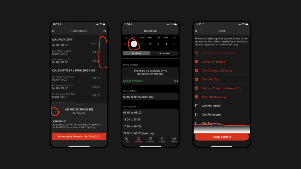
Below, we have screenshots of both Light and Dark Modes of our Promotions screen. Although they look almost identical, the Dark Mode should show a different color scheme. The reason they look the same is because the layouts were hard-coded to use white background RGB color values. 

Figure 20: Hard-coded colors will result in the same screen in both light and dark appearance.

Once we apply the fix, the screens adapt based on their state. 

Figure 21: Updating colors to leverage the newly created DLS colors with both light and dark variations will result in a screen that seamlessly adapts to light and dark conditions.

Example two

Here, we have defined the style `AcceptDeclineInstructionsText` for a specific text view along with a hard-coded text color `@color/black`. And, due to the hard-coded values, the text became totally unreadable in Dark Mode. 

<TextView
        android:id="@+id/details_footer_text"
        style="@style/AcceptDeclineInstructionsText"
        android:layout_width="0dp"
        android:layout_height="wrap_content"
        android:layout_marginTop="16dp"
        android:textColor="@color/black"
        android:visibility="gone"
        app:layout_constraintEnd_toEndOf="parent"
        app:layout_constraintStart_toStartOf="parent"
        app:layout_constraintTop_toBottomOf="@id/accept_modal_instructions"
        tools:text="If you decline this order, it won\'t affect your acceptance rate."
        tools:visibility="visible" />
Figure 22: Hard-coding colors to static system colors, such as black, results in the same color displayed regardless of the light conditions. The code snippet above shows the bug. The screenshot shows the resulting visual experience.

To address text readability in Dark Mode, we updated the text view style to refer to a theme attribute called `textAppearanceSectionSubtext` that is defined in `themes.xml`. This theme attribute is just a style with all the properties defined, such as font typography, weight, and color semantic with necessary color tokens for Light and Dark Modes. With this in place, we moved from a static to a dynamic setting that can switch easily from Light to Dark Mode.

This attribute increases readability, reusability, and developer velocity, as developers don’t need to keep defining these one-off styles anymore. In addition, it gives more flexibility, as we can view component styles from one place and see it reflected throughout the app.

<TextView
        android:id="@+id/details_footer_text"
        style="?attr/textAppearanceSectionSubtext"
        android:layout_width="0dp"
        android:layout_height="wrap_content"
        android:layout_marginTop="16dp"
        android:visibility="gone"
        app:layout_constraintEnd_toEndOf="parent"
        app:layout_constraintStart_toStartOf="parent"
        app:layout_constraintTop_toBottomOf="@id/accept_modal_instructions"
        tools:text="If you decline this order, it won\'t affect your acceptance rate."
        tools:visibility="visible" />
Figure 23: Abstracting the text color and style to reference a DLS style ensures the text will be visible in both Light and Dark Modes. The code snippet above solves the issue, with the screenshot showing the end result.

Handling elevation (drop shadow) in Dark Mode

Elevated surfaces in Light Mode generally rely on a drop shadow, while keeping the primary and the surface background the same. In Dark Mode, however, we cannot purely rely on a drop shadow to elevate a surface because the background is already dark and it would render almost invisible. Inverting the drop shadow to a light color would result in a glowing effect around the surface which is not what we want. 

Instead, we need to indicate elevation by using different background tones. The higher the elevation a surface is, the lighter the color of its background. In our case, we had to create a new shade of grey just for this purpose, as well as a new color semantic called Background.Elevated. Figure 24, below, shows an example of an elevated surface, a Bottom Sheet, and how it translates from Light to Dark Mode.

Figure 24: We can’t rely purely on drop shadows to indicate elevation in Dark Mode. Instead, we need to use different background tones to create separation between the primary background and an elevated surface.

Supporting Dark Mode in Google Maps

Google Maps only supports Light Mode, and our app uses Google Maps for a number of use cases, including showing: 

  • Heatmaps and the nearby starting points in the home screen. 
  • Nearby hotspots when Dashers are waiting for orders.
  • The pick-up and drop-off destination in the order acceptance screen and when a Dasher is driving to a merchant or to a consumer.

It’s important for us to support the dark color scheme in Google Maps when in Dark Mode. Here is how to build Dark Mode into Google Maps: 

This Styling documentation link explains how to apply map styles to Google Maps and it includes details on how to generate color schemes for both Light and Dark modes. 

The configuration file used to apply map styles contains all the details required to customize elements such as the geometry, waypoints, polyline colors, background, and markers. In our case, we defined these using our DLS colors as the baseline. 

Figure 25, below, shows our Dasher home page, which includes a map with all the nearby starting points and how busy they are.

Figure 25: Supporting Dark Mode in Google Maps involves applying a custom map style to the experience.

Update all programmatic hard-coded references to use theme attributes 

There might be some use cases where it’s required to change colors programmatically, such as when a user completes a step in the ordering process and it changes color in the display. Because that change in the display is not statically defined in the layout we need to ensure it is treated as well. So, we identified such cases in the app and updated them to refer to theme attributes instead of RGB values. 

One thing to note here is, when referring to theme attributes programmatically, it’s important that we use view context in order to fetch the right resources. Application context is tied to the lifecycle of the application and it will always apply the default theme and resources that were selected during app launch and disregard any configuration changes done later. 

Wins

Support for Dark Mode was a hit with Dashers, as it gave them an improved user experience, specifically enhanced readability in low light environments, decreased eye strain, and extended battery life, especially on OLED screens. After launching this experience, we heard extensive praise on our Dasher feedback channels and are happy to see an increasing number of Dashers leveraging Dark Mode while delivering at night.

On the design side, we expanded and improved how our DLS color semantics were structured. We created and documented all new color DLS theming libraries (Doordash, Caviar, and merchant) for both Light and Dark Mode. This provided us with a solid foundation for more robust theming abilities in DLS going forward. Additionally, this experience gave our Design team the expertise to create Dark Mode versions of any new or existing feature and product.

Building Dark Mode pushed us to build theming support that was consistent across multiple platforms. While this was a big lift it cleared the way to more easily build features that support Dark Mode across the company. In fact, this ensured that any new feature we developed from that point forward using DLS semantics would have support for Dark Mode out of the box. This also increased developer productivity and satisfaction and made it easier for the team to test both Light and Dark Mode for every feature we ship.

Conclusion

Supporting Dark Mode in mobile apps is a feature most users already expect and a requirement to provide beautiful and scalable UIs. DoorDash’s experience building Dark Mode is not unique. While it’s quickly becoming a requirement, many companies utilize the same kind of statically built experience that does not support Dark Mode or adapt to appearance changes. This results in inconsistent and/or unreadable UI, and in the long run slows down development of new experiences. By building a semantic design structure and theming, companies can not only delight their customers with new features like Dark Mode but can also ensure better consistency and more easily apply changes in the future. 

DoorDash’s platform relies on accurate times affecting real-world events, such as if an order is ready when a Dasher, our term for a delivery person, comes to pick it up. Our assignment algorithm, which makes many of these events possible, considers hundreds of variables, including location, distance, available Dashers, and food preparation time. After considering every variable, we apply a score to each Dasher and delivery pair, and optimize the region to make the most optimal assignments

The dispatch team iterates on this algorithm weekly, as we’re constantly searching for quicker and more efficient ways of making the most optimal assignment. Because we iterate so quickly on our codebase, code readability is an important quality that helps us balance speed with accuracy. If the code is difficult to understand at a glance, it increases our cognitive load and slows down our development time. Code with poor readability also makes it easier for bugs to slip into our algorithm. 

Like many startups, when we first developed the algorithm, we chose to represent time with primitive types. This methodology worked for a while, but as we’ve grown in size and complexity, it became obvious that we needed a more reliable way to represent time due to bugs that stem from this practice. Some bug examples include unit conversion errors from milliseconds to seconds, or errors with adding five minutes to an estimation when we only meant to add five seconds. 

After considering the challenge, we refactored our codebase to use a time library instead of primitives to increase code readability. Refactoring our codebase in this manner was a tall order. Timestamps and durations are the basis for all of our estimations, so naturally they are used extensively throughout our codebase. Because our code directly impacts our customers’ livelihoods and meals, we had to make sure our refactorization would not introduce any unintended changes. Rather than refactoring our code all at once, we broke the problem into smaller chunks and opted to do the migration slowly over multiple changes. 

A quick note about time libraries

In JVM-based languages, the java.time library (also known as JSR-310) is practically the only choice. Another commonly used library, Joda-Time, was actually the precursor to java.time, and was developed by the same person who would go on to lead the java.time project. Given that Joda-Time is no longer under active development, and that the Joda-Time website recommends users switch to java.time, using java.time for our project was an obvious choice. 

A basic time coding example

One of the basic building blocks of code are functions and the parameters we pass into them. Take this function as an extremely simple example:

fun getEstimateInSeconds(timestampInSeconds: Long): Long {
    val now = System.currentTimeMillis()
    return if (timestampInSeconds < (now / 1000)) {
        timestampInSeconds + 60 * 5
    } else {
        timestampInSeconds - 60 * 60 * 3
    }
}

The above code merely takes a timestamp and compares it against the current time, modifying the time to get a result. Functionally, it gets the job done. However, it’s hard to read because of its use of primitive types and literals to represent time. 

Similar to how we iterate on our algorithm, we will iterate on the above function to improve its readability by using java.time. 

Setting function parameters

Notice that the function above takes Long as its parameter, and the parameter timestampInSeconds emphasizes the unit in the parameter name. However, there is no compile-time or runtime guarantee that what gets passed into this function is a timestamp with seconds as its unit. For example, there is nothing stopping an unsuspecting user from passing in the wrong value, like so:

val myTimestampInMinutes = 1000
val myIncorrectResult = getEstimateInSeconds(myTimestampInMinutes)

The above code will compile and run without issue, despite there being an obvious bug. One way the java.time library helps us is by innately capturing time units in its objects. We can improve this function by using java.time’s Instant object to represent timestamps.

fun getEstimate(timestamp: Instant): Long {
    val now = Instant.now()
    return if (timestamp.getEpochSecond() < now.getEpochSecond()) {
        timestamp.getEpochSecond() + 60 * 5
    } else {
        timestamp.getEpochSecond() - 60 * 60 * 3
    }
}

Now that we’re passing a java.time object into this function, the function doesn’t need to make any assumptions about the time unit used for the input. We can retrieve the time unit we need with getEpochSecond() or toEpochMilli(). Additionally, Instants provide a convenient function to get an object with the current time with Instant.now().

Adding or subtracting time

When working with timestamps, it’s common practice to add constant values of time. If the timestamp is in seconds, adding five minutes is frequently represented as 60 * 5. Not only is this practice error prone, but it also becomes unreadable when we start dealing with longer time spans like hours. We can further improve representation of time spans by introducing the Duration object. 

fun getEstimate(timestamp: Instant): Instant {
    val now = Instant.now()
    return if (timestamp.getEpochSecond() < now.getEpochSecond()) {
        timestamp.plus(Duration.ofMinutes(5))
    } else {
        timestamp.minus(Duration.ofHours(3))
    }
}

The Duration object represents a time-based amount of time, such as five minutes, written as ofMinutes(5) in the above code snippet. Now that we’re dealing with the Duration object, we don’t need to convert the timestamp back into the primitive as we can just use the built in plus and minus methods and then return the resulting Instant object. 

Comparing timestamps

There is one more improvement we can make because we are still converting into primitives with the getEpochSecond method and comparing the result with a comparison operator. The Instant object offers a convenient and human readable way to compare one Instant object with another: 

fun getEstimate(timestamp: Instant): Instant {
    val now = Instant.now()
    return if (timestamp.isBefore(now)) {
        timestamp.plus(Duration.ofMinutes(5))
    } else {
        timestamp.minus(Duration.ofHours(3))
    }
}

Comparing timestamps is the same thing as determining which timestamp comes before or after the other. We can use the isBefore() or isAfter() functions to make this comparison without having to convert back into primitive types. 

Conclusion

We began with this code:

fun getEstimateInSeconds(timestampInSeconds: Long): Long {
    val now = System.currentTimeMillis()
    return if (timestampInSeconds < (now / 1000)) {
        timestampInSeconds + 60 * 5
    } else {
        timestampInSeconds - 60 * 60 * 3
    }
}

And ended with this:

fun getEstimate(timestamp: Instant): Instant = {
    val now = Instant.now()
    return if (timestamp.isBefore(now)) {
        timestamp.plus(Duration.ofMinutes(5))
    } else {
        timestamp.minus(Duration.ofHours(3))
    }
}

While these functions do the exact same thing, the latter is more easily read. For a code maintainer, the purpose of this function is more easily understood, leading to less time spent trying to read the code. When quick iteration is vital to an engineering team’s efforts, code readability is a small but worthwhile investment. Migrating from primitive types to a time library for time coding is one way to improve code readability.

Header photo by Fabrizio Verrecchia on Unsplash.

In a business with fluid dynamics between customers, drivers, and merchants, real-time data helps make crucial decisions which grow our business and delights our customers. Machine learning (ML) models play a big role in improving the experience on our platform, but models can only be as powerful as their underlying features. As a result, building and improving our feature engineering framework has been one of our most important initiatives in improving prediction accuracy.

Given that many predictive models are typically trained with historical data, utilizing real-time features allows us to combine long-term trends with what happened 20 minutes prior, thereby improving prediction accuracy and customer experiences. 

At DoorDash, we are working to increase the velocity and accessibility of the feature engineering life cycle for real-time features. Our strategy involved building a framework that allows data scientists to specify their feature computation logic and production requirements through abstract high-level constructs, so feature engineering is accessible to a broader user base among our ML practitioners. 

Leveraging the Apache Flink stream processing platform, we built an internal framework, which we call Riviera, that allows users to declaratively specify their feature transformation from source(s) to features stores through a simple configuration.

An overview of feature engineering at DoorDash

Within DoorDash’s ML Platform, we have worked on establishing an effective online prediction ecosystem. Figure 1, below, gives a high-level overview of our ML Infrastructure in production. We serve traffic on a large number of ML Models, including ensemble models, through our Sibyl Prediction Service. Because the foremost requirement of our prediction service is to provide a high degree of reliability and low latency (<100 ms), we built an efficient feature store to serve aggregated features. We use Redis to power our gigascale feature store to provide high throughput and availability for our features.

Diagram of DoorDash's ML platform
Figure 1: In our ML Platform architecture, we serve ML models through a prediction service which relies on a Feature Store to provide aggregate features in production

Currently, the ML models that power DoorDash primarily use batched features. These features are constructed from long running ETLs, and as such represent aggregations from historical data. However, as outlined in our previous article, we have been gradually trending towards features aggregated from real-time streaming sources because the value derived from such real-time features provides significant improvements to our existing models, and opens up newer avenues for model development. For our initial launch around real-time features, we constructed our feature engineering pipelines as a native Flink application and deployed them for predictions to our Redis-backed serving store.

Building feature engineering pipelines in Flink

While this status quo was stable and sufficient when we began our transition to real-time features, it soon became a bottleneck to accelerated feature development. The three main issues with our existing infrastructure involved accessibility, reusability, and isolation of real-time feature pipelines.

Accessibility

Flink as a programming paradigm is not the most approachable framework, and has a reasonable learning curve. Updating a native Flink application for each iteration on a feature poses barriers to universal access across all teams. In order to evolve into a more generally available feature engineering solution, we needed a higher layer of abstraction.

Reusability

Much of Flink code and its application setup is often a boilerplate, which is repeated and rewritten across multiple feature pipelines. The actual business logic of the feature forms a small fraction of the deployed code. As such, similar feature pipelines still end up replicating a lot of code.

Isolation

To make managing deployments of multiple feature pipelines easier, different feature transformations are often bundled together into a single Flink application. Bundling feature transformations provides simpler deployment at a cost of having inefficient resource management and a lack of resource isolation across the feature pipelines.

We recognized that a declarative framework that captures business logic through a concise DSL to generate a real-time feature engineering pipeline could remedy the inefficiencies described above. A well-designed DSL could enhance accessibility to a wider user base, and the generation process could automate boilerplate and deployment creation, providing reusability and isolation. Using a DSL for feature engineering is also a proven approach for ML platforms, as shown by Uber’s Michelangelo Palette and Airbnb’s Zipline.

As we already used Flink stream processing for feature engineering, Flink SQL became a natural choice for our DSL. Over the last few years, Flink SQL has seen significant improvement in its performance and feature set thanks to contributions from Uber, Alibaba, and its open source community. Given these improvements, we are confident that Flink SQL is mature enough for us to build our DSL solutions.

Challenges to using Flink SQL

While we established that Flink SQL as a DSL was a good approach to build a feature engineering framework, it posed a few challenges for adapting to our use cases. 

  • No abstraction for underlying infrastructure: While Flink SQL works as a DSL to express feature transformation logic, we still need to provide additional abstraction to hide the complexity of the underlying infrastructure. The feature engineering framework needs to provide seamless support for a variety of evolving connectors like Kafka and Redis.
  • Adaptors to support Protobuf in SQL processing: To enable SQL processing, the data needs to have a schema and be converted to Flink’s Row type. Flink has built-in support for a few data formats that can be used in its SQL connectors, with Avro being one example. However, at DoorDash most of the data comes from our microservices, which use gRPC and Protobuf. To support Protobuf in SQL processing, we needed to construct our own adaptors.
  • Mitigate data disparity issues: While we can rely on Protobuf to derive the schema of data, the schema and data producers may not be optimally defined for feature construction. Some source events in our Kafka sources contain only partial data, or spread the relevant feature attributes across multiple events that need to be joined. In the past, we tried to mitigate this problem by creating a global cache in Flink’s operator chain, where the missing attributes can be looked up from past events from different sources. Flink SQL would need to adapt these schema quality issues as well.

With these challenges in mind, we will dive into our design of our Flink-as-a-service platform and the Riviera application, where these challenges are addressed in a systematic way.

An overview of the Flink-as-a-service platform

To help build sophisticated stream processing applications like Riviera, it is critical to have a high-quality and high-leverage platform to increase developer velocity. We created such a platform at DoorDash to achieve the following goals:

  • Streamline the development and deployment process
  • Abstract away the complexities of the infrastructure so that the application’s users can focus on implementing their business logic
  • Provide reusable building blocks for applications to leverage

The following diagram shows the building blocks of our Flink-as-a-service platform together with applications, including Riviera, on top of it. We will describe each of the components in the next section.

Diagram of how Riviera, our real time feature abstraction layer interacts with the rest of our stack
Figure 2: Flink-as-a-service provides multiple levels of abstractions to make application development easier

DoorDash’s customized Flink runtime

Most of DoorDash’s infrastructure is built on top of Kubernetes. In order to adopt Flink internally, we created a base Flink runtime docker image from the open source version. The docker image contains entry point scripts and customized Flink configurations (flink-conf.yaml) that integrate with DoorDash’s core infrastructure, providing integrations for metric reporting and logging.

DoorDash’s Flink library

Because Flink is our processing engine, all the implementation for consuming data sources and producing to sinks needs to be Flink native constructs. We created a Flink library that provided a high level abstraction of a Flink application encapsulating the common streaming environment configurations, such as checkpoints and state backend, as well as providing Flink sink and source connectors commonly used at DoorDash. Applications that extend from this abstraction will be free from most of the boilerplate configuration code and do not need to construct sources or sinks from scratch. 

Specifically for Riviera, we developed components in our platform to construct source and sink with a YAML configuration and generic Protobuf data format support. We adopted YAML as the DSL language for capturing the configuration because of its wide adoption and readability. 

To hide the complexity of source and sink construction, we designed a two-level configuration: infrastructure level and user level. The infrastructure level configuration encapsulates commonly used source/sink properties which are not exposed to the user except for the name as an identifier. In this way, the infrastructure complexities are hidden from the end user. The user level configuration uses the name to identify the source/sink and specify its high level properties, like the topic name. 

For example, an infrastructure-level YAML configuration for a Kafka sink may look like this:

sink-configs:
   -  type: kafka
      name: s3-kafka
      bootstrap.servers: ${BROKER_URL}
      ssl.protocol: TLS
      security.protocol: SASL_SSL
      sasl.jaas.config:  …
      ... 

The user-level configuration will reference the sink by name and may look like this:

sinks:
  - name: s3-kafka
    topic: riviera_features
    semantic: at_least_once

We built support for Kafka as a source, and S3, Kafka, and Redis as sinks.  

For Flink serialization and deserialization schemas, we support both Protobuf and Avro. As mentioned before in our challenges, Protobuf is the de facto serialization format for events published from microservices, but there is no built-in Flink SQL support for it. We solved this obstacle by creating a reflection based deserialization layer that infers, flattens, and translates every Protobuf into a tabular data stream for consumption in the Flink application. For example, the following protobuf schema would translate into a flattened sparse table schema with (id, has_bar, has_baz, bar::field1, …, baz::field1, … ). 

message Foo {
  int64 id = 1;
  oneof sub_event {
    Bar bar = 2;
    Baz baz = 3;
  }
}

To leverage this Protobuf support, all the user needs to do is provide a Protobuf class name as a source configuration. 

In the near future, we plan to leverage the new feature in Confluent’s schema registry, where Protobuf definition is natively supported as a schema format and eliminates the need to access Protobuf classes at runtime.

Creating a generic Flink application in Riviera 

Building on issues with Flink that needed to be addressed and the existing state of our infrastructure, we designed Riviera as an application to generate, deploy, and manage Flink jobs for feature generation from lean YAML configurations. 

The core design principle for Riviera was to construct a generified Flink application JAR which could be instantiated with different configurations for each feature engineering use case. These JARs would be hosted as standalone Flink jobs on our Kubernetes clusters, which would be wired to all our Kafka topics, feature store clusters, and data warehouses. Figure 3 captures the high-level architecture of Riviera.

Figure 3: A Riviera Flink application constructs sources, transformation operator graphs and sinks in Flink from their YAML configurations and then runs them on the Flink-as-a-service platform.

Once we built a reasonable chunk of the environment management boilerplate into the Flink library, the generification of Riviera’s Flink application was almost complete. The last piece of the puzzle was to put the sink, source, and compute information into a simplified configuration.

Putting it all together

Let’s imagine we want to compute a store-level feature that provides total orders confirmed by a store in the last 30 minutes, aggregating over a rolling window that refreshes every minute. Today, such a feature pipeline would look something like this:

source:
  - type: kafka
    kafka:
      cluster: ${ENVIRONMENT}
      topic: store_events
      schema:
        proto-class: "com.doordash.timeline_events.StoreEvent"

sinks:
  - name: feature-store-${ENVIRONMENT}
    redis-ttl: 1800

compute:
  sql: >-
    SELECT 
      store_id as st,
      COUNT(*) as saf_sp_p30mi_order_count_avg
    FROM store_events
    WHERE has_order_confirmation_data
    GROUP BY HOP(_time, INTERVAL '1' MINUTES, INTERVAL '30' MINUTES), store_id

A typical Riviera application extends the base application template provided by our Flink library, and adds all the authentication and connection information to our various Kafka, Redis, S3, and Snowflake clusters. Once any user puts together a configuration as shown above, they can deploy a new Flink job using this application with minimal effort.

Case study: Creating complex features from high-volume event streams

Standardizing our entire real-time architecture through the Flink libraries and Riviera have yielded really interesting findings on the scalability and usability of Flink SQL in production. We wanted to present one of the more complex use cases we have encountered. 

DoorDash’s Delivery Service defines a Protobuf schema for a DeliveryEvent, which records a wide variety of delivery states. These states record different phases of a delivery, such as delivery creation, delivery pickup, and delivery fulfillment, and are accompanied with their own state data. Our parsing library flattens this schema out to a sparse table schema with over 300 columns, and Flink’s Table Environments are able to deal with it extremely efficiently.

Some aggregate features on this data stream can be fairly simple in terms of maintaining the state for the stream computation. For example, “Total created deliveries in the last 30 minutes” can be a useful aggregate over store IDs, and can be handled by rolling window aggregates. However, we have some feature aggregations that require more complex state management. 

One example of such a feature that requires more state is what we call “Delivery ASAP time”. ASAP for a delivery tracks the total time from an order’s creation to its fulfillment. In order to track “Average ASAP for all deliveries from a store in the last 30 minutes”, the delivery creation event would need to be matched with a delivery fulfillment event for every delivery ID, before aggregating it against the store ID. Additionally, the data schema provides store IDs and delivery IDs only during the creation events, but only store IDs for the fulfillment events. Because of this choice for the source data, the computation would need to solve the data disparity issue and carry forward the store ID from creation events for the aggregation.

Before Riviera, we managed the state lookup for a delivery by maintaining an in-memory cache within the Flink application that cached event time and store ID for creation events, and emitted the delta for a store ID when a matching fulfilment event occurred.

With Riviera we were able to simplify this process and make it more efficient, as well, using SQL interval joins in Flink. The query below demonstrates how Riviera creates this real-time feature:

  SELECT st, AVG(w) as daf_st_p20mi_asap_seconds_avg
    FROM (
      SELECT 
        r.store_id as st, 
        r.delivery_id as d, 
        l.proctime as t, 
        (l.event_time - r.event_time) * 1.0 as w
      FROM (
        SELECT delivery_id,
               `dropoff::actual_delivery_time` as event_time,
               _time as proctime
        FROM delivery_lifecycle_events
        WHERE has_dropoff=true
      ) AS l
      INNER JOIN (
        SELECT `createV2::store_id` as store_id,
               delivery_id,
               `createV2::created_at` as event_time,
               _time as proctime
        FROM delivery_lifecycle_events
        WHERE has_create=true
      ) as r
      ON l.delivery_id=r.delivery_id 
      AND r.proctime BETWEEN l.proctime - INTERVAL '4' HOUR and l.proctime - INTERVAL '1' MINUTES)
    GROUP BY st, HOP(t, INTERVAL '1' MINUTES, INTERVAL '20' MINUTES)

Semantically, we run two subselect queries, with the first representing fulfillment events with their delivery_id and dropoff_time, and the second representing the creation events with delivery_id, store_id, and creation_time. We then run a Flink interval join on those sub queries to compute the ASAP for each delivery and aggregate over all stores.

This approach not only reduced our complex state maintenance to a few lines of SQL, it also helped achieve a much higher degree of parallelism. In order to maintain a cache in the original solution, we needed the processing to have a parallelism of 1 on a beefy node, but since Flink can maintain join state more efficiently, we were able to parallelise the computation to 15 workers and optimize it with much smaller pod sizes. Currently, the self join can handle over 5,000 events per second with 300 columns self joined over a period of four hours with ease.

Production results

The launch of Riviera enabled feature development to become more self-serve and has improved iteration life cycles from a few weeks to a few hours. The plug-and-play architecture for the DSL also allows adapting to new sources and sinks within a few days.

The integration with the Flink-as-a-service platform has enabled us to automate our infrastructure by standardizing observability, optimization, and cost management behind the Flink applications as well, allowing us to bring up a large number of jobs in isolation with ease. 

The library utilities we built around Flink’s API and state management have reduced codebase size by over 70%. 

Conclusion

The efforts behind Riviera hold a lot of promise for democratizing real-time processing at DoorDash. The work behind it provides a general framework not just for creating real-time features, but also for generic real-time processing of raw events. We’ve been able to utilize Riviera to generate real-time business metrics for consumption by various dashboarding and analytics endpoints as well. The ability to deploy complex Flink applications via SQL-based DSL is a good foundation for achieving this.

As we grow adoption and consumers, we hope to add many missing links to this framework to improve its value and usability. We plan to work on deployment automations and make it possible to debug and visualize the output of SQL statements before a new Riveria job is deployed. We will expand the use cases of Riviera to more complicated stream joins and find ways to autoscale them. Stay tuned for our updates and consider joining us if this type of work sounds interesting.   

Acknowledgements

Thanks goes out to the team including: Nikhil Patil, Sudhir Tonse, Hien Luu, Swaroop Chitlur Haridas, Arbaz Khan, Hebo Yang, Kornel Csernai, Carlos Herrera, and Animesh Kumar.

One of the key technology decisions we had to make when DoorDash acquired Caviar in 2019 involved integrating the Caviar iOS app with the existing DoorDash mobile infrastructure and platform. Maintaining a separate tech stack for Caviar was not scalable, nor would it have been efficient. However, we also needed to maintain the Caviar experience for its customer base.

We wanted to change the Caviar app’s underlying infrastructure and platform without disrupting how customers used the app. We previously accomplished a similar project for our web experience, and needed to replicate it for our mobile experiences.

Our solution required rebuilding the DoorDash iOS app on a newly architected platform that could also support theCaviar iOS app. Although an intensive strategy, it would result in a scalable mobile platform capable of supporting additional app brands in the future.

Building Caviar and DoorDash iOS apps from the same codebase

Given the decision to rebuild the Caviar iOS app to integrate with DoorDash, the first thing we needed to do was build a new architecture underneath the current DoorDash app that could support both brands. The goal of this new architecture was to:

  1. Gain the ability to create separate binaries for each of the apps.
  2. Share as much code as possible while still being able to build distinct features and experiences.
  3. Minimize the engineering drag on the current DoorDash consumer iOS team.

With all this in mind we came up with three options that could potentially fit our needs: 

Separate build targets

Of the three options, separate build targets was by far the easiest to set up. With this approach we would duplicate the current DoorDash app target to a Caviar app target, then repeat for the test targets.

This approach had two major highlights: it was easy to implement and it also required minimal changes on the DoorDash side of things. We had an aggressive timeline for the DoorDash/Caviar integration so a simple setup was an attractive aspect of this solution. In addition, the minimal amount of changes to DoorDash’s codebase to facilitate it was also reassuring.

However, this initial development speed comes at the expense of maintainability and future velocity. Having duplicate targets meant that when adding files, engineers would need to make the appropriate selections for target memberships for Caviar, DoorDash, or both. Setting file memberships is pretty straightforward, but is also very easy to mess up. And although these errors are pretty easy to fix, they coulds result in builds failing, which slows down development, especially when they fail on the continuous integration/continuous delivery (CI/CD) machine. 

Ultimately, we decided not to take this route. The initial development speed was not worth the impact to maintainability and velocity.

Separate build configurations

Another possible solution used separate Xcode Configuration files (xcconfig) for Caviar and DoorDash. For this approach we would rename our current release and debug xcconfig files to DoorDash-Release and DoorDash-Debug, making those configurations specific to the DoorDash app. We would then duplicate those files to create separate xcconfig files for Caviar debug and release. From there we could create different build schemes that use different xcconfig files for DoorDash and Caviar. This method would allow us to have one app target that could be configured to build either the Caviar or DoorDash based on which configuration file we provided in the build scheme. 

With this approach we would be able to keep a single build target for both apps, and doing so would simplify many things. For starters, a single target meant that we would not need to worry about file target membership like we would have in the previous approach. Also, it would mean minimal breaking changes to the current DoorDash environment. To customize Caviar and DoorDash we would simply add or modify the various build time variables as needed.

However, this approach still did not completely fit our needs. Expanding the configuration files to be able to customize Caviar and DoorDash to the level we wanted would have been a tedious and painstaking process. We would need to define variables for all the differences between the two apps and then map them to the correct dependencies. As we continue to expand each experience, this could easily grow to more variables than we could realistically maintain. In addition, the use of build-time variables in the configuration files would have been a pretty indirect way of customizing the the apps

Seperate app wrappers around a common app library

The solution we went with was to extract the current DoorDash iOS app into a static library, then create two separate Caviar and DoorDash app targets that would depend on the library for all shared application code. 

We took the existing DoorDash project, stripped out all app-specific pieces, such as AppDelegate, xcassets, xcconfig, and app entitlements, and bundled everything together in a static library we call CommonApp. From there we created two new app targets, one for Caviar and one for DoorDash, to act as app-specific wrappers around the shared code that lives within CommonApp. These app wrapper targets include all the code and logic that are mutually exclusive from each app. Here we include elements like AppDelegate, xcassets, xcconfig, app entitlements, and implementation files unique to each experience. 

This approach gave us the ability to easily customize each experience with minimal impact on the other. For cases where we wanted to have different implementations of features between the experiences, we could simply create those implementations in each of the app wrappers and have them used in CommonApp through dependency injection. With this approach, there was a clear separation of the code that nicely reflected reality. Shared code lived in CommonApp and app-specific code lived in the appropriate app targets.

Overall, the only downside to this approach was the amount of effort required on initial setup to extract all the shared code to the static library, CommonApp, and configuring the two new thin targets to inject the proper dependencies to CommonApp. However the maintainability and scalability of this approach was well worth the tradeoff in additional setup time.

Retaining the Caviar look and feel

Now that we had a way to build the apps, we needed to come up with a clean and scalable way to style each app. We had two goals in mind: we wanted to be able to fully customize theming between the Caviar and DoorDash app as well as the ability to easily develop for both experiences. The latter goal would mean being able to set different theming values depending on the experience without having a bunch of if-else statements or ternary operators (see code snippet below).

Our solution involved creating a set of user interface (UI) semantics for colors, iconography, and typography that would abstract away the underlying values and give us a way to provide different sets of values for each app without changing any code at the call sites. Luckily for us, our Design Infrastructure team had already built a design language system (DLS), providing the UI elements we needed.

For colors and icons, our DLS extended the UIColor and UIImage implementations from Apple’s iOS interface framework with static methods for all our semantics and use cases. These methods would map the corresponding underlying values provided by each app’s theme stored in each app’s xcassets (Xcode asset catalogs). Similarly, for typography it mapped the corresponding semantics to the correct underlying fonts provided by each app with the appropriate additional attributes applied. 

The code snippet below shows how we extend UIColor to include enumerations (enums) for the various color semantics (use cases) we have throughout the app. These enums can then be used to fetch the underlying value they are mapped to in each app’s xcassets.

typealias Color = UIColor
extension Color {   
     enum Border: String, CaseValueIterable {       
          case primary = "border/primary"       
          case secondary = "border/secondary"   
     }

     static func border(_ color: Border) -> Color {       
          return ColorAssets(name: color.rawValue).color   
     }
}
build screen showing color assets
Figure 1: All colors defined in the xcassets map to a semantic defined in code which can be used to fetch the color from the xcassets.

Setting values implicitly allows greater flexibility

The DLS let us replace code that sets explicit values with semantics that implicitly set values which can be configured with different values based on the experience. 

In the code snippet below see how we would explicitly define colors based on experience (non-semantic colors) versus implicitly defining colors (semantic color). In the non-semantic version, everytime we set a color we’re required to make a check to see which experience we’re in. While this method works, it is tedious, messy, and error prone. In the semantic version, whether we’re implementing for Caviar or DoorDash we can use the same syntax and the same language. The DLS provides the appropriate color through each app’s xcassets. 

// Non-semantic colors
var borderColor:UIColor? = isCaviar ? .darkGray : .black
var backgroundColor:UIColor? = isCaviar ? .orange : .red
var foregroundColor:UIColor? = isCaviar ? .white : .lightGray

// Semantic colors via DLS
let borderColor:UIColor? = .border(.secondary)
let backgroundColor: UIColor = .button(.primary(.background))
let foregroundColor: UIColor = .button(.primary(.foreground))
// Non-semantic icons
button.setImage(UIImage(named: "arrow-gray-right"), for: .normal)

// Semantic icons
button.setImage(.small(.arrow(.right)), for: .normal)

As for typography, the DLS enumerated every use case, abstracting the specific font and style from the codebase, as seen in the code snippet below. As such, this same architecture can support both the DoorDash and Caviar iOS apps, with different styles applied to each.  

extension DLSKit.Typography {
    public enum Default: String, TextStyle, CaseValueIterable {
        case MajorPageTitle
        case PageTitle
        case PageDescriptionBody
        case PageSubtext
        case TextFieldLabel
        case TextFieldText
        case TextFieldPlaceholder
        case AlertTitle
        case AlertText
        case AlertAction
        case PrimaryButtonText
    ......
    }
}

As with typography, we apply attributes defined in the DLS, such as bolding and font size, which can be seen in the code snippet below. 

public func attributes(overrides: TextAttributes = [:]) -> TextAttributes {
            let paragraphStyle = NSMutableParagraphStyle()
            let textAttributes: TextAttributes = {
                switch self {
                case .MajorPageTitle:
                    return DLSKit.Typography.Base.Bold32.attributes(overrides: [:])                   
                case .PageTitle:
                    return DLSKit.Typography.Base.Bold24.attributes(overrides: [:])                   
                case .PageDescriptionBody:
                    paragraphStyle.lineHeightMultiple = Default.bodyLineHeight
                    return DLSKit.Typography.Base.Medium16.attributes(overrides: [
                        .paragraphStyle: paragraphStyle,
                        .foregroundColor: Default.subtextColor
                        ])                   
                case .PageSubtext:
.....
}

The code snippet below shows the mapped fonts defined in each apps’ xcassets.

    enum Medium: String, CaseValueIterable {
        case TTNorms = "medium/TTNorms"
    }
    enum Regular: String, CaseValueIterable {
        case TTNorms = "regular/TTNorms"
    }
build screen showing font asset
Figure 2: Similar to colors, we define semantics for the fonts used in an app, giving great flexibility over the look we can give any app built from this architecture.

This architecture allowed for set fonts within the shared codebase without requiring us to do any additional work to have them render properly between experiences.

// Correct underlying font provided by each apps xcassets, so engineers can develop without 
// having to worry about picking the correct font for each experience.
textLabel?.font = DLSKit.Typography.Default.ListRowTitle.font()

Building our iOS apps on this new architecture offered a number of practical advantages. When we map semantics to values, app builds are automatically themed, ensuring consistency between versions. When creating new features or other app updates, engineers no longer need to look up the values for UI elements and set them to either DoorDash and Caviar. We just need to use semantics. Future UI or branding updates, or even apps supporting new business lines, become much easier to create.

Rebuilding the Caviar experience

Leveraging the DLS let us build two separate apps from the same codebase themed differently but essentially still the same. The last piece to the project involved customizing the Caviar iOS app to make its experience match its brand. 

Once we determined which pieces of the app should differ between experiences, we defined protocols for these branded components. Identifying these pieces let us replace concrete class implementations in CommonApp with abstract definitions that were not brand-aware. Then, with the use of dependency injection, each of the apps could provide their own implementations of these branded components that would customize the experience accordingly. 

For example, let’s take a look at the landing view controller. Each app should have its own landing view, the screen users first see when they open the app, that matches the brand experience. 

In the code snippet below, we define protocols, including that for the landing view, for brand-specific views. 

public protocol LandingViewControllerProtocol: UIViewController {
    var landingRouter: LandingRouterProtocol { get }
}

We also include a factory protocol to define the brand-specific views, as shown in this code snippet.

public protocol BrandedViewFactoryProtocol {
    /// Use Case: Splash
    func makePreSilentSignInMigrationService() -> PreSilentSignInMigrationServiceProtocol?
    func makeLaunchView() -> UIView
    func makeStaticSplashView() -> StaticSplashViewProtocol
   
    /// Use Case: Landing
    func makeLandingViewController() -> LandingViewControllerProtocol
   
    func makeStorePageHeaderView() -> StorePageHeaderView
   
    func makeLoginBannerView() -> UIView?
    func makeLoginHeaderView(isSignIn: Bool) -> LoginHeaderViewProtocol
   
    func makeVerifyEmailModule(email: String) -> VerifyEmailModuleProtocol?
   
    func makeVerifyEmailSuccessModal() -> VerifyEmailSuccessModalProtocol?
}

Now in CommonApp we can replace instances of these concrete classes with protocols that can be injected with brand-specific implementations. 

    @ResolverInjected private var brandedViewFactory: BrandedViewFactoryProtocol

....

    func tableView(_ tableView: UITableView, headerFor storeViewModel: StoreHeaderViewModelV2) -> UIView {
        let view = brandedViewFactory.makeStorePageHeaderView()
        let presenter = StoreHeaderPresenter(view: view)
        view.delegate = self
        presenter.present(with: storeViewModel)
        storeHeaderPresenter = presenter
        return view
    }

With our protocols defined, we’re able to provide two separate implementations of the store page header that are customized differently between the Caviar and DoorDash iOS apps.

Figure 3: Although built with the same code, we are able to provide two completely different experiences for our Caviar and DoorDash iOS apps by providing separate implementations for areas of the app that should differ between the two.

We defined the landing view protocols using the code shown above. The code snippet below shows how we initiate the different landing views shown in Figure 4, below, in the different instances of our iOS apps.

class LandingModule {
    @ResolverInjected private var brandedViewFactory: BrandedViewFactoryProtocol
   
    let viewController: UINavigationController
   
    init() {
        self.viewController = UINavigationController()
       
        viewController.viewControllers = [brandedViewFactory.makeLandingViewController()]
    }
}

Likewise, we’re able to provide two separate implementations of the landing screen with little modification to the shared code.

Figure 4: With little modification to the underlying codebase, we can show two different landing screens in our Caviar and DoorDash iOS apps.

This approach lets us selectively customize portions of the codebase without impacting the surrounding code, reducing the possibility of introducing errors. The ability to customize the end-user experience between the two apps gives us great flexibility in supporting DoorDash business lines.

Conclusion

Although the addition of Caviar to DoorDash forced us to re-architect our iOS apps, we ended up with a much more scalable overall solution. With the work described above complete, we now have a single codebase we can use to build both the DoorDash and Caviar apps. These apps use distinct themes and branding, yet share 90% of their code. Our mobile team can further customize each app without muddying the shared code, increasing reliability. That shared codebase also means we can make overall improvements and add features for both apps at the same time.

It’s not uncommon for a company to launch with a single app, then grow to the point it needs to support new business lines with new apps. In the launch stage, building a DLS and architecting for multiple build targets to support a single app may not seem to make sense. However, rapid growth can make it difficult to invest the time in building a scalable architecture. Setting up such an architecture at the outset can alleviate many problems later.

Header photo by Dil on Unsplash.

Well-crafted decision graphs help DoorDash agents solve issues quickly and accurately, giving our customers a best-in-class experience. No matter how efficient we make our logistics platform, the reality of supporting the complex interaction of restaurants, consumers, and Dashers, our term for delivery drivers, inevitably gives rise to issues, such as late deliveries or order mix-ups. Our agents leverage our customer service platform to resolve these issues satisfactorily.

As a logistics platform, we focus heavily on the customer experience. When dealing with food delivery, it’s always a larger problem than just a support issue, as a Dasher might miss a payment, a restaurant’s reputation might suffer, or a family may be left waiting for their late dinner. 

Solving delivery issues involving a combination of consumers, Dashers, and restaurants makes everything more complex. There is room for error as different agents can provide different resolutions for similar issues. This is where decision graphs help improve the customer experience. We start by identifying the most frequent issues and create decision graphs that, in most cases, help our customers solve their own issues, while also allowing our support agents to step in if needed and deliver consistent solutions.

These decision graphs are built to simplify the checks that the agent does in order to arrive at a resolution. The agents can then focus on spending quality time with the customers and provide an accurate resolution and a great support experience.

Unstructured customer support causes inconsistent solutions

In the midst of DoorDash’s growth and entry into new markets, ensuring a positive customer experience for consumers, Dashers, and restaurants remains a priority for our business. As we continue to grow and onboard new customer support agents, we need a way to standardize and improve the support experience, allowing our agents to become proficient quickly to allow faster and better customer resolutions.

Previously, agents had to constantly switch back and forth between knowledge base articles, our documentation about delivering first class customer support, and internal tools to process the instructions in the article. Resolving customer cases can be complex, leading to potentially many paths and tools an agent could use, leaving an inconsistent customer support experience. Agents were also required to go through time-consuming manual check lists that could have been automated.

Determining our needs

Bringing our customer support up to a scalable, best-in-class standard led us to consider some type of state machine engine because of the nature of sequential steps in support cases. We investigated other prebuilt alternatives, such as the Camunda automation platform, versus building our own. We ultimately decided to build a platform powered by our own decision engine because our highly complex business required a highly customizable, extensible, and iterable solution. This platform enables us to spin multiple decision graphs and execute them efficiently.

For our platform, we identified the following requirements:

  • Decision engine: A powerful engine which provides a mechanism to process and execute our decision graphs
  • Reusable library of actions: This library contains the steps that trigger resolutions.
  • Automated step processing: This mechanism activates the series of steps in each decision graph. 
  • Ease of workflow creation: Agents can develop new decision graphs.
  • Customization: Decision graphs can easily be modified to respond to new issues.
  • Internationalization: Decision graphs support multiple languages.
  • Traceability of steps: Engineers can easily trace and debug any step in the decision graphs.

Defining a decision graph

Decision graphs guide agents to a resolution given the context of a particular problem. These graphs are primarily built on decisions and consequences. Decisions are nodes in the graph that guide the user to a resolution. The outputs determine the next decision the graph needs to take. 

Some decisions are manual, requiring customer interaction, while others are completed automatically by the decision graph. By traversing a set of decisions, the agent reaches the resolution. Consequences are side effects that occur as a result of visiting a particular decision. 

diagram of our decision platform
Figure 1: A decision graph consists of decisions and consequences ultimately leading to a resolution.

Decision: A decision is a node on the graph that represents a question from the agent or the consumer. At the start of a decision graph, the situation is usually very vague, but each question, such as “How late was the order?” or “Does the customer want their order redelivered?”, leads us to the right resolution. 

Output: An output helps link a decision to the next decision, which can either be automatic or manual. The output leads to a more granular question/decision than just knowing, for example, that an order was late. 

Consequence: A consequence is a side effect that happens when we visit a specific node. In the example of a customer desiring a redelivery as a resolution, a node for this option will fire off calls to create a new order cart with the same items and send the consumer a notification that their new order has been received.

Inputs: Inputs are dynamic values for the decision nodes that will be supplied to the consequence functions. These can range from some values we want to check from the consumer, such as verifying their address, or updating payment information for the Dasher.

Requirements: Requirements are fields on the nodes that can limit portions of the decision graph to the consumer or the agent. This enforces prerequisites on steps depending on specific conditions. For example, we would only want to provide a redelivery if the store is still open.

cards showing text translated into three different languages
Figure 2: For each language, we have separate files with the appropriate copy text translated for each decision.

Copies: Lastly, copies allow decision graphs to be used for any language. This element renders dynamic texts that are relevant to the current order so our decision graphs can scale internationally.

diagram of a decision graph
Figure 3: Agents load the decision tree, which in turn is loaded to the decision engine platform from a YAML file. The decision engine interacts with different DoorDash microservices and databases throughout the entirety of the tree to process the decisions and consequences.

Standardizing decision engines through modularization

 A decision engine can determine if the order has to be cancelled, if the consumer needs to be refunded, or if we need to issue credits. It determines when to pull store information, check the Dasher status, and gather necessary information from other DoorDash services and process consequences. 

As the decision engine gained traction on our platform, we built more reusable components that helped our agents resolve issues with higher customer satisfaction. We stored all our reusable components in a shared library so that agents could choose to use an existing decision instead of engineers having to create a new, duplicative one. 

Diagram of different decision graphs
Figure 4: Decisions such as “How Late Is Order” can be reused across different decision trees. The diagram’s reuse of the same five building blocks in different ways illustrates how we build our decision trees.

Another benefit of this engine is that we can constantly iterate and roll out changes to agents quicker. We are able to receive feedback from agents on what steps in the decision graph can be removed and what we should add. We can then test and incrementally roll out those changes and guarantee the agents use the newer version rather than relying on old steps from an outdated knowledge base article. 

To YAML or not to YAML

We initially chose the YAML format for our new decision graphs due to it being the standard language for configuration files. However, we ran into formatting issues that broke deployments, and so we did not have a way to safely deploy a new decision graph or feature flag changes. The YAML format also made it difficult to visualize the graph structure of the decision graph. 

Another challenge with this approach was that complex knowledge base articles led to very complex YAML files. This complexity made it particularly difficult to debug decision graphs experiencing validation errors. 

Results

After implementing our decision graph platform, we saw immediate improvements. Agents were able to help resolve customer issues up to two minutes faster with the new platform. Customer satisfaction also improved as resolution time decreased and customers received appropriate assistance. Agent satisfaction improved as finding and using the appropriate decision graph was easier than using knowledge base articles.

Conclusion

We created decision graphs for our customer support agents after being exposed to the pain points they experienced using our previous flow. This new approach was successful in ensuring quality and speed for many customer flows. We are continuously iterating on our manual processes to build the next automated decision platform minimum viable product (MVP). 

Companies offering services to consumers, contractors, and businesses at scale may find their customer obsession systems quickly fragment as agents respond to differing issues. Taking a step back and analyzing these issues can reveal many commonalities, offering the opportunity to set up decision graphs and modularize responses. Initiating decision graphs in this manner leads to more uniform and efficient solutions.

At DoorDash, getting forecasting right is critical to the success of our logistics-driven business, but historical data alone isn’t enough to predict future demand. We need to ensure there are enough Dashers, our name for delivery drivers, in each market for timely order delivery. And even though it seems like people’s demand for food delivery should be just as regular as the number of meals they eat in a day, there is a lot of variation in how often consumers decide to order from DoorDash, which makes it difficult to get an accurate forecast. 

Because of the variance of the historical data we use to train our models, we often need to add different types of  human input to our forecasts to make them more accurate. For example, input from our marketing team is helpful because DoorDash is constantly trying out new marketing strategies, and these team members already know what impact to expect. Every time there is a holiday, a major promotion, or even some rain, the behavior of our consumers can shift dramatically in unexpected ways. While our models take most such events into account, any big, trend-breaking event can have a significant negative impact on the future accuracy of our forecasting model and be detrimental to the overall user experience. 

The rarity of these events also makes it impractical to encode them into our models. In many cases, forecasting accurately can be as much about the ability to engineer an incredible machine learning (ML) model as it is about asking our marketing teams what they think is going to happen next week and figuring out how to incorporate that assessment into our forecast.

In general, we’ve found that the best approach is to separate our forecasting workflow into small modules. These modules fall into one of two categories, preprocessing the data or making an adjustment on top of our initial prediction. Each module is narrow in scope and targets a specific contributor to variance in our forecast, like weather or holidays. This modular approach also comes with the advantage of creating components that are easier to digest and understand.

Once we’ve done the groundwork to build a model that correctly estimates the trajectory of our business, our stakeholders and business partners add an extra level of accuracy. Building pipelines that support the rapid ingestion and application of business partner inputs plays a big part in making sure that input is effective. This line of development is frequently overlooked and should generally be considered part of the forecasting model itself.

Preprocessing the data

Preprocessing involves smoothing out and removing all the irregularities from the data so that the ML model can infer the right patterns. For example, let’s say we have a sustained marketing campaign which results in weekly order numbers growing 10% for the next few weeks. If we were expecting seasonal growth to be 5% then we should attribute this extra growth to the marketing campaign and adjust future weeks’ demand to be lower as the marketing campaign loses steam.

Smoothing can be done by using algorithms to automatically detect and transform outliers into more normal values or by manually replacing the bumps in our training data with values derived with some simple method. Using an algorithm to smooth out the data can work really well, but it is not the only way to preprocess the data. There are often some elements of the series that cannot be smoothed well that need to be handled with manual adjustments. These can include one-time spikes due to abnormal weather conditions, one-off promotions, or a sustained marketing campaign that is indistinguishable from organic growth.

How replacing outliers manually in training data can lead to better accuracy

At DoorDash we’ve learned that holidays and other events highly influence the eating habits of our consumers. Making sure that we’re building a forecast off of the correct underlying trends is critical to creating an accurate demand forecast. An important part of building a predictive model is creating a training set that reduces the variance and noise of everyday life,  thereby making it easier for the model to detect trends in the data. Figure 1, below, shows a typical time series (a sequence of data points ordered by time) at DoorDash.

Timeseries of deliveries by day in a random market
Figure 1: The time series shows a sinusoidal pattern but with a huge dip in demand for period 10, where we would expect a peak.

Our data looks somewhat sinusoidal, a wave-like shape defined by periodic intervals that alternate between a peak and a trough, with the peaks and the troughs of the wave series being somewhat irregular. There is a huge dip in the middle of the series that doesn’t match the pattern at all. That dip is typical of a holiday where demand dips, but is an outlier compared to normal ordering behavior.

Here are a few different preprocessing methods we might use before training our model: 

  • Training the model as-is with no pre-processing:
    • We will be training the model on the raw data using the ETS algorithm, which has the exponential smoothing algorithm built into the forecast.
    • These results will be our baseline so we can see how additional preprocessing adds accuracy.
  • Use another smoothing algorithm on top of what’s built into the ETS model: 
    • In this instance we are using the Kalman filter from tsmoothie, an algorithm from the package that helps smooth time series data. We chose this algorithm specifically because it takes in parameters that help adjust for seasonality and trends.
  • Make some manual adjustments to the training set:  
    • This method uses human intuition to recognize that for every dip, there was a broad change to consumer behavior. These changes are caused by a combination of holidays and promotions that are not random variance. For the current example, the best solution is to replace the outlier week with the most recent week prior to the dip as a proxy for what should have happened.
  • Use both manual adjustments and a smoothing algorithm:
    • This final method uses the manual adjustment approach and smooths the result afterwards.
Effects of different smoothing methods on a timeseries
Figure 2: All three approaches yielded slightly different results relative to the raw data. The Kalman filter on it’s own, however, did the poorest job of smoothing out the outlier period.

All three of the methods made noticeable changes compared to the shape of the raw data, as shown in Figure 2, above. The Kalman filter couldn’t quite approximate the sinusoidal shape in the extreme dip but it did smooth the curve out a bit. The manual adjustments did a great job of approximating the shape as well, but didn’t flatten out that spike on day 32. The manual adjustments combined with the Kalman filter exhibit slightly different behavior in peaks and troughs and exhibit a more normal sine wave pattern overall.

The results

After preprocessing the training data and then training a model, we can see that each method yielded a noticeably different prediction.

Forecasted deliveries by pre processing method
Figure 3: While the Kalman filter on its own approximates the shape of the actual data best, it doesn’t get the magnitude correct on the test series.
MethodError Reduction Relative to No Preprocessing (Higher is Better)
Manually Adjusted19%
Kalman Filter15%
Kalman Filter + Manually Adjusted35%
Figure 4: The combination of both the Kalman filter and the manual adjustments yielded a significant decrease in the error relative to either method on its own.

We see that both the Kalman filter and the manually adjusted method yielded improvements over the untreated data. But in this case the combination of the manual adjustments and the Kalman filter ended up yielding an even better result than either method individually. This example shows that by employing a couple of simple pre-processing methods, we can get increased accuracy in our models.

Adjusting the predictions of the forecast to improve accuracy 

Making adjustments to our predictions involves the integration of smaller individual modules that take into account a variety of factors that swing DoorDash’s order volume, with some of the biggest factors being weather and holidays. While we can try and create models that address things like weather or holidays, there will always be trend-breaking events that can’t be modeled. Turning to human input can improve the model’s accuracy at this stage.

Why not just build a better model with more inputs?

Building a bigger and better model ends up not being practical because it’s not really possible to account for every use case. For example, in September of 2019  we gave away one million Big Macs. DoorDash at that point had been giving promotions to customers regularly, but never on that scale. There wasn’t a good way to handle this new scenario with a model that predicts the effect of promotions since the scale and scope were just completely different from our usual promotions, which are what we would have used for training data.

Growth during One Million Big Macs promo
Figure 5: The week of the One Million Big Macs promotion resulted in unprecedented growth on top of what we were already experiencing.

We initially chalked this up as a one-time event, thinking that it wasn’t necessary to design for such an infrequent promotion, but events of this nature kept happening. Just a few months later, we partnered with Chase to offer DashPasses to many of their credit card holders, and got a massive influx of traffic as a result. 

In the face of a major event like this, we could only make one of three choices:

  • Expect that the impact of large promotional events is not so large that we cannot deliver all our orders. 
  • Build a generic promotional model and hope the results generalize to future outliers. 
  • Get input from the team running the relevant promotions to boost our accuracy with manual intervention.

Option one is extremely unlikely, and is not in the spirit of trying to improve a model’s accuracy, since it’s to the detriment of our marketing team’s performance. Option two would give marginal results at best, and given that every major promotion can be different, finding a feature set that can generalize well to outlier events like these is unlikely. Option three often ends up being the only choice, because the business teams that set up these promotions have spent a lot of time sizing up their impact and already have a good estimate on the impact.

In practice, we begin option three by building out the infrastructure that enables a forecast to ingest adjustments that manually alter the forecast. Although the adjustments can end up being something simple, like adding an extra 100,000 deliveries to Saturday’s forecast, there can still be cascading problems to solve. For example, if we adopted the simple example above there would need to be methods or models in place to figure out how to distribute that extra 100,000 deliveries to all our geographies. But once the code is in place to rapidly propagate manual adjustments, each manual adjustment should just feel like adding another input to the model. In this way we can ask business teams their opinions on upcoming forecasts and easily incorporate those into our forecasting model.  

Conclusion

Like most machine learning problems, forecasting requires a real understanding of a problem’s context before throwing computing power and algorithms at it. A simple solution, like getting input from business partners, can end up improving forecasting accuracy just as much as using a complex algorithmic solution. That is why enabling the input of  experts or stakeholders at the company can help improve the forecast’s accuracy even more. 

In September of 2019 I had one child and another on the way. At the same time, I was working as a software engineer, a career often notable for late nights and weekend work. In addition, my focus in supporting infrastructure usually requires a rotating on-call, where I might need to troubleshoot an outage outside of normal working hours.

Needless to say, balancing this line of work with the needs of childcare can be challenging. And beyond succeeding at the everyday work, I also wanted to grow my career. In my previous experience in the tech industry, I faced the constant dilemma of whether I was putting in enough effort at work and at home.

Upon joining DoorDash, I found the company’s culture contained the elements, policies, and programs necessary to achieve a good work-life blend and advance my career. For me, work-life blend means I don’t have to choose between my home and work responsibilities. My career growth and personal time can coexist in relative harmony. At DoorDash, being able to work flexible hours lets me take care of my child while working. In addition, managers and teammates have been exhibiting support and understanding, which is important, especially when I need to prioritize my family’s needs. 

Mothers in tech face considerable challenges. However, finding a company with these three elements: supportive culture, growth opportunities, and an empowering environment, enables my career growth and a work-life blend. DoorDash supports these three elements through its culture, policies, and programs. In this article I will use my experiences at DoorDash to illustrate what these elements look like in action and how they help me at work and at home.

The challenges of being a mother in tech 

While tech can be a challenging, fast-paced environment, being a mother makes that doubly so. Mothers must attend to family responsibilities, and often face limited career mobility, less time to focus on career objectives, and reduced personal flexibility to pursue opportunities. These challenges can be summarized as the following:

  • Mothers often take on extra responsibilities: Children need care, attention, and transportation that often can’t be delegated to a caregiver. According to Women in the Workplace 2020, a study published by Lean In and McKinsey and Company, mothers are more likely than fathers, by a ratio of more than three to one, to take care of housework and caregiving. Having these responsibilities can necessitate taking time off work or not being able to put as much dedication to their careers as peers with fewer outside responsibilities.  
  • Limited opportunities for mobility: Most life choices require parents to think about their families’ needs, not just their own. Family needs can contradict the mother’s career goals. This can limit career choices because mothers might have to pass on opportunities that might disrupt their family. For example, career decisions like moving across the country for a new job or quitting a steady job to join a promising startup would all disrupt someone’s family, entailing putting the kids in a new school or risking economic security. 
  • Fewer opportunities to network and pursue career growth outside of work: Mothers most often have child care responsibilities that make their schedules less flexible, making it difficult or inconvenient to attend networking events or trainings outside of working hours. To put this in perspective, the Women in the Workplace study shows that mothers are much more likely than fathers to spend three or more hours after work on chores and childcare, the equivalent of an additional part time job. Passing up career opportunities can put mothers at a disadvantage when establishing relationships within and across teams.

A company’s culture and policies can enable a work-life blend 

From my experience as a mother in tech, a company’s culture, policies, and programs play a key role in ensuring the team is working in a supportive environment, has growth opportunities, and feels empowered. After starting at DoorDash I experienced all three of these crucial elements of an enabling work culture through my work interactions and utilization of the company’s policies and programs. 

How companies can cultivate a supportive work environment

Companies build supportive environments by understanding that employees have responsibilities and interests outside of work and creating policies to support them. At DoorDash, many managers recognize this important element and ensure that their team members have a life outside of work and provide accommodations by offering flexible work schedules, encouraging team empathy, and building safe spaces.

A flexible work schedule is key to creating a supportive environment 

A flexible work schedule creates a supportive environment because it gives mothers the flexibility they need to manage their kids with their work schedule. On my team, we are allowed to set our own work hours and team members are very flexible with scheduling meetings. For example, I have been able to ensure that I never have meetings outside of my scheduled working hours. This flexible work schedule allows me to take care of my kids and attend to my projects when it’s most convenient. 

Team empathy enables a supportive environment

While flexible hours are helpful, team empathy also enables a work-life blend because it ensures family obligations are understood, accepted, and accounted for. For example, at DoorDash we have been working from home since the shelter-in-place order in March 2020, which means I now have to take care of my kids during the day (I can’t send them to daycare anymore). This has altered my working hours a lot because I have to set aside time during the day to feed, wash, and play with my kids. 

By having empathy and making an effort to understand my situation, my team has been able to accommodate my work schedule. This empathy is especially helpful when there are family-related emergencies, since there is no pressure to put work before family obligations. I also feel like my manager makes decisions that are in the best interests of the team members, taking my parental responsibilities into account. Team empathy creates a supportive environment because I can confidently be a parent and a team member without worrying about neglecting either one. By not having competing priorities it’s easier to blend work and family responsibilities. 

Creating safe spaces and professionalism ensures everyone has a seat at the table. Safe spaces are an environment where everyone is encouraged to voice their opinions and there is no fear of judgement based on what is said. At DoorDash, I have experienced a supportive environment where everyone gives everyone else the opportunity to be heard. In my engineering team I am consistently encouraged by my manager to speak my mind and share ideas in meetings. Whenever I voice my opinion I feel accepted and my input welcomed by the team, which makes me feel more confident and invested in the process. 

DoorDash also cultivates a supportive environment through weekly Ask Me Anything (AMA) sessions and Employee Resource Groups (ERG), such as Parents@. Many underrepresented groups meet regularly to discuss specific issues at DoorDash. I belong to the Parents@ group, an organized safe space where we discuss the issues mothers and fathers face at work. These groups partner with the company’s executive team to help resolve problems at the company. As part of this group, I get to attend many talks from various speakers, with topics such as “Balancing Work and Parenting” and “The Art of Choosing Blend.” These talks have given me tips on how to better blend work and parenting responsibilities. 

A Q&A session with the @parents group and the DoorDash executive team  
A panel event put on by the executive team and the Parents@ ERG 

Along with talks, this group also organizes virtual meetups. Recently, we had a meetup where parents were given the opportunity to discuss challenges they faced during this pandemic. Members of the executive team joined this discussion and took part in the effort to brainstorm ideas on how to ease or help parents handle these new challenges. Parents in the group shared what has been working for them and the executive team was receptive to ideas that were suggested to ease parents’ problems. Group sessions like this have been instrumental in helping parents feel supported.

A virtual meetup event to discuss parents issues that included executive team members and their children.

Growth opportunities are important for mothers in tech  

Companies that encourage their employees to take advantage of growth opportunities are especially beneficial to mothers who may not have that much time to seek career advancement outside of work. This element is key because companies that support continuous learning allow employees to recognise areas of improvement and help them to get better every day. At DoorDash, I have always experienced this emphasis on growth along with a blameless culture. This emphasis on growth gives me the environment to try new things and learn from my mistakes rather than worry about potential failure. In this way, I experienced how DoorDash invests time and money in providing these kinds of growth opportunities. 

A company culture enables personal and professional growth 

Learning and acquiring new skills is of the utmost importance in a fast-paced environment like tech, especially when there are so many new technologies being developed and released everyday. It’s important to remain current and equipped with the latest and greatest. DoorDash believes in getting 1% better everyday. 

Upon joining the company I found many opportunities to learn and progress my career. For example, the Engineering team hosts weekly Lunch and Learn sessions where team members give technical presentations. There are also many dedicated Slack channels for each tech domain where everyone can share their findings and ask for technical help. Lastly, the company supports taking online courses to acquire new skills, including free Udemy courses. These kinds of growth opportunities give parents the resources they need to grow their careers while also balancing family responsibilities. 

Mentorship programs for support and guidance

Mentors help build skills, keep growth on track, and provide feedback. DoorDash offers many mentorship programs, especially for communities underrepresented in tech. One program which stood out when I joined was FemBuddy, which was created for women joining the engineering organization. On day one at DoorDash I was assigned a female buddy who helped me get my bearings and understand the organization’s policies and routines. My FemBuddy also helped me adapt to the new office and introduced me to people in the engineering organization. 

DoorDash also runs formal mentorship programs to help grow leadership, professional, and technical skills. One such program is the Engineering Leadership Mentorship Program. Based on the participant’s desired goals, a mentor is assigned who helps the participant build their skills. Mentors help with guidance, support, and leveraging resources. These kinds of activities can help mothers like me grow their careers while not impeding their home responsibilities. As part of this program, my mentor helped teach me how to improve my engineering leadership skills. One important skill that resonated with me is to always be looking for ways to unblock the team from any situation. I have been able to incorporate these skills into day-to-day activities at DoorDash and help my team be successful.

One path to career growth involves acquiring leadership skills and taking on opportunities to lead and learn. I participate in DoorDash’s Women’s Leadership Forum (WOLF), sponsored by our Women in Eng group, which includes six monthly meetings focused on giving women the opportunity to learn leadership skills and progress their careers. The monthly sessions cover topics such as how to network, how to influence without authority, how to speak confidently in public, and how to improve visibility. The public speaking session gave me tips and tricks to help me not get nervous before any presentation or speech. Programs like WOLF help mothers be more confident and teach important skills that might be hard to aquire outside of work.

Encourage diversity (and diversity of opinion)

Diversity in experience brings a whole different perspective to the table. DoorDash encourages diversity by having OKRs to hire traditionally underrepresented talent (URT) in tech. Groups such as Women in Eng also provide opportunities to discuss and brainstorm ideas on how to improve URT in the company. Part of this group’s effort to improve diversity was to conduct a survey to identify issues facing women at DoorDash. We then had a member from the management team join us to discuss the results of this survey. Some of these issues were then addressed by the executive team or taken on as actionable items. We will follow up on these issues in future sessions to ensure they are acted upon to the fullest extent. 

Fostering an empowering environment

Mothers also need the element of an empowering environment so they can get ahead at work without impinging on their other responsibilities. Encouraging employees to take on new challenges, make decisions, learn from mistakes, and work in a blameless culture is essential for mothers in tech because we feel empowered to achieve more and go beyond our day-to-day responsibilities.

Empowering environments can be beneficial for parents

As a mother, it’s hard for me to find spare time to pursue career-strengthening projects outside of work. Fortunately for me, DoorDash provides opportunities to work on innovative projects that enable on-the-job career growth. When I joined DoorDash, I was given the opportunity to work on a high-impact project, which led me to learn new technologies and add to my skillset. Companies that provide non-trivial projects help mothers get ahead because they may not have time for career advancement outside of work. 

Mothers need a meritocracy to help them grow their careers because they may not be able to devote themselves to networking. Given that mothers have important responsibilities outside work, it’s hard to find dedicated time slots for networking and building relationships. 

DoorDash provides opportunities to take on new projects, allowing engineers to try on different hats and move in that direction if they excel. At DoorDash I have been encouraged to stretch outside of my comfort zone and lead projects that I haven’t had the opportunity to do so in the past. I am also recognized and appreciated for the work I do. This kind of system, which offers merit-based awards and promotions, is ideal for mothers, who generally don’t have the time to cultivate the right relationships to get ahead. 

Still plenty of room to grow at DoorDash 

While DoorDash’s policies and culture stood out to me as the elements I believe a mother in tech needs to grow her career and attain a work-life blend, I know that companies can always do more. While I feel that the company’s vision and policies are moving in the right direction, I recognize that I am especially fortunate to have a manager, team, and peers that have made this vision a reality for me. While part of my intentions for writing this article are to help other mothers in tech find a similar working environment with the same three elements I highlighted, I also see this article as a call to action for others at DoorDash to ensure that my experience is the standard. 

Conclusion

Mothers in tech face many challenges that can be partially solved by finding the right place to work. As a mother of two I wanted to share my experience and why DoorDash embracing the elements I defined makes it a good place for mothers to grow professionally while maintaining a work-life blend. I joined DoorDash while being six months pregnant, and from day one I felt welcomed. Experiencing the company’s culture and benefiting from its various policies and programs made me feel like it embodies the kind of supportive environment, growth opportunities, and empowering environment that mothers need to succeed in their careers.

Acknowledgements

My sincere thanks to all my team members and my manager Rohini Harendra, for creating a positive work environment. I would also like to thank our Engineering Branding team, specifically Ezra Berger, Wayne Cunningham and Holly Jin for their guidance and help publishing this article.

Asynchronous task management using Gevent improves scalability and resource efficiency for distributed systems. However, using this tool with Kafka can be challenging. 

At DoorDash, many services are Python-based, including the technologies RabbitMQ and Celery, which were central to our platform’s asynchronous task-queue system. We also leverage Gevent, a coroutine-based concurrency library, to further improve the efficiency of our asynchronous task processing operations. As DoorDash continues to grow, we have faced scalability challenges and encountered incidents that propelled us to replace RabbitMQ and Celery with Apache Kafka, an open source distributed event streaming platform offering superior reliability and scalability. 

However when migrating to Kafka, we discovered that Gevent, the tool we use for asynchronous task processing in our point of sale (POS) system, is not compatible with Kafka. This incompatibility occurs because we use Gevent to patch our Python code libraries to perform asynchronous I/O, while Kafka is based on librdkafka, a C library. The Kafka consumer blocks the I/O from the C library and could not be patched by Gevent in the asynchronous way we are looking for.

We resolved this incompatibility issue by manually allocating Gevent to a greenlet thread, running Kafka consumer task processing inside the Gevent thread, and replacing the consumer task blocking I/O with Gevent’s version of the “blocking” call to achieve asynchronicity. Performance tests and actual production results have shown our Kafka consumer running smoothly with Gevent, and outperforming the Celery/Gevent task worker we had before, especially when dealing with heavy I/O time, which made downstream services slow. 

Why move away from RabbitMQ/Celery to Kafka with Gevent?

In order to prevent a series of outages stemming from our task processing logic, several DoorDash engineering teams migrated from RabbitMQ and Celery to a custom Kafka solution. While the details can be found in this article, here is a brief summary of the advantages of moving to Kafka:  

  • Kafka is a distributed event streaming platform that is highly reliable and available. It is also famous for its horizontal scalability and handling of production data at massive scale.
  • Kafka has great fault tolerance because data loss is avoided with partition replication.
  • As Kafka is a distributed/pub-sub messaging system, its implementation fits into the broader move to microservices that has been rolled out at DoorDash. 
  • Compared to Celery, Kafka has better observability and operational efficiency, and has helped us address the issues and incidents we encountered when using Celery.

Since the migration to Kafka, many DoorDash teams have seen reliability and scalability improvements. In order to gain similar benefits, our merchant team prepared to migrate its POS service to Kafka. Complicating this migration is the fact that our team’s services also utilize Gevent, because:

  • Gevent is a coroutine and non-blocking I/O based Python library. With Gevent we can process heavy network I/O tasks asynchronously without them being blocked on waiting for I/O, while still writing code in a synchronous fashion. To learn more about our original implementation of Gevent, read this blog article.
  • Gevent can easily monkey-patch existing application code or a third party library for asynchronous I/O, thus making it easy to use for our Python-based services.
  • Gevent has lightweight execution via greenlets, and performs well when scaling with the application. 
  • Our services have heavy network I/O operations with external parties like merchants, whose APIs may have long and spiky latency, which we don’t control. Thus we need asynchronous task processing to improve resource utilization and service efficiency.
  • Before implementing Gevent, we used to suffer when a major partner was having an outage, which could impact our own service performance. 

As Gevent is a critical component for helping us achieve high task processing throughput, we wanted to gain the advantages from migrating to Kafka and keep the benefits of using Gevent.

The new challenges of migrating to Kafka 

When we started migrating from Celery to Kafka, we faced new challenges when trying to keep Gevent intact. First, we wanted to maintain the existing task processing high throughput that was enabled by Gevent, but we could not find an out-of-the box Kafka Gevent library, or any online resources for combining Kafka and Gevent. 

We studied how DoorDash’s monolith application migrated from Celery to Kafka, and found those use cases were using a dedicated process per each task. In our services and with our use cases, dedicating a process per task would cause excessive resource consumption compared to utilizing the Gevent threads. We simply couldn’t replicate the migration work that had been done before at DoorDash, and had to work out a newer implementation for our use cases, which involved operating with Gevent without the loss of efficiency.

When we looked into our own Kafka consumer implementation with Gevent, we identified an incompatibility problem: as the confluent-kafka-python library we use is based on the C library librdkafka, its blocking calls cannot be monkey-patched by Gevent because Gevent only works on Python code and libraries. If we naively replace the Celery worker with a Kafka consumer to poll task messages, our existing task processing Gevent threads will be blocked by the Kafka consumer polling call, and we will lose all the benefits of using Gevent.

I diagram demonstrating the incompatibility between Gevent and Kafka
Figure 1: Task worker is patched by Gevent to process tasks asynchronously, yet being blocked by Kafka consumer because of librdkafka.

while True:
   message = consumer.poll(timeout=TIME_OUT)
   if not message:
       continue

Figure 2: This code snippet is a typical Kafka consumer implementation with a defined timeout on message polling. However, it blocks Gevent threads as timeout is performed by librdkafka.

Replacing Kafka’s blocking call with a Gevent asynchronous call

By studying online articles about a similar problem when working with Kafka producer and Gevent, we came up with a solution for solving the incompatibility issue between the Kafka consumer and Gevent: when the Kafka consumer polls messages, we set the Kafka blocking timeout to zero, which no longer blocks our Gevent threads. 

In the case where there’s no message available to poll, in order to save the CPU cycle in the message polling loop, we add a gevent.sleep(timeout) call. In this way, we can context switch to perform other threads’ work while the Kafka consumer thread is in sleep. Because the sleep is performed by Gevent, other Gevent threads will not be blocked while we wait for the next consumer message poll.

while True:
   message = consumer.poll(timeout=0)
   if not message:
       gevent.sleep(TIME_OUT)
       continue

Figure 3: Setting the Kafka consumer message polling timeout to zero no longer blocks Gevent threads.

A possible tradeoff for doing this manual Gevent thread context switching is that if we interfere with the Kafka message consuming cycle, we may sacrifice any optimizations that come from the Kafka library. However, through performance testing, we haven’t seen degradations after making those kinds of  changes, and could actually see performance improvements using Kafka compared to Celery.

Throughput comparison: Kafka vs Celery

The chart below displays the throughput comparison, in execution time between Kafka and Celery. Celery and Kafka show similar results on small loads, but Celery is relatively sensitive to the amount of the concurrent jobs that it runs, while Kafka keeps processing time almost the same regardless of the load. The maximum number of jobs that were run concurrently in the tests is 6,000 and Kafka shows great throughput even with I/O delays in the jobs, while Celery task execution time increases noticeably up to 140 seconds. While Celery is competitive for small amounts of jobs with no I/O time, Kafka outperforms Celery for large amounts of concurrent jobs, especially when there are I/O delays.

ParametersKafka execution timeCelery execution time
100 jobs per request, 5 requests
no I/O timeout
256 ms153 ms
200 jobs per request, 5 requests
no I/O timeout
222 ms257 ms
200 jobs per request, 10 requests
no I/O timeout
251 – 263 ms400 ms – 2 secs
200 jobs per request, 20 requests
no I/O timeout
255 ms650 ms
300 jobs per request, 10 requests
no I/O timeout
256 – 261 ms443 ms
300 jobs per request, 10 requests
5 secs I/O timeout
5.3 secs10 – 61 secs
300 jobs per request, 20 requests
5 secs I/O timeout
5.25 secs10 – 140 secs
Figure 4: Kafka performs considerably better than Celery for large I/O loads.

Results

Migrating from Celery to Kafka while still using Gevent allows us to have a more reliable task queuing solution while maintaining high throughput. Performance experiments above show promising results for high volume and high I/O latency situations. So far we have been running Kafka consumer with Gevent for a couple of months in production, and have seen reliably high throughput without the recurrence of issues we saw before when we used Celery. 

Conclusion

Using Kafka with Gevent is a powerful combination. Kafka has proven itself and gained popularity as a messaging bus and queueing solution, while Gevent is a powerful tool to improve I/O heavy Python service throughput. Unfortunately, we couldn’t find any library available for combining Kafka and Gevent together, possibly due to the reason that Gevent doesn’t work with the C library librdkafka on which Kafka is based. For our case, we went through the struggle, but were happy to find a working solution to mix the two. For other companies, if high throughput, scalability, and reliability are the desired properties for their Python applications that require a messaging bus, Kafka with Gevent could be the answer. 

Acknowledgments

The authors would like to thank Mansur Fattakhov, Hui Luan, Patrick Rogers, Simone Restelli, and Adi Sethupat for their contributions and advice during this project.

Analytics teams focused on detecting meaningful business insights may overlook the need to effectively communicate those insights to their cross-functional partners who can use those recommendations to improve the business. Part of the DoorDash Analytics team’s success comes from its ability to communicate actionable insights to key stakeholders, not just identify and measure them. Many analytics teams that don’t emphasize communication let insights slip through the cracks when executives don’t understand recommendations or their business impact. 

To combat this common problem, analytics teams need to understand the strategies used to ensure an analytics insight is not being overlooked. This can be done by employing a number of communication best practices designed to identify the business decision makers who can act on the insights and directly explaining the recommendation in a way that addresses their interests clearly and concisely with supportive analytics and visuals.

Teams that can communicate effectively using these best practices benefit from the virtuous cycle of generating good insights, where emphasizing clear communication ensures focus on finding a clear direction and being actionable. The process of articulating key insights and formulating recommendations can serve as a forcing function to make data analysis more focused and more likely to be successful in driving business impact. 

Here are the best practices that the DoorDash Analytics team uses to emphasize communication, clarify our thinking, and ensure no actionable insights are overlooked. 

Analytics communications best practices 

While there is no silver bullet to guarantee effective communication, adhering to some best practices can help data scientists present their insights effectively and drive business impact, while getting 1% better everyday, one of our core pillars at DoorDash. The best practices laid out below describe techniques that can help a data scientist’s communication by focusing on presenting what the audience really needs to know in a way they will understand, and avoiding common communication pitfalls which may distract from the insight and related recommendations. 

Use a TL;DR to clearly communicate what matters

Clearly communicating the business benefits of an analytics insight is important to capture the attention of key stakeholders so they will consider the recommendations that are supported by the data. The better analytics teams are at communicating effectively, the more time they can spend measuring insights. Part of perfecting this art of communication is ensuring that all communications capture the intended audience’s attention and puts them on the path to wanting to quickly learn more.   

To grab the reader’s attention and highlight an insight’s relevance to the business, we often include a TL;DR at the beginning of every analysis. The TL;DR (short for “Too Long; Didn’t Read”) is a clear, concise summary of the content (often one line) that frames key insights in the context of impact on key business metrics. 

While the analytics work that produced the insight may be highly complex, key takeaways and recommendations can usually be distilled  down to a few sentences. Even if the TL;DR was the analysis’ conclusion, it should still kick off communication. If writing a few sentences to summarize the key insight and why it matters to the audience is challenging for a data scientist, that should send the signal that the subject matter is not currently understood well enough to communicate with key stakeholders and should be worked on further. Overall, writing TL;DRs forces analytics professionals to define the bottom line, which in turn makes it easier for business decision makers to recognize the value of their insights and learn more. 

The same logic for using TL;DRs extends to any subheadings used in presentation materials, charts, or analyses. Having clear, actionable titles gives the audience an idea of what is to come, so they will be ready to pay attention to the details. There are two tactics that can make this strategy easier to implement. First of all, avoid ambiguity and ensure that all subtitles or analysis read like the title of a newspaper article. While it might be tempting to have a slide titled “Problem”,  that is much less engaging than something more specific like “The problem with declining website click-through rates.”  

Additionally, lead with the recommendation instead of just the data, as that gives the audience the bottom line faster and catches their attention. For example, saying something like ”20% of first time visitors to the website do not click on an item”, is not as engaging as ”Improving item recommendation could increase first time visitor click through rate by 25%”. Overall, it’s important to use high level titling and summaries to capture the audience’s attention and clearly communicate the bottom line before launching into the details or evidence. 

Identify your audience and speak their language

Ensuring that analytics insights improve the business means actually sharing the insights with key stakeholders who can enact a recommendation. While sharing insights with influencers may seem helpful, sharing insights with audiences that can’t enact recommendations will not directly ensure insights translate into business improvements. Being laser-focused on speaking to the right audience can increase the pace of execution significantly since working directly with decision makers speeds up the pace of making business decisions. 

After identifying the audience for the new insight, tailoring communication to them will increase the likelihood that the recommendation will be convincing. In order to speak directly to the kinds of business stakeholders that will likely be the intended audience, it’s important to try and understand who they are and their priorities. Typically, business decision makers are very busy with a lot of priorities competing for their attention, which is especially true in startups and fast-growing companies. Therefore, connecting the new insights and recommendations to the existing goals and objectives of the target audience is one of the easiest ways to grab and hold their attention. A brief explanation of why the insight matters, framed in terms of potential impact on the audience’s key performance metrics, is a concise way of highlighting the value and relevance of an insight to their performance success.  

For example, if your insight is related to API latency and the audience is the engineering team that is in charge of that API, it would be wise to use relevant domain metrics or terminology since the audience already has the technical context needed to deeply understand the analysis. Similarly, if the audience is a finance decision maker, it would be preferable to frame the insight in the context of potential EBITDA impact, a financial metric, making the insight more clearly relevant and easily understood. 

Use simple data visualizations to support written communications

When communicating data-driven insights, data visualization can be a very useful tool since a picture is worth 1,000 words. However, data visualizations should not be seen as a replacement for the written communication of insights. Even though data visualizations take a leading role in explaining insights they still require interpretation to be fully understood. 

When utilizing visualizations, avoid confusing the audience. Presenting unnecessarily complex visualizations can distract from the key insight and make the overall communication of an insight less effective. This often occurs because analysts have a bias towards using the data visualization technique that helped discover the insight, which might not be the best way to communicate the insight to every audience.

For example, a correlation matrix or facet grid can be an efficient way for an analyst to explore relationships in data, but presenting a dense visualization may be confusing for business partners and distract from communicating the key insight. Even insights that were initially discovered using an advanced visualization technique can often be summarized with a simple chart or table, which will be easier for all audiences to understand. 

Leverage peer review to ensure the story makes sense

Analytics peer review can be an effective tool for collecting feedback and ideas as one prepares for a broader communication. Peer review can go a long way in providing inputs on the story structure, while also helping validate numbers and statistics. 

For example, remembering my first days at DoorDash, being tasked to evaluate a marketing promotion, I knew all the right metrics I should be looking at, and I went about my analysis as I would normally do. But when I saw the data, I did not have enough experience with these new data points and metrics to know if I was in the right ballpark. Leveraging peer review helped me build that confidence and complete my story. 

Peer reviewing projects, sharing work, and brainstorming ideas have always been part of our Analytics team’s culture at DoorDash. The review was quick as the reviewer had a lot of experience looking at these metrics and, as such, the review added a lot of value.

Avoid extraneous trivia that distracts from the narrative

In an effort to appear data-driven, many presentations and documents include a laundry list of metrics presented without context, which have little informational value to the audience. Even summaries are sometimes inundated with numbers. Data presented without narrative can overwhelm even the most data-savvy audience and make it difficult to extract a coherent story. Any insight which is not actionable is trivia. Knowing trivia is fun but can easily turn into a distraction and fog up the general message and recommendations that should be delivered.

Extraneous data also presents the risk of audiences arriving at different conclusions despite receiving the same information. The lack of a clear narrative by the author leaves it up to the audience to make their own story from the numbers. This can result in meetings that devolve into confusion over data interpretation, rather than productive discussions and decision-making. Such communication breakdowns can often be avoided if the author takes the time to tell the story, rather than simply presenting numbers. 

Leverage a structured communication strategy

A structured communication strategy goes a long way in driving alignment with the audience. Consider a three step communication strategy. The first step involves ‘telling’ the audience the subject of the talk, then actually ‘telling’ them, and then summarizing what they were just ‘told’. This communication style is most relevant for a meeting with cross-functional participants because analytics insights and recommendations can oftentimes get granular or technical, making it harder for all the stakeholders to successfully follow along. Therefore, it is important to summarize the agenda upfront and recap the conclusions at the end of the meeting.

This model gives the audience plenty of opportunities to understand the top-level topics and not get lost in the details they did not fully understand. In addition, using a framework to communicate the five W’s (Who, What, Where, Why, and When) is often helpful in providing consistency to the communication, and help to put insights in context. 

Continue communication until the recommended action is complete

Data scientists oftentimes, after sharing their insights, move on to other projects. This creates a disconnect between the data scientist and the team executing on those insights, leading to delays or sometimes misinterpretations, driving suboptimal results. As such, a proactive communication plan for the later stages of a project can minimize these risks. 

For example, for an analysis driving actionable insights, making sure the communication channels are open with regular follow-ups can help keep track of the progress and provide for efficient execution. This regular communication can involve status updates, highlighting road blockers, answering any questions, or iterating towards an even better solution. Finally, in the end, make sure to take a moment to celebrate any wins and also take time to reflect on challenges and learnings.

Conclusion 

Effective communication is a critical component of the data science toolkit, and is relevant at every stage of a data science project, but is oftentimes an area which gets overlooked. This can drive inefficiencies in the projects, misinterpretation of actionable insights, and overall can prove quite costly for a company. As such, following the seven simple suggestions above can significantly improve the impact of analysis teams, while also helping forge strong cohesive relationships with cross-functional teams. 

If you are excited about becoming part of an amazing Data Science team, we are actively hiring for Data Scientists and Senior Business Intelligence Engineers, as well as several other leadership roles on the team. If you are interested in working on other areas at DoorDash, check out our careers page.

Header photo by Pavan Trikutam on Unsplash

Restaurants’ online ordering needs vary greatly, spurring us to build the capability for customized visual and functional experiences on our platform. Our most recent effort, Storefront, required building custom frontend logic to serve a new experience on the same platform as DoorDash and Caviar, our two branded experiences.

While restaurants available through our DoorDash and Caviar frontends use a common interface design, Storefront lets restaurants build their own branding into the frontend experience. These individually branded websites are maintained by DoorDash and fulfilled by the Dasher delivery driver network so that restaurants can focus on what they do best: creating great food. In order for Storefront to meet restaurant needs, the websites require specialized business logic in their visuals.

We previously re-engineered our frontend so we could serve both the DoorDash and Caviar experiences from the same platform, as described in this article. Adding Storefront worked from similar principles, with additional engineering around unique business logic.

Creating Storefront gives us new tools that will help us serve the restaurant community even better, helping them reach customers and reinforce their brands.

Playing catchup

The Storefront and DoorDash frontends used two separate client-side applications that were nearly identical to each other, as a result of the former being a fork of the latter’s repository. These applications made almost all the same API calls and shared an Express server. Most engineers at DoorDash, outside of the immediate development teams, would assume feature parity between the DoorDash and Storefront applications.

Having to build and maintain a website that is materially the same yet occasionally diverging from another website means spending a meaningful amount of time maintaining parity between the two. In our case, the effort of keeping Storefront up to the latest changes implemented on DoorDash required significant effort. We began to reason that we could minimize this effort by running both sites from a combined codebase. 

Identifying the differences

A website is an orchestration of content, styling, and behavior. To scope this project, we needed to identify where those three things diverge on the Storefront experience relative to DoorDash’s. Those divergences, spanning about 25 different files, fell into the following four categories supporting: 

  • A new menu banner showing basic information about the current session, such as where a customer will need to go to pickup an order, as well as a link that takes them back to the business landing page, if needed. Hiding DoorDash-specific elements, such as disclaimers at the bottom of the menu page, DashPass icons, and the group order button. Enabling support for setting the fulfillment type toggle to pickup from a URL parameter.
  • The experience provider facilitating switching on the Storefront experience throughout the app.
  • Custom headers and footers with Storefront-specific content, such as copyright information. Bypassing the login page that a guest user on the DoorDash site would be directed to.
  • Guest checkout as well as adding contact and payment method information. Giving consumers the ability to opt-in to marketing on the checkout page. 

Serving new logic on the Storefront website 

Implementing the features identified above required enabling both functional and visual elements that could be served dynamically. We first moved guest checkout, a unique feature of Storefront, and then proceeded to enable other visual differences with our experience provider. Guest checkout, which lets customers place an order without creating an account, is a feature unique to Storefront. After migrating this functionality, we moved the visual pieces into production one at a time. 

One of the ways that DoorDash, Caviar, and Storefront are able to share the same codebase is through the use of a mechanism called an “experience provider”, which conditionally shows or hides rendered elements to consumers. The following example shows how we serve specific graphical elements for different web experiences:

<ShowOnlyOnDoorDash>
  <DashpassIcon />
</ShowOnlyOnDoorDash>
<ShowOnlyOnCaviar>
  <CaviarIcon />
</ShowOnlyOnCaviar>

The experience provider lets us show a specific brand experience depending on which site is being visited. Furthermore, the experience provider exposes a set of boolean values that can be used to switch behavior depending on which version of the codebase that’s being browsed.

Creating dynamic business logic

The differing business logic between DoorDash and Storefront meant we had to support branching behavior between the experiences. For example, the navigation between a restaurant’s menu page and the checkout page required different logic depending on the web experience being used. Both the DoorDash and Caviar experiences check that the current user is authenticated when they select items from a menu then click the checkout button. If they are not, they are redirected to a login page before the checkout page. 

By contrast, Storefront supports guest users. As a result, if the navigation behavior matched that of DoorDash and Caviar, the experience would be broken. To enable guest users on Storefront, we used our experience provider’s support for boolean values to switch behavior based on the experience the current user is viewing: isStorefront, isCaviar, and isDoorDash. The condition to navigate a user to the login page looks something like this:

const shouldRedirectToLogin = !isStorefront && consumer.isGuest

If the current user is not already logged in and is not viewing the Storefront experience, then shouldRedirectToLogin will evaluate to true. Conversely, if the user is on Storefront, this condition will evaluate to false regardless of anything else and thus the behavior stemming from shouldRedirectToLogin is circumvented. 

In all, there are seven instances of ShowOnlyOnStorefront, 21 instances of HideOnlyFromStorefront, and a few dozen instances where behavior is switched based on the isStorefront boolean.

Setting the visual style

On the visual side, we leveraged the experience provider to serve distinct web experiences. Going from having two experiences, DoorDash and Caviar, to three, with the addition of Storefront, led us to realize that we needed not just a new <ShowOnlyOnStorefront> element, but a <HideOnlyFromExperience> element as well. 

By adding the new <ShowOnlyOnStorefront> along with the <HideOnlyFromStorefront>, <HideOnlyFromCaviar>, and <HideOnlyFromDoorDash> elements, we were able to granularly control every element of the website where conditionally showing or hiding visual elements was required. These new elements made developing Storefront much easier because we removed the risk of impacting the other website experiences.

Conclusion

We took a partial quote from HappyFunCorp, “focus on the part that makes the application different rather than the stuff that makes it the same”, as an axiom for this project. With this project wrapped up in December, 2020, we no longer have to worry about maintaining a fork of the DoorDash web experience, and thus are free to, as the quote suggests, focus on what makes the Storefront experience different from DoorDash’s, rather than what makes it the same. 

With the implementation of this project, there is no longer a second set of APIs who’s contracts need to be maintained, which is a huge time saver for both the marketplace and Storefront teams. Additionally, a lot of new features that are created for the marketplace are available for Storefront by default. We also chalked up a big win for cross-functional collaboration with this project. In collaboration with another team, the Storefront folks were able to bring the long-requested feature of merchant tips to both sites simultaneously.

Companies serving retail clients at scale, such as DoorDash, need to offer branding capabilities appropriate for everything from a neighborhood shop to a national chain. Our experience shows how a single platform can not only offer unique visual experiences, but functional differences as well.

Acknowledgements

My co-captain on the project, Mayur Sirwani, as well as Omendra Rathor, Giorgi Pilpani, Max Presman, Maria Chung, Frankie Liu, from the Storefront team, and Hana Um, Keith Chu, and Patrick El-Hage from Caviar and the marketplace teams deserve explicit shoutouts. Thanks so much for everything you did!

Header photo by Michael Dziedzic on Unsplash.