Skip to content

Many tech companies, including DoorDash, Amazon, and Netflix, greet users with an explore page to help inspire their shopping experience. These explore pages often present a large amount of content, making it a challenge for the backend system to serve them at scale.

DoorDash’s explore page shows a mix of restaurants and food items we recommend to each user based on their past activity. In our efforts to improve the user experience, we Increased the complexity of serving up these pages by including carousels and category listings to offer a relevant, visually engaging selection of nearby food options.

Our growth over the last few years made it clear that the system we used to serve up explore pages did not scale, as it made repeated, duplicative calls to downstream services. Implementing a more agile, scalable system involved creating a new pipeline design pattern to serve our explore page content. 

Problems with serving our explore page

At DoorDash, our explore page provides a list of recommended restaurants and stores based on the user’s engagement history and location. We display elements such as carousels, banners, and collection tiles for users to scroll and explore the options they might like. 

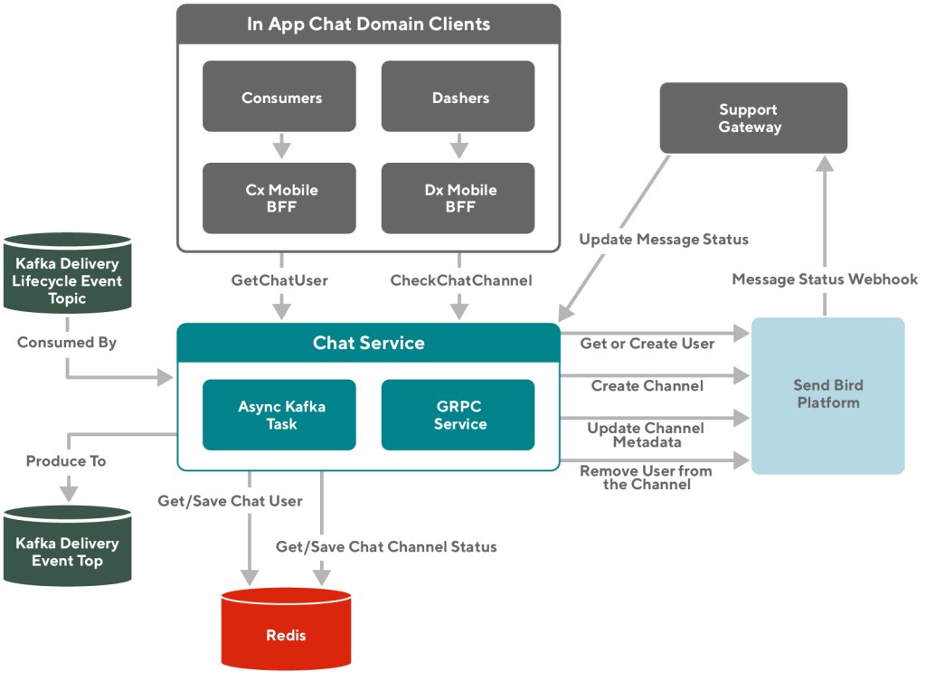
We use a microservice called the Feed Service to power our explore page, which serves as the entry point for requests during the entire consumer session. The Feed Service orchestrates request responses by fetching data from different content providers, adding context, and building personalized display modules as a feed-style response before returning back to the clients.

However, the Feed Service’s previous system faced several limitations, making it difficult to scale the explore page with more restaurants, stores, and carousels. 

Inefficient calls to other systems 

Our explore page made an unnecessary amount of calls to downstream services to get the information it needed to show results to users. For every carousel we built, the system repeated the same discovery flow of retrieval, ranking, and content hydration, making duplicative content calls. As the number of carousels we served increased, this inefficient system could not scale.

Inter-carousel ranking limitations

The ranking process, which determines the order we show selected restaurants and stores on the explore page, was performed within the same service, called the Search Service, as the retrieval process, which meant that ranking could only be done among the stores or restaurants being retrieved. Because we fanned out the retrieval flow for every carousel, the ranking could only be done within the carousel. This approach prevented us from organizing the carousels in the most optimized manner for users, and further stopped us from showing more carousels when we could not use ranking to select the most relevant ones. 

Minimal modularization

As mentioned above, each discovery flow can be broken down to retrieval, ranking, and content hydration steps. But these steps are not extracted or distilled out of an existing service. For example, candidate generation functionality is implemented separately across multiple applications which have strong overlapping functionalities. The lack of modularization in this system made the continuous development overhead proportional to the complexity of the existing logic, as any updates to candidate generation needed to be duplicated in all instances. 

Modularizing with a pipeline design pattern

We converted the existing serving paths in the Feed Service from highly imperative to somewhat declarative with abstractions. We structured the system into a pipeline (a.k.a workflow) design pattern by grouping common functionalities into the same module and including an operator, such as a job or node, in the pipeline. For example, we abstract the concepts of candidate retrieval and store fetching from the Search Service as one specification of a candidate generation operator. Similarly, we can have more operators for ranking, content hydration, and post processing. Individual operators have standardized framework-level support for guardrails, observability, and context propagation.

Running jobs with a DAG-based pipeline

We use a DoorDash-developed execution core called Workflow that dispatches threads and coroutines based on directed acyclic graph (DAG) dependencies and executes the actual jobs. As mentioned above, each job in the pipeline represents a module of common functionalities, which serves as a higher abstraction, and can be:

  • Evolved by more complex implementation.
  • Extended by other explore applications which share similar workflows.

As shown in Figure 1, below, the new explore page content generation process can be broken down into the following jobs:

  • Candidate Retrieval: Fetch data sources from external services that provide the content of the page, such as the Search Service for stores and the Promotion Service for carousels’ metadata. In this case, we only fetch data sources once for the contents on the entire explore page to avoid duplicate calls.
  • Content Grouping: Grouping content into a set of collections that can be later used for ranking and presentation, such as grouping stores based on association of carousels or store list on the explore page. 
  • Ranking: Rank the entities within each grouped collection. This step involves resolving the correct model ID, generating the feature values, and making a call to the machine learning prediction service to compute the scores for each ranked candidate. 
  • Experience Decorator: For the unique set of stores across all collections, we need to hydrate them from external data sources for more user experience-related information, including fetch ETA, delivery fee, images URL, and ratings for stores being displayed.
  • Layout Processor: This processor collects all the data being fetched and produces placeholders for different presentation styles, including the explore page, form data models for carousels, store lists, and banners.
  • Post Processor: Rank and post-process all the elements, such as carousels and store lists, on the explore page that are being processed so far in a programmatic way to optimize the user experience.
A diagram showing modular processes
Figure 1: In our new pipeline, we modularized processes for greater scalability. Candidate retrieval gathers stores and restaurants from providers, then hands them off to other modules, such as Ranking and the Layout processor to prepare them for display on the explore page.

Separating ranking from retrieval

Transitioning ranking from the Search Service to the Feed Service makes the Search function a pure recall dependency while leaving the Feed function responsible for personalization precision. This change means we are now able to perform personalized ranking both within collection elements, such as carousels and store lists, as well as across them. Each user will see a completely personalized explore page with ranked elements, along with individual elements showing ranked restaurants and stores. 

Having the ranking module inside of the Feed Service lets us implement more complex features into a separate service which governs all business logic relating to recommendations and personalization. Used in this way, the ranking module becomes a lightweight abstraction making the Feed Service more scalable.

Improving Observability

We can introduce system telemetry on top of our pipeline, in addition to the existing consumer telemetry data from end-user applications, as shown in Figure 2, below. The telemetry automatically captures workflow components’ context and results, enabling standardized collection of high fidelity details, essentially letting us know what happened and why within the system. Engineers and functional stakeholders will be able to tap into this data through a self-service interface, providing an in-depth understanding of the quality of our personalization algorithms.

Diagram showing system, noting observability
Figure 2: Observability built into our system not only helps us understand consumer behavior, but also achieves traditional system monitoring to prevent outages.

Results

This project was successful in many ways, as it builds a flexible architecture for DoorDash to scale in the years to come, unlocks opportunities for more personalized products and features, and sets the foundations for new discovery-like applications.

Reduce computing resources 

We saw tremendous improvement in system metrics in all downstream services. In particular, we observed:

  • 35% p95 latency reduction for the explore page feed endpoint and 60% CPU reduction from the Feed Service.
  • 80% queries-per-second reduction and 50% CPU reduction from the Search Service.
  • An overall reduction of an estimated 4,500 CPU cores usage.

Unlock cross-carousel ranking

The new system has enabled us to experiment with algorithms that rank across all elements on the explore page, including carousels, store lists, collection tiles, and banners, to ensure that:

  • The most relevant content ranks at the top.
  • Less relevant content can be trimmed from lists and other display elements, reducing the page size.

Build foundations for other applications

We extended the workflow design pattern to other explore-related applications using a similar sequence of operations, such as search and cuisine filters, convenience store pages, and offer hub pages. As each module is an abstraction, each application can either have its own implementation of the module or share the generalized implementation. This change improved both our development productivity and made code maintenance much easier.

Conclusion

To sum up, like many tech companies, DoorDash faces the challenges of scaling its explore page for recommending the best content to users. However, our previous Feed Service-based system had several limitations. We solved our scaling challenges by introducing a pipeline design pattern which modularized each common operator, resulting in a great improvement in efficiency both in terms of system and development. 

Although the new system has been a success, by no means will it be the last iteration of our continuous improvement on optimizing DoorDash’s explore experience. There will be more iterations on fine tuning each module of the system to become more efficient and flexible, such that Feed Service can become more lightweight and scalable for DoorDash’s rapid growth in the years to come.

Engineering teams tackling scaling problems might find a solution in the pipeline design pattern. It allows for modularization of components in a workflow, creating a more flexible system with functions that can be used in multiple applications and features. It can also lead to significant efficiency gains through elimination of duplicative code and processes.

Acknowledgements

Thank you to Jimmy Zhou, Rui Hu, Sonic Wang, Ashwin Kachhara, Xisheng Yao, and Eric Gu for their involvement and contribution to this project, and special thanks to Yimin Wei for building the Workflow execution engine. 

Header image by Peter H from Pixabay.

At DoorDash, we want our service to be a daily convenience offering timely deliveries and consistent pricing. Achieving these objectives requires a good balance between the supply of Dashers (our term for delivery drivers) and the demand for orders. 

During periods of high demand we generally increase pay, providing an incentive to ensure enough Dashers are available for consumers to receive their orders as quickly as possible. We do not pass through this increased pay to consumers, who will pay the same fees no matter the time of day. 

Given the complexity of offering Dashers peak demand pay, we built a new mobilization system that allocates incentives ahead of any anticipated supply and demand imbalance. When building this system, we focused on the following things:

  • Defining our supply and demand measurement metrics and project objectives clearly
  • Generating high-fidelity forecasts for supply and demand
  • Setting up a new optimization process for incentive allocation under constraints
  • Managing uncertainty 
  • Improving reliability and maintainability of the system

How do we quantify supply and demand imbalance?

When outlining the problem of supply and demand imbalance, it is useful to adopt the context of all the affected parties:

  • For consumers, a lack of Dasher availability during peak demand is more likely to lead to order lateness, longer delivery times, or inability to request a delivery and having to opt for pick up. 
  • For Dashers, a lack of orders leads to lower earnings and longer and more frequent shifts in order to hit personal goals.
  • For merchants, an undersupply of Dashers leads to delayed deliveries, which typically results in cold food and a decreased reorder rate.

With this context, it becomes clear that the ideal scenario would be to have a system that balances supply and demand at a delivery level instead of market level, but this is not realistic when choosing market-measurement metrics. Balancing at the delivery level means every order has a Dasher available at the most optimal time and every Dasher hits their pay-per hour target.

Stay Informed with Weekly Updates

Subscribe to our Engineering blog to get regular updates on all the coolest projects our team is working on

In contrast, market-level balance means there are relatively equal numbers of Dashers and orders in a market but there are not necessarily optimal conditions for each of these groups at the delivery level. In practice, the variance level for supply and demand driven by Dasher and consumer preferences and other changing conditions in the environment, such as traffic and weather, make it difficult to balance supply and demand at the delivery level. Hence, we focused on market-level metrics to define the state of each market, even though a delivery-level metric would have provided a more ideal outcome. 

For our primary supply and demand measurement metric, we looked at the number of hours required to make deliveries while keeping delivery durations low and Dasher busyness high. By focusing on hours, we can account for regional variation driven by traffic conditions, batching rates, and food preparation times. 

To understand how this metric would work in practice let’s consider an example. Let’s imagine that it is Sunday at dinner time in New York City, and we estimate that 1,000 Dasher hours are needed to fulfill the expected demand. We might also estimate that unless we provide extra incentives, only 800 hours will likely be provided by Dashers organically. Without mobilization actions we would be undersupplied by about 200 hours.

We generally compute this metric where Dashers sign up to Dash and to time units that can span from hourly durations to daypart units like lunch and dinner. It is very important to not select an aggregation level that can lead to artificial demand and supply smoothing. For example, within a day we might be oversupplied at breakfast and undersupplied at dinner. Optimizing for a full day would lead to smoothing any imbalance and generate incorrect mobilization actions.

Once we decide on the health metric and the unit at which we take actions, we proceed with balancing supply and demand through adjustments to supply. Our team generally adjusts the supply side of the market by offering incentives to increase Dasher mobilization when there is more demand. Through incentives, we provide Dashers a guarantee that they will earn a fixed amount of money on any delivery they accept in a specific region-time unit. We will describe in the following section how forecasting and optimization plays a role in that.

How do we forecast supply and demand at a localized level?

Now that we have a metric to measure supply and demand levels, a unit of region/time to take actions, and actions we take to manage supply, we can determine our forecasting requirement details and how we forecast each market’s supply and demand conditions.

Defining forecasting requirements

Given that the forecasts we generate are meant to be used in an automated system, both the algorithm we use for forecasting and the subsequent library ecosystem we would rely on can have a large impact on maintaining automation in the long run. We primarily reformulated the forecasting problem into a regression problem and used gradient boosting through the Microsoft-developed open source LightGBM framework. There are a couple of reasons behind this choice.

Support for multivariate forecasting

Many univariate forecasting approaches do not scale well when it comes to generating thousands of regional forecasts with low-level granularity. Our experience strongly supports the thesis that some of the best models are created through a process of rapid prototyping, so we looked for approaches where going from hypothesizing a model improvement to having the final result can be done quickly. LightGBM can be used to train and generate thousands of regional forecasts within a single training run, allowing us to very quickly iterate on model development. 

Support for extrapolation

As DoorDash expands both nationally and internationally, we need our forecasting system to be able to generate some expectations for how our supply and demand growth would look in places where we don’t currently offer our services. For example, if we launch in a new city, we can still make reasonable projections regarding the supply and demand trajectory even with no historical data. Deep learning and traditional machine learning (ML)-based approaches work particularly well in this case, since latent information that helps with extrapolation can either be learned through embedding vectors or through good feature engineering. Information about population size, general traffic conditions, number of available merchants, climate, and geography can all be used to inform extrapolation.

Support for counterfactuals

Forecasts are used to set an expectation of what will happen but they are also inevitably used to guide the decision-making process. For example, our stakeholders would ask us how conditions would change if we changed incentive levels in our supply forecast model so that we can understand how to make tradeoffs between supply and costs. These types of counterfactuals are very helpful not only in forecasting what we think will happen, but in also estimating the impact of actions we are going to take. In LightGBM, approximate counterfactuals can be generated by changing the inputs that go into the model at inference time. 

Small dependency footprint

We wanted the forecasting system to have a minimal dependency footprint, meaning that we were not overly reliant on a host of third-party libraries. This requirement immediately removed a lot of the auto-forecasting approaches, where installing one library often meant installing 100-plus additional libraries, or approaches that provided unified toolkits and had a large number of transitive dependencies. A bloated footprint creates compatibility issues, upgrade challenges, and a large exposure area to security vulnerabilities. LightGBM has a very small dependency footprint, and it is relatively painless to perform upgrades. 

Thriving community

Lastly, we wanted to rely on an ecosystem with a thriving community and a strong core maintainer group. Maintaining an open source library is challenging. A library might be created by a graduate student or one to three core developers working within a company. Nonetheless, folks find new interests, new jobs, switch jobs, find new careers, or abandon careers. Keeping track of issues and bugs related to a library is often not a priority a few years or months down the line. This eventual lack of support then forces users to create internal forks in order to adopt the forecast tooling for their use cases or engage in a complete remodelling exercise. For these reasons, when selecting a tool, we looked at metrics like release cycles, number of stars, and community involvement to ensure there would be good community maintenance into the future. 

Forecasting with ML

Forecasting in the context of a pure regression problem can have it’s challenges, one of which has to do with understanding the data generation process and the causality between the inputs and outputs. For example, Figure 1, below, shows how our incentives relate to the growth in the number of Dasher hours.

Figure 1: This data suggests that there is a non-linear relationship between incentives and mobilization, with higher incentives seeing an increase in Dasher hours and very high incentives related to a dramatic drop in hours. This counterintuitive relationship can often be a sign of either an omitted variable bias or simultaneous causality bias.

If we blindly rely on the model to learn causality through correlations found in the data, we would’ve created a system that would mistakenly assume that providing very high incentive levels would lead to fewer Dashers on the road. A causal interpretation, where high growth incentives would lead to a decrease in mobilization would be nonsensical. 

It is more likely that the model is simply missing a confounding variable. For example, in periods associated with bad weather or holidays, Dashers want to spend time inside or with their families. We are more likely to see a decrease in availability during these times, triggering our supply and demand systems to offer higher incentives to keep the market balanced. 

A model lacking knowledge of weather or holidays might learn that high incentives lead to fewer Dasher hours, when the causal relationship is simply missing a covariate link. This example illustrates why it becomes important to figure out a way to sometimes constrain relationships found in the data through domain knowledge, or to rely on experimental results to regularize some correlational relationships identified by the model and not blindly apply the algorithm to the available data.  

A second challenge has to do with a common truism found in forecasting, which is that the unit of forecasting needs to match the context at which decisions are made. It can be tempting to forecast even more granularly, but that is generally a bad idea. This can be easily demonstrated through a simulation.

Consider the following three sub-regions describing daily demand by drawing samples, as shown in Figure 2, below, from a normal distribution with a mean of 100 and standard deviation of 25, giving us a coefficient of variation of 25%. When we aggregate these regions, we simply sum the expected mean to get an expected aggregate demand of 300. Nonetheless, the combined standard deviation is not equal with the sum of standard deviations but with the sum of the variances 
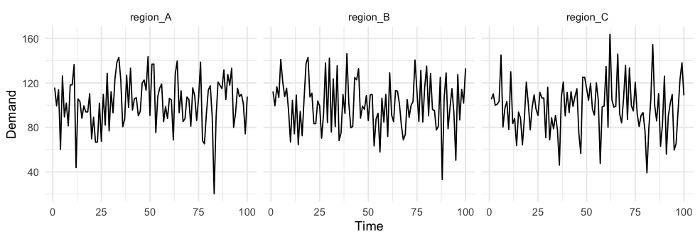
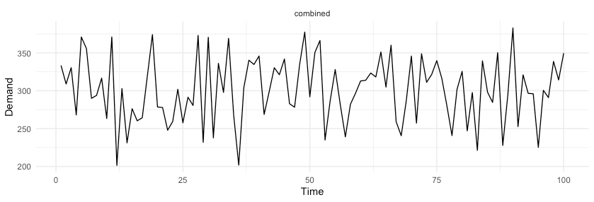
, which gives us a coefficient of variation of the combined forecast of 14.4%. By simply aggregating random variables, we were able to reduce variance with respect to the mean by over 40%. 

Figure 2: The top panel shows demand for three subregions. The bottom panel simply represents the aggregate demand. The relative variance in the bottom panel is reduced by 40% by performing aggregation of random variables.

Although data aggregations can help with getting more accurate global forecasts, actions done on aggregated data can lead to inefficient mobilization. It is best to go for a solution where the unit of forecasting matches the unit of decision making.  

Choosing an optimizer

One benefit of using ML algorithms is that they provide more accurate expectations of what will happen given the input data. Nonetheless, ML algorithms are often simply a building block in a larger system that consumes predictions and attempts to generate a set of optimal actions. Mixed-integer programming (MIP) or reinforcement learning (RL)-based solutions are great in building systems that focus on reward maximization under specific business constraints. 

We decided to pursue a MIP approach given that it was easy to formalize, implement, and explain to stakeholders, and we have a lot of expertise in the domain. The optimizer has a custom objective function of minimizing undersupply with several constraints. The objective itself is very flexible and can be specified to favor either profitability or growth, depending on the business requirements. In the optimizer, we generally encoded a few global constraints:

  • Never allocate more than one incentive in a particular region-time unit.
  • Never exceed the maximum allowable budget set by our finance and operations partners.

Depending on requirements, we might also have different regional or country constraints, such as having different budgets, custom penalties, exclusion criteria for which units should not be included in the optimization, or incentive constraints that are guided by variability of the inputs. 

Dealing with uncertainty

Uncertainty in the inputs plays an important role in how the optimizer allocates incentives when resources are limited. To demonstrate, Figure 3, below, displays the distribution of the hypothesized supply and demand imbalance in two cities.

Figure 3: In City A, we believe that we will be undersupplied and are also generally confident in our prediction. In City B, our mean prediction is that we will be slightly oversupplied, but we are less certain in our estimate and there is some likelihood of experiencing large undersupply. 

If the optimizer knows nothing about uncertainty, it ends up with two issues. First, it will lack understanding that supply and demand balance can go from a spectrum of extreme undersupply to extreme oversupply. If the optimizer is set up to optimize under some preset thresholds, it would miss the chance to optimize for City B because the mean of the distribution is above zero. 

The second issue is that it would end up over-allocating resources in places where our forecasts are uncertain. Our forecasts tend to be noisiest in the long tail of small regions that have few Dashers and few orders. Because the count of these regions is large and they exhibit high variance, if we don’t explicitly account for this uncertainty we are more likely to generate estimates that by chance will have high undersupply, and thus over-allocate incentives to places that exhibit high variance relative to places that have low variance. 

To address the issue of variance, we generate expected estimates of hours gap from forecasts using a resampling process. By performing resampling, we essentially measure the impact of undersupply in the context of the likelihood of that happening. For example, in Figure 3, above, City B has only a 34% chance of being undersupplied. However, if that happens, we can more accurately estimate the impact of sizable changes in undersupply. Either of these approaches lead to a more optimal decision in incentive allocation instead of simply using mean estimates from upstream forecasting inputs.  

Reliability and maintainability improvements

DoorDash has grown tremendously in the last year. More than 70% of the people at DoorDash joined in the 2020-21 period. This generally brought a wave of new engineering, product, platform, and infrastructure-related projects to help with continued growth, expansion, and scalability. For example, we had dozens of internal projects that related to breaking down our monolith and adopting a more microservice oriented architecture. We had hundreds of small and large projects related to product improvements or new vertical launches. Many of these projects came with changes in our data models and in our data generation and collection processes. Unfortunately, ML models can be terribly unreliable when the ecosystem for how data gets produced and exposed is constantly shifting, so we needed to make some changes to enhance the reliability of our system.

Decoupling data dependency chains

We could use many different data sources and encode hundreds of features to build a model that has high performance. Although that choice is very appealing and it does help with creating a model that performs better than one that has a simple data pipeline, in practice it creates a system that lacks reliability and generates a high surface area for feature drift, where the distribution of the inputs changes over time. Hence, when building our forecasting models, we went for simplicity and reliability first. This strategy also helped us move more quickly towards creating an end-to-end mobilization system.

Complex pipelineSimple pipeline
Performance relative to naive (in 1 month)GreatAverage
Performance relative to naive (in 2 months)AverageAverage
Performance relative to naive (in >3 months)TerribleAverage
Remodeling BurdenHighLow
Oncall BurdenHighLow
Figure 4: Models that have complex data pipelines generally can show their strength in the first weeks of deployment but rapidly deteriorate over time. Simple data pipelines are generally more robust and reduce maintenance and remodeling burden.

To manage complexity and shifts in how data gets exposed, we did two things. First, we decoupled data pipelines from each other into separate business domains. Now, when someone is working on improving the signal for the inputs used in forecasting, they do not need to be overwhelmed by monolithic queries and data pipelines. Instead, a developer works on an isolated pipeline and only needs to ensure that aggregations are done on an appropriate entity. 

The second thing we did was to remove intermediary data dependencies. We recognized that if our input signals come from ETL jobs with very long dependency chains in their directed acyclic graphs (DAGs), we would increase our surface areas for failures. Hence, we would aspire to rely on primary tables thoroughly vetted by our Business Intelligence team or a copy of production data sources for which the data generation is not hidden behind complex ETLs. 

Figure 5:  In this example, task E is the ML task with data transformations. If the source data for ML models comes from a long dependency chain in the ETL systems (A through D), there is a high risk of experiencing feature drift and data failures if any of the upstream dependencies fail. 

Focus on experimentation

One of the best ways to test if our system is maintainable is to simply check on the iteration speed with which we can push new changes and launch experiments without creating bugs or introducing regressions. At DoorDash, we perform many experiments to determine whether a feature is working as intended. This generally means that we put a lot more emphasis on measuring the software quality by how quickly we can extend and deliver on new functionality. Unsurprisingly, if experiments are challenging to launch and new features are difficult to test, we have failed in our goal. 

Similarly, if a system stays unchanged over a long period of time (e.g., six months or more), it would also be an indication that something is wrong, because it means we created a system that is rigid and does not invite improvements, ideation, and experimentation. Continuous experimentation is a forcing function towards adopting better practices, such as relying on a CI/CD system for automation, setting up library dependency management, decoupling the code into business domains, and adding testing, alerting, and documentation. 

Results

Implementing this mobilization system let us more accurately allocate incentives to regional-time units that benefited most from the improved supply and demand balance. The system resulted in a better experience for our customers, as our metrics showed reductions in delivery times, cancelations, and extreme lateness. For Dashers, we were able to ensure that incentives are allocated in places where they are needed most. For merchants, we drove the overall order cancellations down. Moreover, due to improvements in forecasting accuracy, we were also able to more reliably hit budget expectations and observed less variability in spending decisions. Because of reliability improvements, we were able to get to a point where our experimentation velocity on the incentive mobilization system rapidly increased.

Conclusion

Problems that deal with optimizing a system under constraints benefit immensely from aligning on metrics that estimate the impact of actions at an appropriate level of aggregation. If forecasts are done daily, but optimization actions are taken sub-daily, decision making will likely be suboptimal. 

Secondly, we generally recommend decoupling forecasting components from decision-making components. Most optimization systems work better if the inputs have stable statistical properties where the forecast predictions are unbiased estimates. For example, it can be tempting to start using an asymmetric loss function in forecasting to align with whether we care more about underpredicting or overpredicting the output. Although this approach is perfect for a variety of problems where the output of an ML model is immediately used to drive the decision, for problems where the ML predictions are simply another input into a broader optimization engine, it is best to generate unbiased predictions. Instead, it is better to let an optimization engine handle tradeoffs. 

If you are passionate about building ML applications that impact the lives of millions of merchants, Dashers, and customers in a positive way, consider joining our team.

Acknowledgements

Many thanks to Jared Bauman and Dan Madwed for helping brainstorm the architecture of the new system, Gary Ren for guiding us through the complexity of Supply-Demand engineering components, Henry Liao for streamlining experimentation, and Matthew Ferro and Eugene Braude for pushing for increased automation.

A proper optimization framework for data infrastructure streamlines engineering efforts, allowing platforms to scale. Although an engineering organization may plan for growth and extensibility, rapidly growing datasets are an issue almost every data team will eventually encounter. 

In 2020 DoorDash saw accelerated growth in each section of our three-sided marketplace: more customers ordering on our app, more merchants on the platform, and more Dashers (our term for delivery drivers) willing to make deliveries. This growth led to more data processing, but we still had to meet the same SLAs with our business partners, which includes dashboard consumers, advanced SQL writers, and data scientists.  Continuing to meet our SLAs required optimizing our ETL jobs to better handle the increased load and data usage. 

At DoorDash our data warehouse is in Snowflake. Although we could have just increased our compute resources to handle the additional load, we instead decided to implement an optimization framework for our ETL jobs to meet our SLAs without increasing costs. 

Order of optimization

We devised this list of optimizations to prioritize our efforts by focusing on the items with the least effort and the most cost savings:

  1. Can this ETL be decommissioned?
  2. Can we break dependencies in the directed acyclic graph (DAG)? 
  3. Can this ETL be done incrementally? 
  4. Can we reduce the number of columns? 
  5. Can we stop data spillage by splitting queries into a smaller dataset?
  6. Can we implement clustering?
  7. Can we utilize Snowflake functions?

Decommissioning an ETL job saves all of that job’s compute usage, while adding clustering to a column may just speed up GROUP BY/ORDER BY SQL functions, which is less effective. Many of the optimizations can be used together, such as using a Snowflake function and reducing the number of columns. For each optimization, we will discuss the implementation steps and associated tradeoffs. 

Can this ETL be decommissioned?

With new data sources and processes appearing, it’s important to remove any legacy ETL jobs that are no longer in use. By tracing the DAG downwards we can do an impact analysis to see if a job can be removed. An impact analysis consists of:

  • Finding all tables, reports, and ETL jobs that rely on the ETL job we intend to remove
  • Looking at how the job is utilized. For example, if the table is used in a LEFT JOIN it may be a candidate for removal, because LEFT JOINs may have fields that can be removed without impacting other fields in something like an INNER JOIN
  • Looking upstream to check if the source tables are still providing accurate data. More often than not it’s better to provide no data than inaccurate data.

(For further explanation of DAGs in terms of ETL, checkout this Apache Airflow documentation page.)

By decommissioning ETL jobs teams can free up compute resources for other jobs to run. This reduces the overall compute cost and helps meet SLAs at the same time since there are fewer jobs being processed.

Can we break dependencies in the DAG? 

If the ETL can not be decommissioned, the next step is to try to break up its dependencies. For example, let’s say we have two jobs that feed into a job downstream. Both of these source tables are needed in the target table and we can not rewrite the SQL query. One job, dataset_a, runs at 3 am and the other job, dataset_b, runs every hour. Our downstream job, daily_aggregate, has an 8 am SLA. We can see what the dependencies look like in Figure 1:

Figure 1: In a diagram of the ETL workflow described above, the dotted line from dataset_b to daily_aggregate represents the left join. We can potentially remove the dependency on dataset_b to help the daily_aggregate job complete before 8 am.

Let’s assume that daily_aggregate is sourced from dataset_a with a LEFT JOIN to dataset_b. The data from dataset_b is run hourly so we just need the data that was most recently processed up to when daily_aggregate is built. Let’s also assume that dataset_b’s ETL usually takes 15 minutes to run, but an increase in the data volume can make processes take up to 45 minutes to complete. Initially, daily_aggregate depended on both dataset_a and dataset_b to complete before starting. Without changing any SQL we can just remove dataset_b from the DAG, as shown in Figure 2, below:

Figure 2: Removing dataset_b, which suffered from unusually long processing times, from our ETL job helps us meet our 8 am SLA.

Since we know that dataset_b is LEFT JOIN’ed to dataset_a, and we know how LEFT JOINs work, we may be able to remove daily_aggregate’s dependency on dataset_b. This helps us achieve our SLA now that we do not have to wait for dataset_b to complete at a specific time.

Reducing extraneous dependencies in DAG configurations breaks up excessively large DAGs and reduces complexities. This optimization is also a cheap and effective way to hit SLAs. No additional computation power, like scaling up the Snowflake warehouse, is required.

Can this ETL be done incrementally?

Over the last year, we had to revamp many of our ETLs in order to ensure that all our data  was  processed daily.  Before our optimizations, jobs that were designed to handle full-table refreshes started to spill to the disk. Some of our datasets grew five times over a short period of time but our SLAs remained the same. 

One way we met our SLAs was to switch many of our ETLs to incremental jobs. Running an incremental ETL means only inserting or updating changed records in a table instead of replacing the whole table. By doing incremental jobs it is possible to avoid reprocessing data that has not changed. 

At DoorDash, attributes related to Dasher logistics, such as a Dasher ID, order level information, and fees associated with the orders usually do not change over time. In this case, deleting all the records and loading the same information, again and again, is unnecessary. Architecting the ETL jobs so that Snowflake processes only the required data helps boost performance because less data processed usually means faster processing times. 

Can we reduce the number of columns in the SELECT clause of the query? 

Routinely reviewing what columns are used in an ETL is a good way to reduce the amount of data processed. As applications change, columns upstream may be deprecated. These columns can be pruned from the ETL. Given how Snowflake stores  data in columnar format, we avoid using SELECT * FROM Tablename in any ETL scripts. It is always advisable to use SELECT on only the required columns from the table. 

Confining SELECT to the required columns serves multiple purposes in improving the performance of queries:

  • By avoiding selecting all the columns from the table the volume of the dataset at the time of processing is reduced, increasing the performance
  • This approach reduces caching of unnecessary data in memory

Can we stop data spillage by splitting queries into a smaller dataset?

Most of the time, query performance is impacted by the data volume and the cluster it is running on. When increasing the cluster size is not an option, we need to think about handling the data volume at the time of execution.

In that case, identifying the bottleneck is the first step towards query performance improvement. We used Snowflake’s Query Profile to identify the issue causing the slowness. 

When operating certain queries with multiple joins or heavy aggregate operations there is a chance that the data volume exceeds the compute memory and starts spilling into remote and local storages. Working on the data spilled in remote/local storage takes a much longer time compared to working with data in memory. In this case, we can process the data by splitting the queries into the smaller datasets and then combining the resulting set. 

Reducing data spillage decreases the compute time of queries. Splitting queries also reduces the compute cost on Snowflake. One thing to watch out for is trying to over-optimize a query into too many steps. A good way to check for this is to again use Query Profile to see how changes differ in the execution plan.

Can we implement clustering?

If queries are running slow or the query profile suggests it is scanning all the partitions of the table, it’s an indication that this table requires a cluster key on the appropriate dimension. Snowflake supports clustering keys for large tables. 

Cluster keys help partition the table based on the defined dimension and helps reduce the partition scan on large tables. We need to analyze the frequent queries and joins running the large table and decide the dimension to be clustered based on the attribute most used in the filter and join conditions.

When taking this approach, it’s important to note that:

  • Clustering keys should not be defined on low cardinality, one or two distinct values, or high cardinality, too many distinct values, such as timestamps.
  • Clustering comes with an associated cost in compute resources and storage.

Can we utilize functions within Snowflake?

Another way to optimize queries is to use Snowflake functions within the code. This improves code readability and reduces the chance of error with hard-coded formulas.

A common question in our business is “How far is X from Y?” Distance can be tricky to calculate in SQL given the curvature of the Earth. In these cases, we use Snowflake’s built-in HAVERSINE function. Haversine calculates the great-circle distance between two points on a sphere given their longitudes and latitudes, formatted as HAVERSINE( lat1, lon1, lat2, lon2 ).

QUALIFY is another useful function for removing duplicate values from a query. Qualify is to Window Functions in Snowflake as HAVING is to GROUP BY in SQL: It allows one to filter out rows based upon the results of a Window function. This is especially helpful in avoiding a second pass-through of the data. Here’s an example from Snowflake:

Without QUALIFY 


With QUALIFY 

Conclusion

For DoorDash’s Data team, getting 1% better every day means deploying new ETLs or optimizing old ones constantly. Having our Order of Optimizations checklist allows us to approach optimization from many different angles. As our team grows, we hope to add more levels of detail to deliver results faster and more predictably. 

Our team not only focuses on delivering fast and reliable data, but also on optimizing the data pipelines. This reduces our compute resource usage and makes our processes more efficient. Having the opportunity to learn how data flows through our applications and what that means for the business is one of the more exciting parts of our role.

If you’re interested in solving interesting data problems, come check out a role on our team.

Acknowledgements

Thanks goes out to DoorDash’s Business Intelligence team, and a special shout out goes to Josh Li for sharing Snowflake functions to the larger team.


Between 16:30 PDT and 18:40 PDT on June 19th 2021, DoorDash experienced a system-wide failure for approximately two hours that saddled merchants with undelivered meals, rendered Dasher’s unable to accept new deliveries or check in for new shifts, and left consumers unable to order food or receive their placed orders in a timely fashion via our platform. The cause was a cascading failure of multiple components in DoorDash’s platform, which put extreme load on our internal payments infrastructure, eventually causing it to fail. The current analysis shows no leading indication prior to the incident triggering at 16:30 PDT, with mitigation taking significantly longer than the standard we aim to hold ourselves to as an engineering team.

We fully understand our responsibility as a commerce engine whose primary aim is to grow and empower local economies. As an engineering team, we firmly believe that reliability is our number one feature, and in this instance we failed, plain and simple. Customers will be refunded for orders that were cancelled as a result of this outage. Merchants will be paid for orders that were cancelled during this period, as well. And Dashers will be compensated for orders they were unable to complete and any ratings that were less than five stars during the outage will be removed from their Dasher history. For those interested in the technical causes, subsequent mitigation and prevention initiatives that we’ve undertaken since the incident, please feel free to read on.

The impact of the outage

From 16:30 PDT to 18:36 PDT, most Dashers were unable to accept new deliveries or check in for their shifts, which significantly degraded DoorDash’s delivery fulfillment capabilities. As a result, at 17:19 PDT DoorDash took action to halt new orders from being placed by our customers and at 17:22 PDT implemented the same action for DoorDash’s Drive partners. Upon finding and fixing the cause of the incident, DoorDash subsequently re-enabled Drive partner’s order placing capability at 18:22 and re-enabled full ordering capability for DoorDash customers between 18:32 PDT and 18:39 PDT. 

Timeline

All times PDT on 06/19/2021

  • 16:30 Latency for some internal payments APIs begin to rise.
  • 16:30 Memory and CPU for internal payments related deployments begin to rise.
  • 16:30 Dasher related services begin to exhibit increased latency and the Dasher app begins to present errors to Dashers that prevent them from accepting new orders and checking in for new shifts.
  • 16:35 System wide alerts begin to trigger with engineers being paged.
  • 16:40 Payments systems are scaled out by 50% in an attempt to alleviate CPU and memory pressure.
  • 16:59 Payments systems were restarted but no sustained recovery was realized.
  • 17:01 Cascading failures increase call volumes on payments by five times  the normal levels.
  • 17:19 DoorDash halted all new consumer orders.
  • 17:22 DoorDash Drive was disabled for merchant partners.
  • 18:12 The Engineering team was able to pinpoint the source of increased traffic within Dasher systems which was in turn putting pressure on our payments services.
  • 18:12 All traffic to Dasher systems was stopped at the network layer to allow systems to recover.
  • 18:20 All traffic was re-enabled to Dasher systems at the network layer but problems re-emerged.
  • 18:22 DoorDash Drive was re-enabled.
  • 18:25 Config was deployed to Dasher systems to prevent downstream payment calls which alleviated the cascading failures.
  • 18:26 All traffic to Dasher systems was stopped at the network layer for a second time to allow systems to recover.
  • 18:28 All  traffic was re-enable to Dasher systems at the network layer.
  • 18:29 Dasher and payment system health  sustained.
  • 18:32 Consumer ordering is re-enabled for 25%.
  • 18:37 Consumer ordering is re-enabled for 50%.
  • 18:38 Consumer ordering is re-enabled for 100%.

Root cause analysis

Starting at 16:30 PDT on 6/19/2021, the payments infrastructure began to exhibit high latency when fetching data required by the Dasher App and its supporting systems. While teams were diagnosing this high latency and the resulting failures, retry attempts from the Dasher systems compounded the issue as additional traffic caused by these retries strained the payment infrastructure that was already unhealthy. This led to Dashers not being able to fulfill orders, causing poor experiences for all consumers, Dashers and merchants. Though we have defined and documented best practices for the interaction between components that would help us mitigate these scenarios, the components involved in this incident (payments and Dasher) did not have these patterns implemented.

A root cause of the issue is the lack of defensive programming techniques such as load shedding and circuit breaking designed to protect distributed systems like ours from the catastrophic failures like what we were experiencing. In this case, the server (payments infrastructure) lacked the implementation of load shedding, which would have prevented it from collapsing due to elevated request volume as a result of higher latencies. The client (Dasher App and systems) lacked the implementation of circuit breaking, which should have triggered to temporarily bypass its invocation of an unhealthy downstream dependency. 

The DoorDash engineering team has spent every hour since the conclusion of the incident implementing corrective actions and defensive coding practices while actively investigating the origins of the payments infrastructure original trigger.

DoorDash’s corrective actions

The first change introduced a load shedding mechanism to the payments infrastructure that triggered the incident. This mechanism, deployed successfully to production at 6/20/2021 07:36 PDT, armed the payments infrastructure with the ability to gracefully shed inbound request volume exceeding thresholds beyond operating capabilities. 

The second change introduced circuit breaking mechanisms to the Dasher infrastructure and operating playbook. This mechanism enables Dasher infrastructure to bypass its dependency on the payments infrastructure in the event of service instability. With these changes we are confident that our Dasher infrastructure can withstand similar downstream instability with little to no system-wide impact.

The third action is a comprehensive audit of payment infrastructure’s interfaces and APIs to ensure that sufficient documentation exists and that the upstream call graph is well understood and fully diagnosable.

We believe these immediate changes will help prevent similar events from occurring and pledge to use this moment to complete a comprehensive audit of our systems to ensure that best practices and operational knowledge is well distributed and implemented. In time, we hope to regain the trust from those that we’ve lost and as always will aim to be 1% better every day.

The ability to attach auxiliary metadata to requests within a large microservice architecture enables powerful use cases, such as infrastructure-level sharding, language localization, and testing-in-production. Adding this context to requests allows services and infrastructure libraries to make local decisions, and it can be used by infrastructure components in the directed acyclic graph that requests follow. Although there are large benefits to enabling context in service-to-service requests, propagating this information for all our microservices is a challenge. 

To provide context to our requests, DoorDash is pioneering the adoption of the open source OpenTelemetry project to solve observability challenges for its diverse and expanding microservice architecture. OpenTelemetry relies on context propagation to stitch together the telemetry data for a particular request. With the dearth of open source or third-party solutions for custom context propagation, OpenTelemetry comes closest to being an off-the-shelf offering, which is why we pragmatically chose it over other options.

In this article we will go over our experience adopting and tailoring OpenTelemetry to propagate custom context in order to power a number of critical use cases. We will take a deep dive into how custom context improves our services, how we implemented OpenTelemetry-based propagation, and how we rolled out new versions of OpenTelemetry and handled security concerns.

Diving deep into custom context use cases

DoorDash uses custom context to power a number of important use cases. Remote Procedure Calls (RPCs) that microservices rely on to delegate work to other services use a standard transport protocol like HTTP or HTTP/2, and an encoding format like Protobuf, Thrift, or JSON to transmit requests and responses over the wire. Each service serves incoming requests using the data provided in the request. However, sometimes it is useful, or in some cases even required, to include additional data with the incoming request. One such example is having authentication tokens for the actors involved in a transaction. The authentication typically happens closer to the network edge and the resulting token can be passed as a protocol header instead of a separate request field for the service call graph.

Another use case is testing-in-production, which allows test traffic to flow through the production deployment. We attach a tenant-id context to every request, distinguishing test traffic from production traffic, letting us isolate data to ensure test traffic is not mutating production data. The data isolation is abstracted in the infrastructure libraries, which use context to route the traffic to specific infrastructure components like databases and caches. With large-scale microservice deployments, the industry is converging on testing-in-production for reliable testing with lower operational overhead.

Many of the use cases that rely on context propagation are critical for running our normal business operations. This puts stringent reliability and correctness requirements on the context propagation infrastructure.

Context propagation with OpenTelemetry

For propagation, the context can be embedded right into the request itself, for example, by modifying the request’s Protocol Buffers. However, a more flexible approach is to propagate the context as a protocol header. Using headers to propagate context scales especially well when there are a diverse set of services involved and when context needs to be propagated for most of the endpoints exposed by the services. Another advantage of using the header for propagation is that the caller does not need to explicitly add the context to the outgoing calls as the propagation can be implicit, hence adding a context becomes a less invasive change. 

OpenTelemetry requires propagation of trace headers. This includes the tracing IDs and vendor-specific headers. OpenTelemetry provides auto-instrumentation to help propagate trace headers across thread and service boundaries. Auto-instrumentation covers an increasingly large variety of libraries and frameworks across different languages. This is especially true for Java/Kotlin, which is used by most of the DoorDash backend services.

Some notable features of OpenTelemetry’s context propagation are that it:

  • Is available through auto-instrumentation.
  • Supports libraries and frameworks in a variety of languages that we use at DoorDash, including Java/Kotlin, Node, Python, and Go.
  • Is a vendor agnostic propagation format, which includes open formats like the W3C’s Trace Context and Baggage.
  • Supports synchronous flows like HTTP and HTTP/2, and asynchronous flows like Kafka.

OpenTelemetry supports multiple formats for propagation of context including Baggage, a format specifically designed for propagating custom context. 

OpenTelemetry propagation formats

OpenTelemetry supports a variety of propagation formats, like Trace Context, Baggage, Zipkin, and B3. At DoorDash we are standardizing on Trace Context for tracing data. For custom context propagation we are standardizing on Baggage.

A close look at OpenTelemetry’s propagation formats

Trace Context defines two headers: traceparent and tracestate.

A traceparent header, shown in Figure 1, helps uniquely identify an incoming request. It contains version, trace-id, parent-id, and trace-flags. This header helps stitch together the spans that a request generates as it flows from one component to another.

Figure 1: A traceparent header consists of opaque identifiers used for tracing.

The tracestate header, shown in figure 2, contains a key-value pair of arbitrary data that allow additional identifiers to be propagated along with the traceparent header. This header contains key-value pairs delimited by commas.

Figure 2: The Tracestate header is formatted as free text containing comma-delimited key-value pairs.

Tracestate can be used to propagate custom context, but there are a few limitations. The standard recommends the size of the header can be limited. Although this is not a hard requirement and the limit can possibly be increased by making it configurable, if it is changed it will need to happen for every service.

Baggage, shown in figure 3, is designed to propagate custom context that has much higher limits on the actual size of the data being propagated. It defines a header called baggage, which is very similar to tracestate.

Figure 3: The Baggage header is formatted as free text containing comma-delimited key-value pairs.

As shown in figure 4, custom context can be defined as a key-value pair similar to tracestate. Additionally, tags or properties can be defined for the key by appending them with semicolons.

Figure 4: Baggage headers can optionally contain additional properties for the key-value pairs.

We abstract away the storage/retrieval of the custom context in helper libraries for all the common languages in use at DoorDash. Service owners can introduce a new custom context by adding it to a central configuration, shown in Figure 5, which also serves as an allowlist. The configuration is a simple JSON allowing service owners the ability to define certain properties of the context.

{
 "test-workspace": {
   "max_length": 16,
   "allowed_from_client": true,
   "short_name": "tws"
 },
 "tenant-id": {
   "max_length": 16,
   "allowed_from_client": true,
   "short_name": "tid"
 },
 ...
}

Figure 5: This custom context allowlist shows two fields, test-workspace and tenant-id, with three properties each specifying maximum length allowed for the field, a flag to indicate if the field can be propagated from the web/mobile clients, and a short name used for actual propagation.

By introducing a custom context library, shown in figure 6, we can change the underlying implementation for context propagation. For example, this approach provides flexibility in using a distributed cache like Redis for larger context and propagating only the cache reference using the OpenTelemetry headers.

Figure 6: The custom context library, used by services to access context, abstracts the underlying implementation of the context. It uses OpenTelemetry headers and an optional distributed cache, like Redis, for larger contexts.

Eventually we envision having OpenTelemetry-based propagation right from our mobile and web clients. For now, we use raw protocol headers to propagate context from the mobile and web clients. Figure 7 details the flow of headers as the request travels from the web/mobile clients to the backend services. We use automatic instrumentation for onboarding the supported services to OpenTelemetry. OpenTelemetry-based propagation begins at the backend-for-frontend (BFF) services. Additionally, the incoming raw protocol headers are transformed into OpenTelemetry headers, which are then propagated to the backend services using the OpenTelemetry auto-instrumentation feature.

Figure 7: Context is propagated using raw protocol headers from mobile/web clients, which are then transformed into OpenTelemetry headers in the BFF services. Backend services use OpenTelemetry headers exclusively for propagation.

It is important to note that the sampling policy for the OpenTelemetry traces does not affect the propagation of context. The sampling policies only affect collection and aggregation of the traces.

Rolling out new versions of OpenTelemetry

Being one of the early adopters of OpenTelemetry, we had to keep up with the rapid churn of the open source tooling and the frequent releases, including incompatible API changes. We quickly realized that we would potentially have multiple versions of the OpenTelemetry tooling deployed in production. Fortunately, the open propagation format helps preserve header formats across versions. However, we do have to deal with tracking library versions that depend on specific OpenTelemetry versions. Bumping up the OpenTelemetry version sometimes requires bumping up versions of related libraries of services en masse. We have been exploring tools to facilitate auto updating of the library versions, including some home grown tools.

The rollout of a new OpenTelemetry version is handled with caution given the rapid development within the project. In order to contain the fallout, we have devised a way to selectively roll out a new version to a portion of the fleet and gradually ramp up as we build confidence. That being said, because critical use cases rely on context propagation, it is imperative that context is being propagated regardless of the OpenTelemetry version a service is using.

Addressing security considerations

With OpenTelemetry auto-instrumentation, the headers are propagated implicitly and unconditionally. While this simplifies adoption, it poses the risk of exposing potentially sensitive context to third-party entities that are being called. Although auto-instrumentation can be disabled for library propagation, it cannot be disabled selectively based on the network targets. The risk of exposure also applies to third-party entities calling into DoorDash, which might bring in irrelevant context that we might prefer not to be propagated to DoorDash services. To address this, we drop all OpenTelemetry headers other than traceparent both at ingress and egress of the DoorDash network. This prevents unwarranted injection of context from outside the network, as well as exposure of internal context to the outside network.

Library abstraction for custom context allows us to optionally encrypt just the headers if the service-to-service traffic is not encrypted. This provides an additional layer of security preventing exposure of potentially sensitive data.

Conclusion

Use of context propagation for propagating cross-cutting and frequently required business context is pervasive in a rapidly growing microservice architecture. OpenTelemetry offers a solution that not only enables distributed tracing in a vendor-agnostic manner but also provides easy-to-use open source tooling for a variety of languages and platforms. With certain security and rollout guardrails in place, custom context propagation via OpenTelemetry can help accelerate the use cases that come to rely on it.

Launching any service in a new country or locale requires adapting the platform to the local customs and conventions. While many of these local tweaks can be done manually, building a streamlined process for international localization saves time when expanding an app or platform into multiple new countries. 

While DoorDash, a US company, had an easier time expanding its platform to support services in Canada and Australia, English-speaking countries with similar street address formatting that call their currency the dollar, than launching in Japan, which proved much more difficult.

Our move into Japan required many internationalization and localization adjustments, commonly abbreviated as i18n and l10n, primarily around ensuring currency, addresses, personal names, and time formats worked locally. We took this opportunity not only to tailor our platform to Japan, but also to build processes and tools to make it easier to expand DoorDash to any new international market in the future.

Defining the four main challenges 

Preparing DoorDash’s platform for Japan, we found four overarching themes that we needed to localize to facilitate a smooth launch:

  • Currency: Displaying the Japanese Yen and calculating its value in our backend systems 
  • Addresses: Configuring Japanese address fields, which are fundamentally different from those in the US  
  • Honorifics: Adding the ability to show honorifics, a culturally important aspect of Japanese society  
  • Dates: Showing the year first in the date, similar to much of the world, but different than the standard date format in the US

All of these areas were necessary to ensure a successful Japan launch, but as any good engineer would, we focused on generalizing these solutions so they could work for any new market language or region.  

Before we get into the particular details of these four areas, we first need to define how we approach locales in our apps and web experience. The key components of a locale are language and region, which are critical for performing localization. For example, the locale en-US means the language is English (en) and the region is the United States (US). Choosing language, region, or both depends on the market or country. 

Calculating a foreign currency

The first step in any international launch is ensuring that customers can see prices and pay in local currency. The challenges we had to confront here mostly came down to ensuring that the currency was displayed properly and that we could actually represent the currency in our systems, keeping it distinct from dollars. 

Modeling currency

Modeling currency is a two part system, the first half being the type of currency and the second half being the amount of that currency. For example, when showing $3.03, the type of currency is actually ambiguous as many countries use $ to represent monetary value. It is important to know the exact type of currency being displayed and its relative value.

Modeling the type of currency is relatively easy. The International Organization for Standardization (ISO) has created currency codes, as outlined in ISO 4217. This standard allows DoorDash’s systems to easily communicate the type of currency with each other.

For representing the amount of a specific currency, one may look at $3.03, for example, and simply store it as a decimal or floating point number. This strategy seems reasonable, but when this information moves across language types, such as Swift, Java, and Python, it may run into conversion bugs.

With these different programming languages using currency, DoorDash went with the solution of representing currency in terms of a Unit Amount and Currency Code. The Unit Amount represents the amount in the smallest unit of that currency. In our $3.03 example, the unit_amount = 303 and currency = USD. This format allows us to treat currencies as Integers, which have no precision issues. The monetary amount can be translated into a decimal number through the following equation:

Decimal number = unit amount / (10 ^ decimal precision)

The United States Dollar (USD) is represented with two decimal places of precision. This means the lowest value the USD can have is $0.01. However, the precision level is dependent on the currency. The Japanese Yen (¥) contains zero decimal places of precision, while the Jordanian Dinar contains three decimal places of precision. That means the smallest amount of Yen one can have is ¥1, and the smallest amount of the Jordanian Dinar is 0.001.  

Accurately displaying currency

How to display currency depends on the locale where currency is to be displayed. Locale is the term we use to describe a place based on a combination of its language (e.g. English) and region (e.g. Japan). Different locales have different formats for writing out currency. Some have the currency symbol after the number, and some use a comma instead of a period to break apart the number. For example, in Spain, what Americans would write as €2.22 (two euro and twenty-two cents), the Spanish would write as 2,22 €. What Americans and Japanese would write as ¥120 (one hundred and twenty Japanese Yen), the British would write as JP¥120.  

There are different libraries for each programming language that can be used to help display currencies accurately, such as NumberFormatter for Swift or ICU for Java. Passing the locale to these libraries delivers the correct format. However, these formatters can be programmatically expensive to create and use. We mitigate this resource usage at DoorDash by calculating most monetary display strings on our backend and pass it back to the client. This method makes our clients run more quickly and dissuades teams from building client-side calculations, which may be more difficult to troubleshoot than backend monetary calculations.

The following code example shows how to create a string representation of monetary value in iOS:

/// Helper method to correctly calculate the value using the number of decimal places 
private func stringUsing(formatter: NumberFormatter, money: Money) -> String {        let factor = pow(10.0, Double(money.decimalPlaces))        let value = Double(money.unitAmount) / factor        return formatter.string(from: NSNumber(value: value))!    }

DoorDash primarily uses Kotlin for our backend. This code example show how to create a string representation of monetary value in Kotlin:

fun formatMoney(
    unitAmount: Int,
    currencyIso: String,
    locale: Locale,
): String {
    val currency = Currency.getInstance(currencyIso)
    val formatter = getCurrencyInstance(ULocale.forLocale(locale))
        .apply {
            this.currency = currency
        }
    val moneyAmountWithDecimalPlaces = unitAmount.toDouble() / 10.0.pow(currency.defaultFractionDigits.toDouble())
    return formatter.format(moneyAmountWithDecimalPlaces)
}

Translating addresses to all users 

Prior to launching in Japan, all countries supported on DoorDash used the Roman alphabet and had similar address formats. This meant that we were able to display the same strings to all users: the consumer ordering the food, the Dasher (our term for a delivery driver) delivering the food, and our support agents assisting with any issues. Adding Japan to our platform introduced a number of issues, the most obvious being that, instead of the Roman alphabet, the Japanese use the Kanji writing system. (Hiragana and Katakana are also used for addresses, but we focused on Kanji for DoorDash services.) Although many Japanese users might be able to read addresses in the Roman alphabet, Kanji is the preferred local form.

In order to address this problem, we needed to re-engineer how we presented addresses. Previously, if a consumer entered “〒027-0052 岩手県宮古市宮町1丁目1−38” as their address, then that is what would be displayed to all parties. Now, we translate all Kanji addresses into Romaji (the Romanization of Japanese). If a client’s preferred locale is set to Japanese, we translate the address back to Kanji before returning it. This allows us to display addresses to different customers in whichever language they have associated with their account.

Displaying names in different languages

We use three different formats to display user names in the DoorDash apps across our mobile and web platforms: formalName, informalName, formalNameAbbreviated. We choose which format to display depending on the context or the screen.

Side-by-side DoorDash app screens
Figure 1: Our localization lets us show different forms of a name depending on the context or screen.

For givenName = “Sid” and familyName = “Kakarla”, we might store:

informalName“Sid”
formalName“Sid Kakarla”
formalNameAbbreviated“Sid K”

Note that western countries tend to use first and last name terminology, whereas given name (first name) and family name or surname (last name) terminology is applicable across the world. 

These formats work well for the markets DoorDash currently operates in and the logic for generating these three formats using the given and family names is sprinkled across our backend services, clients, and BFFs, among other systems. 

In Japan, names start with the family name followed by the given name, the reverse order of most western countries. It’s culturally inappropriate to address someone using their given name even in an app. In addition, honorifics like sama (様) and san (さん) are commonly added as suffixes to names. Another major difference is the lack of a space between the family and given names. Adapting our platform to these differences required changing our logic.

Applying Japanese naming customs 

An honorific is a title that conveys esteem, courtesy, or respect for position or rank when used in addressing or referring to a person. In Japan, san (さん) is the most commonplace honorific and is a title of respect typically used between equals of any age. Although the closest analog in English are the honorifics Mr., Miss, Ms., and Mrs., san is almost universally added to a person’s name.

Sama (様) is a more respectful version for individuals of a higher rank than oneself. Appropriate usages include divine entities, guests, or customers, and sometimes towards people one greatly admires.

We decided to use language as the determining factor for which honorific to use. Think of a scenario where a Japanese user travels to the US. If their phone’s language is set to Japanese, they should expect to see the Japanese naming conventions. Similarly, if an American user travels to Japan and has their device’s language set to English, they should expect to see the English names version. To support use cases like these, the language in the user’s locale is used, and not the region.

                                 For givenName = “Sid” and familyName = “Kakarla”, we now store:

FormatEnglish lang (en-JP, en-US)Japanese lang (ja-US, ja-JP)
informalName“Sid”“Kakarlaさん”
formalName“Sid Kakarla”“KakarlaSid様”
formalNameAbbreviated“Sid K”“Kakarla様”

We also display individual name fields in the account page for adding/updating the respective given and family names.

DoorDash account page in English

For the Japanese use case these fields are switched to show the family name before the given name.

DoorDash account page in Japanese

Implementing naming conventions 

As mentioned above, our naming implementation is sprinkled across different systems, making it difficult to update for potential future markets. To systematize our approach, we built libraries for all the platforms we currently use, including Kotlin, Python, and JavaScript. The goal is to have the logic implemented into a single source of truth, the library, instead of having the same code implemented over and over again as service-specific utilities.

The implementation was pretty simple as we only had to support two naming conventions for our Japan launch, while making it extensible into the future. The code snippet below shows the logic where, if the user’s locale language is Japanese, we generate the names accordingly.  

object NameLocalizer {
    fun getLocalizedNames(userInfo: UserInfo, locale: Locale): LocalizedNames {
        return when (locale.language) {
            Locale.JAPAN.language -> JapaneseNameLocalizer.getLocalizedNames(userInfo)
            else -> DefaultNameLocalizer.getLocalizedNames(userInfo)
        }
    }
}

Standardizing date and time formats  

In addition to addressing localization for currency, names, and addresses, as covered above, the final area we focused on was date and time. We will use the term datetimes going forward to represent this area. Datetimes are important information that indicate a point of time for an event or action. As an example, the consumer app might show the phrase “Your DoorDash delivery is delivered at 4/14/2021 4:32 PM”. Because datetimes are represented differently in different markets, we need to localize this display based on the user’s locale. Here are some examples:

Locale: en-USLocale: ja-JP
2/22/212021/02/23
3:30 PM午後3:30
February 23, 2021 at 3:30:00 PM PST2021年2月23日 15:30:00 GMT-8

Before our work on internationalization, we just used platform-specific datetime libraries for formatting, such as Python’s datetime library, which worked well for the markets we catered to. However, as we began preparing for our Japan launch, we realized that the current solution doesn’t scale. As a better solution, we created Python, Kotlin, and JavaScript libraries and integrated them into our platform so the corresponding services can adopt them and localize datetimes. These libraries reduce the burden on services, which don’t need to employ custom logic, and provide a consistent user experience for DoorDash users. 

The libraries we built for datetimes are based on the standard and open source libraries ICU4J, PyICU, and INTL (the same libraries we used for our currency localization) and also provide support for generating short, medium, long, and full datetime formats. The library supports three actions for formatting dates, times, and datetimes. Here’s an example implementation for formatting datetime in the Kotlin library:

 /**
      *
      * Formats a date time object as a date time string.
      *
      * Params:
      * dt – The date time object (with a time zone) to be formatted.
      * locale - The locale to display the time string in.
      * fmt - The format to display the time string in
      *
      * Returns: A string with the time formatted as specified.
      *
      * SHORT = '2/23/21, 3:30 PM'
      * MEDIUM = 'Feb 23, 2021, 3:30:00 PM'
      * LONG = 'February 23, 2021 at 3:30:00 PM PST'
      * FULL = 'Tuesday, February 23, 2021 at 3:30:00 PM Pacific Standard Time
      *
      */
     fun formatDateTime(
         dt: ZonedDateTime,
         locale: Locale,
         fmt: DateTimeFormat
     ): String {
         var df = when (fmt) {
             DateTimeFormat.SHORT -> DateFormat.getDateTimeInstance(DateFormat.SHORT, DateFormat.SHORT, locale)
             DateTimeFormat.MEDIUM -> DateFormat.getDateTimeInstance(DateFormat.MEDIUM, DateFormat.MEDIUM, locale)
             DateTimeFormat.LONG -> DateFormat.getDateTimeInstance(DateFormat.LONG, DateFormat.LONG, locale)
             DateTimeFormat.FULL -> DateFormat.getDateTimeInstance(DateFormat.FULL, DateFormat.FULL, locale)
         }
         df.timeZone = TimeZone.getFrozenTimeZone(dt.zone.id)
         return df.format(dt.toEpochSecond()*1000)
     } 

Coding internationalization and localization into our platform

First and foremost for any international launch, the most important piece is to make sure all user-facing interfaces, mobile and web, feel natural by localizing the product with accurate translations. For the Japan launch, we were extremely lucky as we were able to leverage the many translation tools we previously used to launch in Puerto Rico, Canada, and Australia. 

Translation service

We developed a translation service which integrates with our third-party translation provider to allow our developers to rapidly build and localize new features. 

All of our applications are integrated with this translation service, and when developing a new feature, an engineer simply needs to create their Git branch with an i18n_ prefix and create a pull request. When the translation service receives a pull request with the i18n_ prefix, it will make a commit and apply the translations. 

With the new strings effortlessly being added into the DoorDash platform, we were able to launch Japan and build out new features in our marketplace, Dasher, and logistics systems.

Identifying the user’s locale and getting the localized strings

Each of our different user-facing clients, iOS, Android, and web, require different approaches to determine the user’s locale so that we can serve the correct strings on initial load. 

On the web, we have a localization library that uses i18next, an open source internationalization framework, to set a user’s locale based on several factors in descending priority order, starting with: 

  1. Browser URL (on DoorDash.com we use a prefix in the URL, such as DoorDash.com/ja-JP)
  2. Query param (query param set to a supported locale, such as ?intl=ja-JP)
  3. Cookies 
  4. Browser property localStorage
  5. The navigator (we fall back to the user’s browser language to determine their locale if all other factors fail to help us identify the locale; this typically happens on initial load for a guest navigating directly to doordash.com)

On the web, we store our strings client-side as a JSON file and initialize our localization library on the initial app load, which uses the above factors to determine the user’s locale. This code example shows our client-side strings:

 const i18n = createI18nInstance({
     // english us
     englishStrings: en_us,
     // french canada
     frenchStrings: fr_ca,
     // spanish mexico
     spanishMexicoStrings: es_mx,
     // English Canada
     englishCanadaStrings: en_ca,
     // English Australia
     englishAustraliaStrings: en_au,
     // Japanese Japan
     japaneseJapanStrings: ja_jp,
 }) 

Once our localization library is initialized, we can use the instance of the localization library across our application and get the correct string for each user’s locale, as shown in this code example:

i18n.t(‘exampleString_test’)

Calling the above function returns the localized string based on the user’s locale.

In this example, exampleString_test refers to the string which is a key in our JSON; we have a localized version of exampleString_test for every locale we support. 

Localization for iOS

For our iOS apps, we define all our strings using Localizable.string files and use SwiftGen, an open source Swift code generator, to convert these string files into enums that we reference throughout our iOS codebases, as shown in Figure 2, below:

Localizable string files in an IDE
Figure 2: Localizable.string files are a standard means of localizing iOS apps.

Localization for Android

For our Android apps, we leverage the built-in Locale.getDefault() class to get the user’s locale, which is based on the device’s language and region settings. 

We store all our strings as XML files following the best practices laid out in the Android Localization Documentation. This allows us to use getString(R.id.EXAMPLE_STRING) to automatically grab the correct string by the user’s locale.

Conclusion

We’ve come a long way as a company since we launched in Canada and Australia, and as noted, Japan posed significant challenges not found in the aforementioned countries. Our Japan launch inspired us to build tools and automation to make this process easier in the future.

Through this effort, large sections of our codebase have been localized to allow us to adapt to any language and location without having to make any code changes. We can support any currency, and if we want to support an additional language it can be as simple as adding the translations to our system. 

The methods described above can be employed by any company ready to offer its apps or services in new countries. An important lesson we learned, something that other engineers should take note of, was the necessity of thorough scoping early on. Our team was resource-constrained when we took on this task, limiting our ability to understand the problem in depth. As a result, we came across some large issues that forced us to scramble at the last minute. This lesson applies to all projects: understand the problem and all the tasks required to solve it before any coding.

Photo by Erik Eastman on Unsplash.

Every delivery enabled by the DoorDash platform is different. Dashers (our term for delivery drivers) meet customers in a wide range of contexts, from apartment and office building lobbies to suburban homes. This variety of circumstances and the timely nature of contact makes communication essential, which is why we built chat into the DoorDash apps.

Building chat into our apps may seem redundant, as smartphones already support calling and texting. However, building our own chat client has several advantages over these external channels. Our chat client creates a buffer between Dashers and customers, ensuring privacy for both parties, and lets us better resolve customer support issues.

Creating a chat client requires quite a bit of engineering and, given our past success integrating existing solutions, we began this project by evaluating third-party software. After settling on a chat technology, we integrated it into our platform and apps.

Relying on a third party solution contributed to a rapid development time for this project. The resulting communication channel has led to an overall better experience for Dashers and consumers.

The problem with external communication channels

Before we implemented in-app chat, a Dasher attempting a delivery might try to call or text the customer if finding the location proved difficult or other issues arose. Although this method may be effective, it requires the Dasher to switch away from the app, which shows the delivery address and other important details.

Communication through such external channels cannot be reviewed by our customer obsession team. If there were a misunderstanding between a Dasher and a customer, our agents would have little context to help resolve the issue. The ability to see communication between the two parties, along with other delivery data such as order, pick-up, and drop-off times, helps our agents arrive at satisfactory solutions for all concerned.

Evaluating chat options

As with any significant new feature, we first needed to consider whether to build it or use existing technology. Chat is almost as old as the Internet, and there are many products enabling it. Seeing no need to reinvent the wheel, we determined our requirements and then evaluated which existing technologies could give us those capabilities and integrate with our platform. 

The critical features for chat in the DoorDash apps included:

  • Push notifications
  • Chat history and timestamps
  • Read receipts
  • Customizable user interface kit (UIKit)
  • Voice over IP (VoIP)

Push notifications ensure that Dashers and customers know they’ve received a message. Both the chat history and read receipts help our customer service agents review interactions and solve issues. The user interface kit lets us integrate the chat interface into our apps while preserving the DoorDash look and feel. VoIP adds the capability for voice chats, which can, at times, be more effective than text chat. A few secondary requirements included content moderation, high quality documentation, and the ability to integrate chatbots.

Our survey of chat technologies resulted in a shortlist comprised of SendBird, Twilio, and Pubnub.

We evaluated each option thoroughly and decided to go with SendBird. Twilio got excluded from our analysis almost immediately because it does not provide a customizable UIKit and lacks some of the features that SendBird and Pubnub provide. Comparing SendBird and Pubnub, we finally decided to go with SendBird because of its easy-to-use chat API and a fully-managed chat platform on the backend. It also provides elegant pre-built UI components. 

Integrating SendBird

Our system design consists of four main components: mobile clients, chat service, data store, and SendBird SDKs. The in-app chat entry points have been added to all of DoorDash’s mobile clients. Mobile clients connect to the chat service to get the chat user and chat channels. The chat service handles communications between the data store and SendBird platform APIs. In the data store we maintain users and channels that get created by SendBird. The chat service uses SendBird to create users, chat channels, and channel metadata, and then stores that data.

Our in-app chat system design consists of four main components: mobile clients, chat service, data store, and SendBird SDKs. The chat service receives chat user and channel requests from the mobile clients, sending them to the SendBird platform. SendBird creates channels and users and updates the message status. The chat service also stores the chats in a Redis data store.
Figure 1: Our in-app chat system design consists of four main components: mobile clients, chat service, data store, and SendBird SDKs. The chat service receives chat user and channel requests from the mobile clients, sending them to the SendBird platform. SendBird creates channels and users and updates the message status. The chat service also stores the chats in a Redis data store.

Connecting the mobile apps

On the mobile side we built a framework that serves as a wrapper around the SendBird UI SDK. The framework adds UI styling and configuration on top of the chat SDK UI. The framework is integrated in both consumer and Dasher mobile apps. Building the framework helped us to isolate the chat-related logic and maintain it in one place.

Integrating chat into our mobile apps required work on four separate codebases. We have the consumer and Dasher apps, with Android and iOS versions of each. 

Both applications, consumer and Dasher, share the same chat window UI and logic. To avoid duplicating the same implementation in all of our apps, we decided to build a framework, one for iOS and another for Android. Each framework is integrated in the consumer and Dasher apps. 

The SendBird SDKs are integrated into the framework, and the framework mostly serves as a wrapper around the SendBird SDKs, as shown in Figure 2, below. The framework APIs:

  • Create the chat and inbox UI and return to the client 
  • Initialize the SendBird SDKs
  • Register a device token for the SendBird push notifications
  • Create the chat button and manage its state
The framework is essentially a wrapper around the SendBird SDKs, which we can integrate with our mobile apps to enable chat.
Figure 2: The framework is essentially a wrapper around the SendBird SDKs, which we can integrate with our mobile apps to enable chat.

On the Dasher side, the chat button appears on the delivery screens so Dashers can initiate the chat with consumers about orders while they are on a delivery. We added the inbox button to the home screen and to the timeline screen, making it easy for Dashers to find new messages. Tapping the inbox button lets a Dasher view all their messages in one place, as shown in Figure 3, below:

The inbox screen, created through the SendBird SDK, makes it convenient to view all customer messages at the same time.
Figure 3: The inbox screen, created through the SendBird SDK, makes it convenient to view all customer messages at the same time.

On the consumer side, the chat button is added to the order card. Consumers can initiate a chat with their Dasher after they place an order.

Exploring the chat service

The chat service is an independent deployable service. The chat service maintains the active channel status and creates users. 

Creating users

Consumers engaging in an order transaction become eligible for in-app chat. At app launch the clients ask the chat service to create a new user on the SendBird platform. Once the chat service is notified that the user has been successfully created, it stores the user information in the data store.

Creating and updating chat channels

Because chat only becomes available during an order and delivery transaction, the chat service needs to listen for specific delivery events. Events that will initiate or cancel a chat are:

  • Order is placed
  • Order is unassigned/reassigned
  • Dasher accepts an order
  • Delivery is canceled 
  • Order is delivered

When a consumer places an order and a Dasher accepts the delivery, a Dasher accepted order event is sent to the chat service. The chat service tells SendBird to create a chat channel. Once the chat service is notified that the chat channel has been successfully created on the SendBird platform, the chat service updates the channel status in the data store.

Configuring the data store

Because chat sessions are temporary events, we chose Redis as our data store, using it as a cache layer for the user info and chat channel status. Redis was also an easy choice, as it is already available in our cloud infrastructure. 

SendBird stores the actual chat text on its platform, which is SOC 2 certified and GDPR compliant, ensuring security and privacy. A pipeline between SendBird and our customer service system lets authorized users view chat histories to help resolve support issues.

Integrating SendBird SDKs

As a hosted service, SendBird maintains its own platform, letting our engineers focus on our logistics platform and customer experience. We only had to integrate SendBird into our platform through the chat API provided in the company’s SDKs.

Using the SendBird API, we were able to customize our chat experience at a very granular level. For example, when a Dasher drops off an order, our chat services, using the SendBird API, can ask the SendBird systems to send an admin message to the customer that the food has been dropped off. 

Results

Adding in-app chat to our consumer and Dasher apps decreased the number of orders showing as Never Delivered, a metric we use to measure how many deliveries were missed. One of the most common causes of Never Delivered is poor communication between a consumer and Dasher. 

Prior to in-app chat, both parties could communicate only via text and phone. These two options are not the most reliable communication options since they can fail due to wrong phone numbers specified in the account profile. Because in-app chat doesn’t rely on phone numbers, and users don’t have to leave the app when they want to chat, we were able to decrease the Never Delivered rate and prove in-app chat’s success. 

Conclusion

SendBird let us build an efficient solution in a short period of time with fewer engineering resources than if we tried to build our own chat solution. Ultimately, it proved one of our guiding principles: choosing the most pragmatic solution for the task.

Whether it’s chat or some other feature, technology companies should carefully consider whether to incorporate a third-party library or build something in-house. In our case, chat was not a core competency on our team, and we wanted to focus our resources on improving our logistics platform. The number of chat solutions available gave us plenty of options to consider.

As shown by our metrics, chat is very important for our customer experience, which could suggest a need to own the underlying technology. However, a process of setting clear expectations for what’s needed at the beginning of the project, and engaging in a thorough evaluation of options, mitigated any risk of outsourcing this particular feature.

Header photo by Malcolm Lightbody on Unsplash.

As we fundamentally rearchitected DoorDash’s platform, migrating the complex session management system from our monolithic codebase to our new microservices architecture proved one of the toughest engineering challenges we faced. This critical system recognizes every unique DoorDash consumer web experience user and has multiple dependencies. Making things more difficult, we needed to complete the migration with zero downtime.

We began the process of migrating DoorDash from a monolithic codebase to a microservice architecture in 2019. This fundamental change gave us a more scalable platform able to meet DoorDash’s growing business needs. Much of the work involved extracting logic from the previous codebase and rewriting it as a service in the new architecture.

While migrating the session management system, we not only needed to untangle existing dependencies, but also discovered hidden dependencies. Maintaining functionality required understanding dependency logic and identifying their owners. 

Our migration strategy involved building a duplicate session management system in our microservice architecture. The new system had to coexist with the prior system on our platform and required components that could handle our production load. Completing the migration with zero downtime meant users needed to be silently granted sessions on the new system to reduce any friction as we logged them out of the old one.

This project demonstrated our team’s commitment to solving challenging engineering problems at scale that improve our customers’ experience.

Our monolith session management is an implicit dependency

While our new microservice architecture provides many benefits in terms of developer productivity, its main purpose was to improve reliability as DoorDash’s business rapidly grew. Unfortunately, as long as our web session logic remained in the monolith, our user identification functionality also stayed in this legacy architecture. Because this functionality is the first action for processing any incoming web request, our overall reliability would be tied to the monolith’s performance, which we already deemed as not scalable enough to support our future growth. Despite our growing suite of microservices, we would need to scale the monolith to keep up with our growth until we could migrate the session service.

What exactly is a session?

When we talk about sessions, we are referring to a series of HTTP calls made by the same user to a server. On the server side, a session management system typically identifies and authenticates a user whey they sign in, and keeps track of when they sign out. For a much more in-depth look into session management, how it interacts with authentication, and access control, refer to this excellent session management cheat sheet by the Open Web Application Security Project.

High stakes extraction

DoorDash session management sits in the middle of the authentication/authorization process, and after soliciting feedback from different internal teams, we realized its connection to security, internal tools, and customer acquisition gives it an outsized business impact.

Session management directly drives customer experience

The most important part of the migration was maintaining existing sessions before, after, and during the authentication process, and our ability to serve them on the website. Many different sales channels lead new customers to the website, allowing them to start their customer journey. If we cannot deliver a new system that is at least as performant as our existing module, we risk upending the customer experience.

Session invalidation is an important security tool

Invalidating a session, when we believe a user’s session should be logged out, is an important security measure. Companies often need to end a user’s session, either in response to a security incident, as with this GitHub security incident, or to remove stale logins. As a critical part of the migration’s success, we needed to ensure the session invalidation tool continued to operate, reducing the risk exposure for our overall business.

Internal tools are dependent on the monolith session logic

Our monolith powers many of our internal tools, from configuring our markets and stores to housing our experimentation infrastructure, all of which rely on our legacy session module. Problems with the session management system migration may lock the team out of critical systems. This would prevent them from mitigating changing market conditions, and could potentially create a cascading effect that negatively impacts our business.

Scoping the session migration

One of the core challenges we faced was understanding the interaction between session management systems and other critical modules. We know that any session management system works in tandem with the authentication and identity modules. However, we were made aware that other teams had previously modified the session management module in order to quickly ship products. 

Figuring out all the module dependencies and API usages required a deep dive into the existing functionalities, exploring the system internally, as well as doing user testing. We browsed the site, performing actions as a typical customer would, while probing the system, inspecting logs, and reading the codes to understand the backend’s behaviors. Through this exploration, the team inspected the library source codes, traced down code paths authored five plus years ago, and collaborated with different teams to identify various challenges and potential issues or pitfalls early on. 

Legacy monolith session module lacks ownership 

At the beginning of this process, we needed to determine which team owned which functionality built in the system management system. At DoorDash, we have been leveraging Django’s built-in session module, which lets developers store arbitrary data for each user, and makes use of cookies to store a session ID key to map to said data. Inspecting the session store, we found a lot of extraneous data coupled with data that is critical to a consumer’s ordering experience. While exploring the codebase, we found a number of issues, including spaghetti code, lack of documentation, and throwaway solutions surrounding the data in question. 

These findings meant that part of the migration would have to involve unwinding other features from the monolith’s logic. To unwind these features we would need to work with other teams to review all of the module’s functionality, assign ownership, and determine if it would be part of the migration or would need a new home in the monolith.

System can mistakenly issue two sessions for two different systems

During our exploration, we discovered that some web pages were still being served by our monolith, which could result in two different session IDs created for a user. If a user browsed one of these pages from the monolith, Django’s session manager would attach its own session ID cookie, and the user would be keeping two different session ID cookies in their browser, one for the monolith session system and one for the new session system. 

The result of having multiple session ID cookies is that subsequent requests will contain two different session IDs, making it hard to tell which one should be trusted. What can often happen is different components of the system are unable to handle both session IDs provided in the same request, causing runtime errors. One of these problem pages is the receipt page, which our users are redirected to immediately after they check out. In this case, our users will check out, and will immediately be asked to provide their credentials to log back in, creating a negative user experience.

Web experience was managed by monolith session module

In a typical authentication flow, a user’s web session exists as a guest session prior to the authentication step. When the user logs in, this session gets upgraded to an authenticated session. Figure 1, below, illustrates how a session system interacts with guest sessions, authentication, and access control. Guest sessions are unique to our web experience, as iOS and Android app users must be logged in to browse merchants and delivery items. 

At DoorDash, we have various platform teams that own and operate our authentication module, but tracking guest sessions is not part of their domains. In our regular web shopping flow, guests are allowed to browse stores and menus, and add items to their cart. But they must be logged in before they can check out. Our reimplementation of the new session management system must grant the same access control as our current system, allowing for guest sessions, but also integrate with our platform’s authentication process to allow business transactions.

Diagram of session management flow
Figure 1: While the platform team takes care of the authentication and access control modules, this sessions management system migration handles the rest, including the pre-auth sessions and session finalization for our guests.

Planning the rollout, migration, and observability

Our replacement session management system had to deliver both feature parity and the same performance as the monolith session module. But these were just table stakes. Our exploration phase revealed a challenging situation where our legacy logic was critical to ensuring a smooth customer experience, had multiple dependencies, and was a central component to other parts of the platform. At the same time, our exploration highlighted a lack of ownership, and to a certain extent, a lack of observability and insight into the existing system. 

Based on these findings, building a functionally equivalent session management system would not be enough. During the rollout, some proportion of our users would be granted sessions by the new system, while others had sessions from the monolith system, and this period of overlapping session systems was the trickiest part of the project. We needed additional features and logic specifically for this transitional period. Ultimately, we settled on three guiding principles, which we referred to as “meta features”, for our rollout: 

  • The rollout would need to be safe for our customers under either the existing monolith or replacement session system; if one malfunctioned, we could safely move the affected customers to the other system.
  • The rollout would need to be observable and measurable. At any given time we needed to know how many people were using the new session system, and how their experiences compared to users of the monolith system.
  • The migration would need to be executed with zero downtime and minimal disruption because the business and so many teams relied on its effectiveness. 

The meta features for a safe rollout, observing performance, and achieving minimal disruption were deceptively simple and straightforward. However, the complexity of the problem, and how it impacts all the incoming requests, led us to carefully deliberate how we could achieve this migration. 

Ensuring a safe rollout

Knowing that rolling forward is easy, but rolling backward is hard, we had to figure out how to tell browsers to keep a different session ID if we roll forward, and erase their session ID if we roll back. At DoorDash, rolling out a new code path via our experimentation framework is not new; however, these code paths are usually either server side or client side. In our case, we wanted to synchronize the rollout both on the server side and client side. Fortunately, we already had a handshake between the client and server, which happens before our React single-page application begins to render. We decided to expand on this single entry point for synchronizing the client and server rollout status.

In this single entry point, we were able to centralize the logic for checking the status of an experiment. Because we didn’t want our users to have two different session IDs, if we detected the user was in the treatment group of the experiment, we asked the browser to delete its existing session-related cookies and accept a new set of session cookies. 

At the same time, we implemented a kill switch feature. If we activated the kill switch, it instructed the browser to delete any session-related cookies, and the server would reissue the monolith-managed session cookies back to the browser, hence rolling back to our default, pre-migrated state. After testing this among our team members and a subset of staff, we confirmed that the new kill switch was behaving as desired, and we were able to safely fall back to the monolith managed session if the new system misbehaved. The simplified decision diagram in Figure 2, below, illustrates the conditions we checked to determine which session system applied to the user.

We also created a special cookie, which we refer to as a magic cookie, that let anyone enter the new session flow. At its most basic level, this cookie acted as a flag for an incoming HTTP request. If the server detected the flag during the handshake process, it would invoke custom logic to bypass the experimentation or kill switch check, and directly allow its associated browser to use our new session management system.

This cookie let us leverage our existing end-to-end testing suite, or host manual testing, so we could continuously validate that our new session system was compatible with the rest of the rapidly changing DoorDash architecture.

Diagram of incoming request flow
Figure 2: We built logic into our platform that determines which session management system applies based on certain conditions. If a user’s browser has what we termed a magic cookie, for example, the system creates a session in our microservice architecture.

Ensuring an observable and measurable rollout

At the beginning of the migration project, we had partnered with our Data Analytics team to come up with an experiment plan, to ensure that the platform’s conversion rate would not be impacted when customers migrated to the new session module. The outcome from this collaboration was an analytic report that tracked all of the steps in our customer journey, comparing the engagement of customers at each step. The team gained a high-level visibility into the performance of the new session system compared to the existing flow, which allowed us to quickly identify underperforming stages and diagnose potential problems. 

On the engineering side, we also took advantage of our decision to create a single session entry point by adding logging statements for failure and sending out metric data, giving us the ability to peer into the health and performance of all our components. With these data-driven guardrails in place, we were able to take the guesswork out of the rollout plan, helping us to decide when our next ramp up should be, and how much of an increment we could take confidently.

Achieving minimal disruption

To ensure a seamless experience for customers navigating between web pages hosted by our monolith and microservice architecture, we added new logic to our monolith that decodes incoming requests containing a new session management system ID cookie, and prevents monolith session ID cookies from being issued if a new session ID exists. While it seems counterintuitive to add new logic into a monolith that we are actively deprecating, the team believed this was a sensible tradeoff. 

Our monolith, written in Django, attaches its own session during an HTTP request as a library behavior, and we did not want to disable this behavior globally as it may lead to other unexpected bugs. We could have moved all the template rendering functionality out of our monolith to completely sidestep this issue, but we needed to focus on our session management migration in order to decouple from our monolith as quickly as possible. 

After our monolith became compatible with our new session system, users could navigate between all pages, regardless of which session system granted their session, letting us defer the page rendering migration and treating it as a separate project. As it turned out, our monolith would still be involved with the new session management system.

Part of the migration involved simulating heavy loads to validate our new components were ready to handle our production traffic volume. We used loadtest, an open source library, to create synthetic traffic and observed the behavior of our system under stressed conditions. We caught some memory leak issues and bottlenecks that would have manifested when we started receiving a non-trivial amount of traffic, and avoided slowing down our customers in a live production environment.

As part of this migration, we communicated to other teams about the upcoming changes. We made sure that each team was aware of this change and its possible impact on our internal tools, which could directly hinder everyone’s ability to do their job. This communication was important as it gave us an opportunity to engage with teams who were concerned with how the changes in session would impact our ability to track user behaviors during experiments. To allay general concerns we also shared our charts and dashboards with our product teams, who in turn helped keep an eye on the charts, because those metrics directly impacted all the web-based features.

Making our code work harder to remove friction for our customers  

After months of planning and execution, we rolled out the new session flow to one percent of our customers. Using the analysis provided by our Analytics team, we saw a small but detectable conversion drag. Given the small rollout percentage, it could have just been noise in the data. After digging into the logs and charts, and using our magic cookie to conduct manual testing, we were confident that the new system was working as expected. 

However, when the same pattern repeated after ramping up to two and then five percent of all customers, we had to investigate further. Once again, we could not find anything wrong in the error logs or charts.

At this point, we hypothesized that bucketing more and more users into the new session flow created additional friction for our users because they start as a logged-out guest in the new session management system. This is a side effect of a policy we introduced to ensure that no user would be issued two different sets of session cookies.

In our quest for a truly disruption-free migration, we went back to the drawing board to solve this problem for our customers. Because our monolith at this point understood both the new and legacy sessions, we implemented a new session exchange mechanism there. When we detected a customer who should be using the new session according to our experimentation framework, but had a legacy session, we assumed that this customer was visiting the site for the first time after being newly bucketed into the treatment group. The logic for this check is seen in Figure 3, below: 

Diagram of incoming request flow
Figure 3: We built additional logic into our monolith that could determine whether a customer’s session information should be copied to the new session management system, ensuring a disruption-free experience.

Within our single entry point, we call the monolith session exchange endpoint, which returns all the data stored in the monolith session system. We then pick and choose the relevant information to store in the new session system. In other words, we prime our new session management system with the customer’s existing data, so their subsequent requests can continue to be authenticated in the new session system. Figure 4, below, shows the revised network flow in a simplified diagram.

Diagram of session information exchange
Figure 4: Using our single entry point, we initiate an exchange of certain session management information from the monolith to the microservice architecture, delivering an unimpeded customer experience.

After testing this new exchange mechanism and confirming it worked, we rolled out the additional functionality prior to our next ramp up. With this new feature in place, we observed our conversion rate had recovered, coming back to the same level as customers with the legacy session. 

Conclusion

Migrating a critical piece of functionality to a new system, especially one built into the existing framework, is tricky. Startups in particular may find feature-complete frameworks such as Django provide ease-of-use and rapid product prototyping. On the flip side, going with any particular framework may cause teams to defer their architecture decisions, leaving companies with unowned pieces of functionality, tribal knowledge, and other surprises under the hood.

While this migration was a challenging task, it was also an opportunity to test our  engineering teams’ soft skills. Success depends on being able to work with other teams to identify ownership, delegate responsibilities if necessary, and communicate upcoming changes. During such a critical process, it’s important to exercise best judgment and resolve conflicts among peers or escalate upwards.

Rolling out any risky, foundational functionality could have a big impact on business metrics. Not only is a rollout plan required, validating it will be crucial for a successful result. Our focus on observability, from both the engineering and business side, gave us the safety and confidence for the entire rollout, and ultimately an incident-free migration.

Ultimately, the team’s customer obsession is what drove us to success. From the very beginning, we know we have to deliver a smooth transition experience to our customers, both internal and external. We dug into the details, trying to discover hidden dependencies on the monolith session management system; monitoring closely for any business impact on our end users; asking ourselves if we can deliver a better experience; and ended up with our session exchange mechanism to repair our conversion drag. At the end of the day, there was no better compliment than the lack of notice from our customers.

Acknowledgements

The authors would like to thank Jie Qin, Li Pei, Dananjayan Thirumalai, Rohit Raghunathan, Ivar Lazzaro, Dmitriy Dunin, Bri Lister, Ram Prasanna, Vlad Protsenko, Michael Sitter, Esha Mallya, Corry Haines, Hang Yin, Kevin Chen, Robert Lee, Arun Kumar Balasubramani, and Kyle Mogilev for their contribution and help throughout this effort.

Machine learning (ML) models give us reliable estimates for the time it takes a restaurant to prepare a food order or how long it will take an order to reach a consumer, among other important metrics. However, once an ML model is trained, validated, and deployed to production, it immediately begins degrading, a process called model drift. This degradation negatively impacts the accuracy of our time estimates and other ML model outputs.

Because ML models are derived from data patterns, their inputs and outputs need to be closely monitored in order to diagnose and prevent model drift. Systematically measuring performance against real-world data lets us gauge the extent of model drift.

Maintaining an optimal experience for our platform users required developing observability best practices to our ML models at a system level to detect when a model was not performing as it should. We approached model observability as an out-of-the-box monitoring solution that we can apply to all of our ML models to protect the integrity of their decision making.

Why we invested in model observability 

The typical ML development flow involves feature extraction, model training, and model deployment. However, model monitoring, one of the most important steps, only starts after a model is deployed. Monitoring a model is important because model predictions often directly influence business decisions, such as which deliveries we offer to Dashers (our term for delivery drivers).

Model predictions tend to deviate from the expected distribution over time. This deviation occurs because, with more customers, more products, and more orders on our platform, the data patterns change. For example, a shift could be the result of an external event, such as the COVID-19 pandemic, which caused a huge shift in how customers interacted with DoorDash. 

In the past, we’ve seen instances where our models became out-of-date and began making incorrect predictions. These problems impacted the business and customer experience negatively and forced the engineering team to spend a lot of effort investigating and fixing them. Finding this kind of model drift took a long time because we did not have a way to monitor for it .

This experience inspired us to build a solution on top of our ML platform. We set out to solve this model drift problem more generally and avoid issues like it in the future for all of the ML use cases on our platform. Ultimately, our goal was to create a solution that would protect all the different ML models DoorDash had in production. 

An overview of our ML platform

Within DoorDash’s ML platform, we have Sibyl, a prediction service, that logs all predictions, as described in Figure 1, below:

Diagram of DoorDash ML platform
Figure 1 : Because we log all predictions in production, we have the data required to analyze the inputs and outputs of our ML models.

Whenever our data scientists wanted to investigate the performance of a model, the prediction logs would be useful. The prediction logs consist of every prediction made by a model, including the prediction result, prediction ID, feature values, and object identifiers that were used to make that prediction. Combining the prediction logs and the model artifact, a data scientist should be able to fully reproduce the model’s prediction.

We store these prediction logs in a data warehouse easily accessible to our data scientists. While this storage methodology made deep dives easy, it did not help in understanding the big picture of why models were drifting. We needed a more specific ML model monitoring solution.

Choosing an ML model monitoring approach

When we approached the problem of how to monitor our ML models, we took a systems thinking approach to MLOps (an approach to operationalizing machine learning). We considered features (ML model inputs) and predictions (ML model outputs) as two key components. To begin designing our solution, we surveyed existing open source approaches and interviewed our data scientists on what kind of information they would like to see for model monitoring. The information we gathered made it clear that statistical monitoring can be applied to both features and predictions.

When we surveyed existing open source projects and industry best practices, two distinct approaches emerged: a unit test approach and a monitoring approach. The difference between the two approaches can be explained in terms of writing software. We can write unit tests to test the functionality and robustness of software, and we can implement monitoring systems to observe production performance. These approaches are complementary, and the question of data monitoring and model monitoring in the open source arena ends up with a solution in either one of these buckets.

ApproachExpectationsAdoptionParity between training and production
Unit testPass/fail statusOpt-inAssumes training data will match production data
MonitoringTrends distributionOut-of-the-boxDoes not assume that training data will match production data

In the unit test approach, the data scientist opts in by analyzing the data, deciding the validations (such as, “I expect delivery time to be not more than one hour”), and recording these validations. These validations are then run on all new data. In the preceding example, the validation checks every delivery time input to be under one hour. However the introduction of new products can change this assumption, so the data scientist will be alerted that inputs have changed.

In the monitoring approach, we use DevOps best practices, generating metrics via standard DevOps tools such as Prometheus and monitoring using charts via tools such as Grafana. Prometheus’ Alertmanager can be set to send alerts when metrics exceed a certain threshold.

Let’s compare the two approaches based on their setting of expectations, requirements of adoption, and assumption of parity between training and production data.

Setting expectations 

In terms of setting expectations, the upside of the unit test approach is that these validations will crystallize the data scientists’ expectations of the expected inputs and outputs of their models. The downside is that these validations are Boolean, meaning they either pass or fail, which does not help the data scientist diagnose the underlying issue. 

For example, this unit test approach will not provide details if data transitions from a gradual to a sudden change.  It will only send an alert when certain metrics are exceeded. The reverse is true for the monitoring approach. There are no preset expectations to judge against, but the trends in the data are visible during analysis.

Requirements of adoption 

In terms of adoption, the upside of the unit test approach is that data scientists have flexibility in choosing the validations on the inputs and outputs of the model. The downside is that  unit tests are opt-in, requiring explicit effort from data scientists to adopt them. In the monitoring approach, the system can generate these metrics automatically but there is less flexibility in what validations are chosen.

Assumption of parity between training and production 

In terms of parity between training and. production, the unit test approach expects training data to match production values. The downside of this assumption is that, in our internal survey, data scientists do not assume parity between training and production data. They expect production data to be different from training data from the first day that a model is deployed to production. 

Allowing for a difference in training and production data means that the unit test approach could generate alerts on launch day. These alerts may be false because perfect parity between training data and production data is difficult in practice. In the monitoring approach, there are no preset expectations and data is immediately available for analysis as well as on an ongoing basis.

Choosing the best approach 

Given these tradeoffs, we decided to ask the team for their preferences between these two approaches. We prepared a questionnaire and interviewed our data scientists on what functionalities they are looking for, and asked them to stack and rank their must-haves with their nice-to-haves. After collecting the survey responses  it became clear that they wanted to see trends distribution, would prefer a platform solution, and did not assume that training data will match production data.

Given the use cases by data scientists, we decided to adopt the monitoring approach. To implement monitoring, we needed three steps: generate the relevant metrics, create a dashboard with graphs, enable alerting on top of these metrics. 

The monitoring approach gave us the following benefits:

  1. Leveraging existing tools: We can design a configurable, scalable, flexible platform for displaying metrics and setting up alerts by reusing tools provided by the Observability team.
  2. No onboarding required: Data scientists don’t need to individually write code to add monitoring to their training pipeline and do not have to think about the scalability and reliability of the monitoring solution. 
  3. Open source standards: By using standard open source observability tools such as Prometheus and Grafana, data scientists and engineers do not need to learn a homegrown system.
  4. Easy visualization: Graphing tools such as Grafana offer the ability to interactively view splits and historical data. This is an incredibly useful tool when it comes to finding correlations between events.
  5. Self-service: Data scientists can use this tool without the help of the platform team, which ensures a more scalable detection of model drift going forward.

Building ML model monitoring as a DevOps system

After choosing the monitoring approach, we had to decide what technology stack to use in order to leverage DoorDash’s existing systems. As shown in Figure 1, above, we could monitor the data at the Apache Kafka topic step or at the final data warehouse step. We decided to use the data warehouse step for the first release because we could leverage SQL queries. We could build our second release on top of our real-time processing system, giving us the benefit of real-time monitoring.

Our prediction logs are continuously uploaded to our data warehouse. The schema of the data is:

  • sent_at : timestamp
    • The time when the prediction was made.
    • We use this timestamp for aggregations in our monitoring. It’s also important to distinguish between multiple predictions made on the same features by the same model.
  • prediction_id : string
    • User-supplied identifier for which object the prediction was made on. This can be a matching delivery ID, user ID, merchant ID, etc.
  • predictor_name : string
    • A predictor name is the purpose, e.g. ETA prediction.
    • A predictor name can be configured to map to a default model ID as well as shadow model IDs.
    • The shadow models will result in additional predictions made and logged.
    • Shadow models are used to monitor behavior and when behavior matches expectations, they can be promoted to a default model ID.
  • model_id : string
    • The versioned name of the ML model trained to perform predictions. ML modeling is an iterative process so we need to keep track of model versions over time.
  • features : key-value pairs
    • Each feature name is accompanied by its corresponding feature value.
  • prediction_result : numerical
    • The output of the ML model that will be used by the caller service.
  • default_values_used : set of feature names
    • If an actual feature value was unavailable, we fallback to the default feature value configured in the model, and we note the same by adding the feature name to this set.

As part of our user research, data scientists told us they worried about what percentage of predictions used default values, as it was a leading indicator of low feature coverage. Sibyl, our prediction service, would use default values specified in the model configuration files whenever specific values were unavailable. For example, it would use a default meal preparation time if we do not know the average meal preparation time for a specific restaurant. 

Sibyl inputs default values in real-time while making predictions. However, at the time of monitoring we do not know the default aggregate values. In order to find out how often we used default values, we added functionality in Sibyl to also log whenever a default value was used.

We combined this schema with SQL aggregation functions, such as avg, stddev, min, max, and approx_percentile (e.g. P5, P25, P50, P75, P95), to create SQL query templates.

Monitoring tasks can be created using YAML configuration files that define the monitoring cadence, and the types of metrics we want to extract from each model and predictor.

Both hourly and daily we plug in the duration, the predictor name, and the model ID into this SQL query template, generate the final SQL, query the data warehouse, and, once we receive the aggregated value, emit this information as a Prometheus metric.

Once the Prometheus metrics are available, our data scientists and machine learning engineers can make full use of the platform. For example, we can view the trends of feature value statistics using the Grafana dashboard, which includes graphs for a specific predictor name, model ID and feature name, as shown in Figure 2, below:

various graphs showing model monitoring
Figure 2: The large collection of views in our Grafana dashboards enables us to conduct deep investigations into changes in ML features and predictions.

We were able to leverage our internal Terraform repository for alerting, where we can create queries using PromQL, add thresholds, and connect alerts to either a team-specific Slack channel or a team-specific PagerDuty. Our Observability team already used this infrastructure, making the path of model monitoring smooth and easy to adopt, since it was not a new tool for our data scientists and engineers to learn.

Improvements of flexibility and coverage

With this first release, we had a fully functional monitoring, graphing, and alerting workflow for detecting model drift. Thanks to close consulting and coordination with data scientists, we were able to onboard many teams, including our Logistics, Fraud, Supply and Demand, and ETA teams, for the first release.

Based on their usage and feedback, we made several improvements.

In our first release, we enabled monitoring flexibility for data scientists by allowing them to configure the specific metrics they wanted for specific feature names. This addition had the drawback of requiring an onboarding step for new models and new feature names. In our second release, we enabled complete monitoring for all models, all feature names, and all metrics, thereby eliminating the onboarding step. This second release achieved our vision of an out-of-the-box experience.

In our first release, we calculated statistics at both the hourly and daily aggregation level. It turns out that hourly is far more valuable than daily, since we see peaks around lunch and dinner times, hence there is more value in the distribution than averages. In our second release, we focused exclusively on hourly aggregation, rebuilding the monitoring using our real-time processing pipeline for real-time graphs and alerting.

Another improvement to the output monitoring came with the introduction of opt-in evaluation metrics. While understanding descriptive statistical properties of our predictions is valuable, a more useful metric would tell us how close our predicted values are to the actual values. Is our ML model actually doing a good job of modeling complex problems in real-world applications? For example, when we predict the ETA of a delivery, we can infer the actual delivery time by the difference between when the delivery was placed and when it was delivered.

ML tasks can be categorized based on what type of prediction they make. Each of these tasks require a specialized set of evaluation metrics:

There are a few challenges with determining which evaluation metrics to use or how to refine them for our monitoring system. In some applications, such as prep time modeling, the data is censored. In other applications, such as predicting fraudulent orders, the true value might not become available for weeks because the payment processors and banks need to investigate the orders.

One commonality between these two cases is that the predicted and actual values need to be stored separately. Actual values are often available either explicitly or implicitly in our database tables for a given prediction ID. Once we make the connection between the prediction ID and the database row with the actual value, we can build a JOIN query to view them side-by-side and use one of the commonly available evaluation metrics. Some computations can be done using elementary operations, such as mean absolute error, but for more complex metrics, the data can be loaded and evaluated using Apache Spark jobs in a distributed manner.

Graph showing model monitoring
Figure 3: Our monitoring system lets us observe deviations in important performance metrics, such as mean absolute error.

To summarize, we leveraged the prediction logs emitted by our internal prediction service, created aggregations, emitted descriptive statistics and evaluation metrics as Prometheus metrics, viewed those metrics in Grafana charts, and enabled alerting using our internal Terraform repository for alerts.

Future work

Looking forward, we want to double down on DoorDash’s “1% Better Every Day” value, making incremental improvements to the monitoring system. The exciting work ahead of us includes expanding the scope of the monitoring system to more applications, and improving usability, reliability, and the overall value to data scientists and DoorDash.

Some real-time applications not only benefit from, but also require us to respond to issues more frequently than just on an hourly basis. We will change the data, graphing, and alerting aspects of our system to operate on a continuous time scale.

To extend the power of qualitative metrics, data scientists could compare the training performance of a model to the performance in production. As a best practice, ML practitioners typically set aside an evaluation set during training. Using this same evaluation set, we can verify whether the model is making the predictions as expected. Common mistakes that could cause discrepancies are missing features or incorrect input conversions.

While descriptive statistics and alert thresholds are a powerful tool for catching misconfigurations and sudden changes, a more general approach is necessary for detecting a broader set of regressions. For example, a metric might not experience a sharp change but rather a gradual change over time as a result of changing user behavior and long-term effects. A general area of research that we could tap into is anomaly detection, where we can treat predictions as time-series data and detect outliers that happen over time.

Product engineers and data scientists often iterate on machine learning models and need to understand the product implications of their changes. More often than not, new experiments map one-to-one to new ML models. To streamline the analysis process, we could integrate ML model monitoring with Curie, our experimentation analysis platform.

Oftentimes, ML models can produce unexpected results that can be difficult to interpret, delaying investigations. This is an especially common problem with more complex models such as neural networks. To mitigate this problem, our platform could also expose information about why a certain prediction was made. What were the inputs that contributed most to the outcome? How would the output change if we change a feature value slightly?

Conclusion

We identified a common process in ML model development that we systematized and integrated into our ML platform, thereby achieving our goal of letting data scientists focus on model development rather than systems design.

The DevOps approach to metrics for monitoring model performance has worked well for our customers, DoorDash’s data scientists and machine learning engineers, both in terms of how quickly we were able to deliver something useful as well as the ease-of-use and flexibility. Our customers are able to view the trends in charts, zoom in and out of time ranges, and compare trends across different periods of time. Our customers are also able to create custom self-serve alerting on top of these metrics. We abstracted away the complexity so our customers can focus more on developing ML models that make DoorDash a great experience for customers, merchants, and Dashers.

The model monitoring system is scalable in terms of data size, number of models, number of use cases, and number of data scientists. We leverage our platform to enable monitoring out-of-the-box.

This design and solution has shown benefits for the ML models we use internally that affect our business metrics. We believe this approach is a viable and scalable solution for other data-driven teams who want to prevent issues such as data drift and model drift.

Acknowledgements

The authors would like to thank Kunal Shah, Dhaval Shah, Hien Luu, Param Reddy, Xiaochang Miao, Abhi Ramachandran, Jianzhe Luo, Bob Nugman, Dawn Lu, and Jared Bauman for their contributions and advice throughout this effort.

Header photo by Nate Johnston on Unsplash.

Most tech companies face real challenges in creating an environment that brings about innovation. Inspiring this kind of creativity requires the right factors to foster the creation of new ideas and execute them. Hackathons serve as temporary environments outside of everyday work schedules which can result in the development of creative solutions to existing problems while improving team morale and networking.  

DoorDash engineers always look to overcome challenging problems with creative and practical solutions, whether it’s bringing a new experience to our customers or improving internal processes with new tools. Company-wide hackathons are one method we use to propagate innovation. 

Setting these events up with a deliberate design, organization, and themes brings out the kind of innovation that will delight the merchants, consumers, and Dashers (our term for delivery drivers) who use our platform, and solve internal challenges the company has been working to overcome. From our experience in holding hackathons, we came up with three essential elements for successfully maximizing the innovative solutions they typically produce.  

Hackathons at DoorDash 

DoorDash supported hackathons for a long time, even before our unprecedented growth, which has helped us perfect their structure and execution. Starting with our first hackathon in 2015, all kinds of applied ingenuity, not just software products or features, have arisen from these events. Hacks can span anything from product features and pitches to a new local market experiment. Some notable examples from past hackathons have been:

  • Kitchens Without Borders: This program promotes the rich heritage of merchants from different countries who immigrated to the United States. Entering “KWB” in DoorDash’s app search field brings up local restaurants promoted through this program. 
  • Dark Mode:  This new mobile feature lessens the eye strain Dashers experience when making deliveries at night by enabling a theme that reduces screen brightness. 
  • WeDash Dashboard: Our engineers make food deliveries using our platform to understand Dasher pain points. The WeDash Dashboard lets engineers gain real-time insights about their deliveries, and displays the Dasher fees they accumulate, which we donate to charity. 

Hackathon participants can either come up with an original idea and  execute it, or pursue a sponsored hack, a predefined challenge to solve an issue faced by the company. Our most recent hackathons used sponsored hacks to help provide inspiration to participants who want to focus on solving real DoorDash problems. Participants who want this kind of structure can join hackathon teams specifically designed to address company OKRs. 

How hackathons create an ideal innovation environment 

Hackathons bring out the type of creativity that ignites innovation in even the most mature companies, but they need certain factors to be effective. At DoorDash, hackathons demonstrate how to create innovation through their combination of cross-functional teams working together, themes that structure the event, and the overall organization and incentives schemes we use to help participants do their best.

Creating new ideas by encouraging cross-functional teams 

DoorDash currently operates with over 6,000 employees and hundreds of teams that operate fairly independently. Being able to meet and work with members of other teams helps create innovation by gathering individuals with different perspectives and experiences. 

Hackathons at DoorDash are designed in such a way that they encourage cross-functional collaboration. By mixing up our normally established teams we can build hackathon groups that are small, motivated, and have all the skills required to execute the proposed hack. Having participants from a variety of different teams organized into hackathon groups also helps mix things up, bringing in fresh ideas and new perspectives. These factors are typically thought of as the ingredients for innovation, helping teams come up with creative solutions during the event. 

How themes provide inspiration at hackathons

Themes play a large part in driving the creative direction of hackathons, as they provide inspiration to create something that aligns with the company’s direction. Each of our hackathons will have a specific theme that always reflects some mixture of an important issue facing the company, the team members, and the communities we serve. 

These themes allow each event to focus on a different important area and ensure that the resulting hacks address it. Themes also help assemble hackathon teams, as they naturally form based on their members’ common interests. While optional, themes provide participants with direction and focus areas to brainstorm new ideas.

We develop our themes by gauging the general interests of the company and employees. One way we gather these interests is by reviewing the questions asked during company AMA sessions and looking at the company’s quarterly OKRs. We also meet with senior company leaders and executives to get their thoughts on what large problems or new feature types the next hackathon should address. These different sources help us come up with a short list of themes.

Examples of some of the previous themes include improving our company and platform’s: 

  • Accessibility
  • Growth
  • User retention
  • Social impact

Themes should align with our teams’ interests and the direction of the company. We often add internal tooling as a theme because it is critical to improving developer velocity, which directly impacts DoorDash’s business.

Generating motivation through awards and recognition

All the choices in how a hackathon is structured impact the participants’ motivation and the overall results. As one example, we chose a frequency of two hackathons per year. This cadence makes them feel special, like something apart from a normal work schedule, and gives participants extra motivation to showcase their best ideas to the company and its leaders.

Prizes, another structural element, encourage innovation through competition. The award categories vary from event to event but are designed to attract more participation and make the winning teams feel proud of their achievements. In the past, we have offered gift baskets, invitations to events with our CEO and other c-suite executives, DoorDash credits, and a variety of other cool prizes to help motivate our participants to compete their hardest. 

The fact that some hackathon projects end up on our development roadmap also serves to motivate participants. Once hacks are in production, they can contribute to the business, benefiting the company and generating value for consumers, Dashers, and merchants. 

Finally, swag never fails. We design new shirts for each hackathon and give them to participants and volunteers. Armed with hackathon themes, our design team crafts fun, fashionable, and memorable shirts and pins, and advertising materials such as posters and Zoom backgrounds. Swag is a worthwhile investment as it brings a lot of community bonding to hackathons.

The benefits of hackathons

For DoorDash, hackathons spur innovation, build team spirit, foster creativity, focus on customer experiences, and improve internal operational efficiency. Each event makes it possible to bring together different sides of the business. This collaboration helps teams come up with creative solutions to solve customer problems and also enables employees to establish cross-functional relationships.

Apart from being a collaborative platform, hackathons also give our people more visibility and showcase their ideas to the company and leadership team. These ideas get a chance to be part of the business and generate revenue for the company.

Conclusion

Companies investing in their engineering and company culture may find that hackathons are a good investment in their employees and products. We found that hackathons served as networking opportunities, resulting in increased collaboration, better product understanding, and helped to solve future problems. Companies that already support or are interested in holding hackathons can take advantage of a series of planning and execution steps which improved the experience for our team. 

First, having senior leaders judge our hackathons meant immediate visibility from management, and resulted in projects getting staffed and developed. Second, creating themes that encourage cross-functional participation help bring structure and assemble hackathon teams. Finally, it helps to include awards determined by popular votes among employees who didn’t participate in the hackathon. These types of awards increase exposure to the company as a whole, and allow non-participants to play a role.

Overall, hackathons define Doordash’s collaborative, customer-focused, and inclusive culture. These events serve as a great example for prospective employees to understand DoorDash as a company and why it’s a great place to grow one’s career.