Skip to content

As DoorDash continues its rapid growth, product development must keep up the pace and move new features into production faster and with high reliability. Shipping features without previewing them in the production Kubernetes environment is a risky proposition and could slow down the product development process because any bugs or defects would send everything back to the drawing board. In a Kubernetes environment, developers must build, push, and deploy docker images in the cluster to preview their features before they are pushed to production. This previewing process was too slow for DoorDash’s needs, so the development productivity team had to find a way to build a faster feedback loop.

As an initial workaround, teams built ad-hoc scripts that leveraged Kubernetes port-forward to access service dependencies running inside the cluster from developer workstations. These ad-hoc scripts created a fast feedback loop for developers to run their microservice locally with actual service dependencies. 

A fast feedback loop — as shown in Figure 1 — improves the process of verifying code changes with real service dependencies, increasing developer velocity and reducing the feature launch time because issues are found much earlier in the development lifecycle.

Figure 1:  In a Kubernetes environment, verifying changes with real services requires undertaking numerous steps that create a slow feedback loop. By contrast, using Kubernetes port-forward to access cluster applications enables change verifications with real services earlier in the development lifecycle, creating a fast feedback loop.
Figure 1:  In a Kubernetes environment, verifying changes with real services requires undertaking numerous steps that create a slow feedback loop. By contrast, using Kubernetes port-forward to access cluster applications enables change verifications with real services earlier in the development lifecycle, creating a fast feedback loop.

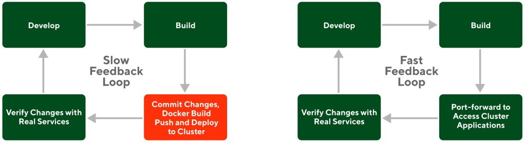
While we initially relied on Kubernetes port-forward to create a fast feedback loop, we quickly hit limitations that made this solution unreliable, hard to maintain, and no longer compatible when DoorDash moved to a multi-cluster architecture.

To address the limitations of the existing fast-feedback-loop solution, we used Signadot and multi-tenancy to build a new solution. In addition to offering new features, the new solution is safe, highly reliable, easy to maintain, and compatible with a multi-cluster architecture. These advantages improved developer velocity, software reliability, and production safety.

Standard Kubernetes port-forward is unsafe and unreliable for product development

Kubernetes port-forward is a mechanism that provides access to an application running in a cluster from a developer workstation. Once the port-forward command is run, requests sent to a local port are automatically forwarded to a port inside a Kubernetes pod. Using port-forward, a service running locally can connect to its upstream dependencies. This way developers can execute requests against the service running locally to get fast feedback without the need for building, pushing docker images, or deploying them in the Kubernetes cluster.

Kubernetes port-forward is not safe and reliable for product development for the following reasons:

  • Port-forward requires maintaining API keys in developer workstations. At DoorDash, clients need to pass an API key in the protocol headers for authentication against the services. This creates a big hurdle in connecting to upstream dependencies because developers don’t have those API keys in their workstations. It is cumbersome for each developer to provision and maintain API keys.
  • Port-forward makes it difficult to restrict API endpoint access. Because port-forward RBAC gives access at the namespace level, it is not possible to build production guardrails such as restricting certain API endpoints.
  • Port-forward requires building and maintaining ad-hoc scripts for each service. Because each service has different upstream dependencies, port-forward requires picking local ports for each one. This requires each developer to ensure that the port numbers are unused and do not conflict with each other. These extra steps make the port-forward hard to build and maintain.  
  • Kubernetes pod failures or restarts make port-forward unreliable. There is no auto-connect feature to cover failure scenarios where the connection is killed or closed by the upstream service. Additionally, port-forward’s unreliability is enhanced because it works at the pod level, but Kubernetes pods are not persistent.
  • Port-forward doesn’t support advanced testing strategies, including routing test traffic to workstations. Given the one-way nature of port-forward, it only supports sending requests to the upstream services. But developers want to send test traffic through the front-end and receive requests on their workstation that were intended for a specific service. 
  • Port-forward is not compatible with a multi-cluster architecture. DoorDash’s move to a multi-cluster architecture highlighted Kubernetes’ incompatibility. Services don’t necessarily stay in one cluster in a multi-cluster architecture, requiring that service discovery be built on top of port-forward. 

For these reasons, we quickly hit limitations that made the port-forward-based solution unreliable and hard to maintain. While other well-known solutions such as kubefwd are similar to port-forward and resolve some of these issues, they don’t address the security features we need to enable safe product development in a production environment. 

Signadot and multi-tenancy combine for a fast feedback loop

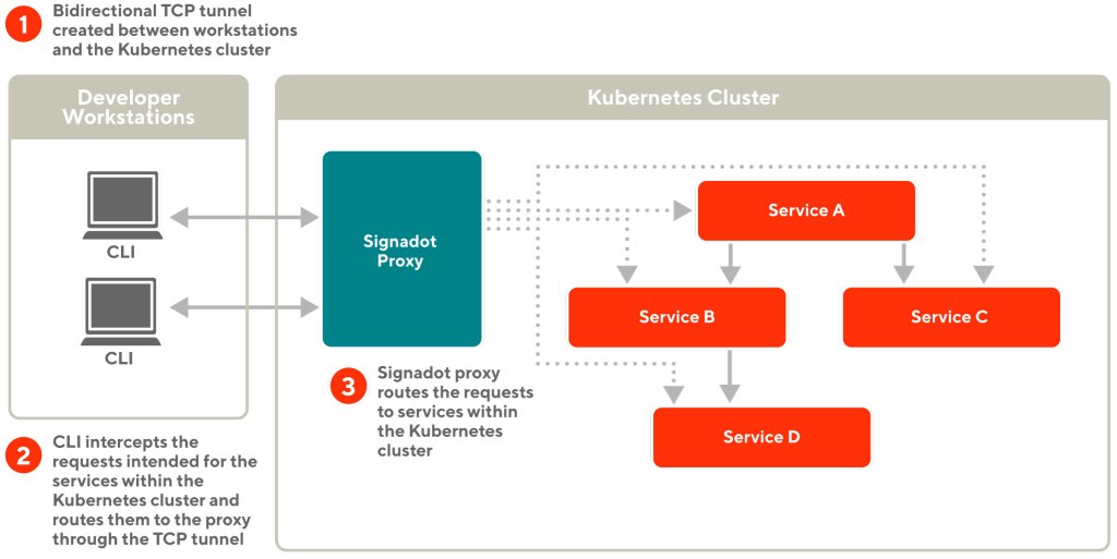
Signadot is a Kubernetes-based platform that scales testing for engineering teams building microservice-based applications. The Signadot platform enables the creation of ephemeral environments that support isolation using request-based routing. Signadot’s connect feature is built on the platform to enable two-way connectivity from developer workstations and to or from remote Kubernetes clusters.

We leveraged Signadot’s connect feature to connect locally running services to those running in the Kubernetes cluster without changing any configuration. Signadot also supports receiving incoming requests from the cluster to the locally running services.

How the connect feature works 

Signadot provides a CLI component running on the developer workstation and a proxy component running on the Kubernetes cluster. The connect feature works as follows, which is also illustrated in Figure 2: 

  • Using the CLI component, a developer creates a TCP tunnel and connects to the proxy component running within the Kubernetes cluster.
  • The proxy component sends back all the Kubernetes services identified by the cluster DNS to the developer’s workstation.
  • The CLI component automatically resolves DNS and proxies network traffic intended for the Kubernetes cluster via the TCP tunnel.
  • The TCP tunnel also allows locally running services to receive requests from the Kubernetes cluster.
Figure 2:  Using the Signadot CLI and the proxy components provided by Signadot, developer workstations can reach Kubernetes services without the need for complex port-forwarding scripts. Signadot CLI intercepts the requests intended for the Kubernetes services and routes them through the proxy using the bidirectional TCP tunnel.

Signadot improves local development significantly when compared with Kubernetes port-forwarding for several reasons, outlined here and in Figure 3:

  • Signadot’s connect feature works without the need for complex port-forward scripts. Developers don’t need to write and maintain the custom port-forward scripts for each service, reducing friction and easing maintenance. Running the Signadot daemon on a developer workstation through the CLI is sufficient to reach services within the cluster. 
  • Signadot’s connect feature is agnostic to Kubernetes pod failures or restarts. Signadot proxy automatically refreshes the service endpoint information and pushes it to the developer workstation, so any pod failures or restarts won’t impact product development.
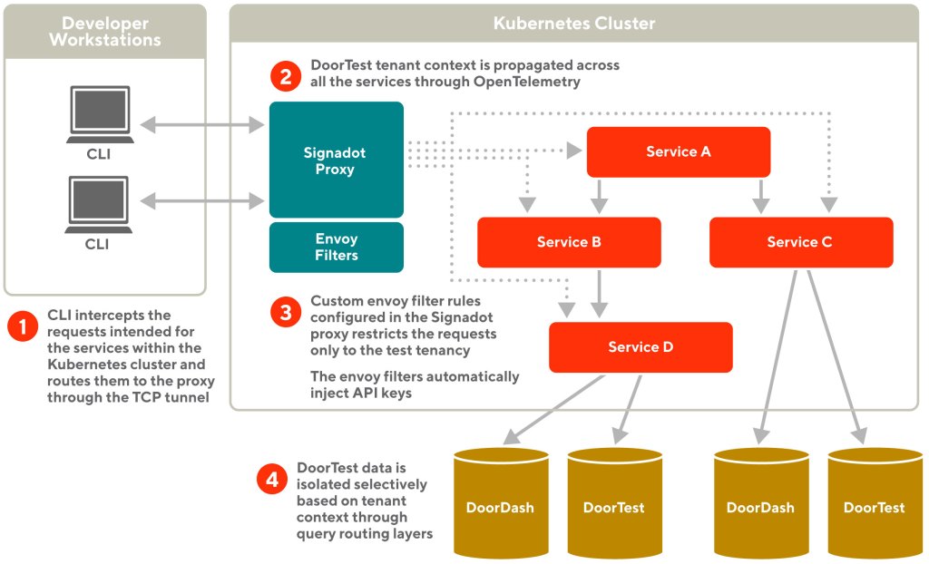
  • Signadot provides pluggable functionality to add custom guardrails at the request level. Signadot provides a feature to write envoy filters for the proxy component. The envoy filters help inspect the requests and apply custom rules based on the request data.
  • Signadot supports advanced testing strategies when developers want to route test traffic to their workstations. Using the bidirectional tunnel with the cluster, Signadot provides support to route test traffic to developer workstations through integration with Istio or custom SDKs.
  • Signadot provides functionality to integrate with multi-cluster environments.
Figure 3:  Using the Signadot CLI, routes server, and the proxy component provided by Signadot, we supported advanced testing strategies where developers route test traffic to their workstations. Signadot provides support to route test traffic to developer workstations through integration with Istio or custom SDKs.
Figure 3:  Using the Signadot CLI, routes server, and the proxy component provided by Signadot, we supported advanced testing strategies where developers route test traffic to their workstations. Signadot provides support to route test traffic to developer workstations through integration with Istio or custom SDKs.

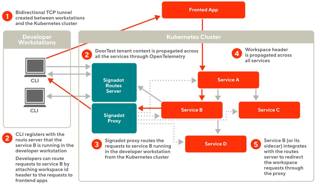
In the example shown in figure 3 above, the developer starts service B’ in their workstation and registers a workspace with the routes server using the CLI. The developer then browses the frontend application with the workspace information injected. The requests hit service B (or its sidecar) and then get routed back to service B’ through the Signadot proxy and the bidirectional tunnel.

The need for multi-tenancy to build production guardrails

We need to provide safeguards to ensure against developers intentionally or accidentally accessing sensitive production data when using the fast feedback loop. To achieve this, we adopted a multi-tenancy model and added safeguards in the Signadot proxy so developers can only access test data.

Multi-tenancy is an architecture paradigm in which one software application and its supporting infrastructure are designed to serve multiple customer segments, also called tenants. We addressed the safeguards challenge in the fast feedback loop by adopting the multi-tenancy model and introducing a new tenant named DoorTest in the production environment. The multi-tenancy model enabled us to easily isolate test data and customize software behavior for the DoorTest tenant as explained in our earlier blog post.

In this multi-tenant model, all services identify the tenancy of the incoming requests using a common header called tenant ID. This header is propagated across all our services through OpenTelemetry, enabling our services to isolate users and data across tenants.

Now that we have a test tenancy created using the multi-tenancy mode, we use Signadot envoy filters to build custom rules that ensure requests only operate in the test tenancy by inspecting the header tenant ID.

Leveraging Signadot envoy filters to build production guardrails

Signadot provides a feature to write envoy filters for the proxy component. Envoy filters help inspect requests going through the proxy, optionally changing the request or response data. Using envoy filters, we build a custom rule that ensures requests only operate in the test tenancy by inspecting the header tenant ID.

Using the envoy filters’ mechanism, we build a custom rule to automatically inject upstream service API keys to the outgoing requests. This way our developers don’t need to configure or maintain the API keys in the developer workstations, as shown in Figure 4.

Figure 4:  Multi-tenancy model isolates test data from production data. The tenancy context is propagated across all the services through OpenTelemetry, so requests in the test tenancy can only access test data. Custom envoy filters configured in the Signadot proxy restrict the requests only to the test tenancy.

This feature provided us with much-needed flexibility to build new guardrails for the fast feedback loop. 

Supporting multi-cluster architecture   

After establishing the fast feedback loop with a single Kubernetes cluster, we had to upgrade our Signadot proxy server to support our multi-cluster architecture. Previously, all services were running under one Kubernetes cluster. We adopted a multi-cluster architecture to improve system reliability, which means that services are running across multiple Kubernetes clusters. 

In this model, the developer sending a request needs only to know the global URL for the service, not which cluster to use.  When a developer requests a service’s global URL, Signadot CLI and the proxy server forward the request to the service’s internal router. Then the internal router dispatches the request to the cluster in which the service is running.

We were limited to routing traffic inside a single cluster with the port-forwarding-based approach and initial Signadot solution. We could not route traffic running in newly introduced clusters. As more services move to the multi-cluster model, we upgraded Signadot so that developers can test out various scenarios.

Figure 5 shows the upgraded Signadot architecture and how each request from the local machine is propagated from one cluster to another.

Figure 5: This chart shows how our system routes a developer's request across multiple clusters. In this scenario, we assume that a developer connects to Cluster 1 and works on a service that needs to connect to Service A and Service B, where Service A runs in Cluster 1 and Service B runs in Cluster 2.
Figure 5: This chart shows how our system routes a developer’s request across multiple clusters. In this scenario, we assume that a developer connects to Cluster 1 and works on a service that needs to connect to Service A and Service B, where Service A runs in Cluster 1 and Service B runs in Cluster 2.

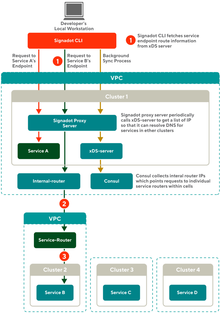
The red arrows in Figure 5 show the previous request flow within Cluster 1, which works in the prior version of Signadot.

Caramel colored arrows in Figure 5 shows how our network infrastructure synchronizes necessary information in the background. To resolve DNS for services running in different clusters, we use the xDS-server and Consul. The Consul monitors all the clusters and gathers lists of IPs for each service. The xDS-server must live in Cluster 1 to provide an API endpoint for the Signadot proxy server. For services in Cluster 1, the IP list will resolve to the actual pod IPs that are deployed in Cluster 1. The IP list for services in other clusters is resolved to an internal router.

When the request comes to the internal router, it routes the traffic to the service router that will then forward the request to the target cluster. 

The Signadot proxy server periodically pulls the IP lists for all services from the xDS-server endpoint. Once a developer runs Signadot CLI on their local machine, the CLI pulls the IP lists from the Signadot proxy server and stores one IP for each service in the local/etc/hosts file.

Now developers can send requests to any service across multiple clusters from their local workstations. This efficient design negates concern about local requests overwhelming the internal DNS server.

Blue arrows in the diagram show how our system propagates a request from the local workstation to Cluster 2:

  1. A developer’s local workstation connects to Cluster 1 and runs Signadot CLI. A developer sends requests to service B’s endpoint with its global URL. At this point, the local workstation knows the IP of the internal router. The local workstation makes a request to service B with one of the IPs. The request is sent to the Signadot proxy server in Cluster 1 through a TCP tunnel made by the Signadot CLI. 
  2. Then the Signadot proxy server routes the request to an internal router. The router is implemented using an Envoy proxy.
  3. The internal router then routes the traffic to a service router. 
  4. The service router ultimately forwards the request to service B running inside Cluster 2, successfully completing a developer’s request to service B.

In this example, a developer is sending a request through Cluster 1. Note that developers can choose which cluster to connect to and therefore can send requests through any cluster. Now developers can test their local code by connecting to dependencies in any cluster.

Other alternative solutions we considered

We considered Telepresence, which provides a fast feedback loop similar to the one discussed in this post. While it is a great solution, we decided to use Signadot because: 

  • Telepresence requires the use of its sidecar for intercepting requests and routing them to developer workstations. This sidecar conflicts with our compute infrastructure where we built a custom service mesh solution using envoy sidecars. So we decided to leverage Signadot SDKs to build the intercepting mechanism in our custom service mesh solution.
  • We needed guardrails applied to the requests originating from the developer workstations, but Telepresence lacks that capability.
  • We integrated Signadot with an internal xDS-server to support multi-cluster architecture, another capability that Telepresence lacks. 

One other alternative would be to move development to remote workstations. While this is a viable idea, we decided to pursue the solution we describe here because: 

  • Building remote development is costly because it requires extra hardware.
  • Building remote development is time-consuming because of the need for multiple integrations with our environment.

Even with remote workstations, we still need the same production guardrails through tenancy and support for multi-cluster architecture as discussed earlier. Using Signadot has helped us reap benefits quickly while providing the flexibility to reuse the same building blocks for future remote development solutions.           

Conclusion 

Many development teams are slowed down by unreliable or slow feedback loops. The Signadot and multi-tenancy solution we describe here is suitable for companies that are growing very rapidly and need to develop product features quickly with high reliability.

Our new fast feedback loop has increased developer velocity by reducing the time to deploy code to the Kubernetes cluster more frequently; increased reliability because developers can easily test their code during the development phase, and boosted production safety through standardization and guardrails.

Managing inventory becomes a serious challenge when transitioning from food delivery —  where the item ordered is prepared on demand — to grocery and alcohol delivery. DoorDash has expanded its service well beyond the restaurant space to deliver a variety of goods from retail outlets (or physical stores) with offerings that span across produce, meats, toiletries, snacks, alcohol, and myriad other categories. The outlets from which we deliver these products range from small local stores to large supermarkets. These outlets maintain inventory data in a wide variety of systems, including everything from a simple spreadsheet  to far more sophisticated solutions such as an inventory planning system.

Overall accuracy of inventory data at any given point in time usually falls well below 100% because of items being out of stock, discontinued, or caught up in supply chain issues. Inventory management, far from being a DoorDash-specific issue, is a universal problem across the new digital grocery and convenience industry. When shopping in a physical store, customers can deal with limited inventory by buying substitutes, driving to a different store, or changing their mind about what they wanted to buy in the first place. For online ordering, customers’ expectations are higher because seeing an item within the ordering UI implies that it’s in stock. To provide a frictionless shopping experience, we must have high confidence that items will be on the shelves before we show them to customers. If an item is out of stock, we need a suitable way to allow customers to substitute an alternative item. 

This blog post tackles the first part of the problem: reducing the variability of whether an item is in stock so that customers can order with confidence. We must solve several complex problems as described below before we can translate limited data with a low probability of being correct into a customer promise of getting what’s ordered. 

As we solve these problems, we can extend inventory accuracy as a service for merchants across our verticals. Ultimately, we can help all customers by sourcing signals to clean up inherently inaccurate data, regardless of whether they are shopping on DoorDash or on the merchant’s website.  

The four hurdles to presenting accurate inventory 

On the engineering side, there are four challenges we need to overcome to build an  accurate inventory presentation layer: 

  1. Collecting the right data: How do we get accurate signals about inventory levels, especially when there is so much inconsistency in existing technology and merchant size 
  2. Classifying, cleaning, and ranking data: After we collect meaningful data, we must decorate, filter and manipulate it to meet our needs 
  3. Predicting and propagating inventory state: Given our system inputs and that real-time inventory levels are beyond our current capabilities, we must project what inventory levels will be during certain periods of time  
  4. Simplifying data for consumption during shopping: Once we have a predictive model, we need to showcase this information to consumers in an easy-to-understand manner

The variability of people, processes, items, and supply chains makes it difficult to establish a single process to collect data for every item across all stores. Some stores sell only a few hundred items, while others might have nearly one million SKUs. Individual merchants may have many stores that share the same inventory system, making it easy to get bulk data from a single integration. Conversely, some merchants may need to integrate or manage data for each store separately. Either way, it’s important to note that each physical store has its own unique operational challenges related to the specific people who manage that store, specific challenges of the local supply chain, and numerous other ground-level concerns. So, even when we have a single integration that provides inventory data for thousands of stores, we cannot treat coverage or quality as consistent across all stores. 

While the first challenge is lack of merchant uniformity, there is a similar concern around items for sale, which can have drastically different shelf lives. While a bottle of wine  may be able to sit on a shelf indefinitely, perishables such as milk or freshly baked bread must move quickly. Shorter shelf lives generally mean lower inventory levels. The variable nature of shelf lives increases the complexity of managing store inventory because perishable items likely will sell out faster than non-perishable items. This means that data collected at one point in time within a  physical store — regardless of size and technical maturity — cannot be considered valid at a different point in time.

Stay Informed with Weekly Updates

Subscribe to our Engineering blog to get regular updates on all the coolest projects our team is working on

Collecting the right inventory data

To address the gap between data collected and the actual state of inventory when a customer places an order, we can — in theory — attempt to go toward more real-time data. To do that, we must ensure that all merchant processes are recorded electronically, including receiving inventory, putting inventory on shelves, and removing items from shelves. But this is not feasible in light of the large operational and capital investments that would be required. Instead, we must optimize use of the data that we can collect and extrapolate inventory states from that. As shown in Figure 1, we collect inventory data in the following ways: 

  • Through data integrations where merchants can provide bulk data about their inventory 
  • Through ad hoc updates from operators or merchants 
  • By collecting Dasher reports about out-of-stock items
  • Through asking Dashers to take photos of shelves in stores
Figure 1: Inventory data collection and main sources of inventory data

By collecting partial or incomplete data from across multiple sources and then reconciling that input  within a comprehensive inventory dataset, we unlock the ability to crowdsource inventory data for a physical store. Already, we are collecting hundreds of millions of inventory data points from these disparate sources. Our next step is to clean, rank, and classify this data into a unified dataset to gain a comprehensive picture of a store’s inventory.

Classifying, cleaning, and ranking data

Diving into this pool of data, we use a variety of techniques including online machine learning models and offline analysis to build opinions about which sources of data are most trustworthy. 

Our models also help us understand historical trends for discrete items such as restocking windows and out-of-stock windows for items. We use higher confidence signals — such as a Dasher or a customer reporting that an item was missing — to grade/rank other sources of data that may be relatively stale, such as inventory data coming from an integration. 

In addition to deciding automatically which data sources to ignore or highlight, we also expose data that is not high-confidence, which helps identify gaps and clean up the entire data pool. 

Brute force approaches cannot scale at this level of complexity, which requires dealing with hundreds of millions of inventory combinations while managing historical data in a way that allows both automated and manual downstream systems to leverage the data efficiently.

Once we have clean and classified inventory snapshots, we can use them to predict future inventory levels, for instance during peak customer purchase windows.

Predicting and propagating inventory state 

Armed with clean data and confidence rankings for data sources, we can feed inventory prediction models with such inputs as existing inventory data, Dasher feedback, and order history to create our own inventory projections to present to customers.

We must keep in mind two significant complexities: 

  • We are using data of varying quality to generate predictions from large data sets of inventory history and Dasher feedback. For example, we get millions of Dasher inputs weekly about inventory levels across our network. 
  • We are striving to predict inventory levels quickly enough to have a positive impact on customer experience; predicting things in an untimely manner, of course, does not solve our problem. Having timely predictions means that models should either be able to pre-compute inventory projections or run in near-real-time to respond to user queries. Currently, we have chosen the pre-computation approach as shown in Figure 2. 
Figure 2: Predicting inventory from large volume of Dasher, historical, and other data

Through cleaning data and predicting inventory availability, we can achieve fulfillment accuracy of nearly 90%. In other words, in nine out of 10 attempts, we can find the exact ordered item in-store and complete the delivery. We are working on models to improve this even further using a variety of signals from our Dashers, merchants, and customers. In the meantime, we bridge the remaining 10% gap through giving customers the opportunity to select alternative items or substitutes as they shop. For example, a customer can choose an alternate brand of whole milk if the exact item they selected isn’t in stock. These combined solutions allow us to counter unreliable and stale inventory data. 

Going forward, we also plan to start modeling item quantity so we can make better predictions such as “we have enough stock to last the next few days” to compensate for lack of other signals.

Simplifying data for consumption during shopping

Ultimately, we feed inventory projections into search indexes that hide or down-rank items with a high unavailability risk. This search-ranking feature lets customers make selections  with confidence instead of worrying that items may or may not show up. 

As shown in Figure 3, dynamically projecting inventory is a complex process that requires we only use temporally valid predictions to modify customer search and browsing experiences.

Figure 3: Vend inventory data at scale to millions of customers

While we have a workable initial solution today, we have a long way to go to build a near-real-time cycle that includes collecting real-world data, maintaining a searchable dataset of valid inventory predictions, and exposing the results in a rich way to let customers make the best choices for their needs. Stay tuned to learn more about how inventory projections evolve at DoorDash! 

Conclusion 

We have moved from making inflexible data source choices where we were chasing a near impossible task of finding a single great source of inventory data. Today, we rely on crowdsourcing bits of high quality data, predicting from historical data, and filter out unreliable inventory data. So that even in an imperfect world with incomplete information about what is in a retail store, our customers can shop with confidence – and get their groceries, convenience, pets, alcohol and other products delivered to their doorsteps. 

Going forward, we believe we will improve our techniques for capturing more opportunistic signals as we help merchants develop their capacity to maintain higher-quality inventory data.

For any operations-intensive business, accurate forecasting is essential but is made more difficult by hard-to-measure factors that can disrupt the normal flow of business. For DoorDash this problem is especially acute as any major deviations from our supply and demand forecasts have the potential to disrupt orders and provide a worse experience for consumers and Dashers. To generate accurate forecasts, we take into account seasonality and multiple factors via modeling and feature engineering. However, there could be factors affecting the orders but the true relationship between the demand and factor requires additional information beyond simple feature engineering. In those cases, we leverage causal inference methods to capture the additional information.  

In this post, we first discuss our general strategy when using causal methods to improve forecast accuracy, and then follow with two specific cases from DoorDash. The first case highlights the importance of accounting for macroeconomic factors via causal inference, with an example that focuses on predicting how tax refunds will affect order volume. The second case describes how to disentangle the impact coming from two concurrent factors. To demonstrate the concept, we have included a case study of daylight saving (which overlapped with Halloween in previous years, but not in following years). The application of these causal inference approaches helps us generate more accurate forecasts.  

Overview of forecasting at DoorDash 

The Forecasting Team at DoorDash established scalable solutions to generate forecasts spanning demand planning, support, finance and now cut across a broad range of operational touchpoints. When generating the forecasts, we leverage time-series methods to get the correct trend and seasonality abstracted from the temporary fluctuations affecting target metrics such as weather and promotions.  

The basic approach to account for temporary fluctuations is to define features (e.g., precipitation for weather, one-hot encoding holidays) and incorporate those features in the model. However, some temporary sources of fluctuations (e.g., tax refunds, child tax credits) may not have a direct measure/feature, which makes them hard to detect and account for in our forecast. For these types of factors, we leverage causal methods such as difference-in-differences and preprocess the demand series so that we can calculate the correct trend. 

When facing fluctuations that cannot be incorporated using feature engineering, the Forecasting Team uses the following strategy to calculate the impact: 

  • Identify sub-segments of the market that are differentially impacted by the factor causing fluctuations in the demand
  • Select an appropriate causal method (e.g., differences-in-differences, synthetic controls)
  • Use the chosen causal method and calculate the impact of the factor
  • Remove the calculated impact from the target series so that trend is not affected by the factor

Given that every one of these factors is hard to measure in its own unique way, we have collected a series of case studies that demonstrate the challenge of removing their impact from forecasts – and the effectiveness of our method. We will start with an example that looks into how a macroeconomic factor such as tax return affects our order volume. Then we will look into a case where we disentangle the impact coming from two concurrent factors.  

Detecting macroeconomic trends: tax refunds case study

Causal inference is useful to measure the impact of macroeconomic factors in the target series.  When dealing with factors creating a large and long-lasting increase/decrease in the target series (i.e, the impact is “clear”), identifying and removing the true impact of the factor generates large gains in the forecast accuracy. Most of the time such factors are associated with macro events that could affect consumers and businesses in any industry, such as shelter-in-place orders during the pandemic, child tax credit payments, supply-chain crises, or Federal Reserves’ interest rate increases. 

Failing to account for the changes in such macro factors could lead to poor forecasts and catastrophic failures in business operations. For instance, factors such as government stimulus or supply crises could create a temporary boost in the customer demand (or prices). If those factors are not taken into consideration during the forecasting, the statistical models could assume those temporary fluctuations as permanent trends and generate artificially high forecasts, which may mislead decision-makers and lead to large losses.        

One area in which the Forecasting Team uses the causal methods is IRS payments to households, which create a temporary increase lasting a couple of months in the consumer spending and order volume. If this impact is not accounted for, the models will generate artificially high forecasts for the weeks that IRS payments end due to the previous demand spike.  

Even though we have data on the amount of tax refunds deposited into the bank accounts through the IRS, we cannot directly use it in our models, as (a) consumer segments may respond differently to tax refunds, and (b) tax refunds are not distributed evenly across those consumer segments both within each tax year and across years, implying that tax refund data could not capture the time-varying response of heterogeneous consumer segments to tax refunds. Therefore, we decided to leverage causal inference to incorporate the information lives outside the tax refund data by following the steps outlined below:

  1. We observed that the consumers’ responses located in different zip codes are disproportionate, which is consistent with the Census Pulse Survey showing the heterogeneous relationship between the share of food spending and household income.  
  2. After making the above observation, we decided to use the difference-in-differences method, in which we set the treatment group as the affected zip codes and the control group as the non-affected zip codes .  
  3. We use the following regression to calculate the impact of the tax refunds on the affected zip codes:
regression formula we use to calculate affected zip codes

where yit is the number of orders in zip code i at date t.  δk are the event-date dummies that capture the time-varying impact of the tax refund as the difference between the treatment and control group starting from the first day (i.e., t=0) that large amounts of tax refunds hit the bank accounts.  Figure 1 shows the estimated coefficients for the treated zip codes.  As expected, the growth in the treated zip codes is higher after receiving the tax returns. 

Figure 1: The difference-in-differences estimate shows the positive impact of the tax refunds on order volume on the treated zip-codes after removing the impact from the factors other than the tax refund.
Figure 1: The difference-in-differences estimate shows the positive impact of the tax refunds on order volume on the treated zip-codes after removing the impact from the factors other than the tax refund. 
  1. After calculating the impact for the treated zip codes, we calculate the tax refund impact for each submarket using the share of orders coming from treated zip codes in that submarket.   
  2. We remove the impact from tax refunds in the preprocessing step, and then generate forecasts using the time-series models for submarkets in the United States. Next, we apply post-processing to incorporate the future tax refund impact based on the tax refund phase out in the earlier years.  

Table 1 shows the relative improvement in 6-week-ahead forecasts measured in terms of mean absolute percentage error (MAPE) and mean percentage error (MPE) with respect to the baseline forecast (making no adjustment for the tax refunds). Specifically, the relative MAPE/MPE is calculated as:    

The results show that preprocessing the tax-refund impact provides a sizable improvement in the out-of-sample performance of the forecast (implying a sizable reduction in the Dx acquisition costs).  

Table 1: Improvement in MAPE and MAE

The above case is a great example of how we use causal methods to capture the impact of a macroeconomic factor (i.e. the tax refund), creating a large increase in the order volume.  Historically, we followed a similar strategy to account for lockdowns during the pandemic.  Moreover, we are actively monitoring potential shifts in the macro conditions that could impact consumer demand and brainstorming on causal methods to measure the impact.       

Disentangling concurrent factors:  daylight saving case study 

Causal inference is useful if we have multiple factors affecting the series concurrently and we aim to disambiguate the impact by measuring the contribution of each factor separately. In the presence of concurrent factors, simply putting dummy variables (i.e., one-hot encoding) for those events will not work (because of the multicollinearity problem). Disentangling the impact is helpful to generate more accurate forecasts (especially if those factors occur in different time periods in the future), and to have a clear understanding of the factors driving the target series (among factors other than the concurrent factors).  

The Forecasting Team leveraged causal methods to measure the impact of the end of daylight saving time in November, which is concurrent with Halloween in the earlier years. Specifically, our team observed that there is a strong increase in the order volume in the week following Halloween and associated the strength with Halloween which coincided with the end of daylight saving in 2019 and 2020 (Table 2). Contrary to earlier years, in November 2021, we observed a strength one week after Halloween. After discussions with business partners, we concluded that one potential factor contributing to a rise in demand is the end of daylight saving. The sun sets an hour earlier, potentially making customers go home earlier rather than eat outside.

Table 2: Halloween v. Daylight Saving

To test whether the impact comes from daylight saving, we develop a creative method that leverages the borders between time zones, which is similar to a paper investigating the impact of sunrise on school performance. More specifically, consider Indianapolis and Chicago where Indianapolis is in the Eastern Time Zone (ETZ) and Chicago is in the Central Time Zone (CTZ).  Table 3 shows the sunset times before and after the daylight saving time in November 2021 in those two cities. As Chicago gets dark around 4:37 PM (as opposed to Indianapolis getting dark at 5:36 PM), we hypothesize that Chicago locals are more likely to get home right after finishing the day and order food from DoorDash instead of spending time outside in the dark.

Table 3: Chicago v. Indianapolis Sunset Times around Daylight Saving End

To calculate the impact, we identified DoorDash submarkets located around the ETZ/CTZ, CTZ/MTZ, and MTZ/PTZ border (see Figure 2). Then, we classified submarkets east of the border as control (e.g., Indianapolis, Detroit, Amarillo) and those west of the border as treatment (e.g., Chicago, Nashville, Denver). 

Figure 2: The cities around the time zone borders experience different sunset times despite their geographical proximity.

Then we run the following difference-in-differences model to calculate the impact: 

where yit is the order volume at submarket i at date t; post is the dummy variable taking value 1 for the dates after daylight saving went effect on November 7, 2021; treatment is the dummy taking value 1 for the states on the west of the time zone border; the controls are day-fixed effects to capture the weekly seasonality.  

We estimate the daylight saving impact as a positive number implying that the order volume increases more for the cities located on the west of the time zone border compared to the ones on the east. Note that the estimated impact will be under biased as the control group is also affected positively from the daylight saving, but not as strongly as the treatment group.  Moreover, the calculated impact is abstract from Halloween, as Halloween is relevant for both treatment and control markets (which is captured with post dummies in the above regression). We are planning to use the calculated value when generating forecasts for the daylight saving end on November 6, 2022.  

Daylight saving is a perfect case that illustrates how a concurrent factor could affect the consumer demand and remain unnoticed. Such cases require close scrutiny and collaboration with the business partners in addition to discovering creative causal methods to measure the actual impact.     

Conclusion

Causal methods are frequently used for estimation (e.g., measuring the impact of promotions) but not for prediction and forecasting. As the forecasting team at DoorDash, we improved the forecasting accuracy of our time-series models by using a creative way of applying causal methods in situations for which we do not have a direct measure of factors driving the demand. Specifically, we discussed use cases of tax refunds and daylight saving in this blog post. As the forecasting team, we are constantly developing and adopting solutions to understand all factors impacting our forecasts, and to generate more accurate forecasts.   

Acknowledgements

Many thanks to Kurt Smith, Lauren Savage, Gonzalo Garica, Matt Heitz, Lambie Lanman, Chris Li, and Ryan Schork for sharing their insights on the development, and support on the execution of the ideas in this blog post. Many thanks to Ezra Berger for continuous support, review, and editing on this article.

TLDR: DoorDash is very excited to be sponsoring two additional engineers for the Hack the Planet Scholarship, which actively contributes to growing tech diversity within the distributed systems tech domain.

Our participation will include financially supporting two extra scholarships and leveraging our team to provide technology mentorship and networking opportunities to the applicants that are selected. Below we will outline more details about the program and how to apply for the scholarship. 

What is Redpanda’s Hack the Planet Scholarship

Redpanda Data started the Hack the Planet Scholarship last year to help make the world of tech look more like the world around us. 

Hack the Planet helps underrepresented groups and minorities get into and excel in technology. The program supports people hacking on a distributed systems-related project over a four-month period. 

Selected scholarship recipients receive $1,500/month and weekly 1-1 mentorship from DoorDash’s senior engineers, who have experience working on some of the largest and most complex distributed systems. This mentorship will cover everything from code review and design review to providing the support needed for participants to successfully complete their projects. Recipients can work on any project they want – although we recommend working on open source projects.

Scholarship requirements and how to apply 

We are asking that all applicants have basic programming skills and be proficient in either Kotlin, C++, Go, C, JavaScript or Java.

To apply, fill out the application form, which includes writing a project proposal that you want to hack on for three to four months. The deadline to apply is June 30th.

Successful proposals will cover the following: 

  • Tell us your story ( include your Github profile ) and why you think this opportunity would help you specifically accomplish something cool 
  • In what areas can we help you, with regards to mentorship or other resources? 
  • Give a summary of the project you had in mind for this hack. What is the problem or opportunity you see in this project, what was your motivation in finding this hack in particular?
    • The project must involve two or more computers trying to achieve some kind of task (saving data, replicating files, etc.). It should be challenging and can be broken down and scoped out into 3-4 months of work. 

Ultimately, we want this to be an exciting and fun experience where you tackle your ambitious ideas with the help and support of our team. 

DoorDash is excited to be a part of the Hack the Planet scholarship program and continue contributing to uplifting diversity programs like this. Please refer to the official Hack the Planet page for more information. 

Failures in a large, complex microservice architecture are inevitable, so built-in fault tolerance — retries, replication, and fallbacks — are a critical part of preventing system-wide outages and a negative user experience. The industry today is replacing legacy monolithic architectures with microservices to capitalize on the promise of better scalability and developer productivity. As with anything in distributed systems, this new architecture comes with tradeoffs — most notably complexity. Interservice communication is done through remote procedure calls, or  RPCs, which add a whole new set of issues to consider. But designing for fault tolerance from the start can ensure the system continues to operate properly in the event of failures.

RPCs can fail for many reasons and fallbacks should be added for resiliency. Other strategies can be employed to recover from a failed RPC, such as retries or distributing traffic to healthy replicas of the target service. When the outage involves the communication link, however, those strategies can’t contribute to system recovery. Having a fallback path ensures that the RPC succeeds regardless of failures in the primary path.

Of course, DoorDash’s microservice architecture is not immune to failures. We work particularly hard to improve fault tolerance in our translation systems because users expect to be able to use our products in their language of choice. Any outage affecting those systems could frustrate users and block customers from placing orders, making it critical that our system operates smoothly even in the event of failures. Here we discuss the types of failures that can occur with RPC calls, summarizing with an example of how we solved for fault tolerance in our translation service. 

Types of issues that can cause an RPC to fail

Interservice communication in microservices architectures can fail for a myriad of reasons, but categorizing these errors into larger groups, each with a common theme, helps in coming up with appropriate generic solutions for each bucket. RPCs can fail because: 

  • networks are unreliable 
  • humans introduce bugs in the code
  • microservices can be dependent on databases. 

We’ll dive into more details about each group below.

Unreliable networks

Networks in distributed systems often are unreliable. The types of errors we experience can be categorized into two large sub-groups: transient errors and persistent errors. Transient errors disappear when retrying the same network request again; such errors might be caused by a spike in network traffic that causes the request to be dropped. Persistent errors, on the other hand, require an external intervention to be resolved. Incorrect DNS configurations, for example, can make a microservice or even a whole cluster unreachable. It is important to account for these issues and plan to overcome them.

Application-level bugs

Bugs are a reality of software development; they can sneak through even the best testing suites and CI pipelines and disrupt RPCs. For instance, an RPC can fail because a bug unexpectedly interrupts the target service. In an architecture using distributed deployments, a bug might be contained within only one set of a microservice’s replicas. In such cases, retrying the request with a different recipient might resolve the problem. The deployment system could then roll back the affected services. But if the bug has made its way to all replicas, the RPC inevitably fails without an external intervention. Because bugs must be expected from time to time, the system should be designed to continue normal operations despite them.

Database-level errors

It’s common for the recipient of an RPC to reach out to its database to generate a response to the sender. This is true in our translation systems. The DoorDash architecture reaches out to the translation microservice to retrieve translated content; the translation microservice reads those strings from the database to generate a response. Many issues can occur because of the microservice’s dependency on the database; for instance, the connection might be having issues or the database server might be down or under heavy load causing an empty response or an exception to be returned from the microservice. The client should be able to detect such errors and act appropriately to circumvent the issue.

Stay Informed with Weekly Updates

Subscribe to our Engineering blog to get regular updates on all the coolest projects our team is working on

Strategies to handle RPC failures

Multiple patterns can be employed to overcome RPC failures, enabling the system to continue operating in the face of outages. There are three key methods to recover from RPC errors: 

  • retrying a failed RPC
  • rerouting traffic from a faulty microservice to a healthy one
  • adding a fallback path to the RPC

Retrying failed RPCs

A common pattern to recover from a failed RPC is to retry the call again. As shown in Figure 1, transient errors are the usual group of failures where employing the retry mechanism can be a great choice. When implementing retries, one needs to be careful about overloading the network.

Figure 1: Retry pattern with exponential backoff

Consider a network experiencing a heavy load that drops an RPC for lack of resources. Immediately retrying the call not only returns another failure, but also adds more pressure to the already saturated network. Instead, deploy an exponential backoff algorithm. With this method, the wait time at every retry for the next call is doubled to give the network the opportunity to recover instead of flooding it with more traffic. 

As helpful as retries can be, they aren’t the perfect solution to every problem. Retries can’t overcome persistent errors within the communication link, for example, so let’s look at the next strategy for improving fault tolerance. 

Error correction through replicas 

Creating multiple replicas of a microservice minimizes the chance of experiencing a single point of failure. As shown in Figure 2, a load balancer is set up between the requester and receiver. When the load balancer notices that one of the replicas is unresponsive, it can redirect traffic going into the faulty replica into healthy ones. 

Figure 2: Faulty and healthy microservice replicas

There may be many reasons why one replica experiences issues. As we saw previously, a bug may have been deployed to a group of replicas, but so long as there are still healthy replicas in the cluster we can minimize the impact. While container orchestration systems make it easy to set up multiple replicas for a service, replicas alone can’t guarantee the architecture’s fault tolerance. Two examples: a bug might not have been caught, allowing it to be deployed to all instances of a service, or none of the instances can access the database.

Using fallbacks to respond to failures

When an RPC fails and none of the previous strategies works for recovery, fallbacks can save the day. In principle, the idea is simple: when an RPC’s primary path breaks, it falls back to a secondary path, as shown in Figure 3. Retries can’t recover from persistent communication link errors, so fallbacks use a different communication link. When none of the available microservice replicas can process an RPC, fallbacks fetch the result from another source. 

As great as fallbacks sound for handling distributed system errors, they do come with drawbacks. The fallback path usually offers reduced performance or quality compared to the primary path. Nonetheless, it works well as a last resort to avoid or resolve outages. For a user, degraded performance is better than the service not being available at all. In conjunction with the strategies described previously, fallbacks help create a strong, fault-tolerant architecture.

Figure 3: Try fallback path when primary fails

Successful failure recovery requires the fallback path to be transparent to the sender and independent from the primary path:

  • Transparent to the sender: Both the primary and fallback paths should at least be similar, if not identical. The sender microservice need not be aware of how the results were fetched so long as the response to the RPC is correct. Implementation details of the fallback mechanism can be abstracted away and contained within the RPC client used by the sender. The sender might tolerate slightly outdated data or decreased performance to maintain normal operation during outages.
  • Independent from the primary path: Fallback paths must be independent of primary paths to prevent an outage from bringing both down. Two independent systems working in parallel with respective reliabilities (and failure probability) of R1=90% (F1=10%) and R2=90% (F2=10%) will have a combined reliability of R=99% (R = 1-F = 1-F1*F2). To design fault-tolerant architecture, fallbacks must be independent from the primary path.

Improving fault tolerance in DoorDash translation systems 

DoorDash uses a microservices architecture that employs gRPC to communicate between services. Product microservices return content to clients in the user’s preferred language. The translated content is fetched from the platform’s translation microservice. A translation client simplifies the interaction with the translation systems, exposing a simplified interface that different teams can use to fetch translated content.

Many services of critical importance to our users depend on translation systems. In our three-sided marketplace, an order may be created, prepared, and delivered by people speaking different languages. It is important for us to accommodate all of our users by providing a multilingual app experience. In addition to our home base in the U.S., DoorDash operates in Australia, Canada, Germany, and Japan requiring the app to support several different languages. To be successful, international operations require reliable and fault-tolerant translation systems.

In an effort to get 1% better every day, we continuously monitor our system to seek possible fault tolerance improvements. Prior to implementing fallbacks, we already were employing exponential backoff retries in our translation client and our translation service was configured to have multiple replicas to handle requests. But we didn’t think that was enough to guarantee that 100% of content appeared localized in the apps. We decided to invest in fallbacks for this critical path to ensure reliable content retrieval.

Implementing fallbacks into RPCs to translation systems

To ensure that we avoided issues with the translation service or its communication link, the fallback needed to fetch localized content from a different source. We decided to store the RPC responses as files in an object storage system. Localized content, which tends not to be updated frequently, usually is a large dataset, making it convenient to bundle into a file.

For the object storage system, we chose Amazon Simple Storage Service (S3). S3’s availability is independent from the translation service, which meant that an outage on one wouldn’t affect the other. S3 is also an industry standard solution with high guarantees for scalability, data availability, security, and performance. Moreover, because S3 is employed for many different use cases within our architecture, DoorDash already had strong knowledge and experience with it.

Figure 4: Periodic job to create backup files

The S3 bucket contains a file for each feature that needs localized content. To populate the bucket, we created a periodic job within the translation service, as shown in Figure 4. The job generates the RPC response that the translation client would otherwise receive and writes that data into a file. Once the file is created, it gets uploaded to the bucket. 

Localized data periodically is requested via the translation client from product microservices within DoorDash’s architecture. In normal operations, the translation service reads this data from its database and returns it as the response. The database is continuously updated with new content for a feature. 

To prevent the backup files from becoming outdated, the periodic job in the translation service needs to run more often than the translation client requests localized content. Some services might run the translation client more often than others under certain conditions, so there is a chance for the retrieved S3 file to be slightly outdated. This is an acceptable tradeoff compared to having no localized content at all. We have also enabled versioning in our S3 bucket so that new runs of the periodic job upload a new version of the files. In the event of issues, it is easy to revert to previous versions. To avoid wasting storage space, older versions that are no longer needed are deleted periodically according to lifecycle rules.

The files uploaded from the translation client to S3 had to be written in a format that was easily digestible. The gRPC requests to the translation service were using protocol buffers to serialize the response before sending it over the wire. For our use case, it made sense to serialize data into the files via protocol buffers as well. We already were benefiting from protobufs in our gRPC communication and those same characteristics are valid for the backup files fallback mechanism. Protocol buffers are language-agnostic and fast to process, plus the encoded data is smaller than other formats, making protobufs ideal for our high-scale, multi-language backend architecture.

Figure 5: Translation client before and after adding a fallback

After we built the source for our fallback path, we were ready to add fallbacks to the translation client RPCs. If the RPC to retrieve localization content failed, despite retries and the high-availability architecture of the translation service, the translation client now falls back to pulling the localized content for the requested feature from S3, as shown in Figure 5. Once the raw data is received by the client, it is deserialized with protobufs in the same manner as the normal gRPC response. During an outage, the data pulled from S3 is either identical or, at worst, slightly behind the data that would have come from the translation service directly. Because S3 availability is independent from the translation service’s availability, it aligns with the two characteristics of a successful fallback.

It’s crucial to react quickly during incidents. We updated the client so that we can configure primary and fallback paths on the fly. During a degradation of the primary path, we might decide to promote the fallback path as primary and vice versa. Using DoorDash’s distributed configuration system, we can update this configuration for all microservices or only selected ones without needing to redeploy the affected services. This enables us to react promptly and with confidence to more long-lasting failures.

Conclusion: Embrace failures in distributed systems

Fault-tolerant architectures embrace failures as the norm. In high-scale architectures, it’s a recipe for disaster to plan around avoiding failures. With all the variables that go into a large system, including hardware and software unreliability as well as adding the human factor to the equation, errors are inevitable.

With the myriad strategies described here to mitigate failures, it is possible to keep systems operational despite them. The fallbacks we have deployed to improve our system’s fault tolerance is just one of the many initiatives DoorDash undertakes to provide our customers the best service possible.

When A/B testing is not recommended because of regulatory requirements or technical limitations to setting up a controlled experiment, we can still quickly implement a new feature and measure its effects in a data-driven way. In such cases, we use the back-door adjustment method, a type of causal inference to measure pre-post effects. This type of pre-post analysis is useful because it requires the same or less analytical effort to implement metrics tracking and make a data-driven decision as would be done in typical A/B testing. Because no test setup is required, this analysis can be used when we have to release new features quickly and as an alternative to slower testing methods. Here we explain how back-door adjustments enable non-biased pre-post analysis and how we set up these analyses at DoorDash.

Which features go live without experimentation

While data-driven experimentation ensures that the impact of new features are proven before they are presented to customers, we still want to be able to fast-track some features that address existing bugs or poor user experiences. For example, when our Global Search product team detected a critical bug in DoorDash’s mobile web platform and there was a correlated drop in key product metrics, the normal development and experimentation cycle was too slow to prevent a negative customer experience. Because we want to prioritize providing a positive customer experience, we opted to fix the issue right away. We still wanted, however, to use pre-post analysis to measure the new feature’s impact. 

Typically, pre-post analysis results in huge biases because other factors could affect metrics and pre-post analysis cannot remove bias introduced by those factors. These controlling factors — including such things as seasonality, competitor moves, new marketing campaigns, and new product launches — could impact how users interact with our product in a manner similar to what we see when we introduce a feature improvement or bug fix.

Even if we can calculate the directional read of a metric lift using a simple pre-post, we can’t get the confidence level of the lift. In other words, if we were to fix this again, we don’t know the likelihood that there would be the same metric improvements. Another key advantage of back-door adjustment — as opposed to another causal analysis method called difference-in-difference — is that it does not require a parallel trends assumption. A parallel trends assumption requires that, absent any change, differences between “treatment” and “control” groups remain constant over time. In scenarios such as a bug fix, the treatment group — the group to be applied with the bug fix — does not necessarily generate a parallel metric trend because the bug existing in the treatment group already distorts the metric trend. So, we decided to measure the impact of the bug fix using a trustworthy pre-post approach that can block the back-door path from other factors that might affect metrics.

Stay Informed with Weekly Updates

Subscribe to our Engineering blog to get regular updates on all the coolest projects our team is working on

Understanding the back-door adjustment 

A back-door adjustment is a causal analysis to measure the effect of one factor, treatment X, on another factor, outcome Y, by adjusting for measured confounders Z. The relationship and causal graph of treatment, outcome, and confounding variables are shown in Figure 1 below. Using this real DoorDash example in which we fixed a bug on the mobile web, we want to measure how the fix impacts success metrics — for instance the mobile web platform’s conversion rate. There can be other simultaneous factors — Z — that would also impact the success metrics, such as DoorDash’s new marketing campaigns, a new product, or other feature launches. We need to block the path of these other factors that could potentially affect metrics so that we can read only the impact of this bug fix. The back-door paths are not the causal associations of the product change to metric lifts, so by blocking them we can get a clean read with high confidence of the treatment’s impact. For context, causal association between two variables occurs when a change in one prompts a change in the other. 

Adding covariates is a common and trustworthy way of blocking the back door, also known as the confounding variables. Covariates affect the outcome — in our case the “metric result” — but are not of interest in a study. In this example, we believe that special events, holidays, or other feature changes are confounding variables, but we are unable to quantify them through metrics. Nonetheless, we are confident that most of the impact of the confounding variables can be reflected by metrics changes in other platforms. So when we want to measure the impact of the bug fix on the mobile web, we can add covariates, such as the conversion rate on mobile apps and desktop platforms, during the same time period. These covariates can help us block the path of confounding variables, or Z. This causal analysis provides more accurate results than simple pre-post and it gives the confidence interval of the point estimate — the metric lift for us to make data-driven decisions.

Figure 1: Confounding variables can drive both treatment and outcome, so we block the back-door path to measure the impact on the causal path.

How to implement a back-door adjustment analysis

Given the robustness of the back-door adjustment method, how do we design the experiment? 

First, we need to prepare data to measure key metrics both before and after the change. Both pre- and post-data for a bug fix has to be within the same timeframe — in this case 14 days of mobile web conversion rate data before the bug fix and 14 days after the bug fix is in production. We also need to prepare data to calculate covariates. In the same example, we can use the conversion rate from the iOS, Android, and desktop platforms because these metrics would block the back door of confounding factors that impact other platforms at the same time. Because mobile apps and web platforms are impacted by the same external changes — such as a product launch on all platforms or a seasonal effect — we can use metrics on the other platforms to reduce biases.

For a typical controlled experiment, we’d set up control and treatment data for the same metrics, such as conversion rate, using an experiment tracking tool. To implement pre-post in the experiment platform, we can configure the metrics and label the pre-data as the “control” group, the post-data as the “treatment” group, and then add covariates for variance reduction and de-bias. Figure 2 below shows the implementation of a back-door adjustment for this bug fix example. The mobile web platform’s conversion rate 14 days before the bug fix is the control, the 14 days following the fix is the treatment, and the conversion rates on other platforms serve as the covariates.

Figure 2: For pre-post analysis using a back-door adjustment, we can input data and read output metrics in a manner similar to a controlled experiment.

Additionally, when we use back-door adjustment analysis we can read metrics impact in almost the same way we do in a controlled experiment. This metric lift is still the treatment metric value minus control metric value. We can calculate the confidence interval and p-value the same way we calculate a controlled experiment; the only difference is that, instead of measuring the difference of control versus treatment, we measure the pre- and post-difference with variance reduction.

Future improvement opportunities

Given the benefits of the back-door adjustment, why not replace all A/B tests with it? Unfortunately, there are a number of limitations to a back-door adjustment, including:

  • We can’t identify all confounders. Sometimes, we don’t know what the confounding variables are or we can’t capture all major confounders. 
  • We can’t choose the right list of covariates and validate the impact of the chosen covariates.

There are two things that we can do to identify confounders. First, we can brainstorm potential confounding effects before measurement to make numerous strong hypotheses. This approach solves the problem because, in practical scenarios, there can be more than one back-door path and we can block more back-door paths with more confounders identified. Second, we can use advanced methods such as the instrumental variables method or the regression discontinuity design method to achieve an unbiased estimate despite being unable to block all the back-door paths. If we can find a good instrument, even when some confounding variables are unknown, we can still achieve unbiased estimates with the instrumental variables method. Similarly, for the regression discontinuity design method, if we can find a cutoff and running variable, even when we don’t know the confounding variables or only know some of them, we can obtain a high-confidence estimate.

To validate that the covariates are strong, we can leverage regression models to short-list covariates and remove disturbing signals, also known as non-confounding variables. The regression model can also validate how much variance is explained by covariates.

Now that we have worked out the limitations, we should be ready to implement any emergency features as needed and employ the back-door adjustment to measure after-the-fact.

Conclusion

When controlled experiments are too expensive or simply impossible, we can use the back-door adjustment with high confidence on metrics impact. The existing experimentation platform at DoorDash makes it easy to implement this approach. We plan to invest more in analytics use cases of the back-door adjustment and improve the experiment platform to easily identify high-quality covariates. 

Acknowledgements

I would like to acknowledge Jessica Zhang, my manager, for supporting and mentoring me on this analysis project and reviewing drafts of this post. I would like to thank the experimentation platform engineer, Yixin Tang, for his advice on statistical theory and implementation for the back-door adjustment. I also would like to thank Jessica Lachs, Gunnard Johnson, Lokesh Bisht, and Ezra Berger for their feedback on drafts of this post. Thanks go out, too, to Akshad Viswanathan, Fahad Sheikh, Matt Heitz, Tian Wang, Sonic Wang, and Bin Li for collaborating on this project.

While UIKit has been the go-to framework for iOS engineers to build user interfaces in their applications over the years, SwiftUI has been steadily gaining traction as an alternative framework that rectifies many downsides of UIKit. For example, SwiftUI requires much less code to build the same UI, and always produces a valid layout. Developers no longer need to spend hours debugging auto layout issues. In this article, we will first compare UIKit’s event-driven approach to SwiftUI’s data-driven one, then we will deep dive into the SwiftUI view cycle, identity, and rendering process to better understand how to write performant code in SwiftUI.

How an event-driven framework operates

UIKit provides an event-driven user interface by nature, where views are created through a sequence of events that perform operations and eventually come together to form what is seen on the screen. In an event-driven framework, there needs to be a controller that glues together the view and the events. This glue is called the view controller.

How the view controller works

The view controller is essentially a control center that decides what happens given particular events. For example, if some content needs to be shown on the screen when a page loads, the view controller listens to the page load event and performs the necessary business logic to load and show the content. Let’s take a look at a more specific example:

Say there is a button that, when clicked, shows an image of a random type of fruit on the screen. After each new button click, a new kind of fruit is shown. Let’s look at a representation of the flow if this was built with UIKit in Figure 1 below.

Figure 1: Flow of an event-driven framework

In this flow, the view controller holds a reference to the button and the view. When a user clicks on the button, the view controller takes this as the signal to compute a new kind of fruit. Once a new fruit is returned, the view controller tells the view to update the UI with it. In this case, the button click event drives the logic that changes the UI.

Stay Informed with Weekly Updates

Subscribe to our Engineering blog to get regular updates on all the coolest projects our team is working on

The challenges of using UIKit and view controllers

Even though this is a very simple example, we can see that the view controller has various responsibilities. With more complex views in a production app, these responsibilities mean the view controller can become massive and hard to manage. We have to write the code and dictate the logic for the interaction between the view controller, view, and each event, which can be error-prone and hard to read.

Of course, much of the pain of dealing with the view controller can be alleviated by having good code architecture and separation of concerns. The VIP architecture that our DoorDash iOS consumer application uses can extract out the business and presentation logic, such that the view controller doesn’t need to know any of that logic, and can just focus on showing the view on the screen given the data. 

But any architecture still cannot avoid the view controller, as its purpose of serving as the glue between the events and the view is irreplaceable in an event-driven framework.

How a data-driven framework operates 

While UIKit uses an event-driven framework, SwiftUI is based on a data-driven framework. In SwiftUI, views are a function of state, not a sequence of events (WWDC 2019). A view is bound to some data (or state) as a source of truth, and automatically updates whenever the state changes. This is achieved by defining views as functions that take in data-binding as an argument.

This data-driven framework completely eliminates the view controller as a middleman. What the user sees on the screen is directly controlled by a state, which can be any data type. Using the same fruit app example that we used above with UIKit, we can see an illustration of this concept below in Figure 2.

Figure 2: Flow of a data-driven framework

The fruit type is a state that is bound to the view, which means whenever the fruit is updated, it will automatically be reflected on the view. This means that when a user clicks the button, we just need to update the state, and the view will update to show the new fruit, without needing a controller to tell it to do so. Hence the term “data-driven” – the UI is a direct representation of data.

The benefits of a data-driven framework 

Working with a data-driven framework means there are no more massive view controllers, and no need to define the logic of events to make view updates. The interface is coupled with the data, resulting in fewer lines of code and better readability. We can easily understand that the fruit the view shows is driven by the fruit state, unlike in UIKit, where we would have to dig through the code to see how the fruit is controlled.

The challenges of using SwiftUI

Any new framework or technology has its tradeoffs. Based on only the event and data-driven framework comparisons from above, SwiftUI may always appear to be the superior option, but that’s not the full story. 

SwiftUI’s drawbacks are mainly associated with the fact that it was only released three years ago. SwiftUI is a new framework, so it’s going to take time for more developers to adopt and learn it. Given the ongoing adoption, there are fewer established code architectures based on SwiftUI. We have also experienced backward compatibility issues, where the exact same SwiftUI code works differently in iOS 14 and 15, which makes it very hard to debug. 

Now that we have a basic understanding of the pros and cons of the two types of frameworks, let’s dive into some specific challenges we experienced when dealing with SwiftUI and its view rendering process, and how to write efficient code to preserve a view’s identity in order to create a smooth and optimal UI.

View in SwiftUI

There are some main concepts worth mentioning when working with SwiftUI:

  • View as a function of state
  • View’s identity
  • View’s lifetime

First of all, data is the source of truth for the view. When the data changes, we receive the updates on a view. So we already know that views in SwiftUI are a function of a state (Figure 3). But what is this state in the SwiftUI world?

Figure 3: View is a function of state, not a sequence of events

When you are switching the mindset from event-driven architecture to a declarative framework, there might be some questions. It’s not hard to get the basic understanding of SwiftUI, but it’s a little bit unclear what happens under the hood. We know that when the state of the view changes, the view is getting updated, but some questions naturally come up:

  • How exactly does the data get updated?
  • How does the view understand what exactly needs to change?
  • Does it create a new view every time a small piece of data changes?
  • How efficient and costly are the data updates?

It’s essential to understand how the framework operates internally. Getting the answers to these and other questions might help to resolve some unwanted behaviors in our apps, like poor performance, random bugs, or unexpected animations. It will help to develop well-optimized, bug-free apps. 

About SwiftUI’s view hierarchy. 

The main UI element in SwiftUI is a View. Performance and the quality of the visual part of the app depend on the efficiency of its definition and state manipulations. Let’s take a look at the default view that’s been created for a SwiftUI template in Xcode:

struct ContentView: View {
    var body: some View {
        Text("Hello, world!")
            .padding()
    }
}

There is a ContentView struct that conforms to the View protocol:

public protocol View {
    associatedtype Body : View
 
    @ViewBuilder var body: Self.Body { get }
}

A computed body property defines the content of the view. The composition of SwiftUI views forms a view hierarchy. The View protocol has an associated type, which is also a View. At some point, SwiftUI will try to render the ContentView, and it will simply ask for the ContentView’s body. However, if the content view will not contain a primitive Text view, but another custom view, SwiftUI will need to ask all the nested custom views for their bodies as well in order to display them. Let’s take a look at this example:

struct FruitsView: View {
    var body: some View {
        BananaView()
    }
}
 
struct BananaView: View {
    var body: some View {
        Text("I am banana!")
            .padding()
    }
}

In this case, FruitsView will ask BananaView for its body, since it needs to know what to display. BananaView asks the Text for its body. This is a set of recursive calls, as seen on Figure 4, because every view has a body, and the body returns some View back.

Figure 4: A sequence of View’s body calls

SwiftUI, in order to have a good performance, needs to cut it short and somehow break the recursion. In our case the recursion will end when SwiftUI will attempt to ask the Text for its body, because Text, as well as some other SwiftUI components, is a primitive type. It can be drawn without asking for the body. This is achieved with a Never type:

extension Text : View {
    public typealias Body = Never
}
 
extension Never : View {
    public typealias Body = Never
    public var body: Never { get }
}

Also, Never conforms to the View protocol. Thus, our recursion will end when we reach the primitive type, as shown on Figure 5, because SwiftUI will handle the primitive types in a special way.

Figure 5: The end of recursion when Never type is reached

Primitive types become the base for any view hierarchy. Text is one of the primitive view types, but there are also others:

  • Text
  • Image
  • Spacer
  • ZStack
  • VStack
  • HStack
  • List
  • Etc.

State management system

Every view has a state, which might be changed during the execution of our app. The state is a single source of truth for this view. View and its state have some mechanisms which drive the body updates, so every time the state of the view changes, the body is requested. In SwiftUI the state can be created in a variety of ways, for example:

  •  @State
  •  @StateObject
  •  @Binding
  •  @ObservedObject
  •  @EnvironmentObject.

@State

State is a source of truth for the view and it’s used when the scope of changes is limited to the view only. By wrapping value types as transient State properties, the framework allocates a persistent storage for this value type and makes it a dependency, so changes to the state will automatically be reflected in the view. It’s good practice to use a private keyword when declaring State, because it is designed to be used by the view internally.

@StateObject

This property wrapper must be applied to the type that conforms to the ObservedObject protocol and allows monitoring of the changes in this object and treats it as a state. SwiftUI creates a new instance of the object only once for each instance of the structure that declares the object. When published properties of the observable object change, SwiftUI updates the parts of any view that depend on those properties.

@ObservedObject

This is a property wrapper type that subscribes to an observable object and invalidates a view whenever the observable object changes. This property wrapper is very similar to @StateObject; the main difference is that the @StateObject is used to initially create the value and then we can pass it as a dependency to the other views using @ObservedObject. 

@ObservedObject is used to keep track of an object that has already been created. 

@Binding

This property wrapper is useful in almost every SwiftUI view. Binding is a property wrapper that can read and write a value owned by a source of truth, for example, a @State or one of @StateObject’s properties. The dollar sign ($) is used to prefix the @State property variable to get the projected value, and this projected value is a binding. Then you can pass a binding further down a view hierarchy and change it. The changes will be reflected on any view which uses it as a source of truth.

struct BananaView: View {
    @State private var isPeeled: Bool = false
    
    var body: some View {
        Text(isPeeled ? "Peeled banana!" : "Banana!")
            .background(.yellow)
        
        PeelBananaButton(isPeeled: $isPeeled)
    }
}
 
struct PeelBananaButton: View {
    @Binding var isPeeled: Bool
    
    var body: some View {
        Button("Peel Banana") {
            isPeeled = true
        }
    }
}

@EnvironmentObject

This property wrapper also doesn’t create or allocate the object itself. Instead, it provides a mechanism to monitor the environment of the view hierarchy. For example, the parent view, which has the source of truth (e.g. StateObject) has a few layers of subviews (Figure 6).

Figure 6: An example of a view hierarchy

View C and View D depend on the data. Passing the data can be accomplished by continuously injecting the observed object multiple times, until these views have a reference to it. View A and B doesn’t really need to know about this object, since only view C and D need the data. This approach can create some boilerplate code and bring extra dependencies to the views which don’t need them. 

An environment object is really helpful here. It is defined at a higher-level view and any child view in a view hierarchy can access the object and get the right data updates, as seen in Figure 7 below. The observed object can be accessed on an ancestor view as long as one of its ancestors adds it to the hierarchy using environmentObject(_:) modifier:

Figure 7: The usage of the environment object a few layers deep
Figure 7: The usage of the environment object a few layers deep  

These are the instruments we can use to update the data and have the view reflect the updates. Every small change to the data flow might cause multiple view’s body computations. These computations can potentially affect the performance, for example in case of using unoptimized computed variables. SwiftUI is smart enough to detect the changes and can only redraw the parts of the view which have been actually affected by a data update. This redrawing is done with the help of AttributeGraph – an internal component used by SwiftUI to build and analyze the dependency graph for the data and its related views.

Identity of a view

In UIKit, views are classes and classes have pointers which identify their views. In SwiftUI, however, views are structs, and they don’t have pointers. In order to be efficient and optimized, SwiftUI needs to understand if the views are the same or distinct. It’s also important for the framework to identify the views in order to make a correct transition and render the view correctly once some of the view’s values have changed.

View’s identity is a concept that brings some light to SwiftUI rendering magic. There might be thousands of updates across your app, and some body properties are recomputed again and again. However it doesn’t always lead to the full re-rendering of the affected view. And the view’s identity is a key to understanding this. There are two ways of identifying the view in SwiftUI, through explicit identity or structural identity. Let’s take a deep dive into both.

Explicit identity

Views can be identified using custom or data-driven identifiers. The pointer identity which is used in UIKit is an example of the explicit identity, since the pointers are being used to identify the view. You probably have seen the examples of it while iterating over your views in a for each loop. Explicit identity can be provided by using the identifier directly: .id(…) . It binds a view’s identity to the given value, which needs to be hashable:

extension View {
        @inlinable public func id<ID>(_ id: ID) -> some View where ID : Hashable
}

Let’s say we have a set of fruits. Each fruit has a unique name and a color:

struct Fruit {
    let name: String
    let color: Color
}

To show a scrollable list of fruits, ForEach struct can be used:

struct FruitListView: View {
    let fruits = [Fruit(name: "Banana", color: .yellow),
                      Fruit(name: "Cherry", color: .red)]
    
    var body: some View {
        ScrollView {
            ForEach(fruits) { fruit in
                FruitView(fruit: fruit)
            }
        }
    }
}
 
struct FruitView: View {
    let fruit: Fruit
    
    var body: some View {
        Text("\(fruit.name)!")
            .foregroundColor(fruit.color)
            .padding()
    }
}

However, this will not compile and there will be an error: Referencing initializer ‘init(_:content:)’ on ‘ForEach’ requires that ‘Fruit’ conform to ‘Identifiable’

This problem can be fixed by either implementing the Identifiable protocol in Fruit struct, or providing a keypath. Either way it will let the SwiftUI know which explicit identity the FruitView should have:

struct FruitListView: View {
    let fruits = [Fruit(name: "Banana", color: .yellow),
                      Fruit(name: "Cherry", color: .red)]
    
    var body: some View {
        ScrollView {
            ForEach(fruits, id: \.name) { fruit in
                FruitView(fruit: fruit)
            }
        }
    }
}

This new code will compile and FruitView will be identified by the name, since the name of the fruit is designed to be unique. 

Another use case where the explicit identity is regularly used is an ability to do a manual scrolling to one of the sections of the scroll view.

struct ContentView: View {
    let headerID = "header"
    
    let fruits = [Fruit(name: "Banana", color: .yellow),
                      Fruit(name: "Cherry", color: .red)]
    
    var body: some View {
        ScrollView {
            ScrollViewReader { proxy in
                Text("Fruits")
                    .id(headerID)
 
                ForEach(fruits, id: \.name) { fruit in
                    FruitView(fruit: fruit)
                }
 
                Button("Scroll to top") {
                    proxy.scrollTo(headerID)
                }
            }
        }
    }
}

In this example, tapping on a button will scroll the view to the top. The .id() extension is used to provide custom identifiers to our views, giving them the explicit identity. 

Structural identity

Every SwiftUI view must have an identity. If the view doesn’t have an explicit identity, it has a structural identity. A structural identity is when the view is identified using its type and its position in a view hierarchy. SwiftUI uses the view hierarchy to generate the implicit identity for the views.

Consider the following example: 

struct ContentView: View {
    @State var isRounded: Bool = false
    
    var body: some View {
        if isRounded {
            PizzaView()
                .cornerRadius(25)
        } else {
            PizzaView()
                .cornerRadius(0)
        }
 
        PizzaView()
            .cornerRadius(isRounded ? 25 : 0)
        
        Toggle("Round", isOn: $isRounded.animation())
            .fixedSize()
    }
}

As seen in the example above, there are two different approaches to implement the animated corner radius change for the PizzaView.

The first approach creates two completely distinct views, depending on the boolean state. Actually SwiftUI will create an instance of ConditionalContent view behind the scenes. This ConditionalContent view is responsible for presenting one or another view based on the condition. And these pizza views have different view identities, because of the condition used. In this case SwiftUI will redraw the view once the toggle has changed, and it will apply the fade in/out transition for the change, as seen in Figure 8 below. This is important to understand that it’s not the same PizzaView, these are two different views and they have their own structural identities. It also can be implemented using the view modifier:

PizzaView()
            .cornerRadius(isRounded ? 25 : 0)

This will keep the view’s structural identity the same, and SwiftUI will not apply the fade in/out transition. It will animate the corner radius change, as shown in Figure 8 below, because for the framework it’s the same view, just with different property values.

Figure 8: The difference in state transitions - the first view has a fade in/out effect and the second view only animates the corner radius change as the view’s structural identity remains the same
Figure 8: The difference in state transitions – the first view has a fade in/out effect and the second view only animates the corner radius change as the view’s structural identity remains the same

In this case the structural identity of the view doesn’t change. Apple recommends preserving the view’s identity by putting conditionals within the view modifier as opposed to use if/else statements.

Structural identity and its understanding is a key for a better optimized app with fewer bugs. It also explains why using a conditional view modifier might be a bad idea.  

There are a few things to keep in mind to achieve a better performance:

  • Maintain the view’s identity. If you can, don’t use conditional statements to preserve the identity. 
  • Use stable identifiers for your view if they are explicitly provided.
  • Avoid using AnyView if possible

A real world DoorDash example of view identity

Let’s take a look at an example within the DoorDash iOS application. The contacts view shows the list of contacts and allows the user to choose single or multiple contacts, as seen on Figure 9 below. The contacts list component is used in DoorDash today when sending a gift.

Figure 9: Contact list component

This view uses the Contacts framework to fetch the contacts on the device and transform those contacts into sections with titles to be displayed in SwiftUI’s `List` component.

We do this by iterating over our list of sections using a `ForEach` and displaying them in the list keyed by the unique identifier of the section.

```
List {
    ForEach(listSections, id: \.id) { contactsSection in
        // Display the contact section header & rows
    }
}
```

The `ContactSection` is responsible for encapsulating the properties needed to display the list of contacts in the view. It contains 3 properties:

  1. A unique identifier for the section
  2. The title of the section
  3. The list of contacts for the section
```
struct ContactSection {
    let id: String = UUID().uuidString
    let title: String
    let contacts: [Contacts]
        
    init(title: String, contacts: [Contacts]) {
        self.title = title
        self.contacts = contacts
    }
}

Our contacts are now displaying in the List, but we have one problem; when an invalid phone number is selected from the list, a toast message animates into the view to alert the customer. As the toast appears, the entire list renaminates (Figure 10) as if there is new data to present — not an ideal user experience.

Figure 10: Contact list body update issue

As the view is animated, Swift is redrawing the view and subsequently our list. Each time we access the computed variable that generates the sections, the `ContactSection` struct is initialized with a new, different identifier for the same section.

In this case, the title of our sections is the first initial of the contact’s name, which makes each title unique. So we’re able to remove the `id` property from our `ContactSection` struct and key the list by the title instead of the inconsistent identifier.

List {
    ForEach(listSections, id: \.title) { contactsSection in
        // Display the contact section header & rows
    }
}

Now, as seen on Figure 11, the animation looks great!

Figure 11: Improved contact list

When using the `List` component in SwiftUI, we want to remember to use a persistent identifier to key the list; it improves our animations and performance.

Conclusion

From the above, we can clearly see the advantages in terms of user experience and performance when we preserve a view’s identity and manage the dependencies correctly and efficiently. These concepts are essential to write better optimized, smooth, and effective iOS applications with SwiftUI. The framework uses a type-based diffing algorithm to determine what views to redraw for each change of the state, and it does it’s best to ensure that our user interface remains performant and optimized.However, it’s important to understand that it’s not pure magic. We still need to write efficient code, and understand how the body invocations work, how the dependencies are managed, and how to preserve the view’s identity.

For any data-driven company, it’s key that every change is tested by experiments to ensure that it has a positive measurable impact on the key performance metrics. At DoorDash, there are thousands of experiments running in parallel every month. The results of every experiment must be analyzed quickly and accurately to ensure this volume of testing is possible. Running thousands of experiments can be a challenge because increased complexity, more varied needs, and sheer scale can be hard to overcome.

To overcome these challenges and enable our product teams to operate faster at scale we built Dash-AB, a centralized library for statistical analysis. This library, connected to our experimentation platform — Curie — enables us to test uniformly according to established best practices and reuse complex statistical methods. This post will take a look under the hood of the challenges we had with experimentation and what statistical methods we defined in order to build Dash-AB. 

The challenges of having minimal experiment standardization 

To support testing every feature via experiments before it can be launched, we needed to standardize our experimentation practices. Previously there was no standardization for experiment analysis at DoorDash, which made it difficult for analysis to keep up with the rate of experiments. Specifically, lack of standardization caused:

  • Error-prone analysis results. For example, in the past we have seen many teams fail to account for clusters in Diff-in-Diff analysis and switchback analysis which leads to a high false positive rate.
  • Wasted effort in data scientists reinventing the wheel. Every team worked on their own implementation, while the same problem had already been solved by someone else in the company.
  • Slow learning. Some teams at DoorDash run more complex experiments and perform more advanced methodological research, but this gained expertise could not be easily shared with other experimenters. 

We needed a way to enforce standardization and facilitate knowledge sharing to improve the velocity of our experiment analysis. Thus, to increase our experimentation capacity we developed a statistical engine to standardize experiment analysis and operate as a centralized place to incorporate best practices.   

Building a centralized library for statistical analysis

To solve these standardization problems, we built a central library called Dash-AB, which serves as the central statistical analysis engine to encapsulate all the methodologies used at DoorDash and empowers all the experiment analysis calculations for different use cases. 

Building a central statistical analysis engine is challenging because of the wide variety of different use cases across DoorDash’s product teams (e.g. experiments on the logistics side are very different from experiments on the consumers side). The library needs to satisfy the following requirements:

  • Trustworthiness is the highest priority: We need to guarantee the quality of any experiment result, which should be reasonably accurate (consistency), robust to misspecification of model (robustness), and sensitive enough to the business or product change (power).
  • Accessible to the team:  We want to make sure users can quickly and efficiently understand how to use the library. Concretely, it has clear input and output exposed to users. The result should be interpretable and intuitive instead of causing ambiguity.
  • Able to scale with the fast-growing experiment volume: Similar to other engineering systems, which support the hyper-growth of DoorDash’s business, Dash-AB always needs to be able to scale to meet the volume of experiments. The library should be able to deliver results in a timely manner even with larger inputs.
  • Provide complete coverage of the problem domains at DoorDash: The library needs to handle different use cases for different product teams. It includes methodologies for different types of experiments and metrics. It also includes more cutting-edge features to improve the experimentation velocity. 

Stay Informed with Weekly Updates

Subscribe to our Engineering blog to get regular updates on all the coolest projects our team is working on

Building a simple user interface 

The first step in building Dash-AB was to make a user interface that even people who were not familiar with statistics could easily use. Experimenters only need to provide Dash-AB with a json config (as below) of experiment and metrics information, and the library will do all the complex calculations. The code sample below is an example of the json config. The experiment randomizes on consumer_id, at a 50/50 split. With this input,  Dash-AB will calculate the results for the metric “number_deliveries” and a covariate “number_deliveries_cov” will be added for variance reduction.

{
  "columns": {
    "number_deliveries": {
      "column_type": "metric",
      "metric_type": "ratio", 
      "numerator_column": "total_deliveries",
      "denominator_column": "total_consumers",
    }, 
    "number_deliveries_cov": {
      "column_type": "covariate",
      "value_type": "ratio",
      "numerator_column": "total_deliveries_cov",
      "denominator_column": "total_consumers_cov",
    },
    "bucket": {
      "column_type": "experiment_group",
      "control_label": "control",
      "variation": ["control", "treatment"],
      "variations_split": [0.5, 0.5]
    }
  },
  "experiment_settings": {
    "type": "ab"
  }
}

Providing different methods to support experiment use cases

Now that we have an understanding of how the user interface looks, we can talk about what is inside Dash-AB to make it useful for all our different experimentation use cases. Figure 1 illustrates how the data flows in Dash-AB. We will go through different methodologies for each step of the process. Essentially, whenever a new experiment is put into our experimentation platform it will go through a pipeline of: 

  • Validation and preprocessing 
  • Variance calculation and variance reduction 
  • Hypothesis testing
    • Sequential testing VS fixed horizon test

Since each of these steps can have a number of different approaches, the next sections will go through each part of the process and explain what methodology options are available. 

Figure 1: Dash-AB structure demonstrates how data, in the form of experiment results, flow through the process

Data validation / preprocessing

Before analysis starts, Dash-AB runs a few validation checks to ensure the quality of data, including: 

  1.  Imbalance test to check if the bucket ratio is as configured. A sample ratio mismatch could cause bias in the experiment results. Thus it’s important to run this check to ensure the validity of results from the beginning. By default, a chi-square test is used to check if there is a mismatch. 
  2.  Flicker test to check if there are any entities that are bucketed to both the treatment and control groups. If the flicker ratio is high, this issue could also cause bias in the results. 

Variance calculation

After validating the quality of data,  Dash-AB starts the calculation of variance, which is the most important step of the whole pipeline. The extensive methodologies in Dash-AB for calculating variance make the support for different experiment use cases possible. These use cases include: 

  • different types of metrics, such as ratio, discrete, or continuous
  • different types of metric aggregation functions, such as average treatment effect, quantile treatment effect
  • variance reduction
  • analysis of interaction effect between multiple experiments or features

There are three types of techniques used to calculate the variance in Dash-AB. Based on the config input from the users, the library chooses the method, but users can also override the default and choose the desired method for their analysis: 

  1. Regression based method: This is the most straightforward approach in terms of implementation, given there are many external libraries available outside and it is applicable for many complex use cases: 
    • Firstly, adding covariates for variance reduction is very easy to achieve in a regression. 
    • Secondly, with Cluster Robust Standard Error, this model can handle clustered data, which is very common in our logistics experiments.
    • Lastly, it can be useful to calculate interaction effects by adding interaction terms to the regression. 

Because of its many benefits, regression was widely used in the early stage of Dash-AB. However, the downsides of the regression based method soon surfaced: 

  • Regression comes with high memory costs and high latency. At DoorDash, our experiments usually involve large quantities of data and it’s very easy to run into long latency and out of memory issues. 
  • It also doesn’t work for ratio metrics where there is only one data point for each bucket. 
  1. Delta-method based: The Delta method allows us to extend the asymptotic normality to any continuous transformation; thus, we are able to calculate the variance of a ratio metric or quantile effect analytically. Because we no longer need to compute complex matrix operations, which is needed in regression based methods, the adoption of delta methods reduces the calculation latency and memory usage significantly.
  1. Bootstrapping: Dash-AB also offers bootstrap based methods for use cases that are not covered, for example, when the data size is too small. Bootstrap-SE and Bootstrap-t are the two main functions provided in Dash-AB. 

Variance reduction 

Variance reduction is a procedure used to increase the power or sensitivity of the experiment so that experiments can conclude faster. In Dash-AB, the control covariates method is used most commonly for variance reduction purposes. There are two main types of variance reduction methods that are used at DoorDash today:   

  • CUPED: uses pre-experimental average metric values as covariates. 
  • CUPAC: uses ML predictions as covariates.

The adoption of these two variance reduction methods at DoorDash generally helps us reduce the needed sample size for statistical significance by 10%- 20%. 

Sequential testing VS fixed horizon test

After all the standard error and treatment effect calculations are finished, Dash-AB goes to the hypothesis testing phase, where it calculates statistics like the p-value and confidence interval. Today, Dash-AB offers two types of tests for different use cases: 

  • Fixed horizon test: This is a regular t-test to measure the confidence interval and p-value. It is the most commonly used test for randomized experiments. However, one down side of this test is that the length of the experiment needs to be decided before the experiment starts. To decide the test duration, we need to estimate the minimum detectable effect (MDE), which can be very difficult. Overly aggressive or conservative estimates can cause issues. Durations that are too long reduce development velocity and durations that are too short undermine the power of the test. Another downside is the peeking issue. Experimenters are not supposed to read the results before the planned end date. Failure to do so can result in an increased false positive rate. However, in practice this is usually very hard to achieve, as teams typically closely monitor the results for any unexpected effects.  
  • Sequential testing: In order to solve the peeking issue and speed up the experiment’s process, we developed sequential testing in Dash-AB, which uses a mSPRT test to calculate an always valid p-value and confidence interval. Sequential testing guarantees always valid results, so experimenters are free to look at the results any time during the experiment. 

Sample size calculation

As previously discussed, sample size calculation is needed to decide the end date for an experiment. Dash-AB provides a pipeline to support sample size calculation. It shares the same variance calculation component as well as a similar interface with the AB pipeline. A sample size calculator UI was also built into our platform to support the calculation.

{
  "columns": {
    "number_deliveries": {
      "column_type": "metric",
      "metric_type": "ratio", 
      "numerator_column": "total_deliveries",
      "denominator_column": "total_consumers",
      "absolute_treatment_effect": 0.1,
      "power": 0.8
    }, 
    "number_deliveries_cov": {
      "column_type": "covariate",
      "value_type": "ratio",
      "numerator_column": "total_deliveries_cov",
      "denominator_column": "total_consumers_cov",
    },
  },
  "experiment_settings": {
    "type": "ab"
  }
}

Diff-in-Diff Analysis 

When experimenting on a regional level, Diff-in-Diff analysis sometimes is used, given that we have a very limited number of regions for randomized testing. Dash-AB provides a Diff-in-Diff pipeline which handles the matching process as well as the analysis of p-values and confidence intervals. 

{
  "columns": {
    "number_deliveries": {
      "column_type": "metric",
      "metric_type": "ratio", 
      "numerator_column": "total_deliveries",
      "denominator_column": "total_consumers",
    }, 
    "submarket_id": {
      "column_type": "experiment_randomize_unit",
    },
    "date": {
      "column_type": "date"
    }
  },
  "experiment_settings": {
    "type": "diff_in_diff",
    "treatment_unit_ids": [1,2,3],
    "match_unit_size": 5,
    "matching_method": "correlation",
    "matching_start_date": "2021-01-01",
    "matching_end_date": "2021-02-01",
    "experiment_start_date": "2021-03-01",
    "experiment_end_date": "2021-06-01",
    "matching_columns": ["number_deliveries"],
    "matching_weights": [1],
  }
}

How Dash-AB empowers statistical calculation behind our centralized experimentation platform

Besides being adopted by data scientists to run analysis locally, Dash-AB is also the central component to our experimentation platform Curie. Curie is DoorDash’s experimentation platform that provides an abstracted UI interface for setting up experiments and measuring their results. At the core of this system is Dash-AB. Curie sends the data and configuration to Dash-AB and Dash-AB handles the statistical analysis and returns the results to Curie.

Figure 2: Dash-AB and related components in DoorDash Experimentation System

Conclusion

In a data-driven world where DoorDash runs massive numbers of experiments, we want to empower all teams to make improvements with speed, rigor, and confidence.  To achieve this, we invested in building a statistical engine library, Dash-AB, which standardizes core experimentation frameworks such as A/B, Switchback, and advanced techniques such as CUPED, CUPAC, interaction analysis. It also powers the analysis platform Curie for automation which reduces the time people need to spend on analysis. 

For other companies that are working towards increasing their development while remaining data-driven, having an experimentation engine like Dash-AB will go a long way towards speeding up experiment velocity. This post should be a useful guide in how to think about the development challenges as well as the different methodologies experiments need in order to be trustworthy and efficient.

Acknowledgement

Without a doubt, building such a statistics library to support the experimentation platform for a diverse set of use cases requires more than just a team; it requires a whole village. Firstly, we would like to acknowledge all other founding members of Dash-AB: Kevin Teng, Sifeng Lin, Mengjiao Zhang and Jessica Zhang. Secondly, we would like to thank the close partners from the data science community at DoorDash: Joe Harkman, Abhi Ramachandran, Qiyun Pan and Stas Sajin. And lastly, we are proud of and appreciate the other Experimentation Platform team members who have been making continuous development and maintenance with customer obsession – Arun Kumar Balasubramani, Tim Knapik, Natasha Ong and Michael Zhou. We also appreciate the continuous support from leadership: Bhawana Goel, Jessica Lachs, Alok Gupta, Sudhir Tonse. Thanks to Ezra Berger for helping us write this article.

Special thanks to Professor Navdeep S. Sahni for providing guidance and counseling on the development of the framework and experimentation science at DoorDash.

Financial partnerships are tricky to manage which is why DoorDash needed the right technology stack to be able to quickly onboard new Dashpass partners. The challenge was that each partner brought with them a diverse set of conditions and rules that our system needed to be able to accommodate without skipping a beat. To ensure that these integrations could be carried out quickly we needed to choose a technology stack that would enable us to manage all our partner considerations and onboard them to the platform in a timely manner. 

After a thorough technology review of the leading task processing technologies we chose Cadence as the task processing engine and opted to follow the separation of concern (SoC) design principle in order to gain reliability, visibility and encapsulate the details. Below we will explain the challenges of ensuring faster DashPass partner integrations and how we conducted a technology review to select Cadence as the best technology to help us speed up integrations. 

Background: How DashPass partnerships work 

DashPass partners with several banks, including Chase and RBC, to offer credit card customers a free DashPass for limited periods of time. To provide this benefit, each partner must be integrated into the DashPass system for card eligibility checks and reconciliation. But integrating each partner with our systems took an extended amount of time — RBC integration took several quarters — because of a variety of challenges, including:

  • Different business requirements for each financial partner
  • Varying synchronous and asynchronous reconciliation processes 
  • Race conditions resulting in data corruption and unexpected behavior
  • Unclear ownerships that reduce overall engineering efficiency and create confusion for team collaborations.

We were able to resolve each of these challenges by building a more coherent platform that speeds up the onboarding process considerably.

Stay Informed with Weekly Updates

Subscribe to our Engineering blog to get regular updates on all the coolest projects our team is working on

Challenge 1: Integration logic varies between financial institutions

Each partner has established different rules around how customers will be allowed to enjoy the DashPass benefit. These differences can be related to factors like how long the customer gets the benefit, when the benefit kicks in or lapses and more.  

Such complexities lead to multiple branches in the decision tree, causing our code base to grow more complex as more partners come on board. If we fail to build solutions to contend with this branching, our code becomes more difficult to read, maintain, and scale. 

Challenge 2: Each institution handles reconciliation differently

Reconciliation is an essential part of dealing with transactions on cards we cannot yet verify, a process known as multi-match. But each institution deals with reconciliation differently. For example, some conduct reconciliation synchronously, while others require asynchronous reconciliation over multiple days. To enable a good user experience in multi-match cases, we may have to compensate after a certain period of time has passed.

Challenge 3: Lack of visibility, reliability, and control

The workflow of claiming DashPass benefits involves multiple steps and branches. Without some mechanism to control what is happening at corresponding steps, it is difficult to retry on failed steps, gain visibility into where the customer has progressed at each step, and recover from infrastructure failures, (i.e. corountines that are “fire and forget” could be lost) and server timeouts. 

Challenge 4: Race conditions and idempotency

Write requests can take some time in certain cases, causing the client to commit a retry, which can result in data corruption because there are two write requests for the same user and the same operation. For example, we use Redis locks for a few endpoints like “subscribe” to protect against users receiving two active subscriptions, but this is not an ideal solution.

Challenge 5: No clear ownership separation

DashPass backend evolved organically as a line-for-line rewrite of DSJ, our legacy Django monolith application. Multiple teams subsequently have worked on DSJ without clear separation of concerns. Core business logic flow — which intercepts payment methods being added and creates links that make users eligible for a partnership DashPass — is intermingled with integration logic specific to particular partners. 

This highly imperative code hurts our development velocity and operational excellence. Debugging regressions and supporting customers can become time-consuming because of limited observability. Because it’s hard for new developers from other teams to make new integrations, team collaboration becomes complicated , and it’s easy to introduce bugs. We use Kotlin coroutines that spawn from main gRPC requests to drive much of the logic, but that is both error-prone — the gRPC server can die at any moment — and is hard to debug.

Key objectives to achieve with improved integrations 

In addition to resolving complexity issues, improving visibility, reducing potential infrastructure failure, centralizing control, and clarifying ownership separation, we are pursuing several key objectives with the DashPass partner integration platform, including:

  • Reducing the engineering time and complexity in onboarding new partners
  • Introducing an interface that assigns core flow to the platform team and institution-specific integration logic to collaborating teams, allowing them to implement a well-defined interface to integrate a new DashPass partner while minimizing effort and the surface area for regressions
  • Gaining visibility into what step each customer has reached as they progress alongside related customer information, card information, and financial response information
  • Making the partner subscription flow immune to infrastructure failures by allowing the server to recover and retry at the last successful step after interruptions 
  • Creating centralized control of the workflow to allow query, history look-up history, and previous behavior analysis

Our solution is to build a platform with flexible workflows to allow fast integration of future financial partners. There are, however, many choices of technology stack for workflow management. Here is an overview of our technology selection process and why we ultimately chose Cadence. 

Selecting the right technology stack 

Among the technology stacks we considered were Cadence, Netflix Conductor, AWS Step Functions, and in-house solutions such as Kafka and Postgres. To assess the choices, we considered the following features: 

  • Language used in the client library. 
  • Ease-of-use in implementing our codebase and whether we needed to change our infrastructure to accommodate features.
  • Easy querying in both synchronous and asynchronous workflow states.
  • Easy look-ups to to search workflows based on, for example, customer ID.
  • Historical check to verify results.
  • Testable to confirm integrations.
  • Backwards compatibility to support future workflow changes.
  • Logging/monitoring and the ease of setting them up.
  • High performance in the face of additional layers of complexity.
  • Reliability in the event of failure, including allowing server-side retries following recovery.

Our technology review 

Ultimately, we took deep dives into four options for our technology stack: Cadence, Netflix Conductor, AWS Step Functions, and building an in-house solution. 

Cadence

Cadence made it onto our shortlist because it’s flexible, easy to integrate and ID unique that would address our use case.

Pros

  • Easy and fast to integrate
  • Open source, so no infrastructure restrictions
  • Guarantees exactly-once job execution with a unique id that cannot be executed concurrently, solving race conditions that currently require locks 
  • Allows failed jobs to retry, creating a valuable recovery mechanism
  • Provides a way to wait for job completion and result retrieval
  • Popular language libraries already built-in
  • Small performance penalties
  • Scales horizontally with ease
  • Supports multi-region availability
  • Offers thorough documentation and already familiar to our team 
  • No reliance on specific infrastructure
  • No limits on workflow and execution duration
  • Easy search function
  • Simplified test setup for integration tests

Cons

Netflix Conductor

Netflix conductor came highly recommended because of its wide support for different languages, has production testing, is open sourced and is widely used.

Pros

  • Open source, so no infrastructure restrictions
  • Supports Java and Python clients
  • Supports parallel task executions 
  • Supports reset of tasks

Cons

  • DSL-based workflow definition, while starting simple, can become complicated as workflow becomes more complex

An In-house solution

While it was certainly an option to select an open source technology we also had the option of building something ourselves (i.e. Kafka + Postgres). 

Pros

  • We dictate the workflow control mechanism
  • Allows implementation of TCC instead of SAGA for transaction compensation

Cons

  • Building an in-house solution requires significant engineering effort
  • Extra complexity because message queue solution would have to poll for result completion

AWS Step Functions

AWS step function was added to our shortlist because it also provides workflow solutions with failure retries and observability.  

Pros

  • Offers Java client library
  • Provides a retry mechanism for each step

Cons

  • Tight throttling limits
  • Requires infrastructure change, engendering extra work
  • Difficult integration testing 
  • Offers state-machine/flow chart instead of procedure code 
  • Inflexible tagging limits elastic search

Why we chose Cadence to power our workflows 

Ultimately, we chose Cadence because of its flexibility, easy scaling, visibility, fast iterations, small performance penalty, and retry mechanism. Unlike AWS Step Functions or a similar DSL-based approach, Cadence allows flexible development of a complex workflow. In addition to allowing synchronous waiting for job completions, Cadence scales well and is available across multiple regions. 

Workflow visibility is key to solving customer issues. Cadence’s elastic search allows for that. Additionally, easy integration tests through the Cadence client library allows fast iteration and confidence in our code. With a low roundtrip time for a synchronous workflow — p50 – 30ms p99 – 50ms — Cadence requires no performance penalty and brings in little degradation in latency. To avoid overloading downstream services during downtime, Cadence provides easy configuration for retries and exponential backoff.

Setting up Cadence workflows 

Our sample workflow links customer credit cards to DashPass partners. When a customer adds a card, the card’s information is validated against payment method eligibility including such things as verifying country validity and bin number. If eligibility checks are successful, the partner API is called for further eligibility checks, which are sorted as eligible, not eligible, and multi-match. Multi-match, in particular, triggers a fallback check as a follow-up action.
In Figure 1, the workflow is diagrammed with green boxes indicating where specific integrations can deviate and where core flow can call out to the corresponding integration. Core flow receives integrations via Guice injection, asks each for eligibility checks, and follows up accordingly. Eligibility checks are included in the Cadence activity. The Cadence activity will call out to the partner implementation accordingly. If fallback checks are required, a separate workflow will be spun up.

Figure 1. Workflow linking customer credit cards to DashPass partners

We set up integration tests to test old paths and new paths (which uses Cadence) to verify they have the same outputs — meaning the same gRPC response and database creation/update. 

We also have shadowing in the rollout to validate the process. In shadow mode, gRPC outputs are compared asynchronously and dry mode is enabled to pretend like we will create a membership link (membership link here means the credit card has been linked to a financial institution successfully) in the subscription database and see if it is the same as the original one.

It is also worth mentioning that core flow is decoupled from plan integrations this way as a separation of concerns pattern. We have developed interfaces for new partners that abstract away implementation details which are represented by green boxes, shown in figure 1 above. Core flow calls into the particular implementation’s method to execute green box logic. Integrations are injected using Guice/dependency injection into the core flow at startup time.

Results

In the months since rollout, there have been no major issues. While integrating RBC took several quarters before we introduced the new integration platform, our integration of Afterpay following the platform’s rollout was completed within a single quarter. Under the new process, creating link partner integration requires only one or two pull requests. Additionally, Cadence has allowed us to address ownership separation concerns and speed future integrations.

Cadence Workflow could be used to resolve similar visibility and reliability challenges in other situations with minimal effort. Among its benefits are increased visibility into workflow and activity, a simplified retry process, free locks via workflow ID, and guaranteed exactly-once-per-task execution. 

Acknowledgement

Special shoutouts to Yaozhong Song, Jon Whiteaker, and Jai Sandhu for their contributions to this work.

On May 12th DoorDash had a system-wide outage that lasted three and a half hours. During this incident, many Dashers were unable to accept new deliveries, consumers had trouble ordering from our mobile app, merchants prepared some meals that went undelivered, and many customers experienced delays in the delivery of their food. This was the result of a cascading failure within DoorDash’s backend services and infrastructure.

Since mitigating the incident, DoorDash has refunded customers and paid merchants for orders that were canceled during this period, and compensated Dashers for orders they were unable to complete. Dasher ratings that were less than five stars during the outage have been removed from their account history.

As an engineering team, we hold ourselves to a high standard and are always working to ensure that we are offering the highest quality of service to the communities we serve. We would like to sincerely apologize to all of our affected Customers, Dashers, and Merchants for any inconvenience caused by this incident.

DoorDash operates a complex three-sided platform and we have service interruptions from time to time that we are typically able to mitigate quickly. The duration and impact of this incident is noteworthy and we want to share how this incident occurred, what led to the sustained duration, and how we will improve going forward.

Reviewing the incident timeline

At 9:40 am, our storage team began a routine operation to reduce the capacity of our delivery service database. The delivery service database is a critical dependency of our order and delivery flows. Several months earlier, we had completed the migration of delivery data from a legacy database to a fully distributed database and now wanted to reduce the cluster capacity to be more efficient. When downsizing a database cluster, data is redistributed between nodes, and query latency is expected to increase marginally, but not enough to cause an impact to our service. Downsizing in small increments is an operation that we had performed numerous times before without issues, so we didn’t anticipate any problems.

At 10:29 am, our logistics team and some of their calling services received alerts for elevated p99 latency. The delivery service’s latency SLO wasn’t impacted by the increased latency at that time, but at 10:38 am, the storage team made a change to dial down the rate of downsizing data replication to reduce latency, alleviating concerns about continuing the operation. There were related latency alerts again at 11:30 am and 2:45 pm, but knowing the database operation was ongoing, and without impact to the SLO, no action was taken.

At 3:57 pm, our logistics team and their dependent teams received another batch of latency alerts and at 4:04 pm, they were paged to investigate errors. The teams assembled on an incident call at 4:07 pm. Dashers were experiencing significant errors when attempting essential functions such as accepting orders and confirming drop-offs. This impact to Dasher flows was correlated with the delivery service database latency and resulting service errors we had been alerted for. At 4:16 pm, the storage team paused the cluster downsizing operation as an attempt to mitigate the issue.

When the team paused the downsizing operation the incident unexpectedly got much worse. At 4:16 pm, we were alerted by our synthetic monitoring system of failures to www.doordash.com. This alert was a surprise as the website does not have an obvious dependency on our delivery service database. We then began receiving reports of widespread impact to our consumers’ customer experience. Engineers began reporting various issues they were seeing across many different flows and services, including degradation in our Drive product and our ability to fulfill orders. Over the next 45 minutes, we continued investigating the errors and disruptions, but with the widespread issues happening at the same time, we failed to identify a clear signal on what the root problem was. Without this signal, we attempted to mitigate by restarting various logistics services, but this did not help us identify a root cause or resolve the incident.

Unknown to members of the team handling the incident, at 4:12 pm our Traffic team had been alerted that we were hitting our circuit breaker limits in Envoy. The team had been running the Envoy traffic infrastructure for over a year and this was the first time they had received this alert. Given our lack of experience with this error, the magnitude of hitting this limit wasn’t well understood by the team. They investigated and took action by increasing several Envoy configuration limits, but ultimately we were not able to mitigate the system-wide failure with this alone.

At 5:30 pm, we decided to turn off customer traffic at our edge and prevent consumers from using the app to place orders, believing this would allow for our systems to recover and clear request queues. We gradually ramped traffic back up over the course of the next 30 minutes. From 6:00 pm to 6:22 pm there was a partial recovery with 80% of our normal volume of orders from the consumer app being processed.

From then on, we continued seeing an impact to our Dasher customer flows as well as intermittent wider instability of our services. At that point, we understood that Envoy circuit breakers had opened and were likely causing the impact beyond the Dasher flows, so we narrowed focus back to removing the delivery service database latency that we originally detected. We performed various mitigation actions related to the delivery service and its database infrastructure. This included scaling out the number of service instances and database proxy instances to accommodate the increased latency, and restarting some database instances to undo configuration changes made during the incident. This, together with some of the previous mitigation efforts on Envoy, helped us eventually see clear signs of recovery.

At 7:30 pm, our services were finally healthy and stable.

Root cause analysis

Since the incident, engineering teams have spent many hours fully investigating the root cause in great detail. For the purpose of this post the root cause can be summarized as follows:

  • Our planned database maintenance increased query latency more than we had expected based on prior similar maintenance operations.
  • Increased database latency caused increased response latency from the delivery service.
  • Increased delivery service latency had a wide-ranging impact on its dependent services, including timeouts resulting in error responses.
  • The increased request latency, along with increased traffic due to retries, caused an increase in connection utilization at multiple points within our Envoy infrastructure. We reached limits for both active connections and requests which caused a large proportion of requests passing through Envoy to be rejected (Envoy returned 503 to callers). Because multiple services shared the same Envoy cluster, this broadly impacted customer flows.
  • In an attempt to mitigate the increased delivery database latency, we modified database timeouts and restarted, which caused delivery service errors and tail latency to worsen. This mitigation attempt together with a surge in customer traffic caused Envoy to reach limits again and the customer experience to further be impacted.

Although this failure started with increased latency from a database operation, hitting the Envoy limits resulted in this incident going from a relatively localized issue to a widespread failure of our systems. Its widespread nature caused a lot of noise in our signals and a more chaotic incident response that extended the incident dramatically.

Learnings and improvements

Here are some of the key issues and follow-ups.

Database infrastructure

Since the incident, we have audited our configuration and usage of this database cluster and now understand that a combination of factors – schema design, suboptimal configuration, and usage patterns – are what caused the additional latency during the resize process. Until those are corrected on this cluster and others, we won’t be performing similar operations. When we resume these operations, we will ensure that we have a better understanding of the latency that our applications can tolerate.

When we migrated delivery data from a legacy database to a new distributed database, we introduced a database proxy to perform the migration and allow for a rollback path. The presence of this proxy added another layer to debug and increased mitigation complexity, so we have expedited its safe removal.

Traffic infrastructure

We had been running Envoy for about 12 months in production. We left the circuit-breaking configuration at the defaults, without sufficient consideration. We lacked a clear understanding of the impact that hitting this limit would have on our customers. Though we were alerted quickly and had detailed dashboards, we also identified some areas of improvement to Envoy observability. We are following up with an audit of all critical Envoy configuration settings, improving our understanding and enhancing our visibility with more metrics and alerts, and enabling distributed tracing. One thing we learned about circuit breakers in Envoy is that they are essentially rate limits and not traditional circuit breakers. This has been a key learning for us.

Multiple services share the same east-west traffic infrastructure. In this configuration, the circuit breaker is shared for all traffic passing through it. This means that a single service under heavy connection or request load can cause the circuit breaker to open for other services as well. As part of immediate incident follow up, we have effectively disabled shared circuit breaking. We will next look at traffic routers per domain for better failure isolation.

Conclusion

We want to again sincerely apologize to our community of Customers, Dashers, and Merchants who count on us to access opportunity and convenience. As an engineering team, we would also like to give credit to and thank the teams across DoorDash who worked to handle support cases, issue refunds, and help to make things right for our customers.

We will learn from this incident and apply those learnings to improve our infrastructure and reliability in 2022 and beyond.