Skip to content

Within the dispatch team of DoorDash, we are making decisions and iterations every day ranging from business strategies, products, machine learning algorithms, to optimizations. Since all these decisions are made based on experiment results, it is critical for us to have an experiment framework with rigor and velocity. Over the last few years, we have established Switchback Framework as the foundation for most of our dispatch experiments. On top of that, we explored ex-post methods like Multilevel modeling (MLM)  to improve experiment rigor under certain assumptions.

In this blog post, we will talk about how we use another statistical method: Cluster Robust Standard Error (CRSE) in Switchback Framework. We present the problem of within-cluster correlation in data, and show MLM can be biased when certain assumptions do not hold. Then we discuss the different types of robust standard error estimations given error correlations, how we use them in our switchback testing, and evaluation results based on cluster-bootstrap simulations. Finally, we discuss how we use CRSE in Diff-in-Diff to improve rigor and some tips and caveats we found valuable in practice.

Problem of clustering

Introduction

Clustering is a phenomenon that individuals are grouped into clusters and individuals within the same cluster are correlated. As a result, when applying regression model in practice, errors are independent across clusters but correlated within clusters. One classic example of clustering is geographic region cluster where individuals in the same city/state are correlated. At DoorDash, clustering is very common. For example, deliveries are clustered on different regions or time as deliveries in the same region/hour would share similar characteristics like delivery duration, dasher efficiency, etc. Orders from the same merchant can form a cluster because they have similar food preparation time. Deliveries completed by the same dashers can form a cluster because they might have similar travel or parking time.

In dispatch experiment, we use switchback testing that randomizes on regional-time “units”, i.e. all deliveries and Dashers in each unit are exposed to the same type of algorithm. The main reason we use switchback is to deal with network effects which have been elaborated in the prior blog post Switchback Tests and Randomized Experimentation Under Network Effects at DoorDash.

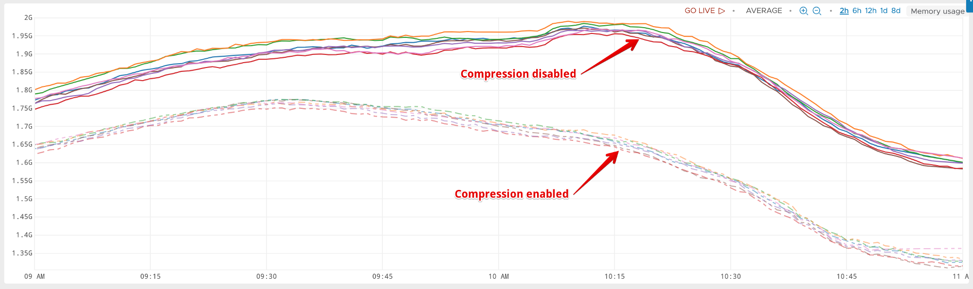
When the desired estimated treatment effect is usually at delivery level, clustering introduces problems in the regression model, as the error terms are correlated within each regional-time unit. The correlation within unit would lead to underestimated standard error and p-value, and hencely higher false positive rate. In one of our previous post Experiment Rigor for Switchback Experiment Analysis, we quantitatively measured how much the standard error is underestimated under OLS. The results show that the false positive rate is as high as 0.6 in our switchback world. To mitigate this issue, we will need to resolve the clustering problem and thus correctly estimate the standard error of the treatment effect. 

Pitfall of using MLM

To solve the clustering issue in the past, we applied MLM model on some switchback experiments. MLM, also known as linear mixed-effect model is a statistical model whose parameters can be either fixed or random effect, and can vary more than one level. Although, simulation result shows that it is much more efficient compared to most other models,MLM does not apply to all of the experiment scenarios at DoorDash. For some experiments, we found that MLM can give us contradictory results compared to OLS estimates. For example, MLM estimator produced a statistical significant result of -0.22 treatment effect, while the difference between average treatment and average control is 0.26, which is hard to interpret. 

The main reason why MLM can give us a biased result is due to the misspecification of model. In MLM, we assume normal distributed randomness of heterogeneity, which is not always the case in reality. When this assumption does not hold, the result can be biased. A more broad representation of this class of methods can be described as two stages: First by adding some additional constraints and assumptions when estimating the error correlation, then using FGLS to estimate the original model. The success depends on if we can consistently estimate the error. If all assumptions hold for the data in an experiment, then these model based approaches usually have a high power.

At DoorDash, dispatch experiments are quite diverse, ranging from time-delayed effects and route optimization, to parameter tuning, so there is usually no unique assumption that holds for all cases. Hence, for a new experiment that we do not have much prior knowledge, we need a “model free” method that can give a correct standard error estimation while not requiring any specification of error correlation.

Cluster Robust Standard Error

Introduction to CRSE

Cluster robust standard error (CRSE) can account for heteroskedasticity and correlations within clusters, while not making strong assumptions for error correlation. In this section, we will walk you through the development of CRSE from the OLS “nominal” variance that we are most familiar with. 

From the well-known formula of the solution to OLS, we can write the beta and variance of  beta as:

where Ω is the covariance matrix of the errors V(Ɛ|X).

When we have the assumption that errors are independent and identically distributed (iid), becomes a diagonal matrix with all elements equal σ2. Then we can get the variance of estimated treatment effect: 

When the errors are heteroskedastic, matrix becomes a diagonal matrix with all elements different. We can write the “meat” of the “sandwich” as below, and the variance is called heteroscedasticity-consistent (HC) standard errors.

When it comes to cluster standard error, we allow errors can not only be heteroskedastic but also correlated with others within the same cluster. Given such structure, Ω becomes a block-diagonal matrix, where ?i is the error vector in each cluster.

And the “meat” of “sandwich” becomes:

Where G is the number of clusters. To better illustrate, below is a visualization of the variance matrix Ω, taking switchback experiment at DoorDash as an example. In this simplified example, we have three regional-time units: San Francisco 1pm , New York 3PM, and Los Angeles 4AM. In each of the three units, there are only three deliveries. From the definition of CRSE above,  errors of deliveries are correlated within units but independent across units.

As we mentioned earlier, OLS, by neglecting within-cluster correlation, severely underestimates the variance. The formula below provides a useful approximation of how much the default OLS variance estimate should be inflated:

where the first ρ is a measure of within-cluster correlation of regressor, the second  ρ is the within-cluster error correlation, and Ng is the average cluster size. 

In dispatch switchback experiment, since the regressor is experiment bucket and it remains constant within a cluster, they are perfectly correlated. The model errors also have high correlation because deliveries within the regional-time units have very similar characteristics. As for cluster size, it is considerably large in popular region during peak time. Therefore, in our case, the default OLS variance estimator is severely downward biased and much smaller than CRSE.

Simulation

To validate that cluster robust standard error correctly estimate the standard error in dispatch experiments, we ran through a simulation procedure where we assign normal treatment effect to  50% of randomly selected deliveries from bootstrapped data and apply multiple different methods. The methods we used are:

  1. Delivery level regression 
  2. Regional-time unit level regression
  3. Delivery level with CRSE on regional-time unit
  4. Delivery level with CRSE on regional-time unit and added market as fixed effects

Simulation Results

Here are the simulation results using the above mentioned methods. We use WithinCI, the percentage which computed the confidence interval that covers the true mean, to measure the validity of method; and Power, the percentage which we actually detect the difference with statistical significance when there is any, to evaluate and compare across methods.

From the table, we can see that when we conduct test on delivery level without CRSE, WithinCI is much smaller than 0.95, which means it severely underestimates variance and confidence interval, and hence cannot be used. Unit level test has good validity from the evidence that WithinCI is close to 0.95. However, the power is very low and the sample size becomes much smaller after taking average over each unit. More importantly, taking average over each unit will weigh each units equally. From business consideration, however, we would want to put equal weight on each delivery instead of each region-time unit. After using CRSE on region-time unit at delivery level, the simulation result shows that the standard error is correctly estimated, with an improvement on power. We also experimented adding region fix effect or transform the metric on top of CRSE application, the result shows a large power improvement with fix effect. Although the result is not shown here, we also simulated using MLM on the same data. CRSE again proves that it is a more robust method on our switchback experiments.

Other Applications and Implementation

Implementation Caveats of CRSE

An important assumption of cluster robust standard error is that the number of clusters goes to infinity. Adjustment is common on finite cluster scenarios. For example, in stata, Instead of using ug, cug in formula (2) can be used rather than ug, where There are lots of software packages and libraries that implement CRSE and they can be slightly different. When we applied CRSE, in order to check if the specific implementation is suitable, we use cluster bootstrap to obtain a “true” cluster robust standard error and compare it with the one we implemented. In cluster bootstrap,  re-sampling is done on the cluster level. 

  • For i in number of bootstrap samples N:
    • Generate m clusters {(X1, y1), (X2, y2), …(Xm, ym)} by resampling with replacement m times from the original data
    • Compute estimator beta from generated data i
  • Collect {i, i=1,2,3…n} and compute the variance

We expect our implementation of CRSE to have a close enough value to cluster bootstrapped result. One major reason we do not directly apply cluster bootstrap variance in experiment is the speed. Generating CRSE by bootstrap enough times on big dataset can take a fairly long time. 

Application of CRSE in Diff-in-Diff

As mentioned earlier, clustering is a very common phenomenon in experiments at DoorDash, so cluster robust standard error can be used in many experimentation analysis. Particularly, cluster robust standard error is used in Diff-in-Diff experiments. At DoorDash, Diff-in-Diff experiment is usually applied when we measure treatment effect at aggregate geographic level. For example, we experiment on the effect of a marketing campaign by assigning the marketing campaign to some treatment states and use some states as control. Where i is individual, t is time, and s(i) is the market that individual i is in. The errors are highly correlated with each other over time within one market. Therefore, CRSE is necessary in diff-in-diff to obtain a correct estimate of standard error. In this example, since the standard error is clustered on market level, CRSE should be applied at market level. 

Conclusion

In switchback experiments where data are grouped into clusters, CRSE is a robust and straightforward way to get unbiased statistical inference. As we tackled this problem on the dispatch team, we were able to find applications of CRSE on many other experiments in Consumers, Dashers, and Merchants as well. Success to control for cluster error correlation is a big step forward in iterating on our marketplace experiments with more confidence. As we move on, we will keep improving our switchback experiment framework, especially on interaction effects, sequential testing, and joint test. 

Special thanks to Professor Navdeep S.Sahni, Sifeng Lin, Richard Hwang, and the whole dispatch team at DoorDash for their help in publishing this post.

References

  • A. Colin Cameron & Douglas L. Miller, (2015). A Practitioner’s Guide to Cluster-Robust Inference. Journal of Human Resources, University of Wisconsin Press, vol. 50(2), 317-372.
  • Freedman, D. A. (2008). On regression adjustments to experimental data. Advances in Applied Mathematics, 40(2), 180-193.

On my first day, I walked into DoorDash HQ expecting the typical orientation — long talks, heavy technical training, and tons of meetings. And while yes, I did eventually get all of that and more, little did I know I’d be leaving as fast as I had arrived, receiving orders, bouncing from restaurants and delivering to hungry customers.

This is something I admire so much about DoorDash — encouraging employees to dash at least once every month so that we can better understand how we’re impacting dashers, consumers, and merchants. This was the last thing I was expecting to do as an incoming Software Engineering Intern during my orientation, but was surprisingly one of my favorite aspects of the internship because it helped bring us closer to the product.

This is especially relevant to my work, as an intern. From my experience and what my friends have said about the typical software engineering internship, it never feels like interns do significant work that contribute to the overall mission of whichever company they are at. This can be attributed to a number of reasons — the brevity of internships, lack of experience, and the time necessitated to learning and ramping up — all of them totally understandable. However, DoorDash really does it differently, letting you dive right into the core logistical problems the team is solving every day to create a better platform for its customers, dashers and merchants. When I had my first real day of work, I was given three starter tasks right off the bat that allowed me to engineer and work with three related, but separate code bases. DoorDash lets you learn by doing, and I personally love that.

Moving past my assigned starter tasks, I was lucky enough to discuss with my mentor, Gary, about what project I’d work on for the remaining weeks. The degree of freedom that I had experienced in picking something I was interested in working on was incredible, especially as an intern. As far as I could tell, this was somewhat indicative of the full-time experience as well. After determining the pros and cons of each potential project I could work on, I ended up going with a project that was challenging and had high impact on how DoorDash understands and works with its supply and demand issue.

Diving into that final project, I worked on a lot of Machine Learning and integrating that work into the existing system. At the end of the day, I helped contribute to improving dasher messaging, predicting delivery times as well as predicting market demand. During the development process, I had to learn so much, not just from my teammates but also from other sectors of the company. Luckily, the work was highly encompassing and touched so many aspects of the DoorDash code base, forcing me to get in contact with other software engineers I would have never talked to or learn from. And I had to do it myself (alongside my mentor, who’d I pester with questions) — and not necessarily having a source telling me every exact thing I had to do. The degree of independence I had taught me a lot about the importance of being proactive, setting your own goals, and also striving to keep a balance of figuring out things on my own and knowing the right times to reach out for help. In other words, I learned more than just technical things at this company, but also soft skills that help a software engineer succeed in whatever environment they’re in. For me, that’s the biggest takeaway, as all of this is highly transferable to my future career.

To say that my summer flew by is an understatement. with its fast-paced engineering culture and inspirational, high-energy and mission-devoted team,, my time at DoorDash felt almost fleeting. I can truly say there wasn’t a day I wasn’t excited to come to work — leaving is bittersweet, which is something I’ve never felt about a job. Whether it be going to Angel Island for a team offsite, grabbing coffee with someone from a different sector of the company to just learn about what their work is like, or involving myself in the company’s monthly Smash Ultimate tournaments, the people are the primary reason why DoorDash is such an awesome place to be at and why my internship was so fulfilling. I am so sad to leave, but so grateful for what I’ve learned here and the friends I’ve made. Big shout out to my mentor, Gary, my manager, Raghav, and the rest of the Logistics ML and Assignment teams for making this summer one of the best ones yet!

Since I joined DoorDash back in January of this year, my utmost priority has been to build up the design team. Hiring is one critical part of the effort to support the company’s exponential growth, but equally important is the team’s career development.

Based on the team’s overall feedback, we identified a clear need to establish a career ladder framework that would help designers better understand where they stood in their career and what they needed to do to develop themselves further.

I decided to take a design-thinking approach to this task, and went through a problem-solving process similar to the one we use for our design projects: I defined the audience and their needs; set clear benchmarks and design principles; and generated solutions. Finally, I tested each one then iterated based on the results.


illustration of the design process
The design process

Audience and their needs

I identified three audiences who would use the career ladder: designers, managers, and HR. I also captured what each audience cared about the most:

Designers

  • I want to understand where I stand currently.
  • I want to know what I need to do to get to the next level.
  • I may consider becoming a manager at some point. What skills do I need to transition to that different path?

Managers

  • I need to know how I should level my new hire.
  • I need to calibrate levels across my team.
  • I need to assess who’s ready for promotion in my team.
  • I also want to know where I am at in my own career.

HR

  • How do design levels map to the company’s job architecture?
  • How do pay bands map to the job levels?

Competitive landscape audit

Most career ladders I’ve seen are written in the form of a spreadsheet or a doc like below. The spreadsheet is most common because its grid format makes the presentation of the rubrics easy.Collage of  a collection of performance review templatesFor the Product Design positions, the rubrics usually consist of multiple criteria per level, such as tenure (years of experience), execution, product sense, communication, complexity of the role, scope of influence/impact, collaboration, contribution to culture, etc.

But I found that usually these criteria were tightly interconnected and clearly isolating each rubric per level seemed nearly impossible. For example, scope of influence can’t be explained without accounting for someone’s product sense and communication skills.

Also, as you move up the career ladder, not all criteria hold the same weight nor do all skills grow equally. For example, design execution chops become less critical when you’re leading a team.

I wanted to design a solution that is simpler and easier for the audience to consume and comprehend. I also wanted to design it to be better than another mundane spreadsheet – after all, not only is this meant for designers, but I am a designer as well.

Design principles

There were three design principles I considered:

Simple

There was no clear value in introducing complex rubrics at each level. Simpler structure equals to easier comprehension. I hoped that simplified content would also encourage more frequent conversations between managers and designers.

Comprehensive

By showing the overall structure of the career ladder and describing what it takes to get to the next level, I wanted to make sure the relative state of each level was clear.

Human

Unlike many other existing docs that looks like a performance criteria guidance, I wanted to help the team imagine the persona of each level as they read it.

Design Solution

I chose to use a Google doc because it helps the narrative be more conversational. It also made sharing with the team easier.

There were many iterations of content and form designs over a couple of months, but here’s a glimpse of the final solution at a high level.

Similar to any good guidebook, the document opens with a table of contents for easier scanning of the content and navigating through different sections. Next comes the purpose of the document and how it should be interpreted and used.

The below visualization is the overall structure of the ladder and how the influence radius changes as you ladder up. This visualization provides the context of each level, and helps the HR team contextualize the Design team’s level against the rest of the org’s. It was also important to explain what it means to take an Individual Contributor (IC) career path versus a People Management path as well as the commonalities and differences.

Visualizing the design team career ladder 
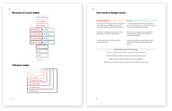
As to the actual job ladder definition, there are four sections describing each level: Profile, Hard Skills, Soft Skills and To get to the next level. Profiles generally describe the key attributes of each persona. “To get to the next level” is meant to help designers identify their development area while it helps managers crystalize the promotion criteria for their team members.Defining the different designer levels at DoorDash
There’s a separate chapter for People Managers explaining the general philosophy around culture, people management, and team building. Each level description is laid out similar to ICs but the difference is that it’s more focused on Responsibilities than Skills because many skills are overlapped with the equal-level ICs.Defining the different design manager levels at DoorDash

Test and iteration

This ladder was rolled out to the team in June, in time for our mid-year performance conversations. So far, the team’s feedback has been positive, and it’s been a useful guideline in career conversations.

Just like any other design process however, I anticipate it will continue to be iterated upon as the team and the company evolve over time. As with any product, career ladders wouldn’t be very useful if there are no active follow-ups with the audience. After the rollout, I’ve been holding weekly office hours to make myself available to anyone who would like to have a conversation about their career.

We’re also planning to develop a similar document for our other UX functions like UX Research and UX Content Strategy.

Some interesting decisions and learnings

  1. I made a conscious decision not to make the years of experience too explicit and keep it rather looser in definition. When there are specific numbers attached, it can be misleading because tenure isn’t always equal to an individual’s impact or contribution. For example, having 10 years of experience doesn’t automatically mean that you are qualified to become a design lead. Even if you have fewer years under your belt, you can still be a design lead if your talent is exceptional and you’re making a significant contribution to the company. A career ladder has to provide a general framework but with some flexibility.
  2. As you ladder up, the distinction between hard and soft skills become blurry. When you’re operating at the leadership level, even if you’re an IC, your problem solving (which is typically defined as a hard skill) also involves soft skills like negotiation, teambuilding, and cross-functional communication. So I decided that the highest IC role would have an all-inclusive “Skills” section without a breakdown for hard vs. soft skills.
  3. A career ladder is merely a guidebook for your career journey, not the be-all-end-all. At the end of the day, it’s your job to define your own career aspirations/goals, and the manager’s job is to help you get there using the career ladder as a general guidebook. If we were to use travel as an analogy, you must determine your final destination on the map while managers act as guides who set milestones to help you get there. Don’t expect your managers to set the destination for you.
  4. A promotion is an indication of career progression, but it cannot be the actual career goal. Otherwise you’ll find yourself frustrated and anxious all the time. A promotion should be an outcome of your hard effort and outstanding performance. With that said, getting meaningful career experiences doesn’t always mean you need to be looking for your next promotion. Many times, lateral career moves to focus on a different domain or skill can be just as rewarding as a promotion. I want people to see their career more as a jungle gym than a ladder. Some moves will be lateral, some moves will be up, but you should be growing in breadth or depth either way. This is why it’s also important to find a company and a manager who is willing to invest in your career development, and will recognize you for your true value.

What’s your story?

I feel privileged to establish a foundation of the design team’s career ladder definition at DoorDash. For other design leaders who also have gone through similar exercises and challenges, I’d love to hear your wisdom and learnings.

For the designers who have seen career ladders in the past, what are the most important things you’re looking for in such documents, and what matters most to you?

Please share your insights in the comments below!

Special thanks to Tae Kim, our amazing Content Strategy lead at DoorDash and Justin Steffen, my awesome HRBP, for helping me with this article.

While writing complex services in go, one typical topic that you will encounter is middleware. This topic has been discussed again, and again, and again, on internet. Essentially a middleware should allow us to:

  • Intercept a ServeHTTP call, and execute any arbitrary code.
  • Make changes to request/response flow along continuation chain.
  • Break the middleware chain, or continue onto next middleware interceptor eventually leading to real request handler.

All of this would sound very similar to what express.js middleware do. We explored  various libraries and found existing solutions that closely matched what we wanted, but they either had unnecessary extras, or were not delightful for our taste buds. It was pretty obvious that we can write express.js inspired middleware, with cleaner installation API under 20 lines of code ourselves.

Continue reading “Writing Delightful HTTP Middleware in Go”

At DoorDash we are consistently making an effort to increase our user experience by increasing our app’s stability. A major part of this effort is to prevent, fix and remove any retain cycles and memory leaks in our large codebase. In order to detect and fix these issues, we have found the Memory Graph Debugger to be quick and easy to use. After significantly increasing our OOM-free session rate on our Dasher iOS app, we would like to share some tips on avoiding and fixing retain cycles as well as a quick introduction using Xcode’s memory graph debugger for those who are not familiar.

If pinpointing root causes of problematic memory is interesting to you, check out our new blog post Examining Problematic Memory in C/C++ Applications with BPF, perf, and Memcheck for a detailed explanation of how memory works.

I. What are retain cycles and memory leaks?

A memory leak in iOS is when an amount of allocated space in memory cannot be deallocated due to retain cycles. Since Swift uses Automatic Reference Counting (ARC), a retain cycle occurs when two or more objects hold strong references to each other. As a result these objects retain each other in memory because their retain count would never decrement to 0, which would prevent deinit from ever being called and memory from being freed.

II. Why should we care about memory leaks?

Memory leaks increase the memory footprint incrementally in your app, and when it reaches a certain threshold the operating system (iOS) this triggers a memory warning. If that memory warning is not handled, your app would be force-killed, which is an OOM (Out of memory) crash. As you can see, memory leaks can be very problematic if a substantial leak occurs because after using your app for a period of time, the app would crash.

In addition, memory leaks can introduce side effects in your app. Typically this happens when observers are retained in memory when they should have been deallocated. These leaked observers would still listen to notifications and when triggered the app would be prone to unpredictable behaviors or crashes. In the next section we will go over an introduction to Xcode’s memory graph debugger and later use it find memory leaks in a sample app.

III. Introduction to Xcode’s Memory Graph Debugger

To open, run your app (In this case I am running a demo app) and then tap on the 3-node button in between the visual debugger and location simulator button. This will take a memory snapshot of the current state of your app.

The memory graph debugger button

The left panel shows you the objects in memory for this snapshot followed by the number of instances of each class next to it’s name.

ex: (MainViewController(1))

The classes in-memory in Xcode

Signifies that there is only one MainViewController in memory at the time of the snapshot, followed by the address of that instance in memory below.

Stay Informed with Weekly Updates

Subscribe to our Engineering blog to get regular updates on all the coolest projects our team is working on

If you select an object on the left panel, you will see the chain of references that keep the selected object in memory. For example, selecting 0x7f85204227c0 under MainViewController would show us a graph like this:

The memory graph with the strong referencing and unknown referencing
  • The bold lines mean there is a strong reference to the object it points to.
  • The light gray lines mean there is an unknown reference (could be weak or strong) to the object it points to.
  • Tapping an instance from the left panel will only show you the chain of references that is keeping the selected object in memory. But it will not show you what references that the selected object has references to.

For example, to verify that there is no retain cycle in the objects which MainViewController has a strong reference to, you would need to look at your codebase to identify the referenced objects, and then individually select each of the object graphs to check if there is a retain cycle.

In addition, the memory graph debugger can auto-detect simple memory leaks and prompt you warnings such as this purple ! mark. Tapping it would show you the leaked instances on the left panel.

The retain cycles automatically detected by Xcode

Please note that the Xcode’s auto-detection does not always catch every memory leak, and oftentimes you will have to find them yourself. In the next section, I will explain the approach to using the memory graph debugger for debugging.

IV. The approach to using the Memory Graph Debugger

A useful approach for catching memory leaks is running the app through some core flows and taking a memory snapshot for the first and subsequent iterations.

  1. Run through a core flow/feature and leave it, then repeat this several times and take a memory snapshot of the app. Take a look at what objects are in-memory and how much of each instance exists per object.
  2. Check for these signs of a retain cycle/memory leak:
    • In the left panel do you see any objects/classes/views and etc on the list that should not be there or should have been deallocated?
    • Are there increasingly more of the same instance of a class that is kept in memory? ex: MainViewController (1) becomes MainViewController (5) after going through the flow 4 more iterations?
    • Look at the Debug Navigator on the left panel, do you notice an increase in Memory? Is the app now consuming a greater amount of megabytes (MB) than before despite returning to the original state
  3. If you have found an instance that shouldn’t be in memory anymore, you have found a leaked instance of an object.
  4. Tap on that leaked instance and use the object graph to track down the object that is retaining it in memory.
  5. You may need to keep navigating the object graphs as you track down what is the parent node that is keeping the chain of objects in memory.
  6. Once you believe you found the parent node, look at the code for that object and figure out where the circular strong referencing is coming from and fix it.

In the next section, I will go through an example of common use cases of code that I’ve personally seen that causes retain cycles. To follow along, please download this sample project called LeakyApp.

V. Fixing memory leaks with an example

Once you have downloaded the same Xcode project, run the app. We will go through one example using the memory graph debugger.

  1. Once the app is running you will see three buttons. We will go through one example so tap on “Leaky Controller”
  2. This will present the ObservableViewController which is just an empty view with a navigation bar.
  3. Tap on the back navigation item.
  4. Repeat this a few times.
  5. Now take a memory snapshot.

After taking a memory snapshot, you will see something like this:

Snapshot of the retain cycles and leaked instances of the classes

Since we repeated this flow several times, once we return back to the main screen MainViewController the observable view controller should have been deallocated if there were no memory leaks. However, we see ObservableViewController (25) in the left panel, which means we have 25 instances of that view controller still in memory! Also note that Xcode did not recognize this as a memory leak!

Now, tap on ObservableViewController (25). You will see the object graph and it would look similar to this:

Closure holding a strong referencing causing a memory leak

As you can see, it shows a Swift closure context, retaining ObservableViewController in memory. This closure is retained in memory by __NSObserver. Now let’s go to the code and fix this leak.

Now we go to the file ObservableViewController.swift. At first glance, we have a pretty common use case:
https://gist.github.com/chauvincent/33cf83b0894d9bb12d38166c15dd84a5
We are registering an observer in viewDidLoad and removing self as an observer in deinit. However, there is one tricky usage of code here:
https://gist.github.com/chauvincent/b191414d54ba4cbb04614b1f85ac2e24
We are passing a function as a closure! Doing this captures self strongly by default. You may refer back to the object graph as proof that this is the case. NotificationCenter seems to keep a strong reference to the closure, and the handleNotification function holds a strong reference to self, keeping this UIViewController and objects it holds strong references to in memory!

We can simply fix this by not passing a function as a closure and adding weak self to the capture list:

https://gist.github.com/chauvincent/a35a8f08c7dd4fc183ab2bd5b2ba5e6d

Now rebuild the app and re-run that flow several times and verify that the object has now been deallocated by taking a memory snapshot.

You should see something like this where ObservableViewController is nowhere on the list after you have exited the flow!

Snapshot of the memory graph after fixing the memory leak

The memory leak has been fixed! ? Feel free to test out the other examples in the LeakyApp repo, and read through the comments. I have included comments in each file explaining the causes of each retain cycle/memory leak.

VI. Additional tips to avoid retain cycles

  1. Keep in mind that using a function as a closure keeps a strong reference by default. If you have to pass in a function as a closure and it causes a retain cycle, you can make an extension or operator overload to break strong reference. I won’t be going over this topic but there are many resources online for this.
  2. When using views that have action handlers through closures, be careful to not reference the view inside its own closure! And if you do, you must use the capture list to keep a weak reference to that view, with the closure that the view has a strong reference to.

For example, we may have some reusable view like this:

https://gist.github.com/chauvincent/b2da3c76b0b811c947487ef3bf171d5a

In the caller, we have some presentation code like this:

https://gist.github.com/chauvincent/c049136b236c8b358d81ad16168a0243

This is a retain cycle here because someModalVC’s actionHandler captures a strong reference to someModalVC. Meanwhile someModalVC holds a strong reference to the actionHandler

To fix this:

https://gist.github.com/chauvincent/fe868818e9be6f61cf3bc032539ff3a8

We need to make sure the reference to someModalVC is weak by updating the capture list with [weak someModalVC] in to break the retain cycle.

3. When you are declaring properties on your objects and you have a variable that is a protocol type, be sure to add a class constraint and declare it as weak if needed! This is because the compiler will give you an error by default if you do not add a class constraint.  Although It is pretty well known that the delegate in the delegation pattern is supposed to be weak, but keep in mind that this rule still applies for other abstractions and design patterns, or any protocol variables you declare.

For example, here we a stubbed out clean swift pattern:

https://gist.github.com/chauvincent/8882082ea1280c722955b4803ca6854b
https://gist.github.com/chauvincent/15f52e6908a70ea36d099a16d2d660e2

Here, we need the OrdersListPresenter’s view property must be a weak reference or else we will have a strong circular reference from the View -> Interacter -> Presenter -> View. However when updating that property to weak var view: OrdersListDisplayLogic we will get a compiler error.

Errors from not adding a class-bound protocol while making a reference weak

 This compiler error may look discouraging to some when declaring a protocol-typed variable as weak! But in this case, you have to fix this by adding a class constraint to the protocol!

https://gist.github.com/chauvincent/bbc2c2fc42df62bad61a9d4c49b0290e

Overall, I have found using Xcode Memory Graph Debugger to be a quick and easy way to find and fix retain cycles and memory leaks! I hope you find this information useful and keep these tips in mind regularly as you develop! Thanks!

Engaging, encouraging, and empowering our community to value diversity and inclusivity through intentional decisions around hiring, rewards, and penalties.

If you really care about something, it has to be at the core of what you do. At DoorDash we believe an inclusive environment is a competitive advantage. To reflect this, we integrated Diversity and Inclusion values into the way we hire, promote, and behave.

Diverse teams do better work [source 1] [source 2], it’s a proven statement. To maintain diverse teams you can’t just hire diverse teams, you also need to foster an inclusive environment to retain those teams.

Hire for Values

We looked at how we could better incorporate our values into the interview process. Our previous “Culture Fit” interview did not meet our expectations, so we’ve revamped this portion and now call it “Engineering Values”. We wanted to make sure this section asked “Who are you, what do you care about, and what do you want to bring to your next company?”, rather than “Will you fit in here?”.

One of the main changes we made was introducing questions about diversity and inclusion. This is extremely important to us, not only as a moral imperative, but also because a diverse workforce will best serve our diverse audience of consumers, dashers, and merchants.  

Since this interview was new and felt less objective than the coding rounds, we decided to launch it as a paired interview, where we have two interviewers present.  This allows us to get a better signal by providing two points of view and gives us a tight feedback loop for interviewers to improve their skills. Paired interviews lead to less unconscious bias, due to developing more uniformity in how we ask questions and introduce the interview.

It’s been almost a year since we introduced this new interview and it is one of our favorite parts of our process. What’s been exciting is to see that it’s also become a favorite part of the process for our candidates. Many candidates tell us that we were the only company they interviewed with that proactively brought up the topic, and they relayed how much they appreciate this part of the interview process.

Reward

We want to allow employees to engage not only in “job function” necessities but also to allow them the space to engage in events/discussions that increase community building within the company, such as getting involved in Pride@DoorDash events.  Our goal here is to make sure that doing the right thing and doing the thing that’s right for your career intersect as much as possible.

Therefore, as of September, we’ve added our engineering values to our engineering levels. This means that our team is not only responsible for execution, but also for fostering a diverse and inclusive workplace. We even have a question about how the employee contributes to the company culture in our performance reviews, enforcing this attribute as part of our goaling system.

Accountability
No one is perfect, so it’s important to build a culture where we’re all helping each other stay on track. A quick, “Did you notice Nick was trying to speak up during that meeting” can help people realize the impact of their behavior, and correct accordingly.  The critical piece here is that people feel comfortable letting each other know about transgressions and also that we accept feedback from our peers.

We consider values as core to expected engineering behavior alongside technical performance.  Therefore, we can handle improving inclusive behavior the same way we approach improving performance in general. The goal is to guide someone to better behavior by discussing what went wrong, educating on how to do better next time, and providing opportunities to demonstrate improvement.

When it comes to performance review, culture is not an afterthought, it is simply part of the expectation for reaching the next level.

Looking Forward

In the end, we learned an important lesson.  The way for us to be successful in making our culture more inclusive was to make the things important to us ubiquitous and top of mind for all engineers. We did this by:

  • Documenting, publishing, and living the core values that we believe in.
  • Incorporating those values into our hiring process.
  • Rewarding the people that promote and diversify our culture.

This is still just the beginning for us. Diversity and inclusion is not just a movement or a group of initiatives. Successful initiatives create a culture where everyone sees diversity and inclusion as a part of their day to day work.  It must be a part of who we are.

At DoorDash, we believe in learning from our marketplace of Consumers, Dashers, and Merchants and thus rely heavily on experimentation to make the data-driven product and business decisions.

Although the majority of the experiments conducted at DoorDash are A/B tests or difference-in-difference analyses, DoorDash occasionally relies on a type of experimentation internally referred to as “switchback testing”. Switchback tests randomize experiment buckets on geographic region and time “units” rather than users to reduce the impact of dependencies in observations on our experiment results. Although the implementation of switchbacks is similar to A/B tests, two characteristics of their datasets add complexity to their analysis: (1) the nested data structure and (2) the small number of more independent “units” available for analysis.

This blog post will discuss how we determined the most accurate approach to analyzing switchback experiments and improved the statistical power of our experiments. In so, we have been able to iterate on products decisions more confidently and 30% more quickly.

Introduction to Switchbacks

While A/B testing is commonly used at DoorDash, it is not optimal for testing our assignment algorithm because the assignment of one delivery to a Dasher depends heavily on the outcome of another delivery’s assignment to a Dasher. For example, say there are two deliveries that need to be assigned and only one Dasher is available. If we apply an algorithm change to one delivery which will assign it quicker than the standard, we risk impacting the second “control” delivery’s assignment since the “treated” delivery would most likely be assigned to the only Dasher. Switchback testing mitigates the risk of these network effects by randomizing our experiment into buckets on regions and times of day rather than Dashers or deliveries. By randomizing on these regional-time “units”, all deliveries and Dashers in each unit are exposed to the same type of algorithm, in turn reducing the impact of dependencies among deliveries in two different experiment buckets.

An illustration of this randomization structure is shown below.

Once randomization happens on the region-time unit level, each delivery is bucketed into to a treatment or control group based on that of its region and time, and as a result, we get a nested data structure: multiple deliveries are part one of one ‘unit’.

Key Considerations in Switchback Analysis

The most straightforward way to analyze our switchback delivery data might appear to be a two-sample t-test, which directly compares the average delivery duration in our treatment experiment group versus our control group, as represented by the following regression: 

Duration ~ bucket

However, using deliveries as observations violates the assumption of independence for which we tried to correct by randomizing on region-time units in the first place. We therefore tended to aggregate our results on the unit of randomization (i.e. regional-time unit) prior to running t-tests, as we found this provided a more accurate estimate of the average effect and variance of our experiment’s treatment. More on “unit-level” analysis can be found in the prior blog post Switchback Tests and Randomized Experimentation Under Network Effects at DoorDash.

Still, unit-level summarization has two drawbacks. First, by first aggregating delivery durations by region-time unit, it is difficult to obtain statistically significant results due to limited sample size. For example, let’s assume one regional-time unit has 20 deliveries. If we analyze our experiment on regional and time units rather than deliveries, the 20 deliveries available for a power analysis become only 1 unit from which we can get statistical power. Second, unit-level analysis does not correctly account for instances in which our algorithm change might have distinct effects on delivery times in regional-time units with few deliveries (i.e. 1am) versus those with many deliveries (i.e. 5pm). In these situations, it is difficult for us to confidently conclude whether an algorithm change reduced or increased our delivery durations on average, as unit-level and delivery-level results can directionally diverge.

Therefore, we wanted to test if we could improve our treatment effect and variance estimates by analyzing our experiment results using two other methods: unit-level t-tests with variance reduction covariates and multilevel modeling (MLM), both briefly discussed below.

Unit-level t-tests with variance reduction were appealing because they would address our statistical power concern of unit-level analysis. By adding covariates Χ_i that satisfy the conditional independence requirements (expressed below), we looked to explain away some of the variation in delivery times unrelated to the experiment bucket in our experiments. Some covariates we used included time of day, week number, region, and total order value.MLM was appealing because our dataset is naturally nested (meaning  correlations exist between delivery durations from the same day, same time of day, and same region), and MLM is a tried and tested approach for interpreting nested datasets.

To help understand MLM, let’s look at an example of a switchback experiment run only in San Francisco, illustrated below. Note, although switchbacks randomize across regions and times, we only randomize on times in this example for simplicity’s sake:

Running MLM can be viewed as a combination of two stages.

The first stage runs a linear regression on each region-time unit to explain delivery-level variation using the equation  Duration ~ 1 + bucket + ε for every region and time . In the example above, this would mean running four of such regressions, two of which are illustrated below:

The second-stage regression uses the coefficients determined in the first-stage regression to explain the variability between the region-time units, as shown in the following regressions where β_0 and β_1 represent the average intercept and average treatment effect respectively and þ_0_RegionTime and þ_1_RegionTime represent random-effects. The random effects make it possible for each region-time unit to have different intercepts to explain delivery durations.

Although MLM is not exactly a two-staged regression, it is very similar. In combining the two stages into one formula (as shown below), MLM can account for individual delivery durations in each unit when estimating unit level average intercept β_0 and treatment effect β_1.

Region_Time represents the region-time unit (i.e. SF Day 1 in the above example) and i represents a delivery.

When choosing MLM as an alternative approach, we hypothesized MLM would not only be more statistically powerful than unit-level analysis because it includes individual deliveries in its calculations of treatment effects and variance; we also believed MLM would account for dependencies among deliveries when calculating variance, as will be proven in the results.

Objective For Improving Analysis of Switchbacks

In improving our analysis of switchbacks, we set out to reduce the false positives and the false negatives associated with our experiment analysis because we want to trust that (A) we do not incorrectly conclude a treatment effect exists when none exists, and (B) detect a change in our key metric when our treatment changes that metric. Specifically, false positives occur if we conclude a treatment effect exists when in reality there does not. For example, if we run an AA test data and see a p-value less than 0.05, we would incorrectly reject the “null hypothesis” that there was no treatment effect where in fact the null hypothesis is true. False negatives occur if we fail to conclude a treatment effect exists when one does exist. For example, if we run an A/B test and, given we have enough sample size to based on our power calculations, the p-value is greater than 0.05 when a known treatment effect exists, we incorrectly accept the null hypothesis. Notice how sample size is a component here, as false negatives relate to statistical power.

Comparing Analysis Alternatives Through Data Simulation  

We evaluated our models on switchback data using frequentist statistics perspective, meaning we assumed (A) there exists a fixed treatment effect (i.e. 0 for AA tests) and (B) the estimate of that treatment effect relies on what data is available.

To implement our approach, we took a few weeks of company-wide delivery data and simulated many versions of an artificial experiment on the same data. These simulations were done by grouping our delivery data into time-region units and randomizing the units into treatment and control, as would be done in a switchback, meaning every delivery would get the experiment group of its unit. For our AA tests, we kept everything as is, and for our A/B tests, we added a known normally distributed treatment effect to all deliveries in the treatment group units; the normal distribution was a simplifying assumption. Next, we tested our 4 methods of experiment analyses (delivery-level analysis, unit-level analysis, unit-level with variance reduction, and multilevel modeling) on each of the simulated AA and AB tests and recorded the mean treatment effect and p-value for each of our simulations. Finally, we graphed the distributions of p-values and treatment effects for our final step: calculating false positive rate, false negative rate, and bias.

Simulation Findings: MLM versus other methods

From our simulations, we determined MLM was the optimal method of analysis. As shown below, MLM had the lowest false positive rate (0.03) and the second highest statistical power (0.93). There are several advantages to applying MLM for switchback experiment analysis.

First, although delivery-level t-tests have the highest statistical power, MLM provides a more dependable treatment effect estimate given delivery-level’s unfavorably high false positive rate (0.62). The high delivery-level false positive rate stems from the nested structure of our switchback datasets:  the more correlated our deliveries are within the same regional-time unit, the more we underestimate the variance of our clustered dataset when using traditional t-tests.

To concretely understand why delivery-level t-tests underestimate the variance of our switchback experiment results, it’s helpful to compare the t-test variance estimate to that of the data’s true variance using the variance formula for ordinary least squares (OLS): Duration ~ β_0 + β_hat + bucket. Assuming Var(β_hat) is the true variance of the treatment effect, n is our sample size, and ρ_e is our intraclass correlation coefficient (ICC) (detailed below), the variance for our treatment effect estimate is:It is easy to see from the above equation that we correctly estimate the variance of our treatment effect only when the ICC (denoted by ρ_e) equals 0. This is not possible with our switchback data because when data has a nested structure, the ICC is always greater than 0. This is because the ICC quantifies the proportion of total variance that comes from the two components of variance in a nested dataset: between-group variance (i.e. the variance in regional-time units) and within-group variance (i.e. the variance in delivery durations within regional-time units). More concretely, the ICC is calculated as follows, where the numerator denotes the between-group variance and denominator denotes the total variance:If the numerator is zero in the above equation, that means we see no between-group variance exists, meaning our data is not nested and we can in theory use t-tests to analyze our data. However, when any between-group correlations exists, as in the case of our switchback dataset, we know our dataset is nested and t-tests are no longer appropriate. Therefore, by using a t-test to interpret our switchback dataset, it makes sense that we get a large t-statistic and an incorrectly small p-value:MLM corrects for the underestimation of variance in nested datasets by incorporating both between-group variance and within-group variance in its variances estimates, as seen by MLM’s low false positive rate.

Second, although unit-level analysis improve our estimation of variance by eliminating the correlation among delivery observations, MLM has much higher statistical power than unit-level analysis. In fact, by using MLM, we cut the time necessary to get statistically significant results by ~30% compared to unit-level analyses. This is because the sample size available for unit-level analysis is substantially lower than that available in MLM, due to the inclusion of delivery-level and unit-level data in MLM. With fewer observations, we get lower t-statistics and thus p-values higher than 0.05 for unit-level analysis when treatment effects exist.

Third, while we can improve the power of the unit-level test by adding more covariates such as time of day (i.e. lunch or dinner) and regional area, we could not find covariates that reduced the variance of the treatment effect estimate by enough to compensate for the sample size differences between unit-level analysis and MLM. Additionally, with variance reduction regressions, we risk introducing bias to our experiment results if adding the wrong covariates (i.e. covariates that correlate to the treatment effect) or omitting necessary covariates. The details of bias are included in the APPENDIX. For example, if we include unit_id’s as a dummy variables, we substantially reduce the degrees of freedom and increases variance in our estimates, whereas MLM does not have the issue when it considers unit_id as a random effect. By including unit_id as random effect, we can model the difference in average delivery times per regional-time unit compared to that of the entire dataset in what is essentially a two-stage regression.

All of these findings strongly suggest we should use MLM to analyze our switchbacks with unit_id as a random effect.

Conclusion  

Obtaining experiment results in which we can be confident is a key component for shipping products that will ultimately improve the user experience for our Consumers, Dashers, and Merchants. Analyzing switchback experiments using MLM is a big step forward in iterating on our marketplace experiments more confidently and more quickly than ever before.

This is just the beginning. There is still room for improvement on variance reduction for switchback data to get results more quickly through (1) using random effects in other variance reduction techniques such as sequential testing or CUPED, (2) adding additional predictors and fixed and random coefficients to MLM (using the build-up strategy to help determine which effects to include and the complexity of model), (3) using other robust variance estimation, such as cluster standard errors, Huber–White standard errors, Generalized Estimating Equations and/or (3) other solutions like Weighted least squares (WLS) on unit-level data or Block bootstrap. As we look to iterate more quickly on marketplace experiments with small treatment effects, we plan to expand upon the simulation processes used here to find a better MLM model for our experiment analysis in the future.

Want to help us improve experimentation? Check out open positions on our careers page!

APPENDIX

Further Explanation of Unit-Level Variance-Reduction Results

To better understand why unit-level results with variance reduction did not perform as well as MLM, we need to recall (1) the conditional independence requirements and (2) unit-level sample size concerns which were both mentioned above in the “Key Considerations in Switchback Analysis” section of this blog.

Regarding conditional independence, if we can find a set of covariates that satisfies the conditional independence requirements, this will make the selection bias zero, and hence observed difference in delivery durations will be the average treatment effect, as shown below:where Duration_0i is the duration of delivery had it been assigned to the control bucket, irrespective of whether it actually was assigned to control, and Duration_1i is the duration of delivery had it been assigned to treatment.However, generally we do not know the perfect set of covariates satisfying the conditional independence and we will likely omit variables that are correlated with the delivery duration and one or more of its explanatory covariates in the model. This is known as the omitted variable bias. We can quantify this bias using the Omitted Variables Bias Formula to get a sense how the result changes by adding new covariates.However, even if we reduce the omitted variable bias, unit-level variance results still start from fewer observations from which to get statistical significance than MLM. Therefore, the explanatory power of covariates added to the model will have to compensate for the advantage of having both within-group and between-group variances.

Update: DoorDash has opened a new New York City office. Learn about that office launch in this article.

As DoorDash expands its footprint into all 50 states, growing from 600 cities to 3,300 in the past year alone, it’s time for our Engineering Org to expand to keep pace. In addition to our engineering teams in San Francisco and Mountain View, a group of engineers from San Francisco recently moved to Manhattan to kick off our bicoastal Engineering presence.

Delivery is nothing new to New York, rather it’s been evolving there for decades, making Manhattan the gold standard. In 1945, Manhattan was where the first “ordered to take home” pizzas were delivered, and the city hasn’t looked back since. Today, hundreds of thousands of meals are delivered each day throughout Manhattan. This illustrious history of food delivery in New York City made it the obvious location for our next office. In the coming months, we’ll immerse ourselves in the city, trying to get to the core of what makes it unique— venturing out to eateries across the city, testing different forms of delivering food, and learning how New York became the trailblazer it is in the delivery industry. Getting engineering boots on the ground will allow us to learn and iterate on the model that’s been so successful in the past, and scale our learnings across every market in which DoorDash operates.

One of our primary focuses in the NYC office will be building products to help DoorDash deliver quickly and reliably in highly dense delivery markets while using machine learning models to adapt our existing logistics platform to handle the challenges of urban geographies. Manhattan is situated amongst a conglomerate of metro areas, which makes it the perfect location to start testing our bets. As we learn more over the coming months, we’ll do more to delight our customers, wherever they may be.

Our new office near Madison Square Park — 45 W 25th St, New York, New York

The New York team testing out a new delivery vehicle on the streets of Manhattan

DoorDash is the fastest growing on-demand logistics platform in North America. We are passionate about building solutions that have the power to transform last-mile logistics.

Our team is growing quickly and we’re looking for talented engineers with a passion for impact. In addition to working on game-changing products, you’ll also be shaping the core technology that powers DoorDash and be part of the cornerstone of the New York Engineering culture.

If you’re interested in solving challenging logistics problems, come join us today!

For those of you that don’t know me, I’ve been writing blogs about preparing for technical interviews and about my startup. I ran a computer science club that helps engineers prepare for technical interviews and participated in Y-Combinator’s Startup School. Because I stopped working on my startup, I needed a (real?) job so I applied to a bunch of companies.

I got more than 15 job offers — from small startups to huge tech companies. It was definitely not an easy ride though. I initially got rejected from tons of companies because I wasn’t prepared for technical interviews. Here’s a blog I wrote about what I did to prepare for them.

I was blessed to have had a great problem of choosing one offer from multiple offers. Rather than following my gut feeling (which is what I normally do in these types of situations), I decided to put some more thought into it. I didn’t want to join a large company because I was more interested in joining a startup. After thinking of 5 factors that I thought were important, I decided that DoorDash was the right company for me:

1. The Founding Story

Every company has a unique founding story. I think it’s important to know the story because it helps you understand the company’s DNA. Founding stories are clues that give away information about how the company creates culture.

Back in 2014, I came across YC’s Stanford course on how to start a startup. I discovered amazing people like Paul Graham, Brian Chesky, Marc Andreessen, Stanley Tang, The Collison Brothers, and many others that literally changed my life. The DoorDash founding story was truly inspiring. I was astonished to learn how three Stanford friends came together to create a relatively unprofessional looking website called PaloAltoDelivery.com with just a few menu PDFs, and they did all the deliveries themselves in the early days. Before that, I had a totally different idea about how companies were created. That willpower, determination, and “roll up your sleeves” mentality says a lot about how DoorDash became a multi-billion dollar startup.

Stanley Tang talking about the founding story of Doordash (2014)

I was particularly interested in DoorDash and Airbnb’s founding stories and was inspired by Brian Chesky and Stanley Tang. Little did I know that 4 years later, I would be sitting across from Stanley and asking him questions face-to-face.

2. The Vision

It’s easy for startups to get caught up with what they’re currently doing and forget about the long-term vision. Many startup founders fail to articulate their long-term vision to people. That’s not good. I respect startups that aim high and think with big numbers. Go big or go home. DoorDash is one of those companies. Today DoorDash is primarily known as a marketplace for food delivery, but tomorrow it’s going to be much more.

3. Growth Rate

Growth rates are much more important than the current size of a company because it’s a sign of the impact you can make. A startup can have 100 million users but if it doesn’t have an impressive growth rate it’s not going to be relevant in the future. DoorDash has impressive growth. Although they had fewer employees compared to the larger startups that I had received offers from, their growth definitely impressed me.

At the same time, it wasn’t too large of a unicorn. I wanted to join a company that allowed me to make a big impact in. It’s very difficult to do that in larger companies.

4. Market Growth Rate

As Sam Altman says, don’t just look at the current market size. Look at the market growth rate. That’s especially important to think about when it comes to new markets. 10 years ago the market size of social media was almost insignificant compared to today. The current market size for the last-mile delivery industry is big today, but it’s going to be even bigger in the next few years. The market is so big, and continues to grow, that UberEats, DoorDash, Grubhub, and Postmates can all enjoy the pie together. It’s not a zero-sum game — yet. That leaves room for so many opportunities and interesting challenges. DoorDash is definitely in the front line.

5. Culture

After having read Ray Dalio’s “Principles”, it became very clear to me that culture is the most important thing in a company. Culture isn’t just about allowing pets in the office and encouraging diversity, it’s more than that. Culture is what makes or breaks a company. Bad culture attracts bad people. Great culture attracts great people.

Once again, DoorDash stood out from the crowd when it came to culture. Unlike many startups that conduct behavioral interviews as if it’s just a formality, that was clearly not the case at DoorDash. Also the big 5 big words written in the cafeteria that wrote “humble, thoughtful, bold, optimistic, and relentless” were signs that DoorDash truly cares about culture.

Great things happen when an employee’s incentives are aligned with the company’s. That way, the two grow together. I’m excited to be part of the DoorDash family and am looking forward to the exciting future!

One of challenges we face almost everyday is to keep our API latency low. While the problem sounds simple on the surface, it gets interesting sometimes. One of our endpoints that serves restaurant menus to our consumers had high p99 latency numbers. Since it’s a high traffic endpoint we naturally use caching pretty intensively. We cache our serialized menus in Redis to avoid repeated calls to the data base, and spread out the read traffic load. By the end of this post we will present how we used compression to not only improve our latency, but also to get ourselves more space to cache.

The problem with large values

After some deep instrumentation and inspection we determined the problem in this particular scenario was that some of our menus were almost half a MB long. Our instrumentation showed us that reading these large values repeatedly during peak hours was one of few reasons for high p99 latency. During peak hours, reads from Redis took more sometimes at random took more than 100ms. This was especially true when a restaurant or a chain with really large menus were running promotions. Why this happens should be a surprise to no one, reading or writing many large payloads over the network during peak hours can end up causing network congestion and delays.

Compression to the rescue

To fix this issue, we obviously wanted to reduce the amount of traffic between our server nodes and cache. We were well aware of techniques like LevelDB using snappy to compress, and decrease the on-disk size. Similarly, our friends at CloudFlare also used a similar technique to squeeze more speed out of Kafka. We wanted to do something similar i.e. use a compression algorithm, with good speed and a decent compression ratio.

Like other folks we did our benchmarks, and found that LZ4, and Snappy were two nice options. We also considered other famous options like ZlibZstandard, and Brotli but found their decompression speeds (and CPU load) were not ideal for our scenario. Due to the specific nature of our endpoint, we found LZ4 and Snappy were more favorable. Both libraries were in the Goldilocks zone of compression/decompression speedCPU usage, and compression ratio.

There are a plethora of benchmarks on the internet already comparing compression speeds and ratios. So without going into detail and repeating  the same benchmarks, here are some examples and a summary of our findings:

  • 64,220 bytes of Chick-fil-A menu (serialized JSON) was compressed down to 10,199 bytes with LZ4, and 11,414 bytes with Snappy.
  • 350,333 bytes of Cheesecake factory (serialized JSON) menu 67,863 bytes with LZ4, and 77,048 bytes with Snappy.

Here are our overall observations:

  • On average LZ4 had slightly higher compression ratio than Snappy i.e. while compressing our serialized payloads, on average LZ4 was 38.54% vs. 39.71% of Snappy compression ratio.
  • Compression speeds of LZ4, and Snappy were almost the same. LZ4 was fractionally slower than Snappy.
  • LZ4 was hands down faster than Snappy for decompression. In some cases we found it to be 2x faster than Snappy.

In case you are curious, when comparing different compression techniques yourself you can use lzbench. Our benchmarks clearly showed LZ4 to be more favorable, then Snappy. Due to higher compression ratio, almost same compression time, and (most important of all) fast decompression speed LZ4 emerged as our favorite option.

Connecting the dots

To see things in action before deploying them to production, we setup a sandbox and chose 10K random menus. The sample contained a good mix of menu sizes ranging from 9.5KB –  709KB when serialized. Getting and setting these entries in Redis without compression, with Snappy, and with LZ4 yielded following numbers:

Redis Operation No Compression (seconds) Snappy (seconds) LZ4 (seconds)
Set (10000) 16.526179 12.635553 12.802149
Get (10000) 12.047090 07.560119 06.434711

The above numbers confirmed the hypothesis of potential gains while doing read/write operations using LZ4 compression. With these results, we made appropriate changes in our code, and slowly on-boarded different stores.

Conclusion

After deployment in production our instrumentation not only confirmed a drop in p99 latency, but we also noticed reduced Redis memory usage.

Redis memory usage with compression vs without compression

p99 latency and a spike for uncompressed values (compared on same time when values are compressed)

p99 latency and a spike for uncompressed values (compared on same time when values are compressed)

While the choice and the observed effect looks obvious now; understanding, and diagnosing the problem was hard at the beginning. Not only we are reducing any potential congestion during peak hours, but we are allowing ourselves to cache more data in Redis.

At DoorDash it’s really important for us to make the consumer experience as positive as possible! We look for every possible opportunity to improve, and optimize our system. In this particular scenario compression helped us improve our system when dealing with large payloads and Redis.